
vitisstudio / filament-hover-sidebar

Hover-to-expand flyout sidebar for Filament panels.
Package info
github.com/VitisStudio/filament-hover-sidebar
pkg:composer/vitisstudio/filament-hover-sidebar
Fund package maintenance!
Requires
- php: ^8.2
- codeat3/blade-phosphor-icons: ^2.4
- filament/filament: ^5.0
- spatie/laravel-package-tools: ^1.15.0
Requires (Dev)
- larastan/larastan: ^3.0
- laravel/pint: ^1.0
- nunomaduro/collision: ^8.0
- orchestra/testbench: ^9.9|^10.0|^11.0
- pestphp/pest: ^3.7|^4.0
- pestphp/pest-plugin-arch: ^3.0|^4.0
- pestphp/pest-plugin-laravel: ^3.0|^4.0
- rector/rector: ^2.0
Suggests
None
Provides
None
Conflicts
None
Replaces
None
README
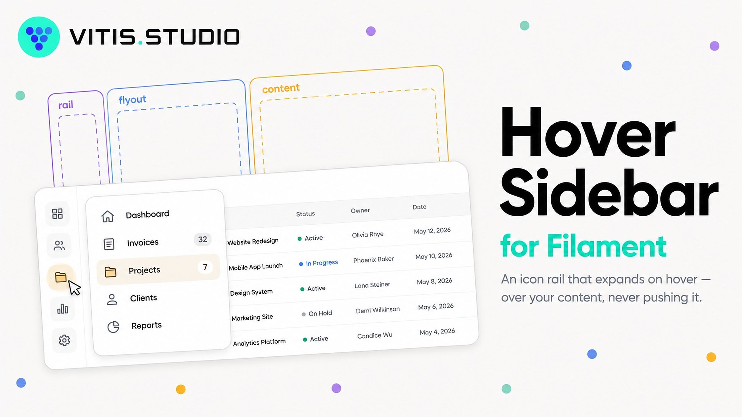
An icon-only sidebar for Filament panels that expands on hover, flies out over the content instead of pushing it, and can be pinned open as a normal drawer.
Filament v5 already gives you the collapsed rail (sidebarCollapsibleOnDesktop()) and group
flyout menus. What it has no API for is hover-to-expand, and its desktop sidebar is lg:sticky
— in the flex flow — so expanding it reflows the page. This plugin adds the first and fixes the
second.
What it looks like
Collapsed, the sidebar is an icon rail and the table gets the width:
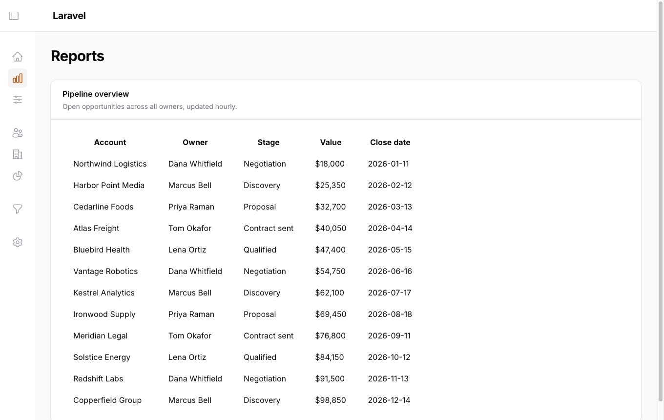
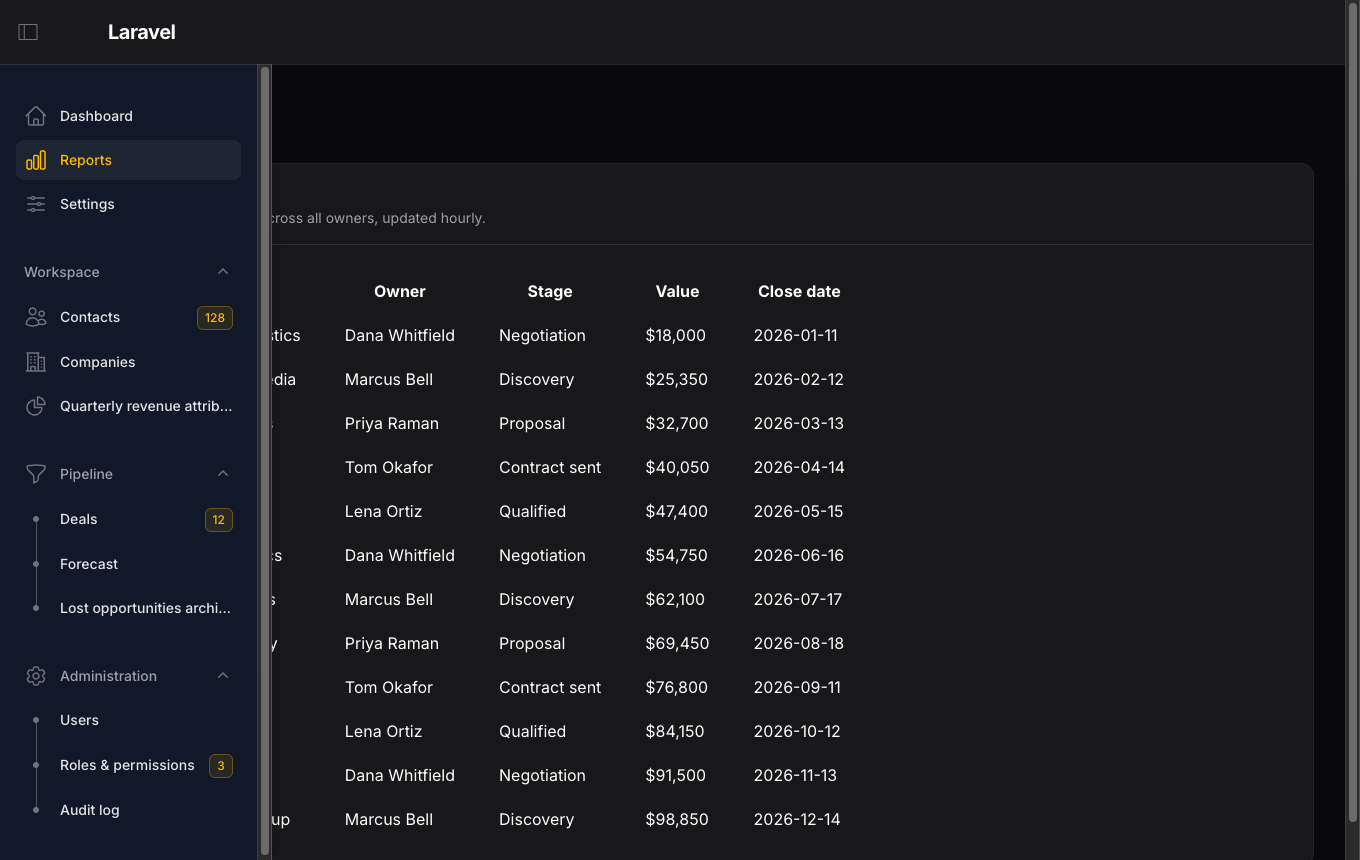
Hover it and the full navigation flies out over the table. Owner, Stage, Value and
Close date sit at exactly the same pixels in both shots — the sidebar moved, the content
did not. That is the whole contract. (The second shot is dark mode; the flyout inherits the
panel background, so themes need no configuration.)
Requirements
| Supported | |
|---|---|
| Filament | v5 only (^5.0) — see below |
| Laravel | 11.28+, 12, 13 |
| PHP | 8.2, 8.3, 8.4 |
Verified against filament/filament v5.7.7 with Livewire v4 on Laravel 13 and PHP 8.4; CI
covers every Laravel and PHP combination above at both --prefer-lowest and --prefer-stable.
On Filament v4. The package runs there unmodified — the whole API surface and every CSS
hook it depends on exist in v4.12.7, and its sidebar stylesheet differs from v5's only in
using a --topbar-height variable where v5 hardcodes 4rem. Support is still declared as
^5.0 deliberately: this plugin overrides core sidebar internals, so it carries real version
risk, and promising two majors doubles the surface that has to be re-checked on every
Filament release. If you need v4, widening the constraint locally is likely to work, but it
is untested territory as far as this package is concerned.
How it works
The plugin owns a pinned flag (an Alpine $persist key — the user's actual preference)
and treats core's $store.sidebar.isOpen as pure presentation, driving it from
pinned || peeking.
That one flag is what makes this small. Core gates labels, badges, the logo, global search,
group headers, item tooltips (via x-effect), aria-expanded, and whether a nav group renders
as an inline list or a dropdown — all on isOpen. Flipping it makes the whole sidebar
internally consistent for free, with no forked Blade view.
- Unpinned — the sidebar goes
position: fixedand.fi-main-ctntakes apadding-inline-startequal to the collapsed width. Hover widens the sidebar over the content. Nothing reflows. - Pinned — the plugin gets out of the way entirely and core's sticky push behaviour stands.
Ships as plain CSS and plain JS. No npm, no Tailwind build, no custom theme required.
Installation
composer require vitisstudio/filament-hover-sidebar
php artisan filament:assets
Register the plugin on a panel:
use VitisStudio\FilamentHoverSidebar\HoverSidebarPlugin;

return $panel
    ->sidebarWidth('17rem')
    ->collapsedSidebarWidth('4.5rem')
    ->plugin(
        HoverSidebarPlugin::make()
            ->openDelay(90)
            ->closeDelay(180)
    );
sidebarCollapsibleOnDesktop() is applied by the plugin's register(), so you do not need it.
The CSS and JS are registered panel-agnostically and load everywhere, but nothing activates
until a panel adds the plugin — the JS no-ops without its config object, and the CSS is gated on
an fhs body class the plugin adds.
Configuration
| Method | Default | Purpose |
|---|---|---|
openDelay(int $ms) |
90 |
How long the pointer must rest on the rail before it expands. Below ~60ms the rail twitches on every pointer transit across the viewport edge. |
closeDelay(int $ms) |
180 |
Grace period before a departing pointer collapses the rail. |
pinnable(bool) |
true |
Renders the topbar pin toggle. Set false for hover-only. |
pinnedByDefault(bool) |
false |
Initial value of the persisted pinned preference. |
unpinnedIcon(...) |
phosphor-sidebar-simple-light |
Toggle icon while the sidebar is a rail — click to pin it open. |
pinnedIcon(...) |
phosphor-sidebar-simple-fill |
Toggle icon while the sidebar is pinned — click to collapse it. |
Both icons accept anything Filament's icon components take — a Blade Icons name, a
BackedEnum, or an Htmlable. Pass null to restore the packaged default:
use Filament\Support\Icons\Heroicon;

HoverSidebarPlugin::make()
    ->unpinnedIcon(Heroicon::OutlinedBars3)
    ->pinnedIcon('heroicon-s-x-mark')
The defaults come from Phosphor via
codeat3/blade-phosphor-icons, which the package requires — no Heroicon set ships a sidebar
panel glyph. Override both if you would rather not render Phosphor at all.
The flyout inherits the panel's own background, so custom themes and dark mode are picked up with no configuration. Override only if you want the flyout to differ from the panel:
:root {
    --fhs-sidebar-bg: #ffffff; /* defaults to the panel background */
    --fhs-duration: 150ms;
}
Translations for the pin button live in filament-hover-sidebar::hover-sidebar and can be
published:
php artisan vendor:publish --tag="filament-hover-sidebar-translations"
What you get
- Hover-to-expand — the unpinned rail widens after
openDelay, collapses aftercloseDelay. Keyboardfocusin/focusoutexpand it too, so tabbing into the nav works. - Tap-to-expand — a press on the collapsed rail expands it and goes nowhere: with no labels
showing, a press on an icon is a request to see the nav, not to follow it. The next press
navigates. On touch, a press anywhere else collapses the rail again. Both delays are skipped,
since a press is deliberate in a way a drifting pointer is not. Keyboard activation is
exempt —
focusinhas already expanded the rail by then. - Flyout — the expanded sidebar is
position: fixedover the content;.fi-main-ctnkeeps its collapsed-width padding, so nothing reflows and no table re-lays-out mid-hover. - Drawer — the pin button switches to core's sticky push behaviour, persisted per browser.
- Group flyout menus — free from core: give a
NavigationGroupan->icon()and its items appear in a dropdown beside the collapsed rail.
Gotchas worth knowing before you debug them
- Collapsed width. Core's intrinsic collapsed rail is ~5.4rem:
1.5remnav padding each side, less the-0.5remgroup margin, plus a2.5remicon button, plusscrollbar-gutter: stable. The plugin's CSS drops the gutter so the documented4.5remdefault actually fits. Go below that and icons clip against.fi-sidebar-nav'soverflow-x: hidden. - Long labels clip during the width transition for the same reason. Either accept it or add
overflow-x: clipwith a wider padding box. - Touch devices. The rail is gated on width alone (
min-width: 1024px), so a tablet in landscape gets it. What differs is the driver: the JS readsevent.pointerType, somousekeeps the hover peek andtouch/penget the press behaviour above. Touch fires nopointerleave, so a tapped-open flyout is dismissed by apointerdownelsewhere on the document or by navigating; a hovered-open one is left alone across a Livewire navigation, because the pointer may still be resting on the rail. Gating the CSS on(hover: hover) and (pointer: fine)— as v0.1.x did — drops tablets all the way back to core, which puts core's collapse button back in the topbar and leaves the rail inert under a finger. - Swallowing that first press takes a capture-phase
clicklistener.preventDefault()on apointerdowndoes not cancel the click that follows it, so a tap still navigated. The listener also has to run in the capture phase: Alpine'snavigateplugin binds click on the link element itself, so only a listener above it in the tree gets there first, and it takesstopPropagation()— not justpreventDefault()— to keep the event off it. isOpenstill persists. Core$persists it underisOpen/isOpenDesktop, so peeking writes localStorage on every hover. Harmless — the store overwrites fromfhs.pinnedon boot — but do not treat those keys as meaningful once this plugin is installed.- Do not attempt a CSS-only version (
display: block !importantoverx-show). Alpine still believes the sidebar is collapsed, so tooltips fire over the now-visible labels,aria-expandedreportsfalse, and icon'd groups stay stuck in dropdown mode. - The flyout has to paint its own background. Core's desktop sidebar is
lg:bg-transparentand just shows the panel colour painted on.fi-body;position: fixedtakes it out of the flow, so it needs one of its own. It inherits that down the ancestor chain rather than naming a colour — Tailwind v4 only emits theme variables that are actually used, so--color-gray-50is not reliably defined, and any hardcoded value breaks custom themes. The:has()selector keeps this off.fi-sidebar-close-overlay, whose translucent scrim is deliberate. - Render hooks here must be unscoped. Scoping them to the panel id renders nothing. Core
passes a page's render-hook scopes (
getRenderHookScopes()— page and resource class names) toBODY_START, and passes no scopes at all toTOPBAR_START; a panel id matches neither.Panel::boot()only runs for the active panel, and the hook closures re-checkFilament::getCurrentOrDefaultPanel(), so unscoped registration stays panel-correct. - Version risk lives here. This overrides
.fi-sidebarpositioning and hides core buttons by class name. Pinfilament/filamentand re-checkvendor/filament/filament/resources/css/components/sidebar.csson minor upgrades.
Try it without an app
The package ships a Testbench workbench — a throwaway Filament panel wired to the plugin, with
no authentication, so /admin opens straight onto the dashboard.
composer install
composer serve
That builds the workbench (sqlite, migrations, filament:assets) and serves it at
http://127.0.0.1:8000/admin. composer build runs the build alone.
The panel is defined in workbench/app/Providers/AdminPanelProvider.php at a 4.5rem collapsed
rail and 17rem open width, with filler navigation chosen to exercise the parts of the sidebar
that are gated on isOpen: long and short labels, badges, a group without an icon (inline list,
gated header) and two groups with icons (core's dropdown flyout). Two extra pages are there to
test SPA navigation, which replaces the sidebar node and forces the JS to rebind.
The Settings page prints $store.fhs.pinned, $store.fhs.peeking, $store.sidebar.isOpen
and the fhs-pinned body class live. The Reports page holds a wide table and prints
.fi-main-ctn's left edge, which must not move while the sidebar is open.
Local development against a real app
"repositories": [
    { "type": "path", "url": "../filament-hover-sidebar" }
]
composer require vitisstudio/filament-hover-sidebar:@dev
php artisan filament:assets
filament:assets must be rerun after any edit to the two resources/dist files — Filament
copies them into public/js and public/css.
Testing
composer test
The package suite covers the PHP surface: plugin defaults, fluent configuration, the
sidebarCollapsibleOnDesktop() side effect, the render-hook payload and its scoping, panel
isolation, and asset registration.
Note that the render-hook tests deliberately render each hook the way core renders it —
BODY_START with a page class as its scope, TOPBAR_START with no scopes — rather than with
the scope the plugin registered under. Asserting against the plugin's own scope is
self-consistent and proves nothing.
The layout contract itself is browser-level, and a Pest v4 browser test in a host application is the only meaningful coverage:
it('expands the sidebar on hover without moving the content', function () {
    $page = visit('/admin');

    $before = $page->script('document.querySelector(".fi-main-ctn").getBoundingClientRect().left');

    $page->hover('#fi-main-sidebar')
        ->waitForText('Dashboard')
        ->assertScript(
            'document.querySelector(".fi-main-ctn").getBoundingClientRect().left',
            $before,
        );
});
Assert against the content box, not the sidebar's — the sidebar moving is the feature, the content staying put is the contract.
Relationship to other packages
Deliberately not part of vitisstudio/filament-custom-layout — that package is a record-page
content contract (regions, presenters, descriptors); this one is panel chrome. No shared
abstraction, disjoint install surface, and the CSS here overrides core internals so it carries
the fragile half of the version risk.
Upstream references
vendor/filament/filament/resources/js/stores/sidebar.js— theisOpenstorevendor/filament/filament/resources/css/components/sidebar.css—lg:sticky, widthsvendor/filament/filament/resources/views/components/sidebar/item.blade.php— tooltipx-effectvendor/filament/filament/resources/views/components/sidebar/group.blade.php— group dropdown flyoutvendor/filament/filament/src/Panel/Concerns/HasSidebar.php— width + collapsible APIvendor/filament/filament/src/View/PanelsRenderHook.php— hook constants
Changelog
Please see CHANGELOG for what has changed recently.
Credits
License
The MIT License (MIT). Please see License File for more information.