
vitisstudio / filament-choosable-chips

A FilamentPHP v5 form field that renders checkbox/radio options as dismissable, colorable, icon-bearing badge chips with a fluent options API.
Package info
github.com/VitisStudio/filament-choosable-chips
pkg:composer/vitisstudio/filament-choosable-chips
Fund package maintenance!
Requires
- php: ^8.4
- filament/forms: ^5.0
- illuminate/contracts: ^11.0||^12.0||^13.0
- spatie/laravel-package-tools: ^1.16
Requires (Dev)
- larastan/larastan: ^3.0
- laravel/boost: ^2.4
- laravel/pint: ^1.14
- nunomaduro/collision: ^8.8
- orchestra/testbench: ^11.0.0||^10.0.0||^9.0.0
- pestphp/pest: ^4.0
- pestphp/pest-plugin-arch: ^4.0
- pestphp/pest-plugin-laravel: ^4.0
- phpstan/extension-installer: ^1.4
- phpstan/phpstan-deprecation-rules: ^2.0
- phpstan/phpstan-phpunit: ^2.0
Suggests
None
Provides
None
Conflicts
None
Replaces
None
This package is auto-updated.
Last update: 2026-09-30 06:17:15 UTC
README
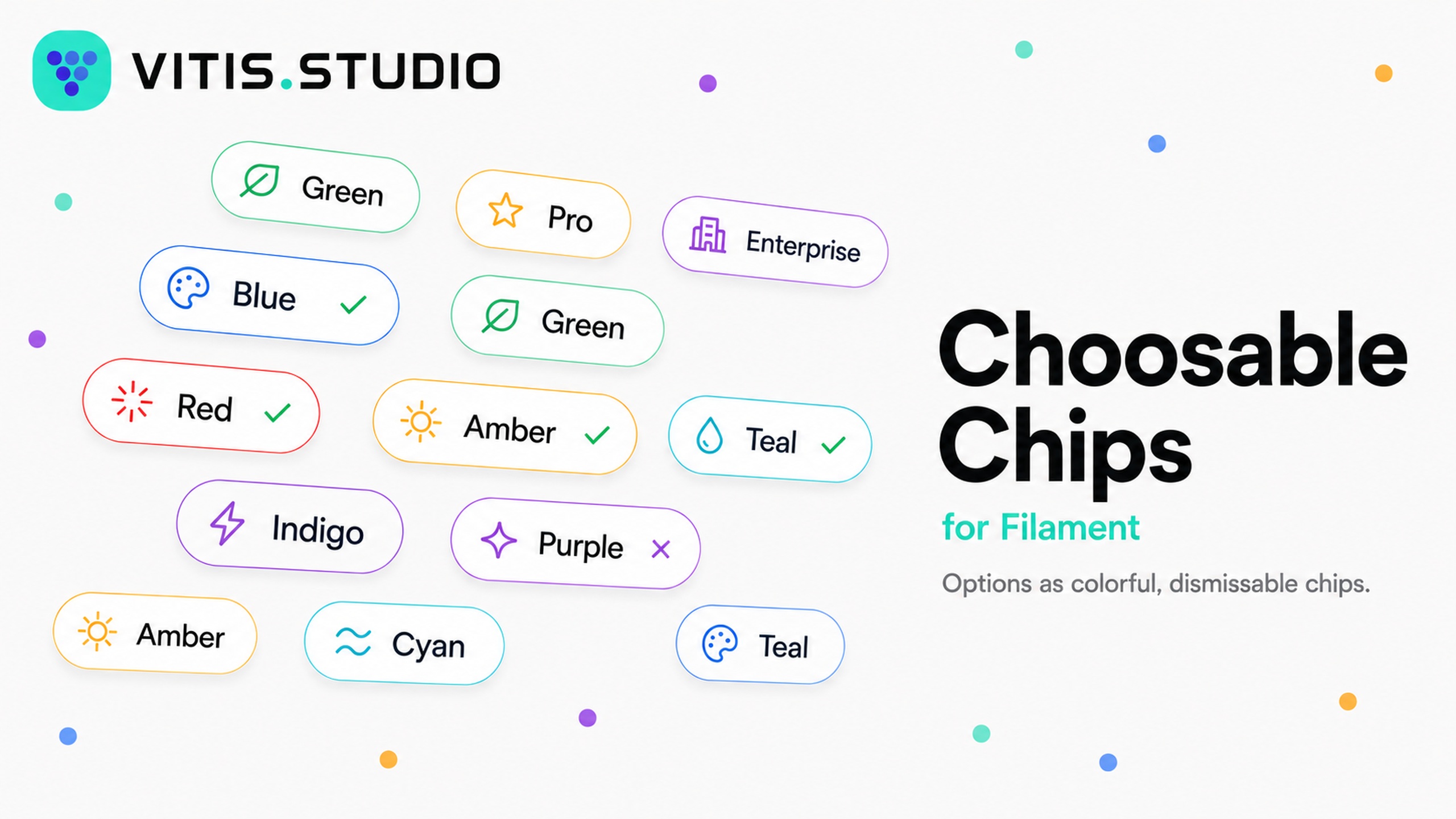
A FilamentPHP v5 form field that renders checkbox/radio options as dismissable, colorable, icon-bearing badge chips. The API is patterned after Select/ToggleButtons, so per-option labels, colors, and icons are supplied through the same fluent option map you already know. Each chip is a native Filament badge, so it inherits Filament's theme out of the box.
Features
- Single or multi select from one field — radio semantics by default, checkbox semantics with
->multiple(). - Per-option color, icon, and description, keyed by option value (same shape as
Select::options()). - Dismissable chips using the badge's built-in delete button — click a chip to toggle it, or click the × to clear it.
- Selected check marks with
->checkSelected(), colored independently of the chip. - Reuses the Filament badge component and color tokens, so it matches your panel with no extra CSS.
- Enum support and an
invalidation rule derived from the enabled options, like the built-in option fields.
Requirements
- PHP 8.4+
- Filament v5 (
filament/forms^5.0)
Installation
Install the package via Composer:
composer require vitisstudio/filament-choosable-chips
That's all that's required — the field uses Filament's existing badge styles, so there is nothing to publish or build for the default look.
If you use a custom panel theme, register the package views as a Tailwind source in your theme's CSS so the chip utility classes are compiled:
@source '../../../../vendor/vitisstudio/filament-choosable-chips/resources/views';
Then rebuild your theme (npm run build).
Usage
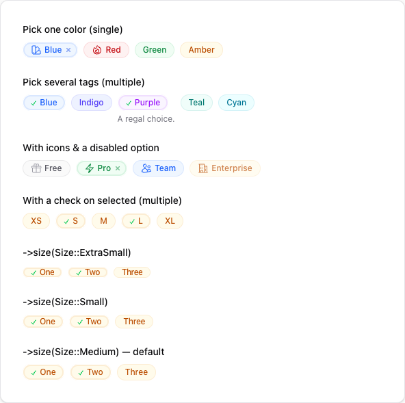
Use the field anywhere you build a Filament schema (a resource form, a custom page, a relation manager, an action, etc.). Single-select (radio semantics) is the default — the field stores a single scalar value:
use VitisStudio\FilamentChoosableChips\Forms\Components\ChoosableChips;

ChoosableChips::make('color')
    ->options([
        'blue' => 'Blue',
        'red' => 'Red',
        'green' => 'Green',
        'amber' => 'Amber',
    ])
    ->colors([
        'blue' => 'info',
        'red' => 'danger',
        'green' => 'success',
        'amber' => 'warning',
    ])
    ->icons([
        'blue' => \Filament\Support\Icons\Heroicon::OutlinedSwatch,
        'red' => \Filament\Support\Icons\Heroicon::OutlinedFire,
    ]);

Multiple selection
Call ->multiple() for checkbox semantics. The field then stores an array of values (cast the underlying Eloquent attribute as array):
ChoosableChips::make('tags')
    ->multiple()
    ->options([
        'blue' => 'Blue',
        'indigo' => 'Indigo',
        'purple' => 'Purple',
        'teal' => 'Teal',
        'cyan' => 'Cyan',
    ])
    ->colors([
        'blue' => 'info',
        'purple' => 'purple',
    ])
    ->descriptions([
        'purple' => 'A regal choice.',
    ]);

Icons and disabled options
Per-option icons accept a Heroicon enum case or an icon name. Disable individual options with ->disableOptionWhen():
use Filament\Support\Icons\Heroicon;

ChoosableChips::make('plan')
    ->options([
        'free' => 'Free',
        'pro' => 'Pro',
        'team' => 'Team',
        'enterprise' => 'Enterprise',
    ])
    ->icons([
        'free' => Heroicon::OutlinedGift,
        'pro' => Heroicon::OutlinedBolt,
        'team' => Heroicon::OutlinedUsers,
        'enterprise' => Heroicon::OutlinedBuildingOffice2,
    ])
    ->disableOptionWhen(fn (string $value): bool => $value === 'enterprise');

Check on selected
Call ->checkSelected() to prepend a check mark to selected chips. The check is colored with ->selectedColor() (defaults to success). When you don't configure checkSelected() explicitly, it turns on automatically for fields that have no per-option icons(), so it never collides with a leading icon. While the check is shown it replaces the dismiss × (the check already signals selection, and clicking the chip clears it):
ChoosableChips::make('sizes')
    ->multiple()
    ->checkSelected()                 // also auto-on when no icons() are set
    ->selectedColor('success')        // color of the check (default: success)
    ->options([
        'sm' => 'S',
        'md' => 'M',
        'lg' => 'L',
    ]);

Sizes
Set the chip size with ->size(), passing a Size enum (or its string value). The default is Size::Medium. Filament's badge styles only render xs and sm distinctly — md, lg, and xl share the base size.
use Filament\Support\Enums\Size;

ChoosableChips::make('a')->size(Size::ExtraSmall);   // or ->size('xs')
ChoosableChips::make('b')->size(Size::Small);        // or ->size('sm')
ChoosableChips::make('c')->size(Size::Medium);       // default
To change the size for every chip field at once, set a default in a service provider:
use VitisStudio\FilamentChoosableChips\Forms\Components\ChoosableChips;

ChoosableChips::configureUsing(fn (ChoosableChips $component) => $component->size('sm'));



Enums
Pass a backed enum to options(). Labels, colors, and icons are read automatically from the enum when it implements Filament's HasLabel, HasColor, and HasIcon contracts:
ChoosableChips::make('status')
    ->options(OrderStatus::class);
API
| Method | Description |
|---|---|
options(array | Arrayable | string | Closure) |
The value => label option map (or an enum class string). |
multiple(bool | Closure = true) |
Switch to multi-select (checkbox) mode. Default is single-select. |
colors(array | Arrayable | Closure) |
Per-option color map keyed by value (any Filament color token). |
icons(array | Arrayable | Closure) |
Per-option icon map keyed by value (Heroicon or icon name). |
descriptions(array | Arrayable | Closure) |
Per-option helper text keyed by value. |
disableOptionWhen(Closure) |
Disable specific options; disabled chips can't be selected or removed. |
dismissible(bool | Closure = true) |
Show a × on selected chips to clear them. Enabled by default, but suppressed while the selected check is shown. |
checkSelected(bool | Closure = true) |
Prepend a check mark to selected chips. Auto-on when no icons() are set. |
selectedColor(string | Closure | null) |
Color of the selection check. Defaults to success. |
checkIcon(string | BackedEnum | Closure) |
Icon used to mark selected chips. Defaults to a check mark. |
size(Size | string | Closure) |
Badge size (Size enum or its string value, e.g. 'sm'). |
defaultColor(string | Closure | null) |
Color used for options with no explicit color. Defaults to primary. |
gridDirection(GridDirection | string | Closure) |
Lay chips out by column (default) or row. |
Publishing the views
The default look needs no publishing. To customise the chip markup, publish the view and edit it:
php artisan vendor:publish --tag="filament-choosable-chips-views"
The view is published to resources/views/vendor/filament-choosable-chips/.
Example app
A full Filament v5 panel using the field lives in example/. It links this package via a Composer path repository, so it always runs against your local copy. See example/README.md for setup; in short:
cd example
composer install && npm install && npm run build
cp .env.example .env && php artisan key:generate
touch database/database.sqlite && php artisan migrate
php artisan serve
Testing
composer test
To preview the field in a browser without a full app, the package ships a Testbench workbench app:
composer serve
Upgrading
This package follows semantic versioning. Review the changelog before upgrading across a major version.
Changelog
Please see CHANGELOG for more information on what has changed recently.
Contributing
Please see CONTRIBUTING for details.
Security Vulnerabilities
If you discover a security vulnerability, please email dan@vitis.studio rather than using the issue tracker.
Credits
License
The MIT License (MIT). Please see License File for more information.