
laboiteacode / filament-tribute-theme

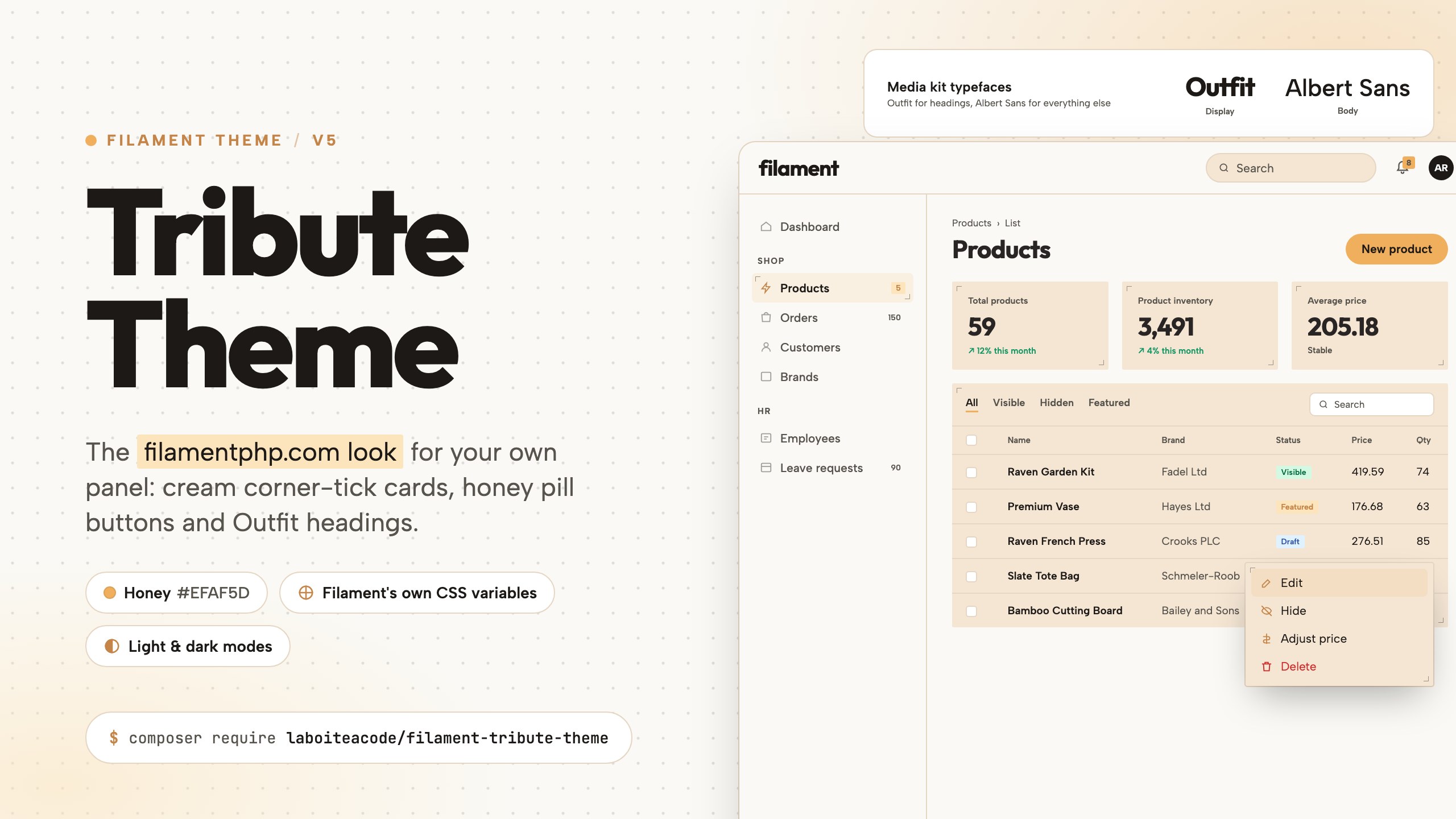
A free Filament v5 theme paying tribute to filamentphp.com: cream corner-tick cards, honey pill buttons and Outfit headings, built on Filament's own CSS variables.
Package info
github.com/La-boite-a-code/Filament-Tribute-Theme
Language:CSS
pkg:composer/laboiteacode/filament-tribute-theme
Requires
- php: ^8.2
- filament/filament: ^5.0
- illuminate/contracts: ^12.0 || ^13.0
- spatie/laravel-package-tools: ^1.93
Requires (Dev)
- larastan/larastan: ^3.10
- laravel/pint: ^1.29
- nunomaduro/collision: ^8.9
- orchestra/testbench: ^10.0 || ^11.0
- pestphp/pest: ^3.8 || ^4.0 || ^5.0
- pestphp/pest-plugin-arch: ^3.1 || ^4.0 || ^5.0
- pestphp/pest-plugin-laravel: ^3.2 || ^4.0 || ^5.0
- phpstan/extension-installer: ^1.4
- phpstan/phpstan-deprecation-rules: ^2.0
- phpstan/phpstan-phpunit: ^2.0
- rector/rector: ^2.5
Suggests
None
Provides
None
Conflicts
None
Replaces
None
README
Filament Tribute Theme
The filamentphp.com look, for your own panel.
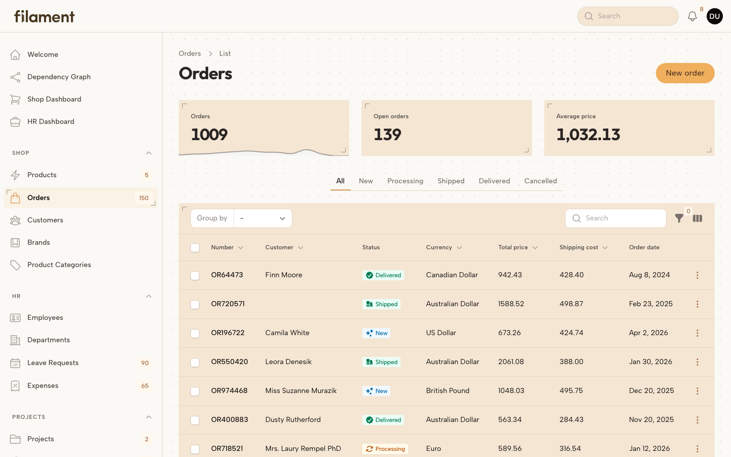
A free Filament v5 theme paying tribute to filamentphp.com: the warm off-white dotted canvas, cream cards marked by two corner ticks, honey pill buttons with the site's dark "flood" hover, flat underlined tabs and the Outfit + Albert Sans type pairing from the Filament media kit.
| Light | Dark |
|---|---|
 |
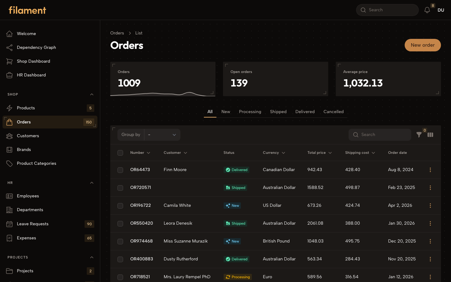 |
Table of contents
- Why this theme
- Requirements
- Installation
- Colours
- Plugin API
- How the theme is built
- Customizing tokens
- Utilities for your own views
- Dark mode
- How it's compiled
- Testing
- Credits
- License
Why this theme
Filament's own website has a distinctive material: cream surfaces, corner ticks instead of borders, honey calls to action with dark ink, generous Outfit headings. Panels built with Filament ship with a neutral white look instead. This theme brings the site's material into the panel without fighting the framework: colours are registered through the panel, rules are written with Filament's own utilities, and Filament keeps owning every interactive state.
Requirements
- PHP
^8.2 - Laravel
^12.0or^13.0 - Filament
^5.0 - Tailwind CSS
^4.1with@tailwindcss/vitein the host application
Installation
1. Pull the package
composer require laboiteacode/filament-tribute-theme
2. Run the installer
php artisan filament-tribute-theme:install
This publishes resources/css/filament/admin/theme.css, the panel theme
entry-point.
If your panel already has a theme entry-point, add the two imports from the
published stub to it instead (Filament's theme.css first, then the package).
3. Wire the theme into your panel
Edit app/Providers/Filament/AdminPanelProvider.php and register both the
theme stylesheet and the plugin:
use Laboiteacode\FilamentTributeTheme\FilamentTributeThemePlugin;

public function panel(Panel $panel): Panel
{
    return $panel
        ->viteTheme('resources/css/filament/admin/theme.css')
        ->plugin(FilamentTributeThemePlugin::make());
}
Make sure the entry-point is listed in your vite.config.js inputs, as for
any Filament custom theme.
4. Build the assets
npm run build      # production
npm run dev        # development (HMR)
Reload the panel and the theme is live.
Colours
The theme registers one brand colour: honey, the filamentphp.com
signature, anchored on the media kit's #EFAF5D. It is a full 50–950 OKLCH
scale registered as the panel's primary through Filament's own ->colors()
API, so buttons, focus rings, active navigation, badges and charts resolve
their contrast-aware shades from it with no extra CSS.
The scale is hand-tuned rather than generated. Filament picks button, badge and link shades by contrast, and a generated scale drifts away from the brand: the honey turns orange at the dark end and the calls to action lose the dark ink they have on the site.
Alongside it the plugin registers warm Color::Stone grays — the site's own
text colours — and Filament's stock info, success, warning and danger
scales.
Using your own brand colour
Pass any colour to colors() to keep the theme's material with your own
accent:
use Filament\Support\Colors\Color;

FilamentTributeThemePlugin::make()
    ->colors([
        'primary' => Color::hex('#7c3aed'),
        'gray' => Color::Stone,
    ]);
Or leave the panel's existing ->colors() untouched with withoutColors().
Plugin API
All options are fluent and can be chained on FilamentTributeThemePlugin::make().
| Method | Purpose | Default |
|---|---|---|
font(?string $font, ?string $url = null) |
Body font registered through Filament's ->font() (null to keep the panel's own; $url for a custom stylesheet) |
'Albert Sans' |
maxContentWidth(bool|string $value = true) |
true for 'full', any Filament preset string, or false to keep the panel's setting |
false |
colors(array $colors) |
Replace the auto-resolved colour array with your own (Color::hex() / Filament palettes / shade arrays) |
auto |
withoutColors() |
Skip colour registration entirely — keep the panel's ->colors() untouched |
enabled |
By default the plugin registers honey as primary, warm Color::Stone grays
(the site's text colours) and Filament's stock info / success / warning
/ danger scales.
Headings render in Outfit (imported from Bunny Fonts by the published
theme.css) and body text in Albert Sans (registered through Filament's->font(), served by Bunny Fonts with italics). Pass your own family, and optionally a stylesheet URL, tofont()to change it.
Example — full configuration
use Filament\Support\Colors\Color;
use Laboiteacode\FilamentTributeTheme\FilamentTributeThemePlugin;

FilamentTributeThemePlugin::make()
    ->maxContentWidth('full')
    ->font('Albert Sans')
    ->colors([
        'primary' => Color::hex('#7c3aed'),
        'gray' => Color::Stone,
    ]);
How the theme is built
The stylesheet is deliberately small (under 550 lines) because it leans on Filament's own CSS architecture instead of restyling it:
- Colours are Filament's. Every rule reads the runtime variables Filament
injects —
--primary-*,--gray-*,--success-*… — and--color-*inside a.fi-color-*scope. No parallel scales, no remapping. - Contrast is Filament's. Filament v5 already paints primary buttons in honey‑400 with dark ink because white text on honey‑600 fails WCAG AA. The theme only adds the pill shape and the site's dark "flood" hover.
- Utilities are Filament's. Rules are written with
@applyand thedark/hovervariants Filament defines, inside@layer componentsright after Filament's own layer. Every selector mirrors the shape of the Filament rule it refines, so Filament keeps owning focus, invalid, disabled and responsive states.
What it restyles, to match filamentphp.com:
- Canvas — the site's
#faf9f5off-white with the dotted pattern; the topbar, sidebar and global search sit on it with tan hairlines - Cards — sections, tables, stats, dropdowns, modals and the auth card become cream surfaces with two diagonal corner ticks
- Buttons — pills; cream ghost secondaries; quiet outlined danger
- Sidebar — corner-bracket active item with dark ink and a honey icon, tracked uppercase group labels
- Tabs — flat strip with a honey underline
- Tables — flat header band, tan dividers, honey-tinted hover, tan pagination squares
- Typography — Outfit for page, section, modal and stat headings on Stone ink
Customizing tokens
Override the handful of custom properties in your panel's theme CSS, after the package import:
@import '../../../../vendor/filament/filament/resources/css/theme.css';
@import '../../../../vendor/laboiteacode/filament-tribute-theme/resources/css/index.css';

:root {
    --tribute-radius: 0.5rem;            /* rounder cards */
    --tribute-surface: white;            /* white cards instead of cream */
}
| Token | Role |
|---|---|
--tribute-canvas |
Body canvas colour |
--tribute-surface |
Card surface colour |
--tribute-line |
Hairline / divider colour |
--tribute-corner-tl / --tribute-corner-br |
Corner tick images |
--tribute-corners / --tribute-corner-pos |
Which ticks are drawn, and where |
--tribute-radius |
Card corner radius |
--tribute-shadow-lg |
Dropdown / modal elevation |
--tribute-ease-out |
Motion curve |
--tribute-canvas, --tribute-surface, --tribute-line, the corner ticks and
--tribute-shadow-lg are redefined under .dark; override them there too.
Utilities for your own views
Three opt-in utility classes are available in Blade views scanned by your
theme's @source directives:
| Class | Renders |
|---|---|
tribute-card |
Cream surface with the two corner ticks |
tribute-display |
Outfit display heading (bold, tight tracking) |
tribute-eyebrow |
Uppercase, tracked eyebrow text in the primary colour |
<div class="tribute-card p-6">
    <p class="tribute-eyebrow">This month</p>
    <h3 class="tribute-display text-2xl">Revenue</h3>
</div>
Dark mode
Filament's dark mode is fully supported. The canvas and cards switch to the Stone 950 / 900 scale with lighter corner ticks, the primary button hover inverts (cream flood, dark label) and every semantic colour keeps Filament's dark shades.
How it's compiled
The package ships only source CSS — no precompiled bundle. The host app's
Vite/Tailwind pipeline picks up the package's resources/css/index.css
through the theme entry-point published to
resources/css/filament/admin/theme.css, alongside Filament's own theme
import. Tailwind's @source scanning stays aware of your panel classes, so
unused utilities are pruned in your build like any other dependency.
Testing
composer test      # Pest
composer analyse   # PHPStan
npm run build      # compiles the theme against Filament's stylesheet
Credits
- Built on top of
filamentphp/plugin-skeleton. - Brand colours and typography from the official Filament media kit.
- Maintained by La Boite à Code.
License
MIT — see LICENSE.md.