happenv-com / filament-enhanced-charts

Apache ECharts integration for Filament
Package info
github.com/happenv-com/filament-enhanced-charts
pkg:composer/happenv-com/filament-enhanced-charts
Requires
- php: ^8.4
- filament/filament: ^4.0 || ^5.0
- spatie/laravel-package-tools: ^1.15.0
Requires (Dev)
- driftingly/rector-laravel: ^2.1
- ergebnis/composer-normalize: ^2.48
- larastan/larastan: ^3.0
- laravel/pint: ^1.24
- nunomaduro/collision: ^8.0
- orchestra/testbench: ^10.0 || ^11.0
- pestphp/pest: ^4.0 || ^5.0
- pestphp/pest-plugin-arch: ^4.0 || ^5.0
- pestphp/pest-plugin-laravel: ^4.0 || ^5.0
- pestphp/pest-plugin-livewire: ^4.0 || ^5.0
- phpstan/phpstan-deprecation-rules: ^2.0
- rector/rector: ^2.1
Suggests
- flowframe/laravel-trend: Time-series aggregation (per day/week/month, gap-filled) for chart widgets; feed its result to Happenv\FilamentEnhancedCharts\Data\ChartData::fromTimeSeries().
Provides
None
Conflicts
None
Replaces
None
This package is auto-updated.
Last update: 2026-11-17 11:17:02 UTC
README

Apache ECharts integration for Filament: dashboard widgets and table columns driven by a fully typed, fluent PHP option model.
class OrdersChart extends EnhancedChartWidget
{
    protected static ?string $heading = 'Orders per day';

    protected function getOption(): Option
    {
        return Option::cartesian()
            ->xAxis(CategoryAxis::make()->data(['Mon', 'Tue', 'Wed']))
            ->series(LineSeries::make()->name('Orders')->smooth()->data([12, 20, 15]));
    }
}
Key features
- Typed option model. The ECharts option tree is mirrored as fluent PHP builders — if you know an ECharts option, you know the method — and everything not (yet) modelled stays reachable through a
->raw()escape hatch on every node (The option model). - 23 series types. Line, bar, pie, scatter, effectScatter, candlestick, boxplot, heatmap, radar, gauge, funnel, sankey, chord, sunburst, treemap, tree, graph, parallel, themeRiver, pictorialBar, map, lines, and fully custom
renderItemseries. - Every coordinate system. Cartesian grids, polar, radar, geo/maps, calendar, singleAxis, parallel and matrix — plus datasets with transforms, visual maps, data zoom, toolbox, brush and graphic elements.
- Filament-native. Panel theming, automatic dark mode, Filament
Colorpalettes,RawJsfor client-side callbacks, Livewire polling, deferred loading and filters. - Data straight from Eloquent.
ChartData::fromPairs(),ChartData::fromTimeSeries()(laravel-trend compatible) andDataset::fromModels()turn query results into chart data, andHasChartDatabuilds a whole chart from data and a type (Feeding data from Eloquent). A tabularChartDatasetplus a preset name draws any suitable chart without choosing a chart type (Chart presets). - 64 languages. Month and day names, toolbox and aria strings follow the app locale in every language Filament ships (Translations).
- Charts in table cells. Sparklines, candlesticks and donut pies inside table cells via
EnhancedChartColumn, or any custom per-record chart (Charts in table cells). - Testable. Livewire assertions for the resolved chart options in your application's tests (Testing your application), and the package itself is covered by a Pest suite on every supported version combination.
Gallery
A taste of what the typed option model draws — every chart is a regular widget class, and follows your panel's light or dark mode automatically.
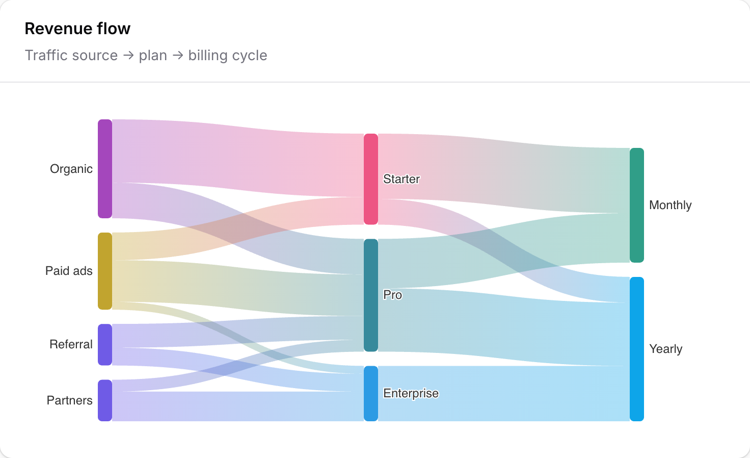 Sankey |
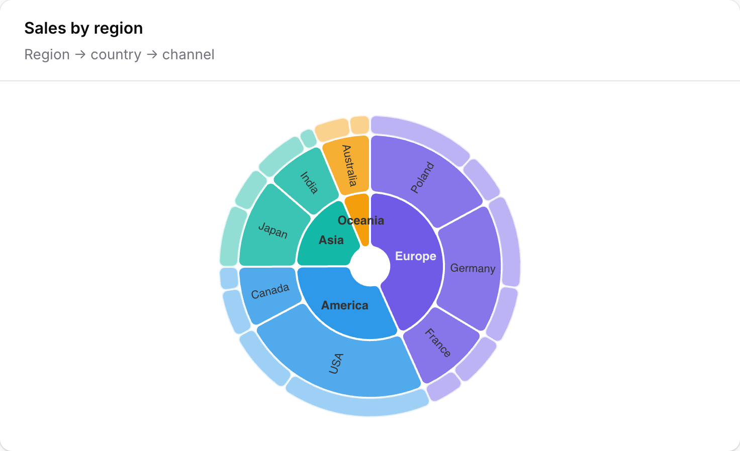 Sunburst |
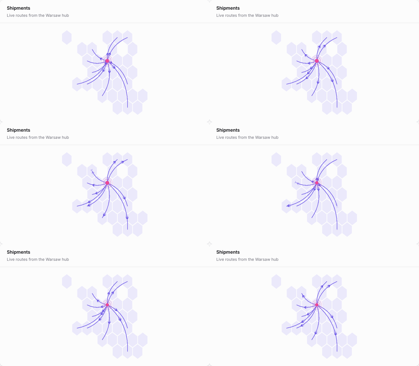 Animated routes |
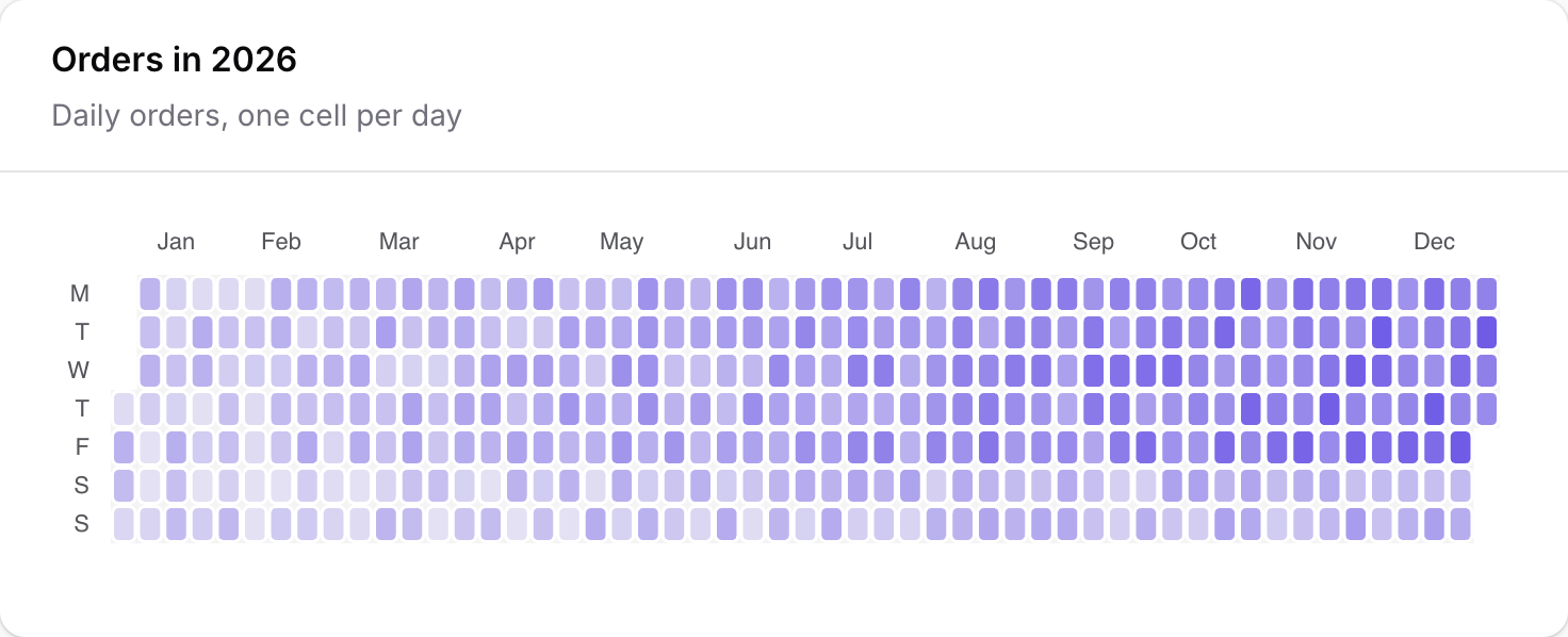 Calendar heatmap |
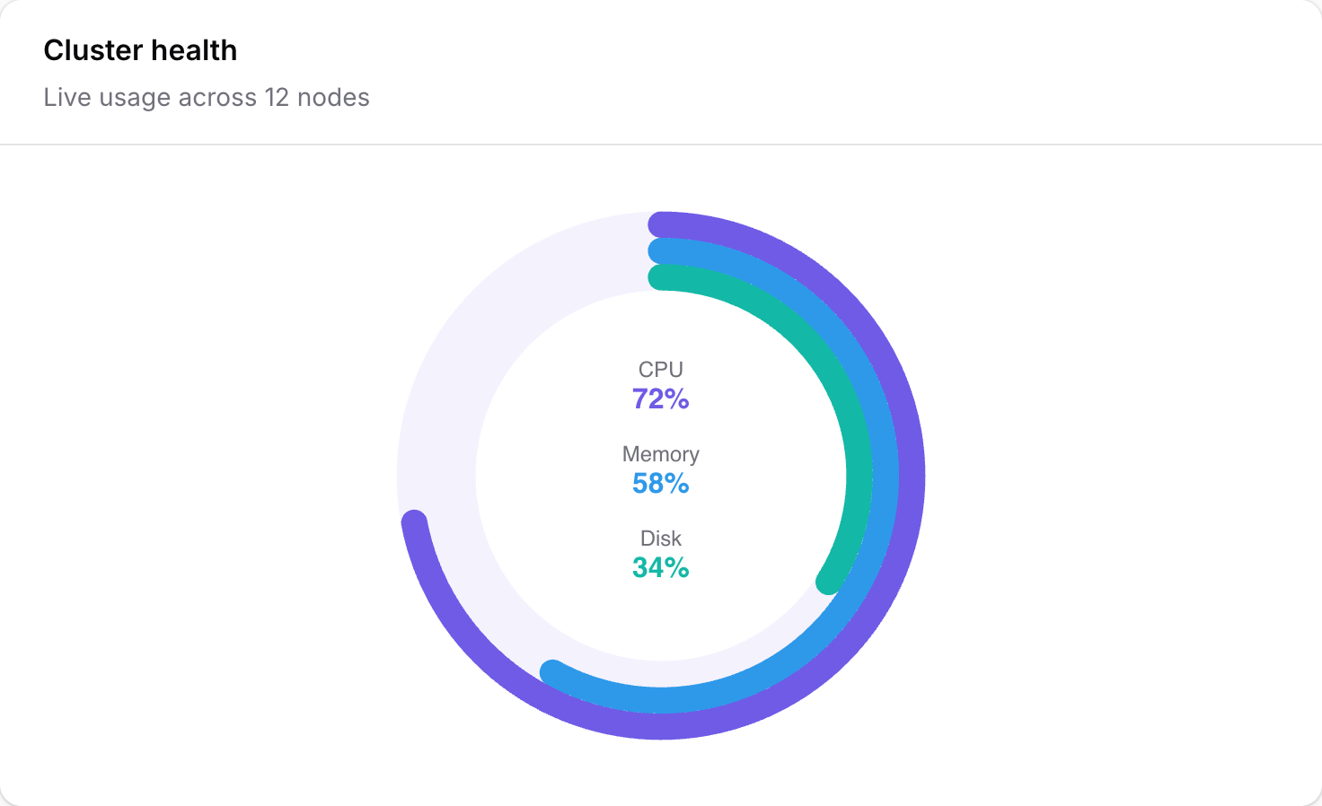 Progress rings |
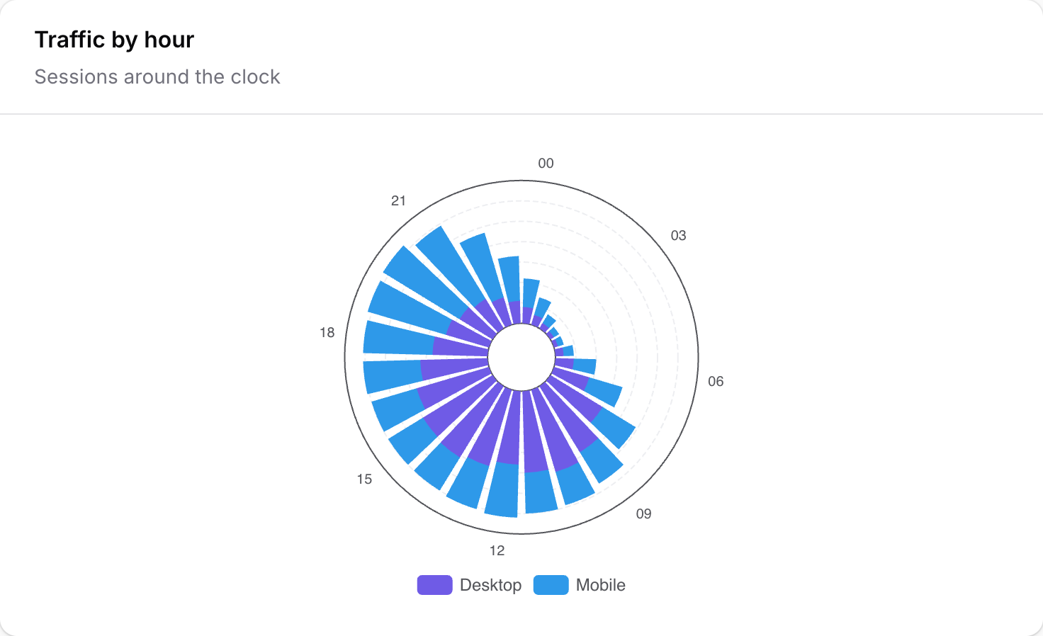 Polar bars |
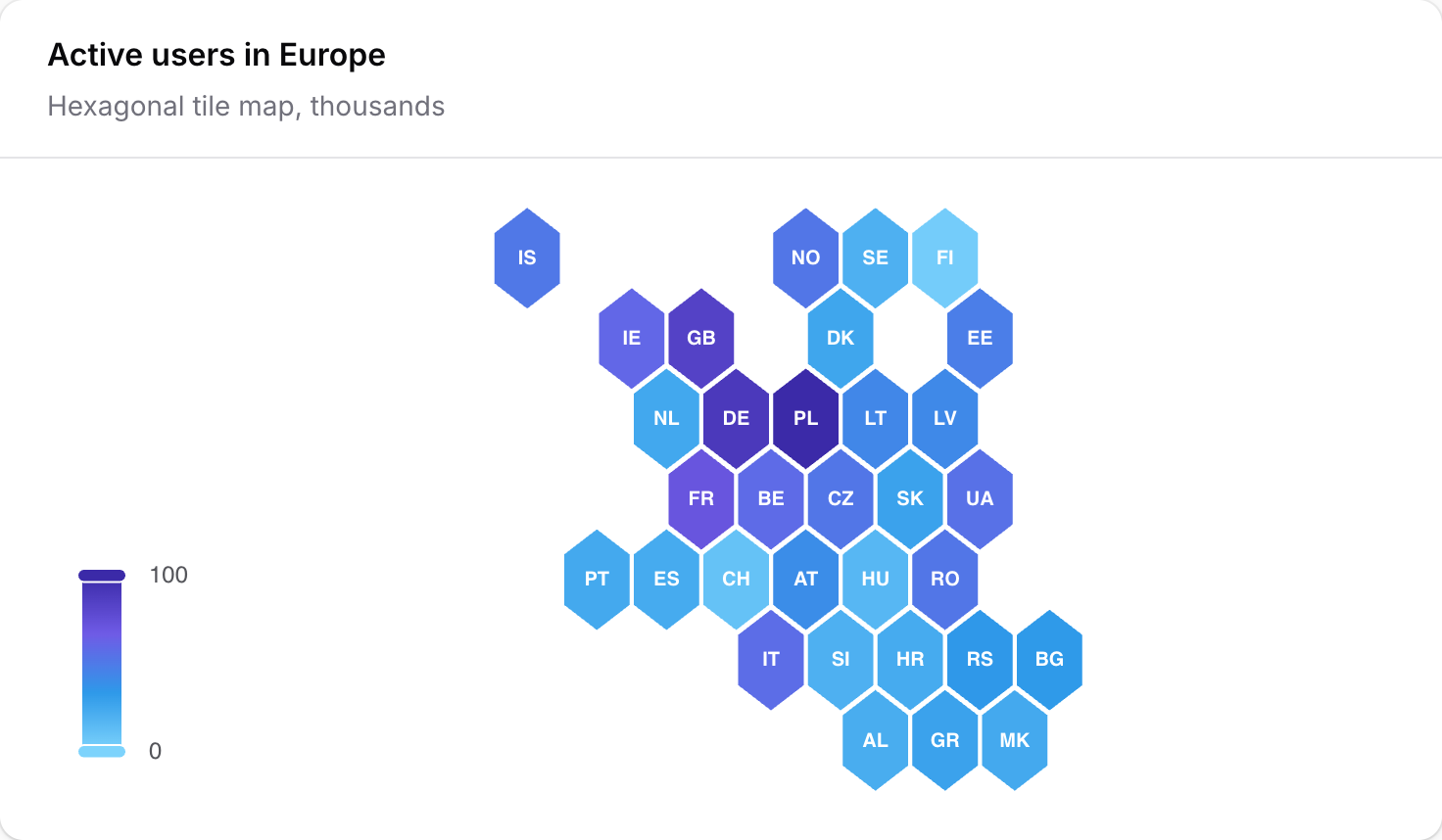 GeoJSON map |
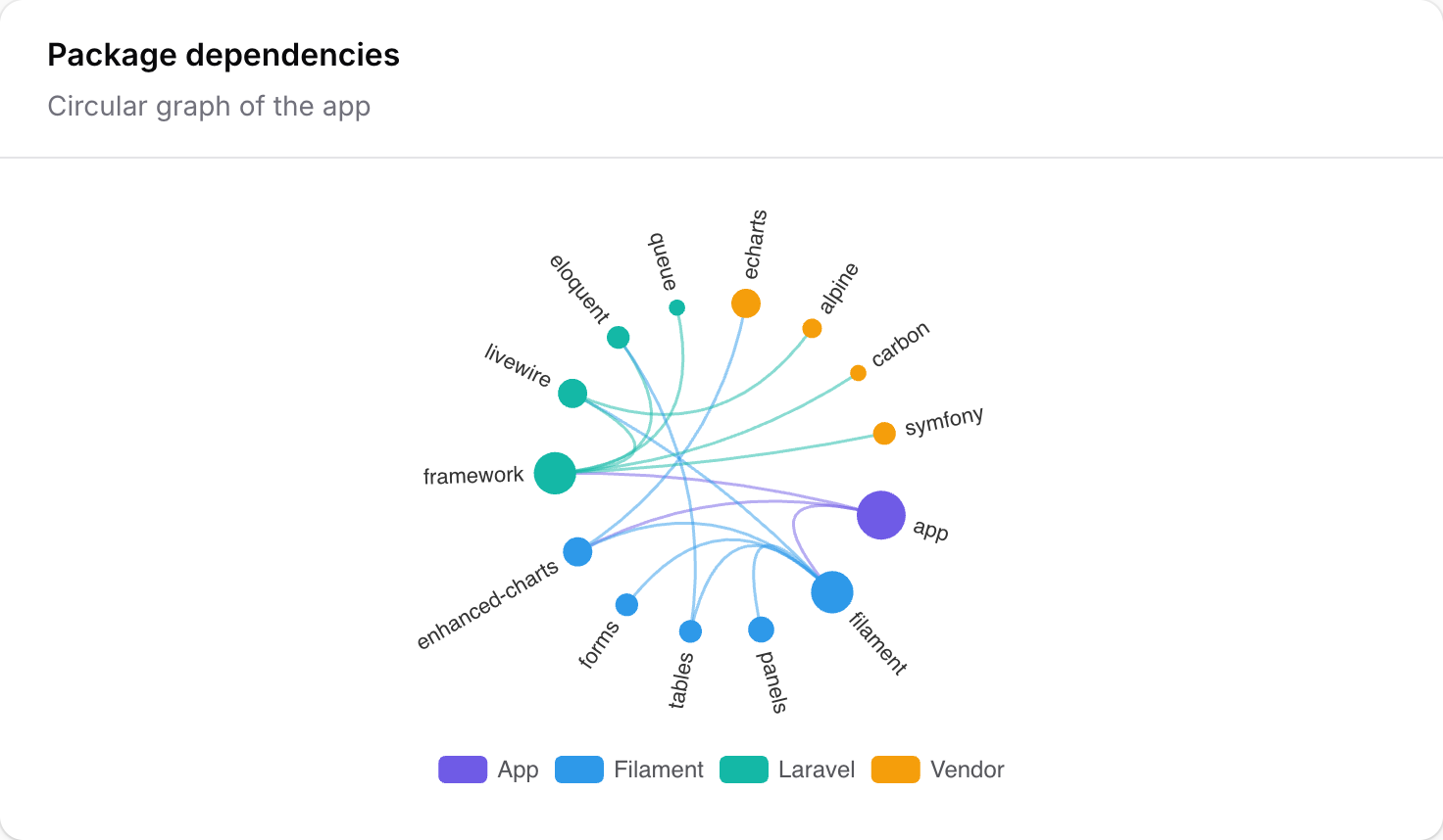 Graph |
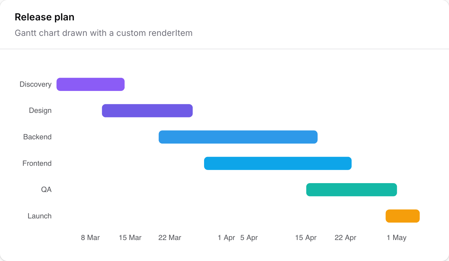 Custom Gantt |
Requirements
| Package | Versions |
|---|---|
| PHP | 8.4 – 8.5 |
| Laravel | 12, 13 |
| Filament | 4, 5 |
Installation
Install the package via Composer:
composer require happenv-com/filament-enhanced-charts
Register the plugin on each Filament panel that should render charts:
use Happenv\FilamentEnhancedCharts\FilamentEnhancedChartsPlugin;

public function panel(Panel $panel): Panel
{
    return $panel
        ->plugins([
            FilamentEnhancedChartsPlugin::make(),
        ]);
}
After installing or upgrading, republish the compiled JavaScript assets:
php artisan filament:assets
Upgrading from filament-echarts 2.x? See UPGRADING.md.
Configuration
Publish the config file:
php artisan vendor:publish --tag="filament-enhanced-charts-config"
It lists the chart types the make:filament-enhanced-charts generator offers (see Generating a widget):
return [
    'chart_options' => [
        'Line', 'Bar', 'Pie', 'Scatter', 'Candlestick', 'Radar',
        'Boxplot', 'Sunburst', 'Parallel', 'Sankey', 'Funnel', 'Gauge',
    ],
];
Optionally, publish the views and translations:
php artisan vendor:publish --tag="filament-enhanced-charts-views"
php artisan vendor:publish --tag="filament-enhanced-charts-translations"
Usage
Generating a widget
The generator asks for the chart type, an optional resource and the panel, and writes a ready-to-edit widget from the matching stub:
php artisan make:filament-enhanced-charts BlogPostsChart
Your first widget
A chart widget is a regular Filament widget: extend EnhancedChartWidget and return an Option from
getOption(). That is the whole story.
use Happenv\FilamentEnhancedCharts\Option\Axis\CategoryAxis;
use Happenv\FilamentEnhancedCharts\Option\Option;
use Happenv\FilamentEnhancedCharts\Option\Series\BarSeries;
use Happenv\FilamentEnhancedCharts\Option\Series\LineSeries;
use Happenv\FilamentEnhancedCharts\Widgets\EnhancedChartWidget;

class BlogPostsChart extends EnhancedChartWidget
{
    protected static ?string $heading = 'Blog posts';

    protected function getOption(): Option
    {
        return Option::cartesian()
            ->xAxis(CategoryAxis::make()->data(['Jan', 'Feb', 'Mar']))
            ->series(
                LineSeries::make()->name('Posts')->smooth()->data([10, 15, 8]),
                BarSeries::make()->name('Comments')->data([45, 60, 32]),
            );
    }
}
Two entry points exist on Option:
Option::make()— a blank slate.Option::cartesian()— a batteries-included preset for the common case: an axis-triggered tooltip and a top legend, ready for->xAxis()+->series().
When an x-axis is set and no y-axis is given, a ValueAxis is defaulted for you. Set
->yAxis(...) explicitly when you need something else (e.g. a CategoryAxis for a heatmap).
The option model
Everything under Happenv\FilamentEnhancedCharts\Option\* is a fluent builder that serializes to the
exact ECharts option shape. This package deliberately
does not re-document every chart type — the ECharts docs and
examples gallery are the reference; the builders mirror
them method-for-method.
| Kind | Classes |
|---|---|
| Root | Option |
| Axes | Axis\CategoryAxis, Axis\ValueAxis, Axis\TimeAxis, Axis\LogAxis |
| Series | Series\LineSeries, BarSeries, PieSeries, ScatterSeries, EffectScatterSeries, CandlestickSeries, BoxplotSeries, HeatmapSeries, RadarSeries, GaugeSeries, FunnelSeries, SankeySeries, ChordSeries, SunburstSeries, TreemapSeries, TreeSeries, GraphSeries, ParallelSeries, ThemeRiverSeries, PictorialBarSeries, MapSeries, LinesSeries, CustomSeries |
| Components | Component\Legend, Tooltip, Title, Grid, DataZoom, VisualMap, Toolbox (+ Toolbox\* features), AxisPointer, Brush, Polar, AngleAxis, RadiusAxis, Radar, Geo, Calendar, SingleAxis, Parallel, ParallelAxis, Matrix, Dataset, Transform, Graphic (+ Graphic\* elements) |
| Styles | Style\ItemStyle, LineStyle, AreaStyle, Label, Emphasis |
| Marks | Mark\MarkLine, MarkPoint, MarkArea |
| Data | DataPoint, SankeyNode, SankeyLink |
Conventions that hold across the whole tree:
::make()+ fluent setters. Every builder is created with::make()and configured by chaining; setters return$this.- One or many. Slots that ECharts accepts as "an object or an array of objects" are variadic:
->grid(...),->xAxis(...),->title(...),->series(...),->visualMap(...), … Pass one or several; the emitted JSON follows ECharts' single-vs-array convention automatically. - Builders or arrays. Sub-config setters accept the matching builder or a plain array:
->itemStyle(ItemStyle::make()->borderRadius(4))and->itemStyle(['borderRadius' => 4])are equivalent. - Conditional building. All builders use Laravel's
Conditionable:->when($this->filter === 'year', fn (Option $o) => $o->dataZoom(...)). - Per-point configuration. Wherever a data item can be more than a value, pass a
DataPoint:DataPoint::make(1048)->name('Search')->itemStyle(ItemStyle::make()->color('#c23531')).
The raw() escape hatch
Every node (Option, each series, axis, component, DataPoint, …) accepts
->raw(array $options). Raw options are deep-merged over the typed output, raw wins — so you
can reach any ECharts option the typed API doesn't model yet without abandoning the builders:
LineSeries::make()
    ->data($values)
    ->raw(['universalTransition' => true]);
To skip the typed model entirely, return a raw tree from a blank Option:
protected function getOption(): Option
{
    return Option::make()->raw([
        'xAxis' => ['type' => 'category', 'data' => ['A', 'B']],
        'series' => [['type' => 'bar', 'data' => [5, 7]]],
    ]);
}
Prefer the typed methods — raw() is the last resort, not the default.
Formatters and JS callbacks
Strings passed to formatter()-style methods are treated as literal
ECharts templates and pass through
unchanged. For a real client-side function, pass Filament's RawJs: it is serialized as a marker
and revived into a genuine JS function in the browser.
use Filament\Support\RawJs;
use Happenv\FilamentEnhancedCharts\Option\Axis\ValueAxis;
use Happenv\FilamentEnhancedCharts\Option\Component\Tooltip;

Option::make()
    ->tooltip(Tooltip::make()->trigger('axis')->formatter('{b}: {c} pcs')) // template string
    ->yAxis(ValueAxis::make()->axisLabel(
        RawJs::make('(value) => (value / 1000) + "k"'),                    // executable JS
    ));
RawJs works anywhere in the tree — renderItem on a CustomSeries, symbolSize callbacks,
animationDelay functions, labelLayout, colors-by-callback, and so on. Inside these callbacks
the echarts global is available, so gallery snippets using echarts.format.addCommas(...) or
echarts.graphic.clipRectByRect(...) port verbatim.
Numbers
Anywhere a number is accepted you may pass a native \BcMath\Number instead of
int|float|string; it is serialized as an exact numeric literal rather than a lossy float.
Number formatting
Numbers on a chart are written in the application locale (app()->getLocale(), read each time
the option is built): 18 000 in Polish, 18,000 in English. The browser does the work with
Intl.NumberFormat — you never write JavaScript for it.
With no configuration, value and log axes, tooltips and the data labels of cartesian series
(bar, line, scatter, effectScatter, pictorialBar, heatmap) that are switched on show a
plain, locale-aware number with up to two fraction digits. Category and time axes are never touched,
and neither is a formatter you wrote yourself (formatter(), valueFormatter(), axisLabel(RawJs),
Label::formatter(), raw()): an explicit formatter always wins.
Happenv\FilamentEnhancedCharts\Support\NumberFormat is an immutable value that describes the format:
use Happenv\FilamentEnhancedCharts\Support\NumberFormat;

NumberFormat::number();                        // 1 234,5      (up to 2 fraction digits)
NumberFormat::number(decimals: 2);             // 1 234,50     (exactly 2)
NumberFormat::currency('PLN');                 // 1 234,50 zł  (pl)  ·  PLN 1,234.50 (en)
NumberFormat::currency('EUR', decimals: 0);    // 1 235 €
NumberFormat::percent(fraction: false);        // the value is 0-100: 45   -> 45%
NumberFormat::percent(fraction: true);         // the value is 0-1:   0.45 -> 45%
NumberFormat::compact();                       // 18 tys. (pl)  ·  18K (en)
NumberFormat::currency('PLN')->compacted();    // a compact currency
NumberFormat::number()->unit('kg');            // 12,5 kg  — a plain suffix for what Intl has no unit for
NumberFormat::number()->locale('de');          // pin a locale instead of the application's
percent() makes you say which scale the data is on, because both are common. Only finite numbers
are formatted; a category name or a date is left as it is. On an axis a currency drops the fraction
digits of a whole tick (18 000 zł).
Where to set it — per value axis, per series, per tooltip/label, per chart, or per measure:
use Happenv\FilamentEnhancedCharts\Option\Axis\CategoryAxis;
use Happenv\FilamentEnhancedCharts\Option\Axis\ValueAxis;
use Happenv\FilamentEnhancedCharts\Option\Option;
use Happenv\FilamentEnhancedCharts\Option\Series\BarSeries;
use Happenv\FilamentEnhancedCharts\Option\Series\LineSeries;
use Happenv\FilamentEnhancedCharts\Option\Style\Label;

$revenue = NumberFormat::currency('PLN');
$orders = NumberFormat::number()->unit('szt.');

Option::cartesian()
    ->xAxis(CategoryAxis::make()->data(['Jan', 'Feb', 'Mar']))
    ->yAxis(
        ValueAxis::make()->name('PLN')->format($revenue),                       // a value axis
        ValueAxis::make()->name('Orders')->format($orders)->position('right'),
    )
    ->series(
        BarSeries::make()->name('Revenue')->data([120000, 98000, 143500])
            ->format($revenue),                                                 // a series: its tooltip rows
        LineSeries::make()->name('Orders')->yAxisIndex(1)->data([310, 280, 402])
            ->format($orders)
            ->label(Label::make()->show()),                                     // ...and its labels, when shown
    );
ValueAxis::format()/LogAxis::format()— the tick labels.Series::format()— the series' value in the tooltip (a chart can mix a money series and a count; each is formatted with its own format) and in its data labels when they are shown.Series::formatDimensions($xFormat, $yFormat)— the tooltip of a point whose value is a list (a scatter point[x, y]): each dimension in a format of its own.Tooltip::format()— every value in the tooltip that has no series format.Label::format()— one label.Option::numberFormat()— the default of the whole chart (axes, tooltip, labels).- Precedence, most specific first: a formatter you wrote → the series' / axis' own format → the
chart's
numberFormat()→ the plain locale-aware number.
Locale. The format is written for app()->getLocale() at the moment Option::toArray() runs (not
when the builder was created, so a builder reused across locales stays consistent) and the locale
travels inside the option, so an initial render and every Livewire update agree, and a widget
re-rendered in another locale sends the new one. Pin one with ->locale('de') (underscores such as
pt_BR are fine). An unknown tag falls back to the browser's locale.
Measures and presets. A DatasetMeasure carries a number format of its own, or implies one from
its unit, and the presets apply it to the series, tooltips, labels and the value axis of that unit:
new DatasetMeasure('revenue', 'Revenue', unit: 'PLN');                 // currency PLN
new DatasetMeasure('margin', 'Margin', unit: '%');                     // a percentage of 0-100
new DatasetMeasure('weight', 'Weight', unit: 'kg');                    // a number followed by kg
new DatasetMeasure('rate', 'Rate', unit: '%', format: NumberFormat::percent(fraction: true)); // explicit wins
$measure->withFormat(NumberFormat::currency('EUR', 0));
A unit that is a three-letter ISO 4217 code (PLN, EUR, USD, …) is a currency, % is a
percentage of 0-100, anything else is a plain number with the unit as a suffix, and no unit means
the plain number. When every measure of a dataset shares a format the whole chart uses it; when they
differ (a revenue and an order count) each series and each unit's value axis uses its own. A
measure's format is part of ChartDataset::toArray() / fromArray() only when it is set.
Feeding data from Eloquent
A series' data() and an axis' data() take any iterable, so a Collection works — but the
shape matters:
-
A positional list (a bare
pluckor an array) → pass it straight todata(). Keys are dropped (the series/axis is positional), so a keyed Collection never mis-serializes to an object:$totals = Order::query()->orderBy('day')->pluck('total'); // [120, 90, 140, …] LineSeries::make()->data($totals);
-
A keyed map where the key is the label (
pluck('total', 'channel'), agroupBycount) → useChartData::fromPairs()to split it into labels + values:use Happenv\FilamentEnhancedCharts\Data\ChartData; $data = ChartData::fromPairs(Order::query()->pluck('total', 'channel')); // ['B2B' => 60, …] Option::make() ->series(PieSeries::make()->data($data->toDataPoints())); // named slices // or, for a cartesian chart: Option::cartesian() ->xAxis(CategoryAxis::make()->data($data->labels())) ->series(BarSeries::make()->data($data->values()));
-
Tabular rows for multiple series → build a
Datasetand let each seriesencode()its columns.Dataset::fromModels()projects a query result to just the chart columns (never the full attribute bag) — don't hand aCollection<Model>todata():Option::make() ->dataset(Dataset::fromModels( Order::query()->selectRaw('day, sum(total) total, channel')->get(), columns: ['day', 'total', 'channel'], )) ->series(LineSeries::make()->encode(x: 'day', y: 'total'));
Time series
For "per day/week/month" aggregations, flowframe/laravel-trend
is the recommended companion: it handles the per-driver date bucketing (Postgres/MySQL/MariaDB/
SQLite) and gap-fills empty periods with zeros. It is an optional suggest — install it only if you
need time series:
composer require flowframe/laravel-trend
Feed its result straight to ChartData::fromTimeSeries():
use Flowframe\Trend\Trend;
use Happenv\FilamentEnhancedCharts\Data\ChartData;

$data = ChartData::fromTimeSeries(
    Trend::query($this->scopedOrders())
        ->between(now()->subDays(30), now())
        ->perDay()
        ->sum('total'),
);

Option::cartesian()
    ->xAxis(CategoryAxis::make()->data($data->labels()))
    ->series(LineSeries::make()->smooth()->data($data->values()));
ChartData::fromTimeSeries() reads date/aggregate off each row with data_get(), so it is
decoupled from the trend package — any Collection of rows carrying a label and a value column
works (pass labelKey:/valueKey: for different column names).
Shortcut: a chart from just data + a type
When the chart is a single series of one of the common types, the HasChartData trait writes
getOption() for you — declare the data and (optionally) the type, nothing else:
use Happenv\FilamentEnhancedCharts\Concerns\HasChartData;
use Happenv\FilamentEnhancedCharts\Data\ChartData;
use Happenv\FilamentEnhancedCharts\Enums\ChartType;
use Happenv\FilamentEnhancedCharts\Widgets\EnhancedChartWidget;

class SalesByChannelChart extends EnhancedChartWidget
{
    use HasChartData;

    protected static ?string $heading = 'Sales by channel';

    protected function getData(): ChartData
    {
        return ChartData::fromPairs(Order::query()->pluck('total', 'channel'));
    }

    protected function chartType(): ChartType
    {
        return ChartType::Bar; // Line (default), Area, Bar, or Pie
    }
}
ChartType is a curated set — Line, Area, Bar, Pie — that maps cleanly onto the
labels + values (or, for pie, the named DataPoint) shape. The trait builds a cartesian option
(category x-axis + value y-axis) for the axis types and an axis-less option for pie. The moment you
want more — a second series, custom styling, marks, a scatter's x/y pairs — implement getOption()
directly with the typed builders; this trait is only the shallow-end shortcut.
Chart presets: a chart from a dataset, without knowing chart types
ChartType needs you to pick the chart. When the data is an aggregate ("orders per channel per
month") and the choice should be made by a person, a settings screen or an AI, hand the package a
tabular ChartDataset and a preset name — the package says which presets can draw that data
and builds the Option:
use Happenv\FilamentEnhancedCharts\Data\ChartDataset;
use Happenv\FilamentEnhancedCharts\Data\DatasetDimension;
use Happenv\FilamentEnhancedCharts\Data\DatasetMeasure;
use Happenv\FilamentEnhancedCharts\Presets\ChartPresets;

$dataset = ChartDataset::fromRows(
    dimensions: [DatasetDimension::time('month', 'Month'), DatasetDimension::category('channel', 'Channel')],
    measures: [new DatasetMeasure('orders', 'Orders')],
    rows: $rows, // [['month' => 'Jan 2026', 'channel' => 'Allegro', 'orders' => 12], …]
);

$presets = app(ChartPresets::class);

$presets->catalog($dataset->shape()); // [['name' => 'stacked-bar', 'description' => '…', 'requirement' => '…'], …]
$option = $presets->option('stacked-bar', $dataset); // an Option, ready for getOption()
- Dimensions split the rows. A dimension has a kind:
categorylabels,timebuckets (an already formatted label such asJan 2026; the cartesian presets never parse it as a date) orregion— ISO 3166-1 alpha-2 country codes in uppercase (PL,DE;DatasetDimension::region()). Every preset that takes a category takes a region too (it is just a label there); onlyworld-mapandflow-linesneed regions. Measures are the numbers (int|float|null). A row is keyed by dimension and measure names. - Multi-valued dimensions. A dimension may be marked
multiValued(); presets that encode part-of-whole then refuse it — see Data semantics. - Measure additivity. A measure may be marked non-additive (
->nonAdditive(): a ratio, an average, a distinct count) or semi-additive (->semiAdditive(): a stock level); presets that encode part-of-whole then refuse it — see Data semantics. - Measure roles. A measure may carry a
MeasureRole—Min,Q1,Median,Q3,Max,Open,Close,Low,High— naming the statistic it holds (DatasetMeasure::withRole(MeasureRole::Median, 'median', 'Median')).boxplotneeds exactly the five measures with the roles min, q1, median, q3, max, andcandlestickthe four with open, close, low, high, in any order; the preset puts them in the order ECharts reads.DatasetShapecarries the roles (roles,hasRole(),hasExactlyRoles()), soaccepting()andcatalog()stay truthful. A role is a description, not a restriction: every other preset ignores roles and draws the measures as plain values, so a candlestick dataset still draws as aline. A dataset uses each role at most once. - Measure units. A measure may carry a free-text
unit(new DatasetMeasure('revenue', 'Revenue', unit: 'PLN');PLN,pcs,%,views; it also implies a number format, see Number formatting). On the presets that draw one series per measure, each distinct unit gets its own value axis: the first on the left, the second on the right, further ones alternating sides with a growing offset (60 px steps) and more room in the grid. Each axis is named by its unit and takes the colour of its series when it carries just one; the series carry the matchingyAxisIndex(xAxisIndexfor the horizontal variants). Stacked variants stack within a unit only, never across units. A measure without a unit counts as a scale of its own when others have one. The number of units never changes which presets accept a dataset. ChartDataset::fromRows()coerces query results (numeric strings, ints as labels); the constructor andfromArray()are strict.toArray()/fromArray()round-trip through JSON, so a dataset can be stored;fromArray()throwsInvalidChartDataseton anything malformed.$dataset->shape()is just the dimension kinds, the measure count and the measure roles;ChartPresets::accepting($shape)returns the presets that accept it, andcatalog()the same asname/description/requirementdata — what an AI needs to choose. A preset registered later shows up there with no change on the consumer's side.option()throwsChartPresetExceptionfor an unknown preset or one that does not accept the shape — it never renders a blank chart.
In a widget, the HasChartPreset trait replaces getOption():
use Happenv\FilamentEnhancedCharts\Concerns\HasChartPreset;

class OrdersPerChannelChart extends EnhancedChartWidget
{
    use HasChartPreset;

    protected function getDataset(): ChartDataset
    {
        return ChartDataset::fromRows(…);
    }

    protected function chartPreset(): string
    {
        return 'stacked-bar';
    }
}
Data semantics: grain and multi-valued dimensions
A ChartDataset is an aggregate: its rows are the measures summed per combination of dimension values.
The grain is what one source record is — an order, an order line, a product. A dimension is
multi-valued when one record of that grain carries several of its values: a product in several
categories, an order with several tags. Grouping by such a dimension counts the record once per value,
so the measure over that dimension is correct per value ("orders tagged gift") but the values
do not add up to the whole (an order with two tags is in two rows). A chart that draws the rows as
shares of a total — a pie, a stack — would show a total larger than the truth, so it would lie.
Mark such a dimension where you build the dataset; nothing else changes:
DatasetDimension::category('tag', 'Tag')->multiValued();   // fluent, on any dimension
DatasetDimension::category('tag', 'Tag', multiValued: true); // or as an argument (also on region())
new DatasetDimension('tag', 'Tag', multiValued: true);
The flag survives toArray() / fromArray() (it is written only when true, so a v1.5 array reads
unchanged) and reaches the shape: DatasetShape::hasMultiValuedDimension(), isMultiValuedAt($index),
$shape->multiValued (the positions), withMultiValued(...$indexes); describe() and toArray()
mention it. ChartPresets::accepting($shape) and catalog($shape) then leave out every preset that
encodes part-of-whole along a multi-valued dimension, and option() throws ChartPresetException
for it, naming the dimension. A preset that merely compares values — bar, grouped-bar, line,
heatmap, radar, … — keeps accepting it: each value is read on its own, nothing is summed across them.
Only the dimension a chart partitions by matters: in stacked-bar the x axis may be multi-valued, the
stacked dimension may not. Marking is the consumer's responsibility — the package cannot see your joins.
| Preset | Partitions by | Why |
|---|---|---|
pie, donut, rose |
the dimension | slices are the parts of one circle |
funnel |
the dimension | steps are read as proportions of the top step |
treemap, sunburst |
every dimension | a parent is the sum of its children, areas fill the whole |
tree |
every dimension | each node carries the sum of the leaves below it |
stacked-bar, stacked-horizontal-bar, stacked-area |
the second dimension (with 2 dimensions) | the stack height is the total of the series; the x axis is not summed |
theme-river |
the category or region (not the time) | the stream is each category's share at a period |
sankey |
both dimensions | node height is the flow through it and flow is conserved |
chord |
both dimensions | an arc is as long as its ribbons sum to |
graph |
both dimensions | a node is as large as its links sum to |
Not part-of-whole, so never refused: every cartesian comparison (bar, horizontal-bar, line,
smooth-line, area, grouped-bar, multi-line, bar-line, pictorial-bar, polar-bar), heatmap,
calendar-heatmap, radar, parallel, scatter, effect-scatter, boxplot, candlestick,
gauge, world-map and flow-lines (each cell, point or country is read alone). Stacking several
measures of one dimension is a different thing from partitioning by a dimension and is not refused.
A custom preset extending AbstractChartPreset encodes no part-of-whole unless it overrides
partitioningDimensions(DatasetShape): array (the positions it adds up by); the registry and
option() then refuse a multi-valued one for it too, even if it overrides accepts() itself. This is
a separate EncodesPartOfWhole interface rather than a new method on ChartPreset, so an existing
ChartPreset implementation keeps compiling and behaves as before.
Measure additivity
A multi-valued dimension makes the rows overlap; a non-additive measure makes the values meaningless to add. Margin %, an average order value or a distinct customer count of two slices are not the customer count or margin of their union, so a pie or a stack of them is wrong however clean the grain. A stock level is in between: it adds up across warehouses, never across months.
use Happenv\FilamentEnhancedCharts\Data\DatasetMeasure;
use Happenv\FilamentEnhancedCharts\Enums\Additivity;

new DatasetMeasure('orders', 'Orders');                                  // Additivity::Additive (default)
(new DatasetMeasure('margin', 'Margin %', unit: '%'))->nonAdditive();    // ratio, average, distinct count
(new DatasetMeasure('stock', 'Stock'))->semiAdditive();                  // adds up across categories, not time
new DatasetMeasure('margin', 'Margin %', additivity: Additivity::NonAdditive); // or as an argument
(new DatasetMeasure('x', 'X'))->withAdditivity(Additivity::Additive);    // set explicitly
Additivity |
Part-of-whole preset accepts it when… |
|---|---|
Additive (default) |
always |
SemiAdditive |
none of the dimensions the preset partitions by is a time dimension (a pie by warehouse, a stacked-area of categories over time; not a pie by month, nor a sunburst with a time level) |
NonAdditive |
never; every preset that encodes part-of-whole refuses it — and so do stacked-bar, stacked-horizontal-bar and stacked-area when they stack measures (1 dimension, 2 or more measures), since the stack reads as their total |
Which dimensions a preset partitions by is the same table as above, so presets that merely compare values
(bar, line, grouped-bar, heatmap, …) keep drawing any measure. The refusal is the same shape as the
multi-valued one: ChartPresets::accepting($shape) and catalog($shape) leave the preset out and option()
throws ChartPresetException, with a translated reason naming the measure and suggesting presets that split
no total (bar, line, …). The keys live in resources/lang/<locale>/additivity.php (en, pl, de shipped;
others fall back to en) and can be overridden like any package translation:
filament-enhanced-charts::additivity.non_additive—:preset,:measurefilament-enhanced-charts::additivity.semi_additive—:preset,:measure,:dimension(the time dimension)filament-enhanced-charts::additivity.suggestion—:presets
The flag survives toArray() / fromArray() ("additivity": "non-additive" is written only when the measure is
not additive, so an older array reads as additive) and reaches the shape: DatasetShape::$additivity (one entry
per measure), additivityAt($index), hasNonAdditiveMeasure(), withAdditivity(...$additivity); describe() and
toArray() mention it. ChartDataset::totals() — which sums a measure per label — throws
InvalidChartDataset for a non-additive measure when two rows share a label, so a total of a ratio is never
computed; a semi-additive one (a stock level) throws when the rows of a label differ in a time dimension. A custom
preset benefits automatically once it implements EncodesPartOfWhole (and, to refuse stacked measures, the optional
StacksMeasures interface — AbstractChartPreset implements it as "never"; override stacksMeasures()). Like multi-valued, marking
is the consumer's responsibility.
Built-in presets
| Preset | Requirement |
|---|---|
pie, donut, rose, funnel |
1 single-valued dimension (category, time or region) and 1 measure — a named slice per dimension value |
polar-bar |
1 dimension and 1 measure — bars around a circle |
pictorial-bar |
1 dimension and 1 measure — a bar chart whose bars are stacks of rounded pills (a built-in symbol, no image) |
bar, horizontal-bar, line, smooth-line, area |
1 dimension and 1 or more measures — one series per measure; a value axis per unit |
bar-line |
1 dimension and 2 or more measures — the first measure (or, with several units, the first unit's measures) as bars, the rest as lines; a value axis per unit |
grouped-bar, stacked-bar, stacked-horizontal-bar, multi-line, stacked-area |
2 dimensions (first on the x axis, second splits it into series; for the stacked-* ones the second must be single-valued) and 1 measure, or 1 dimension and 2 or more measures (a value axis per unit; stacks never mix units) |
heatmap |
2 dimensions (x, y) and 1 measure, with a visual map |
sankey |
2 single-valued dimensions (source, target) and 1 measure |
graph |
2 single-valued dimensions (source, target) and 1 measure — a force-directed network; link width is the measure, a node is as large as its links sum to |
chord |
2 single-valued dimensions (source, target) and 1 measure — ribbons between arcs around a circle |
treemap, sunburst |
1 or 2 single-valued dimensions (the second nested in the first) and 1 measure |
tree |
1 to 3 single-valued dimensions (each nested in the previous) and 1 measure — a tree under a root labelled by the measure; parents are the sum of their leaves |
radar |
2 dimensions (axes, entities) and 1 measure, or 1 dimension (entities) and 3 or more measures (axes) |
parallel |
1 dimension (every value is a line) and 3 or more measures (one parallel axis per measure) |
gauge |
no dimensions and 1 measure — a single value |
theme-river |
2 dimensions (1 time, 1 single-valued category or region) and 1 measure |
calendar-heatmap |
1 time dimension of days written YYYY-MM-DD, and 1 measure |
scatter, effect-scatter |
1 dimension (every row is a point named by it) and exactly 2 measures (x, y); the effect variant ripples |
boxplot |
1 dimension and exactly 5 measures with the roles min, q1, median, q3, max |
candlestick |
1 time dimension and exactly 4 measures with the roles open, close, low, high |
world-map |
1 region dimension and 1 measure — a choropleth of countries with a visual map |
flow-lines |
2 region dimensions (from, to) and 1 measure — animated lines between countries on the world map |
The flow presets (sankey, graph, chord, flow-lines) drop a null, zero or negative flow and a
flow from a node to itself, and sum repeated pairs. boxplot, candlestick and parallel leave out
a row that lacks one of its values rather than draw it wrongly. custom has no preset on purpose:
its renderItem is JavaScript code, not data, and an option an AI wrote must never carry
executable code — use getOption() and the typed CustomSeries for it.
The world map. world-map and flow-lines draw on a simplified world map shipped with the
package (about 160 KB, built from Natural Earth 1:110m
countries, public domain — see NOTICE; regions are keyed by ISO alpha-2 code and named in the app
locale through intl, in English where it has no name). It is a Filament asset
(filament-enhanced-charts-map-world) that a page requests only when a chart's option uses the map:
HasChartPreset supplies it through getMaps() by itself, and anything else can ask
ChartMaps::for($option) for the name => URL pairs (an empty array for a chart that draws no map)
and pass them as maps to the chart component. Run php artisan filament:assets after upgrading, as
for any Filament asset. Codes the map lacks (small states) are skipped; the map is for orientation, not
for borders, and takes no position on disputed ones. Map presets are not available in table-cell charts.
Registering your own preset
Implement ChartPreset (or extend AbstractChartPreset, which checks accepts() for you) and
register it from a service provider. A preset that encodes part-of-whole also implements
EncodesPartOfWhole (see Data semantics); one that
does not needs to know nothing of it. A name registered twice replaces the earlier preset, so an app
can also override a built-in.
use Happenv\FilamentEnhancedCharts\Data\ChartDataset;
use Happenv\FilamentEnhancedCharts\Data\DatasetShape;
use Happenv\FilamentEnhancedCharts\Option\Option;
use Happenv\FilamentEnhancedCharts\Presets\AbstractChartPreset;
use Happenv\FilamentEnhancedCharts\Presets\ChartPresets;

final class BulletPreset extends AbstractChartPreset
{
    public function name(): string { return 'bullet'; }                      // stable kebab-case key

    public function description(): string { return 'Compares a value with a target.'; } // one English sentence

    public function requirement(): string { return '1 dimension and 2 measures'; }

    public function accepts(DatasetShape $shape): bool
    {
        return $shape->dimensionCount() === 1 && $shape->measures === 2;
    }

    protected function build(ChartDataset $dataset): Option
    {
        return Option::make()->…;
    }
}

// In a service provider's boot():
$this->app->make(ChartPresets::class)->register(new BulletPreset);
Colors
Color setters (color(), backgroundColor(), borderColor(), shadowColor(), …) accept:
- any CSS color string (
'#7c3aed','rgb(124, 58, 237)'), - an ECharts gradient/pattern array,
- a Filament palette —
Color::Amberresolves to its 500 shade, and Filament'soklch(...)values are converted torgb()so ECharts can both paint them and derive hover shades:
use Filament\Support\Colors\Color;

BarSeries::make()
    ->color(Color::Emerald)          // 500 shade
    ->data($values);

LineSeries::make()
    ->color(Color::Amber[600])       // an explicit shade
    ->data($values);
Dark mode
Dark mode is automatic. Charts render transparent over the Filament card, and when the panel is in dark mode the package overlays a theme layer client-side — axis lines/labels, split lines, legend, title, tooltip, visual maps, parallel axes and outside series labels are all lightened for readability. The theme reapplies live when the user toggles light/dark. You write the option once; both modes just work.
Tip: skip forced backgroundColor and hardcoded text colors in your options — inherit the card
and let the theme adapt.
Page scrolling
By default the mouse wheel scrolls the page, not the chart: inside data zoom stops
wheel-zooming (drag-to-pan is kept) and any roam is downgraded to drag-pan. That way a dashboard
full of charts never traps the user's scroll.
Opt a chart back into wheel-zoom (e.g. a full-bleed map) on the widget:
protected static bool $scrollable = false;
or per option, which wins over the widget default:
Option::make()->scrollable(false);
Widget configuration
protected static ?string $heading = 'Revenue';        // or override getHeading()
protected static ?string $subheading = 'Last 30 days'; // or getSubheading()
protected static bool $isCollapsible = true;           // or isCollapsible()
protected static int $contentHeight = 400;             // px, default 300; or getContentHeight()
protected static ?string $footer = 'Updated hourly';   // or getFooter() (string|Htmlable|View)
protected static string $chartId = 'revenueChart';     // stable DOM id, optional
protected static string $renderer = 'canvas';          // or 'svg'; or getRenderer()
protected int | string | array $columnSpan = 'full';
The header disappears entirely when no heading, subheading or filters are set.
Deferred loading
Don't hold up the page for a slow query:
protected static bool $deferLoading = true;

protected function getOption(): Option
{
    if (! $this->readyToLoad) {
        return Option::make();
    }

    return Option::cartesian()->series(/* the expensive part */);
}
Loading indicator
protected static ?string $loadingIndicator = 'Loading…'; // or getLoadingIndicator() returning a View
Live updating (polling)
Widgets poll every 5 seconds by default. Change or disable it with an instance property:
protected ?string $pollingInterval = '10s';

protected ?string $pollingInterval = null; // disable
Updates are diffed server-side — the chart only re-renders when the resolved options actually changed.
Filtering chart data
Single select
Return options from getFilters() and read the active value from $this->filter:
public ?string $filter = 'month';

protected function getFilters(): ?array
{
    return [
        'week' => 'Last week',
        'month' => 'Last month',
        'year' => 'This year',
    ];
}

protected function getOption(): Option
{
    $data = match ($this->filter) {
        'week' => $this->weekly(),
        'month' => $this->monthly(),
        'year' => $this->yearly(),
    };

    return Option::cartesian()->series(LineSeries::make()->data($data));
}
A select appears in the widget header and the chart updates live on change.
Filter schema
For a richer filter form, implement the package's HasFiltersSchema contract and use
Filament's chart-widget filters trait; filter values arrive in $this->filters:
use Filament\Forms\Components\DatePicker;
use Filament\Schemas\Schema;
use Filament\Widgets\ChartWidget\Concerns\HasFiltersSchema;
use Happenv\FilamentEnhancedCharts\Contracts\HasFiltersSchema as HasFiltersSchemaContract;
use Happenv\FilamentEnhancedCharts\Widgets\EnhancedChartWidget;

class BlogPostsChart extends EnhancedChartWidget implements HasFiltersSchemaContract
{
    use HasFiltersSchema;

    public function filtersSchema(Schema $schema): Schema
    {
        return $schema->components([
            DatePicker::make('date_start')->default(now()->subMonth()),
            DatePicker::make('date_end')->default(now()),
        ]);
    }

    public function updatedInteractsWithSchemas(string $statePath): void
    {
        parent::updatedInteractsWithSchemas($statePath);

        $this->updateOptions();
    }

    protected function getOption(): Option
    {
        $start = $this->filters['date_start'] ?? null;
        $end = $this->filters['date_end'] ?? null;

        // ...
    }
}
Implementing the contract is what makes the filter dropdown render — don't skip it.
Maps (GeoJSON)
A MapSeries or geo component needs its map registered client-side. Return name => url pairs
from getMaps(); each is fetched and passed to echarts.registerMap() before first paint:
use Happenv\FilamentEnhancedCharts\Option\Component\VisualMap;
use Happenv\FilamentEnhancedCharts\Option\Series\MapSeries;

/** @return array<string, string> */
public function getMaps(): array
{
    return ['world' => asset('geo/world.json')];
}

protected function getOption(): Option
{
    return Option::make()
        ->visualMap(VisualMap::continuous()->min(0)->max(100)->calculable())
        ->series(MapSeries::make()->map('world')->roam()->data($rows));
}
Charts in table cells
EnhancedChartColumn renders a small chart per row. Three presets cover the common cases; chart()
takes over for anything else. Return null/empty data to render nothing for that row.
use Happenv\FilamentEnhancedCharts\Columns\EnhancedChartColumn;

EnhancedChartColumn::make('trend')
    ->sparkline(fn (Product $record): array => $record->daily_sales)
    ->fill(),                                      // area fill; ->bars() for bar sparklines

EnhancedChartColumn::make('ohlc')
    ->width(160)                                   // px, '100%', or a Closure; height(int) too
    ->candles(fn (Product $record): array => $record->ohlc_rows), // [open, close, low, high] rows

EnhancedChartColumn::make('mix')
    ->pie(fn (Order $record): array => ['B2B' => 60, 'B2C' => 40]), // donut

EnhancedChartColumn::make('custom')
    ->chart(fn (Server $record): ?Option => Option::make()
        ->series(GaugeSeries::make()->data([DataPoint::make($record->cpu)]))),
Cell charts ship with a sensible baseline (tooltip escaping the cell, no legend, tight margins)
and are disposed cleanly as rows leave the DOM. ->renderer('svg') is available per column.
Custom ->chart() closures can start from the same baseline via
EnhancedChartColumn::cellOption() (optionally passing the tooltip trigger, e.g. 'axis').
Testing your application
The package registers a Livewire Testable mixin with chart assertions for your app's tests:
use function Pest\Livewire\livewire;

livewire(RevenueChart::class)
    ->assertChartSeriesCount(2)
    ->assertChartHasSeries('line')
    ->assertChartOptions(fn (array $options): bool => $options['series'][0]['smooth'] === true);
RawJs and BcMath\Number values appear in the resolved options as ['__js__' => '…'] markers — see UPGRADING.md.
Translations
Charts speak your app's locale. Month and day names on time axes and calendars, the toolbox, legend selector and the screen-reader (aria) description all follow app()->getLocale() — in every language Filament ships:
am ar az bg bn bs ca ckb cs da de el en es et eu fa fi fil fr he hi hr hu hy id it ja ka km ko ku lt lus lv mk mn ms my nb ne nl pl pt pt_BR ro ru si sk sl sq sr_Cyrl sr_Latn sv sw tg th tr uk ur uz vi zh_CN zh_HK zh_TW
Each language is an ECharts locale object in resources/lang/{locale}/locale.php. Where ECharts has its own translation it is used as is (npm run locales regenerates those files); for the others the month and day names come from CLDR and the rest is translated in the package. A missing key falls back to English.
Publish the files to change a string or add a language:
php artisan vendor:publish --tag="filament-enhanced-charts-translations"
AI assistants (Laravel Boost)
The package ships a Laravel Boost skill, filament-enhanced-charts-development, in resources/boost/skills/. php artisan boost:install (or boost:update) offers it to your coding agent: how to write a chart widget with the typed option model, shape Eloquent data, use raw() and RawJs, add filters, polling and table-cell charts, and test the resolved options, with the pitfalls that come with them.
Development
composer test          # the test suite
composer phpstan       # static analysis
composer cs            # fix code style: composer normalize, Rector, Pint
composer ci            # everything CI checks, locally
The package's JavaScript is built by bin/build.js into resources/dist, which is committed. After changing resources/js, rebuild and commit the result — CI refuses outdated assets:
npm ci
npm run build   # or `npm run dev` to rebuild on change
npm run lint    # Prettier check, as in CI
Upgrading
Breaking changes and how to migrate are described in UPGRADING for every major version.
Changelog
See CHANGELOG and GitHub releases for what has changed recently.
Contributing
See CONTRIBUTING for details.
Security vulnerabilities
Please review our security policy on how to report security vulnerabilities.
Credits
- Happenv sp. z o.o.
- webard
- elemind
- Strongly inspired by Leandro Ferreira's Apex Charts plugin
- All contributors
License
The MIT License (MIT). See License File for more information.