
elemind / press-filament-theme

Press is an editorial theme for Filament v5 in four editions, built on a horizontal rail instead of a sidebar.
Package info
github.com/elemind/press-filament-theme
Language:CSS
pkg:composer/elemind/press-filament-theme
Fund package maintenance!
Requires
- php: ^8.3
- filament/filament: ^5.0
- illuminate/contracts: ^11.28|^12.0|^13.0
- spatie/laravel-package-tools: ^1.15.0
Requires (Dev)
- larastan/larastan: ^3.0
- laravel/pint: ^1.0
- nunomaduro/collision: ^8.0
- orchestra/testbench: ^9.0|^10.0|^11.0
- pestphp/pest: ^4.0
- pestphp/pest-plugin-arch: ^4.0
- pestphp/pest-plugin-laravel: ^4.0
- pestphp/pest-plugin-livewire: ^4.0
- rector/rector: ^2.0
- spatie/laravel-ray: ^1.26
Suggests
None
Provides
None
Conflicts
None
Replaces
None
README
The sidebar is a habit, not a requirement.
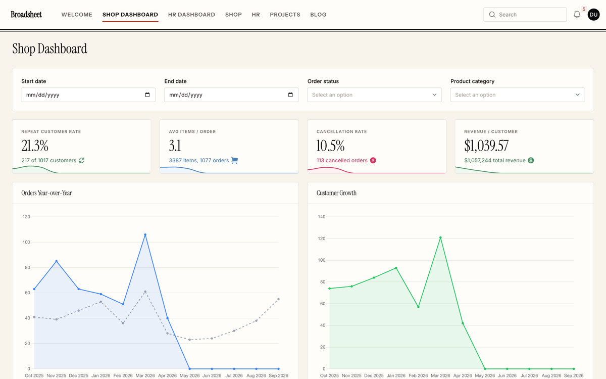
Press moves a Filament panel's navigation into a horizontal rail across the top and gives the screen back to the work. It ships in four editions that share one engine: not four accent colours, but four publications — type, shape, navigation and colour move together.
Try the live demo
Open the live demo → — explore all four editions in light and dark mode, switch between them from the user menu, and sign in instantly with the prefilled form.
Why a rail
A vertical sidebar spends a fifth of every screen restating where you are. On a table with nine columns that fifth is the difference between reading a row and scrolling it. Newspapers settled this a century ago: the masthead runs across the top, the columns run the full width beneath it, and nothing permanent eats into the page.
The rail is the family signature, and the rest follows from it. Rules instead of striped rows, because a rule is a boundary and a stripe is decoration. Tabular figures, so that a column of money reads as a column. One family for headings, section titles and statistics, so a page has a voice. Status colours mixed as printing inks rather than left at the framework's defaults, which on warm paper read as somebody else's website.
Below lg the rail steps aside and Filament's own drawer takes over, exactly as it does without
this theme.
The four editions
| Edition | Character |
|---|---|
| Broadsheet | Masthead red on warm neutrals. Instrument Serif headings, small caps under a double rule |
| Telex | Phosphor green on cold graphite. IBM Plex Mono headings, a bar that stays dark in both modes |
| Gutter | Ultramarine on pure neutrals. Archivo, zero radius everywhere, edge-to-edge nav blocks |
| Vellum | Iris on violet neutrals. Figtree, generous radii, glass pills and a three-radial wash |
Every screen in both modes. Judge the pairs yourself — a theme that only works in one of them is half a theme. Or skip the pictures and switch editions yourself.
| Light | Dark |
|---|---|
 |
 |
 |
 |
 |
 |
 |
 |
What it changes
| Filament, out of the box | Press | |
|---|---|---|
| Navigation | Vertical sidebar, ~16rem of every screen | A horizontal rail; the full width goes to the content |
| Headings | The body face at a larger size | A display face per edition, sized as headlines |
| Surfaces | Cards on a tinted page | Rules and bands; cards where a card is the point |
| Status colours | Framework defaults | Mixed per edition against that edition's ground |
| Sign-in page | An empty field with a card in it | A composed screen: column rules, cell matrix, grid or wash |
Accessibility
Measured, not asserted: on the rendered page, in a browser, with translucent layers composed against what is actually behind them, using the WCAG 2.1 formula — not estimated from the palette.
| Edition | Contrast | Tightest margin | Focus indicator |
|---|---|---|---|
| Broadsheet | 98 / 98 AA | 4.75:1 | 5.36:1 |
| Telex | 98 / 98 AA | 4.65:1 | 4.91:1 |
| Gutter | 98 / 98 AA | 4.59:1 | 6.34:1 |
| Vellum | 98 / 98 AA | 4.56:1 | 5.26:1 |
392 of 392 measurements pass AA, across three pages in both modes. Beyond contrast:
- Focus (2.4.7, 1.4.11) is drawn with
outline, not by borrowing the ring, so it survives every component that redefines its own shadow. - Target size (2.5.8) is held by a
min-heighton the sort buttons; the rest qualifies under the spacing exception. - Reduced motion drops the theme's own transitions only. It does not override motion the application chose.
- Forced colors keeps borders in
CanvasTextand the active underline inHighlight, and turns the rail's edge fade off. - RTL: not one physical property in the stylesheet.
Requirements
| PHP | 8.3+ |
|---|---|
| Laravel | 11.28+, 12 or 13 |
| Filament | 5.x |
Installation
composer require elemind/press-filament-theme
Register the plugin in each panel provider that should use Press:
use Elemind\PressFilamentTheme\PressFilamentTheme;
use Elemind\PressFilamentTheme\Enums\PressVariant;

public function panel(Panel $panel): Panel
{
    return $panel
        ->plugin(
            PressFilamentTheme::make()->variant(PressVariant::Telex)
        );
}
Important
Register the plugin first. Filament collects the stylesheets from the registered plugin, so running the command on a panel without it publishes nothing — and reports no error.
php artisan filament:assets
That is the whole install. The stylesheet ships compiled: no Tailwind pass, no Vite entry, no
npm step in your deploy. Re-run php artisan filament:assets after every composer update that
touches this package, and as part of your deploy — it is what copies the stylesheets into public/.
Each edition also has a shortcut, and with none set you get Broadsheet:
PressFilamentTheme::make()->broadsheet();
PressFilamentTheme::make()->telex();
PressFilamentTheme::make()->gutter();
PressFilamentTheme::make()->vellum();
The rail
The plugin turns on topNavigation() for you and registers the script that marks which edge of
the rail still has content behind it.
PressFilamentTheme::make()->telex()->rail(false); // keep Filament's sidebar
Turning it off is not a downgrade path: the palette, the typography, the table treatment, the status ramps and the sign-in page all still apply. Only the rail styling stops.
Dark mode
Both modes are supported with no configuration; the editions are measured in both. Telex is the one designed dark-first — the bar stays graphite either way — and it is at its best with:
use Filament\Enums\ThemeMode;

->defaultThemeMode(ThemeMode::Dark)
That stays your call: the theme never changes the panel's theme mode on its own.
Fonts
Fonts are served from Bunny Fonts — GDPR-friendly, no request to Google Fonts. Each edition sets its own sans and, for Broadsheet, a serif; all four share IBM Plex Mono. To self-host them, override after registering the plugin:
->font('Instrument Sans', url: asset('css/fonts/instrument-sans.css'))
A panel with no network access to a font CDN still reads correctly — it just stops sounding like itself.
Two ways to use it
Precompiled (default)
The package ships four compiled stylesheets, one per edition. composer require, the plugin
registration above, then php artisan filament:assets is the whole setup.
The trade-off is the one every precompiled Filament theme has: the CSS is built without seeing
your app, so Tailwind utilities you write in your own Blade files are not generated. Filament's
own UI is unaffected — it uses semantic fi-* classes throughout.
From source
If you write Tailwind utilities in your Blade files, or you need to compose Press with CSS from other plugins, compile it yourself. Publish the sources:
php artisan vendor:publish --tag="press-filament-theme-css"
That copies the engine to resources/css/press/engine and the presets to
resources/css/press/presets. Import them into your panel's theme file, after Filament's and
before your @source directives:
@import '../../../../vendor/filament/filament/resources/css/theme.css';

@import '../../press/engine/engine.css';
@import '../../press/engine/rail.css';
@import '../../press/presets/telex.css';

@source '../../../../app/Filament/**/*';
@source '../../../../resources/views/filament/**/*';
You can skip the publish step and import straight out of vendor/ if you would rather not
duplicate the files — the paths are longer and move with the package:
@import '../../../../vendor/elemind/press-filament-theme/resources/css/engine/engine.css';
Keep the plugin registered either way: it still applies the fonts and the rail script, so
php artisan filament:assets stays part of the install — it is what publishes that script, and the
presets the runtime switch fetches. It detects viteTheme() on the panel and stops short of setting
its own theme, so the two do not fight. Be aware that Panel::getTheme() gives viteTheme()
precedence unconditionally — once your panel compiles its own CSS, that file is the only one
Filament will load, and applyTheme(true) cannot change that.
PressFilamentTheme::make()->telex()->applyTheme(false); // never set the packaged theme
Letting people choose
Off by default. Turn it on and everyone picks their own edition:
PressFilamentTheme::make()->broadsheet()->runtimeSwitch();
A "Theme" entry appears in the user menu; picking an edition stores the choice and reloads the
page. ->variant() stays the default for anyone who has not chosen yet.
Offer only some of them:
PressFilamentTheme::make()->runtimeSwitch([PressVariant::Telex, PressVariant::Gutter]);
A stored choice outside that list falls back to the default. If the default itself is not in the list, the first offered edition takes its place — otherwise it would be a default nobody could return to.
Where the choice lives
In a cookie named press_variant, for a year, read on every request — including for guests, so
the login screen keeps the edition someone last used. To keep it somewhere else, hand over the two
ends:
PressFilamentTheme::make()
    ->runtimeSwitch()
    ->variantResolver(fn () => auth()->user()?->press_variant)
    ->variantPersister(fn (PressVariant $variant) => auth()->user()->update([
        'press_variant' => $variant->value,
    ]));
The resolver may return a PressVariant or its string value ('broadsheet', 'telex',
'gutter', 'vellum'). The two are independent: reading from the database while still writing a
cookie is a legitimate combination. Note that a cookie is per browser, not per identity — the same
person on two devices gets two editions until they choose on each.
Putting the switcher elsewhere
PressFilamentTheme::make()->runtimeSwitch()->switcherUi(false);   // not in the user menu

PressFilamentTheme::variantAction()                              // put it where you like
->switcherVisible(fn () => auth()->user()->isAdmin()) gates the entry; the closure runs at render
time, so the authenticated user is available. It also accepts a plain bool.
With a theme you compile yourself
The switch works in both installation modes, but a panel that compiles its own theme has to leave the edition out of it. Import the engine and the rail, and not a preset:
@import '../../../../vendor/filament/filament/resources/css/theme.css';

@import '../../press/engine/engine.css';
@import '../../press/engine/rail.css';

@source '../../../../app/Filament/**/*';
@source '../../../../resources/views/filament/**/*';
The plugin then adds the chosen preset after your stylesheet. Leaving a preset compiled in does not work: a preset is written to sit on the engine's defaults, not on another preset, so any token the compiled one declares and the chosen one does not would survive — you get one edition's colours with another's typography.
Customising
Important
Press overrides the panel's ->colors(). The engine maps its own ramps onto Filament's
--primary-* and --gray-* variables at :root:root, which outranks the palette Filament
prints inline. A panel that sets ->colors(['primary' => Color::Amber]) alongside Press will
not show amber — and nothing warns you.
To change the colours, change the theme's own tokens rather than Filament's. Every edition is a
list of --press-* declarations sitting on the engine's defaults; your own stylesheet, loaded
after the theme, can do the same:
:root:root {
    --press-primary-500: oklch(0.55 0.18 240);
    --press-radius-md: 0.5rem;
}

.dark {
    --press-primary-500: oklch(0.68 0.15 240);
}
Two rules worth knowing. Declare a token in both :root and .dark if it should differ
between modes — a :root declaration in a later stylesheet beats an earlier .dark one at equal
specificity. And write a switched-off shadow as 0 0 #0000, never none: the theme's shadows are
composed from several variables, and a none in the middle collapses the whole declaration.
Your logo
Press does not touch ->brandLogo() or ->darkModeBrandLogo() — with one exception worth knowing
before you pick your assets.
Telex flattens the logo to white. Its bar is dark in both light and dark mode, so the edition
applies filter: brightness(0) invert(1) opacity(.9) to any image in the brand slot. A coloured
logo comes out as a white silhouette, in both modes, and the darkModeBrandLogo variant is
flattened to exactly the same white as the light one. That is deliberate: a single wordmark that
reads on a dark bar beats two that each read on only one. Broadsheet, Gutter and Vellum leave the
image untouched, so their bars show your colours and the light/dark pair does what Filament
promises.
To opt out for Telex, unset the filter in a stylesheet loaded after the theme, and supply assets that already read on a dark bar:
:root:root {
    --press-rail-logo-filter: none;
}
A brand set as text rather than an image — ->brandName() with no logo — is a different lever:
text takes --press-rail-logo-color, not the filter, because a filter tuned for a silhouette turns
a wordmark into nonsense on any edition that tints instead of flattening.
Reference
Editions — PressVariant::Broadsheet | Telex | Gutter | Vellum, string values 'broadsheet',
'telex', 'gutter', 'vellum'.
Plugin methods
| Method | Default | Does |
|---|---|---|
variant(PressVariant) |
Broadsheet |
Picks the edition |
broadsheet() telex() gutter() vellum() |
Shortcuts for the above | |
rail(bool) |
true |
Horizontal navigation; false keeps the sidebar |
applyTheme(bool) |
auto | Force the packaged theme on or off instead of detecting viteTheme() |
runtimeSwitch(bool|array) |
false |
Lets people choose; an array narrows the offer |
variantResolver(?Closure) |
cookie | Where the choice is read from |
variantPersister(?Closure) |
cookie | Where the choice is written to |
switcherUi(bool) |
true |
Whether to add the entry to the user menu |
switcherVisible(bool|Closure) |
true |
Gates that entry |
PressFilamentTheme::variantAction(string) |
'pressVariant' |
The switcher as an Action, to place yourself |
Published assets — php artisan filament:assets writes
public/css/elemind/press-filament-theme/press-<edition>.css (the compiled editions),
press-preset-<edition>.css (the presets alone, only fetched when the runtime switch needs them)
and public/js/elemind/press-filament-theme/press-rail.js.
Cookie — press_variant, one year, only written when the runtime switch is on.
Anything marked @internal in the source is implementation: it is public because the framework
needs it to be, not because it is an API to build on.
Testing
composer test
Development
npm install
npm run build          # all four editions
npm run dev:telex      # watch one
The Tailwind version is pinned exactly, so that the compiled stylesheets in resources/dist/ can be
reproduced byte for byte.
Changelog
Please see CHANGELOG for what has changed recently.
Contributing
Please see CONTRIBUTING for details.
Security
Please review our security policy on how to report security vulnerabilities.
Credits
License
The MIT License (MIT). Please see License File for more information.
Press is a third-party theme. It is not affiliated with or endorsed by Filament. The panel in the screenshots is the Filament demo application, restyled.