truefans / laravel-reactable
Reusable user likes, reactions full stack implementation.
Fund package maintenance!
Requires
- php: ^8.4
- illuminate/contracts: ^11.0||^12.0
- spatie/laravel-package-tools: ^1.16
Requires (Dev)
- larastan/larastan: ^3.0
- laravel/pint: ^1.14
- livewire/livewire: ^3.0
- nunomaduro/collision: ^8.8
- orchestra/testbench: ^10.0.0||^9.0.0
- pestphp/pest: ^4.0
- pestphp/pest-plugin-arch: ^4.0
- pestphp/pest-plugin-laravel: ^4.0
- phpstan/extension-installer: ^1.4
- phpstan/phpstan-deprecation-rules: ^2.0
- phpstan/phpstan-phpunit: ^2.0
- spatie/laravel-ray: ^1.35
- dev-main
- 2.1.0
- 2.0.0
- 1.1.9
- 1.1.8
- 1.1.7
- 1.1.6
- 1.1.5
- 1.1.2
- 1.1.1
- 1.1.0
- v1.0.0
- dev-dependabot/composer/livewire/livewire-tw-4.1
- dev-dependabot/github_actions/dependabot/fetch-metadata-2.5.0
- dev-dependabot/github_actions/actions/checkout-6
- dev-first_reaction_fix
- dev-alpin_optimisations
- dev-browser_test_for_avatars
- dev-test_merge_request
- dev-errors_fixes
- dev-vendor_prefix
- dev-release/1.1.2
This package is auto-updated.
Last update: 2026-03-31 00:30:38 UTC
README
A beautiful, Facebook-style reactions and comments system for Laravel with Livewire. Add customizable emoji reactions and full-featured commenting to any model in your Laravel application with a single trait.
📸 Demo
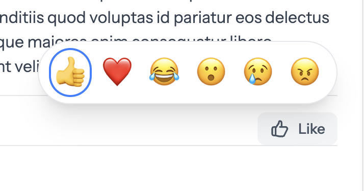
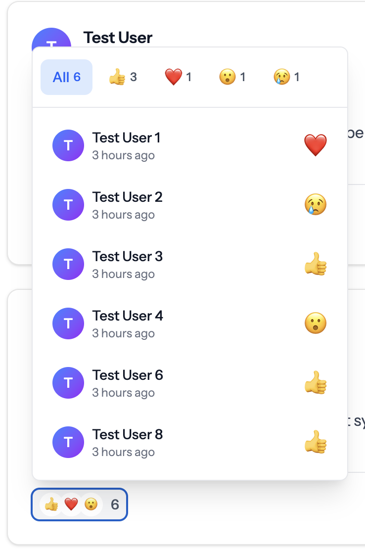
Reactions System
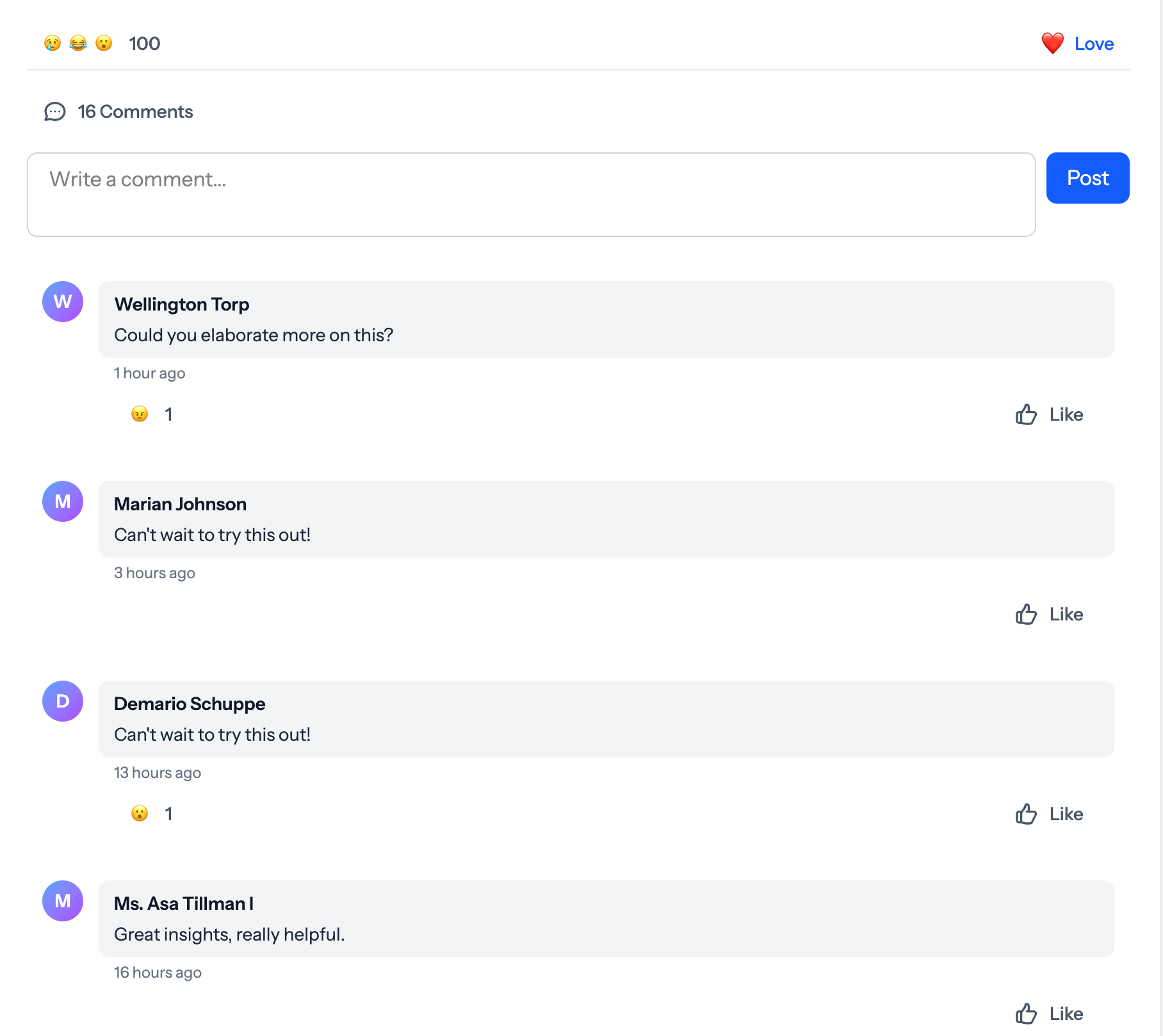
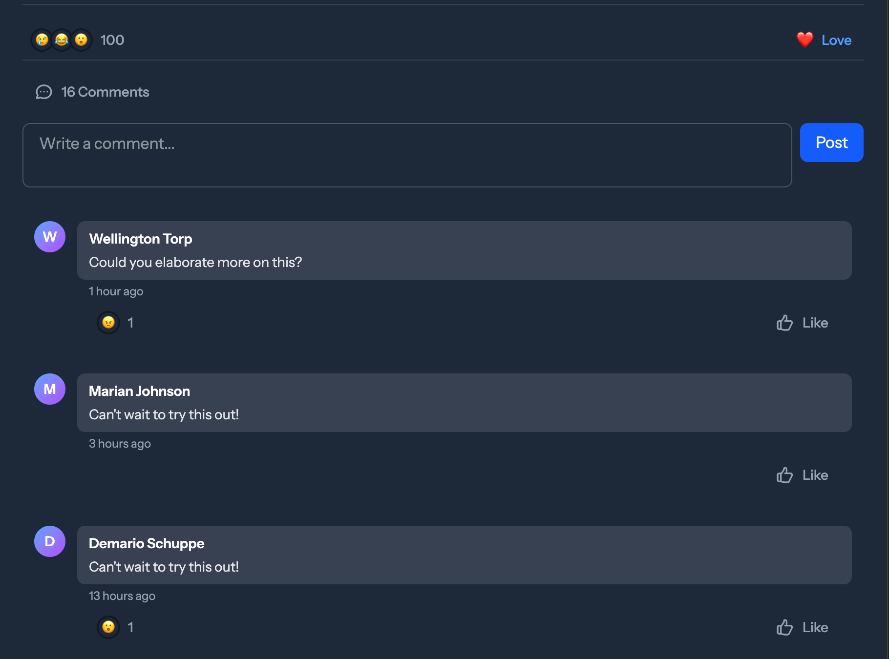
Comments System
✨ Features
Reactions
- 🎭 Facebook-Style UI - Beautiful reaction picker with hover/click interactions
- 🔥 Livewire Powered - Real-time reactions without page refresh
- 📦 Polymorphic Relations - React to Posts, Comments, Images, or any model
- 🎨 Fully Customizable - Configure reaction types, icons, colors via config
- 👥 User Reactions List - See who reacted with filterable tabs by reaction type
- ♾️ Infinite Scrolling - Seamlessly load more reactions as you scroll
Comments
- 💬 Full Commenting System - Add, edit, and delete comments
- 😍 Reactions on Comments - Users can react to comments (configurable)
- ✏️ Inline Editing - Edit comments with validation and XSS protection
- 🗑️ Custom Delete Modal - Beautiful confirmation modal with Alpine.js
- 🔄 Load More Pagination - Efficient pagination for long comment threads
- 🛡️ XSS Protection - Built-in sanitization and validation
General
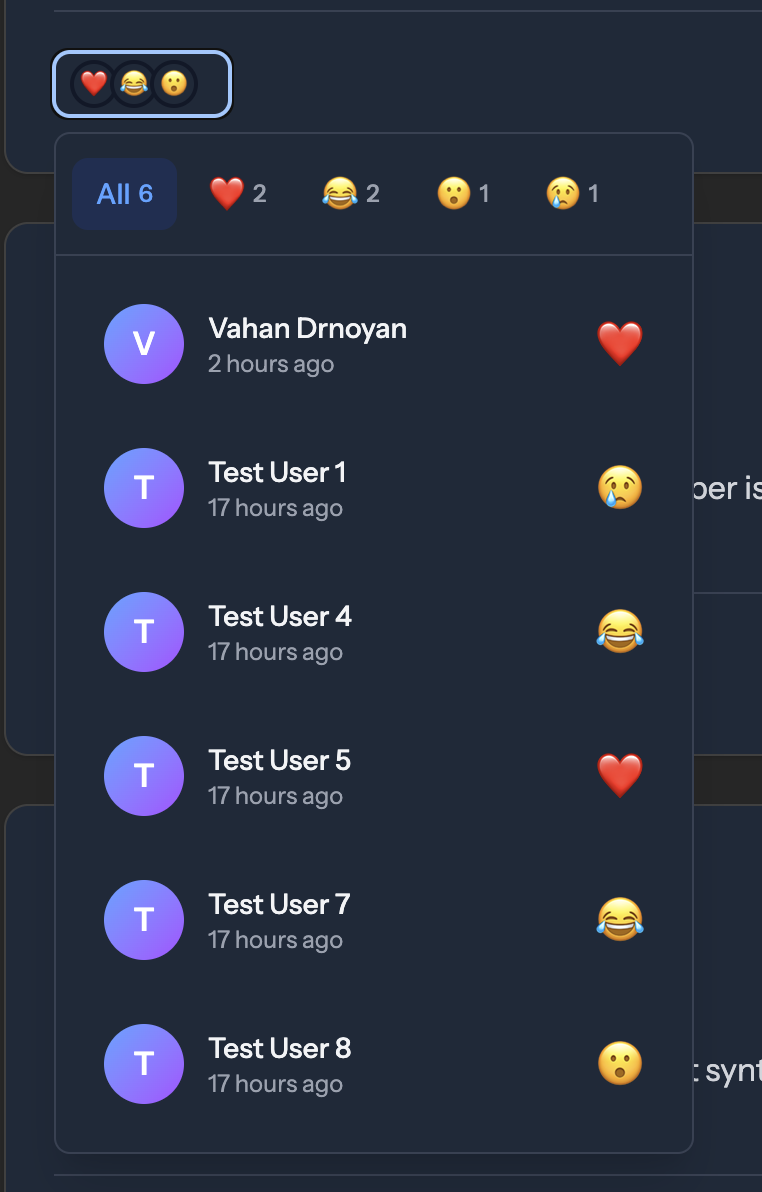
- 🌙 Dark Mode Support - Beautiful UI in both light and dark themes
- ⚡ Optimized Queries - Eager loading prevents N+1 queries
- 📱 Responsive Design - Works perfectly on mobile and desktop
- ♿ Accessibility First - Full keyboard navigation, focus management, and ARIA attributes
📋 Requirements
- PHP 8.4+
- Laravel 11.0+ or 12.0+
- Livewire 3.0+
- Alpine.js (included with Livewire)
🚀 Installation
Step 1: Install via Composer
composer require truefans/laravel-reactable
Step 2: Publish Assets
php artisan vendor:publish --provider="TrueFans\LaravelReactable\LaravelReactableServiceProvider"
Step 3: Run Migrations
php artisan migrate
📖 Usage
Reactions
1. Add trait to your model:
use TrueFans\LaravelReactable\Traits\HasReactions;

class Post extends Model
{
    use HasReactions;
}
2. Eager load in controller (prevents N+1 queries):
public function index()
{
    $posts = Post::with(['user', 'reactions'])
        ->latest()
        ->paginate(10);

    return view('posts.index', compact('posts'));
}
3. Display in Blade:
<livewire:tflr_reactions :model="$post" :key="'post-reactions-'.$post->id" />
Comments
1. Add trait to your model:
use TrueFans\LaravelReactable\Traits\HasComments;

class Post extends Model
{
    use HasComments;
}
2. Eager load comment counts (prevents N+1 queries):
public function index()
{
    $posts = Post::with(['user', 'reactions'])
        ->withCount('comments')  // Important for performance!
        ->latest()
        ->paginate(10);

    return view('posts.index', compact('posts'));
}
3. Display in Blade:
<livewire:tflr_comments :model="$post" :key="'post-comments-'.$post->id" />
Configuration
Customize reactions and enable/disable features in config/reactable.php:
return [
    'reaction_types' => [
        'like' => ['icon' => '👍', 'label' => 'Like', 'color' => 'blue'],
        'love' => ['icon' => '❤️', 'label' => 'Love', 'color' => 'red'],
        // Add your own custom reactions!
    ],

    'comments' => [
        'enable_reactions' => true, // Allow reactions on comments
    ],
];
🎯 Advanced Usage
Trait Methods
The HasReactions trait provides these methods:
// Add/remove reactions
$post->react('like', $user);  // User defaults to auth()->user()
$post->unreact($user);

// Check reactions
$post->hasReactedBy($user);  // Returns bool
$post->getReactionBy($user);  // Returns 'like', 'love', etc. or null

// Get counts
$post->getReactionsSummary();  // Returns ['like' => 5, 'love' => 3, ...]
$post->getTotalReactionsCount();  // Returns int
$post->getReactionsCountByType('like');  // Returns int
The HasComments trait provides these methods:
// Add/remove comments
$post->addComment('Great post!', $user);
$post->removeComment($commentId, $user);

// Check comments
$post->hasCommentedBy($user);  // Returns bool
$post->comments()->count();  // Get total comments
Custom Reaction Permissions
Override the canReact method in your model to control who can react:
class Post extends Model
{
    use HasReactions;

    public function canReact(string $type): bool
    {
        // Prevent users from reacting to their own posts
        if (auth()->id() === $this->user_id) {
            return false;
        }

        return true;
    }
}
🎯 Advanced Usage
IMPORTANT: Always eager load relationships when displaying multiple models with Reactions or Comments components.
For Reactions Component
// ✅ CORRECT - Eager load reactions
$posts = Post::with(['user', 'reactions'])
    ->latest()
    ->paginate(10);

// ❌ WRONG - Will cause N+1 queries
$posts = Post::with('user')
    ->latest()
    ->paginate(10);
For Comments Component
// ✅ CORRECT - Eager load comment counts
$posts = Post::with(['user', 'reactions'])
    ->withCount('comments')  // Adds comments_count attribute
    ->latest()
    ->paginate(10);
Complete Example Controller
use App\Models\Post;
use Illuminate\View\View;

class PostController extends Controller
{
    public function index(): View
    {
        $posts = Post::with(['user', 'reactions'])
            ->withCount('comments')
            ->latest()
            ->paginate(10);

        return view('posts.index', compact('posts'));
    }

    public function show(Post $post): View
    {
        $post->load('user');
        $post->loadCount('comments');

        return view('posts.show', compact('post'));
    }
}
Database Queries
Get posts with specific reactions:
// Get posts with specific reaction
$lovedPosts = Post::whereHas('reactions', function($query) {
    $query->where('type', 'love');
})->get();

// Count reactions for a post
$reactionCount = $post->reactions()->count();

// Get all users who reacted to a post
$users = $post->reactions()->with('user')->get()->pluck('user');
🧪 Testing
Create test data with the included seeder:
use TrueFans\LaravelReactable\Models\Reaction;

// Create reactions programmatically
public function run(): void
    {

        $reactionTypes = ['like', 'love', 'laugh', 'wow', 'sad', 'angry'];

        Post::factory()
            ->count(10)
            ->has(
                Reaction::factory()
                    ->count(100)
                    ->state(fn() => [
                        'user_id'        => User::factory(),
                        'type'           => fake()->randomElement($reactionTypes),
                        'reactable_type' => Post::factory(),
                    ])
            )
            ->create();

    }
♿ Accessibility Features
Keyboard Navigation
- Full keyboard navigation support for all interactive elements
- Tab - Move between interactive elements
- Enter/Space - Activate buttons and toggles
- Escape - Close open dialogs and return focus to the triggering element
- Arrow Keys - Navigate between reaction options and filter tabs
- Home/End - Jump to first/last item in lists
ARIA Attributes
role="menu"androle="menuitem"for reaction pickerrole="dialog"for modals with proper labelingaria-expandedto indicate expandable/collapsible elementsaria-pressedfor toggle buttonsaria-liveregions for dynamic content updatesaria-busyfor loading statesaria-labelandaria-labelledbyfor better screen reader context
Focus Management
- Focus is trapped within open dialogs
- Focus returns to the triggering element when dialogs close
- Focus is managed during dynamic content loading
- Hidden elements are removed from the tab order
Screen Reader Support
- All interactive elements have appropriate labels
- Status messages for reactions and loading states
- Semantic HTML structure for better navigation
- Hidden text for screen readers where visual context is insufficient
Color Contrast
- Meets WCAG 2.1 AA contrast requirements
- Proper color contrast in both light and dark modes
- Visual indicators beyond color for interactive states
🎨 UI Components & Interactions
Main Like Button
- Default State: Shows thumbs-up icon with "Like" text
- After Reacting: Shows your reaction emoji and label (e.g., "❤️ Love")
- Click: Opens reaction picker (or removes your reaction if already reacted)
- Hover Effect: Background changes to indicate interactivity
- Color: Blue when you've reacted, gray when you haven't
Reaction Picker
- Appears: Above the Like button on hover
- Layout: All reaction emojis in a single horizontal row
- Smart Positioning: Uses Alpine.js Anchor plugin for intelligent placement
- Auto-flip: Automatically repositions to stay within viewport
- Placement: Prefers top-end (above button, right-aligned)
- Fallback: Flips to bottom or sides if no space above
- Offset: 8px gap from button for better spacing
- Interactions:
- Hover over emoji → Scales up with animation
- Click emoji → Saves reaction and closes picker
- Hover away → Closes picker automatically
- Animations: Smooth fade-in/out with scale transitions
- Accessibility: ARIA labels and focus rings for keyboard navigation
Reaction Count Summary
- Display: Top 3 reaction icons as overlapping circles + total count
- Position: Left side of the component (opposite of Like button)
- Clickable: Click to open detailed reactions list
- Hover Effect: Background changes to indicate it's clickable
- Dynamic: Only appears when post has reactions
Reactions List Dropdown
- Opens: When clicking on reaction count summary
- Smart Positioning: Uses Alpine.js Anchor plugin for intelligent placement
- Auto-flip: Automatically repositions to stay within viewport
- Placement: Prefers top-start (above button, left-aligned)
- Fallback: Flips to bottom or sides if no space above
- Offset: 8px gap from button for better spacing
- Width: Auto-width (min 320px, max 448px) - expands based on content
- Features:
- Filterable Tabs: Switch between "All" and specific reaction types
- Active Tab: Highlighted in blue
- Tab Counts: Shows number of each reaction type
- Tab Wrapping: Tabs wrap to multiple lines if needed (no horizontal scroll)
- User List:
- User avatar (first letter in gradient circle)
- User name
- Reaction time (e.g., "2 hours ago")
- Reaction emoji on the right
- No Scrollbars: Full height display without vertical scrolling
- Click Outside: Closes dropdown automatically
- Hover Effects: Each user row highlights on hover
- Accessibility: Proper ARIA attributes and keyboard navigation
Smart Positioning Technology
- Powered by: Alpine.js Anchor plugin (included with Livewire by default)
- Benefits:
- Zero configuration required
- Automatic viewport detection
- Intelligent fallback positioning
- No overflow or clipping issues
- Works with scrolling and resizing
- Lightweight (~2KB)
- How it works:
- Monitors button position in real-time
- Calculates available space in all directions
- Automatically chooses best position
- Smoothly transitions between positions
Responsive Design
- Works perfectly on mobile and desktop
- Touch-friendly button sizes
- Prevents horizontal scrolling
- Proper z-index layering for dropdowns
- Smart positioning adapts to screen size
- No fixed positioning issues on mobile
🧪 Testing
The package includes a comprehensive test suite with 59 tests covering all functionality.
# Run tests
composer test

# Run tests with coverage
composer test-coverage

# Run specific test file
vendor/bin/pest tests/HasReactionsTraitTest.php
Test Coverage:
- ✅ HasReactions trait (20 tests)
- ✅ Reaction model (11 tests)
- ✅ Livewire component (26 tests)
- ✅ Architecture tests (2 tests)
For detailed testing documentation, see tests/README.md and tests/TESTING_GUIDE.md.
🤝 Contributing
Contributions are welcome! Please feel free to submit a Pull Request.
Development Setup:
- Clone the repository
- Run
composer install - Run tests with
composer test - Make your changes
- Ensure all tests pass
- Submit a PR
📝 License
The MIT License (MIT). Please see License File for more information.
👨💻 Credits
🆘 Support
If you discover any issues or have questions, please open an issue.
Made with ❤️ by TrueFans

