
otatechie / filament-kinetics

A minimal theme for Filament 4 and 5.
Package info
github.com/otatechie/filament-kinetics
Language:CSS
pkg:composer/otatechie/filament-kinetics
Requires
- php: ^8.3
- filament/filament: ^4.13.3 || ^5.8.3
- mallardduck/blade-lucide-icons: ^2.0
Requires (Dev)
- laravel/pint: ^1.14
- orchestra/testbench: ^10.0||^11.0
- pestphp/pest: ^4.0||^5.0
- pestphp/pest-plugin-laravel: ^4.0||^5.0
Suggests
None
Provides
None
Conflicts
None
Replaces
None
README
A minimal theme for Filament 4 and 5. Free and MIT-licensed.
Try the live demo: a small marketplace admin with sample data on every page. The sign-in is filled in, and the data resets on every deploy, so click anything.
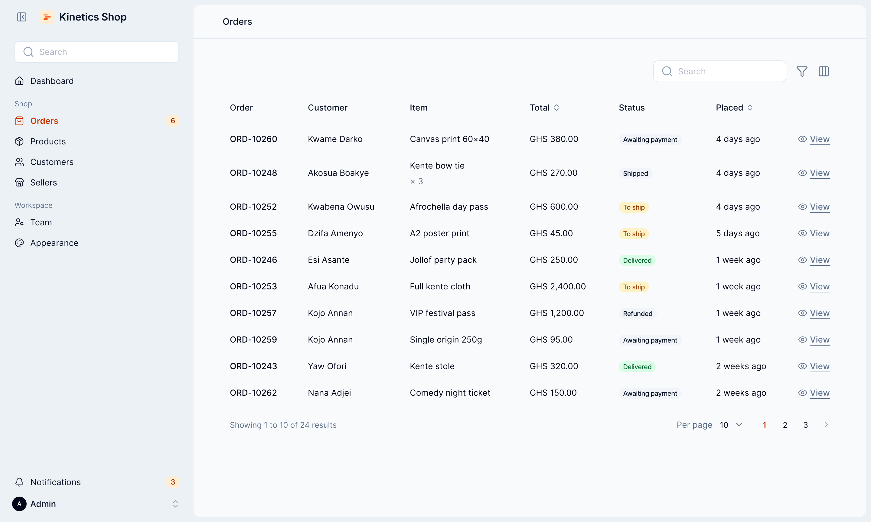
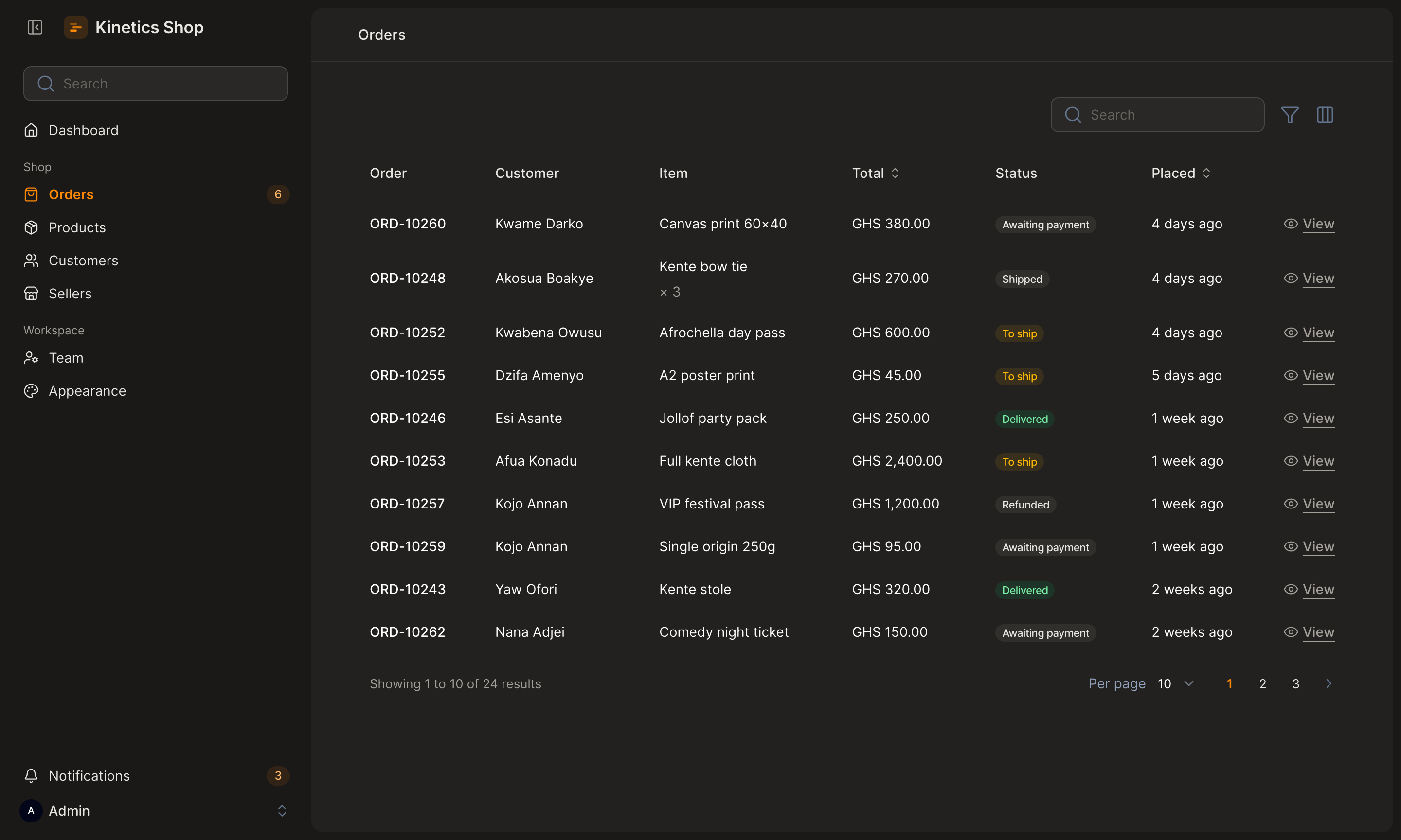
Pages sit on a quiet canvas as one rounded panel. Tables have no lines, controls are compact, and motion is quick and eased out. Kinetics takes its colours from your panel and stays out of the way of your own Tailwind classes.
What you get
- Sidebar layout. Search, notifications and the account menu sit in the sidebar, so there's no top bar.
- Tables without lines. No borders or cards, compact rows, a rounded hover, and a shadow on the side that has more to scroll to.
- Compact controls. 40px inputs and buttons that line up, and smaller checkboxes and switches.
- Searches that explain themselves. A search or filter that matches nothing says so, with a button to clear it, instead of "No orders".
- Consistent modals. Every modal reads from the left, with the button that acts first. On phones, buttons stack at full width.
- Warm dark mode. Charcoal surfaces and off-white text.
- A rounded font and lighter icons. Open Runde and Lucide, bundled.
- Notifications out of the way. Pop-ups appear in the bottom-right corner, clear of your buttons, and stack when there are several. Errors stay until they're closed.
- Your colours, readable. Every colour comes from your panel's palette, and text on buttons and links passes contrast checks.
- Quick motion. Animations stay under 300ms, and stop when reduced motion is on.
- An Appearance page, if you want one. Colours, corners, font, dark mode and layout, changed from the panel by the people you allow. Off unless you turn it on.
- Setup checks. A missing theme, a wrong import order or a missing plugin comes with a message saying what to fix.
Compatibility
| Filament | Laravel | PHP |
|---|---|---|
| 5.8.3 or later | 12, 13 | 8.3, 8.4, 8.5 |
| 4.13.3 or later | 12 | 8.3, 8.4 |
Your panel also needs a
custom theme
built with Vite. php artisan make:filament-theme creates one.
Quick start
composer require otatechie/filament-kinetics
php artisan make:filament-theme   # if your panel doesn't have a theme yet
In your theme's theme.css, import layers.css before Filament and
kinetics.css after it:
@import '../../../../vendor/otatechie/filament-kinetics/resources/css/layers.css';
@import '../../../../vendor/filament/filament/resources/css/theme.css';
@import '../../../../vendor/otatechie/filament-kinetics/resources/css/kinetics.css';

@source '../../../../app/Filament/**/*';
@source '../../../../resources/views/filament/**/*';
Add the plugin to your panel, then build:
use Otatechie\Kinetics\KineticsPlugin;

$panel
    ->plugin(KineticsPlugin::make())
    ->viteTheme('resources/css/filament/admin/theme.css');
npm run build
Installation covers each step in detail, including multiple panels, updating and removing.
Customising
Colours come from your panel. Change primary and buttons, links, focus
rings, the current page, toggles and checkboxes all follow; gray sets the
light-mode surfaces and text:
use Filament\Support\Colors\Color;

$panel
    ->plugin(KineticsPlugin::make())
    ->colors([
        'primary' => Color::Teal,
        'gray' => Color::Stone,
    ]);
Anything the plugin sets, such as the font, the top bar or the content width, you can change by calling the panel method after the plugin:
$panel
    ->plugin(KineticsPlugin::make())
    ->font('Inter')
    ->topbar();
Or from the panel. ->appearancePage() adds a page where colours, shape,
font, dark mode and layout can be changed without a deploy, by the people you
allow. It's off unless you turn it on; see
The Appearance page.
Everything else is a CSS variable. Set them in your theme.css after the
Kinetics import, light values on :root and dark ones on .dark:
:root {
    --kinetics-radius: 0.75rem;
}

.dark {
    --kinetics-panel: #1c1c1c;
}
| Variable | Used for |
|---|---|
--kinetics-radius |
Corners of cards, inputs, modals and dropdowns |
--kinetics-canvas |
The page behind the sidebar and panel |
--kinetics-panel |
The rounded content panel |
--kinetics-card |
Sections, inputs, modals, dropdowns and notifications |
--kinetics-foreground |
Main text |
--kinetics-muted-foreground |
Secondary text, placeholders and labels |
--kinetics-border |
Dividers and dropdown edges |
Customising lists every setting and variable, with their light and dark values, and has recipes for common changes: rounder corners, square buttons, one flat surface, a dark mode from your own greys, and stronger field borders.
Documentation
Getting started
- Installation: requirements, setup, multiple panels, updating and removing
- Troubleshooting: what each warning means, and fixes for common problems, including the Appearance page
Using Kinetics
- Customising: what the plugin sets, colours, font, layout, icons, notifications, every variable, dark mode, and styling your own pages
- The Appearance page: letting people change the panel's look from inside it
- Components: how each part of Filament is styled
Background
- Design principles: the decisions behind the look
- Motion: timing, easing and reduced motion
- Accessibility: contrast, focus, keyboard use and notifications
Contributing
- Development: how the package is organised, the CSS rules, testing and releasing
- Changelog
Support
Found a bug or stuck on setup? Open an issue
with your Filament and Kinetics versions
(composer show filament/filament otatechie/filament-kinetics), your
theme.css and your panel provider. Troubleshooting
covers the common problems first. For security issues, see
SECURITY.md instead.
License
MIT. See LICENSE.md.