blueways / bw-placeholder-images
Inline SVG placeholder images with lazy loading
Package info
github.com/maikschneider/bw_placeholder_images
Type:typo3-cms-extension
pkg:composer/blueways/bw-placeholder-images
Requires
- ext-json: *
- ksubileau/color-thief-php: ^1.3.0
- typo3/cms-core: ^10.0 || ^11.0
- typo3/cms-filemetadata: ^10.0 || ^11.0
Requires (Dev)
- bk2k/bootstrap-package: ^12.0
- helhum/typo3-console: ^7.0
- roave/security-advisories: dev-latest
- typo3/cms-adminpanel: ^11.5
- typo3/cms-backend: ^11.5
- typo3/cms-belog: ^11.5
- typo3/cms-beuser: ^11.5
- typo3/cms-dashboard: ^11.5
- typo3/cms-extbase: ^11.5
- typo3/cms-extensionmanager: ^11.5
- typo3/cms-filelist: ^11.5
- typo3/cms-fluid: ^11.5
- typo3/cms-fluid-styled-content: ^11.5
- typo3/cms-form: ^11.5
- typo3/cms-frontend: ^11.5
- typo3/cms-impexp: ^11.5
- typo3/cms-info: ^11.5
- typo3/cms-install: ^11.5
- typo3/cms-lowlevel: ^11.5
- typo3/cms-opendocs: ^11.5
- typo3/cms-recordlist: ^11.5
- typo3/cms-recycler: ^11.5
- typo3/cms-redirects: ^11.5
- typo3/cms-reports: ^11.5
- typo3/cms-rte-ckeditor: ^11.5
- typo3/cms-scheduler: ^11.5
- typo3/cms-seo: ^11.5
- typo3/cms-setup: ^11.5
- typo3/cms-tstemplate: ^11.5
- typo3/cms-viewpage: ^11.5
README
TYPO3 Extension: Placeholder Images
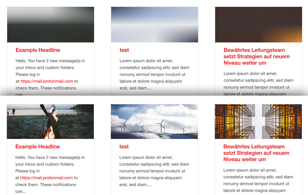
Generates SVG inline placeholder images from FAL Media elements. The Foundation Interchange plugin is configured to resolve the right responsive image. The SVG placeholder consists of three gradients with 9 different colors from the original FAL image to make it look more natural.
The color extrection code is based on Frans Saris lazy_load_placeholder TYPO3 extension. Lazy loading code inspired by Mika Tuupola. SVG inline compression is done like Taylor Hunt explained it in his blog post.
Requirements
- TYPO3 v8.0+
- Foundation 6 (or Foundation.Interchange Plugin)
Installation
This extension is installable only via composer.
composer require blueways/bw-placeholder-images- include TypoScript template
Configuration
The Javascript File is automatically included via includeJSFooterLibs. This can be disabled by unsetting
plugin.bw_placeholder_images.settings.placeholderImagesJS = EXT:bw_placeholder_images/Resources/Public/JavaScript/placeholderImages.js
Useage
The color extraction starts automatically after uploading any jpg, jpeg, gif or png image via FAL.
Viewhelper
Register the viewhelpers in any fluid template.
{namespace bw=Blueways\BwPlaceholderImages\ViewHelpers}
bw:lazyImage
This viewhelper acts like the normal <f:image /> viewhelper, however there is an svg image output of the referenced src or image. The final images are added via additionalAttributes in Foundation Interchange style.
Example with different crop variants:
<bw:lazyImage
    image="{mediaElement}"
    cropVariant="small"
    width="585"
    additionalAttributes="{data-lazy-interchange: '
        [{f:uri.image(image:mediaElement,maxWidth:\'600\', cropVariant:\'small\')}, small],
        [{f:uri.image(image:mediaElement,maxWidth:\'500\', cropVariant:\'medium\')}, medium],
        [{f:uri.image(image:mediaElement,maxWidth:\'450\', cropVariant:\'large\')}, large]
    '}"
/>
bw:lazyPlaceholder
Acts like <f:uri.image /> viewhelper.
Foundation Interchange can handle responsive background images, this viewhelper helps to generate the nessecary Output of an image resource path.
Example without crop variant and only one final image for all sizes:
<div
    style='background-image: url("{bw:lazyPlaceholder(src:'{image.properties.uid}')}");'
    data-lazy-interchange="[{f:uri.image(src:'{image.properties.uid}', maxWidth:'640')}, small]"
></div>
Attention: The style='' Tag needs to be rendered with single quotes.
TODO
- include dependencies in package
- make fallback color editable via typoscript
- animate image switch

