zicht / htmldev-bundle
Easy living styleguides with Symfony and Twig
This package's canonical repository appears to be gone and the package has been frozen as a result. Email us for help if needed.
Maintainers
Requires
- php: ^8.0
- knplabs/knp-menu-bundle: ^3
- psr/simple-cache: ^1.0
- symfony/cache: ^6.4
- symfony/framework-bundle: ^6.4
- symfony/routing: ^6.4
- symfony/yaml: ^6.4
- twig/twig: ^3
- zicht/framework-extra-bundle: ^11
- zicht/twig-classes: ^1.1
Requires (Dev)
- friendsofphp/php-cs-fixer: ^3.15
- phpunit/phpunit: ^9.6
- vimeo/psalm: ^5
This package is auto-updated.
Last update: 2025-11-27 16:39:58 UTC
README
Create living Styleguides with Symfony and Twig! ✨
Goals
- Provide a single visual source for the design of a project.
- Serve components and assets from the styleguide to prevent code duplication.
- Deliver a good developer experience (DX) ✨ that makes creating a good-looking styleguide very easy.
Install
-
Require via composer.
composer require zicht/htmldev-bundle
How to use
Setup
-
Load the bundle into your AppKernel.
new Zicht\Bundle\HtmldevBundle\ZichtHtmldevBundle()
-
Configure routing.
Add the following Yaml to your app's route configuration.
htmldev:
   resource: "@ZichtHtmldevBundle/Resources/config/routing.yml"
⚠️ if you combine this bundle with the zicht/page-bundle, make sure this configuration is placed above any routing containing
/{locale}. -
Add an app/config/bundles/ bundle configuration file to configure a Twig namespace and add project specific assets to the Styleguide (optionally you can configure much more, see down below):
twig:
    paths:
        "%kernel.root_dir%/../htmldev": htmldev

zicht_htmldev:
    styleguide:
        assets:
            -  type: stylesheet
               path: 'assets/main.css'
            -  type: script
               path: 'assets/main.min.js'
For the Styleguide, there are two asset types: stylesheet and script. For both you can either configure a
pathwhich will be passed through the Twigasset()function, or you can configure a URL (to an external stylesheet or script for instance) or you can configure abodyto add inline CSS or scripting. -
Create a directory
data/styleguide/in thehtmldev/directory. Add a filenavigation.ymlcontaining at least the following:- title: Components uri: /htmldev/components/buttons -
Go to the styleguide's URL at
/htmldev(e.g. http://localhost/htmldev) and you should see a basic setup of the styleguide: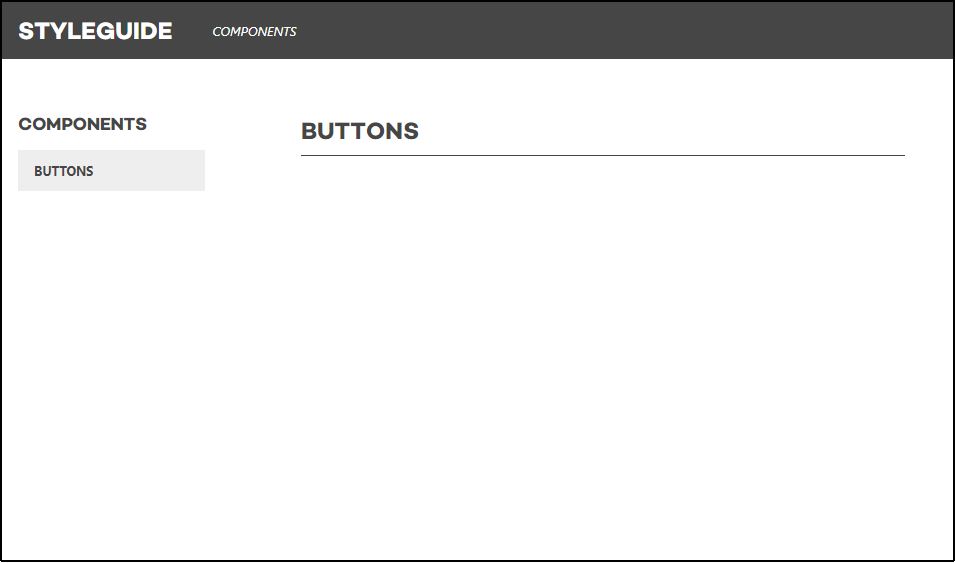
-
Optionally you can change the styleguide's title and its output.
-
To change the Styleguide title, edit the config and add a
title: '...'element:zicht_htmldev: styleguide: title: 'Design System'
-
To change the Styleguide's subtitle, or add a (SVG) logo, edit the config and add a
subtitle: '...'element:zicht_htmldev: styleguide: title: 'Design System' subtitle: 'Zicht'
Or you can use raw SVG-code, but don't forget to define a height that doesn't exceed 35px:
zicht_htmldev: styleguide: title: 'Design System' subtitle: >- <svg xmlns="http://www.w3.org/2000/svg" viewBox="0 0 32 32" width="35px" height="35px" preserveAspectRatio="xMidYMid meet"> <path fill="currentColor" d="M32 16c0 8.8-7.2 16-16 16S0 24.8 0 16 7.2 0 16 0s16 7.2 16 16zm-21 1.9h6.1l8.7-10.6h-14l-4.3 4.4h8.6L11 17.9zm9.7 5.9l4.3-4.4H9.8l-3.6 4.4h14.5z"/> </svg>
-
To change the Styleguide output, edit the config and add an
output: []section:zicht_htmldev: styleguide: output: ['example', 'twig', 'html'] # or ['example', 'html'] or ['example'] or ...
Default (when not explicitly configured) is
output: ['example', 'twig']
-
-
By default SVG's will be cached on every other environment then development. This is due to performance reasons. It makes use of file caching for the rendered SVG files. In order to disable this on development you may want this to be array. To achieve this you could set the config param just like this:
zicht_htmldev: svg_cache: array
other supported options are file and apcu or a service id where the class implements the PSR-16.

Adding stuff to the styleguide
Components
Components are simple Twig templates which represent a small peace of the design of a project, for example a button or a card.
The HtmldevBundle looks for these components in the htmldev/components/ folder. Inside this directory, you're free to
structure them how you want.
The component is rendered inside a Twig control structure {% strict false %} block from the zicht/framework-extra-bundle
which means there's no need for strict null or empty checks on variables inside a component: a simple {% if variable %} will suffice.
Recommended: for easy conditional CSS classes, the HtmldevBundle automaticall loads the zicht/twig-classes helper function:
{% set cx = {
article: classes({
'u-margin--b2': image.url,
'u-margin--b0 u-text--center': not image.url,
})
} %}
<article class="{{ cx.article }}">
...
</article>
Rendering components in the Styleguide
The HtmldevBundle loads the example/dummy data for the components from Yaml files from the htmldev/data/ directory.
For example, it loads a htmldev/data/buttons.yml:
-
styleguide_title: Blue button
styleguide_type: buttons/text
text: Button
color: blue
-
styleguide_title: White button outline
styleguide_type: buttons/text
styleguide_dark: true
outline: true
text: Button
color: white
This way, you can add components to the styleguide without typing Twig code. The keys that start with styleguide_
are only used to influence rendering of the component in the styleguide. The other keys are properties of the component itself.
The available options for rendering in the styleguide are:
styleguide_typeThe name of the component to show. For example,buttons/textcorresponds to the filehtmldev/components/buttons/text.html.twig.styleguide_titleThe title that will be rendered with the component.styleguide_descriptionAn extra description of the component that will be rendered below the title.styleguide_dark(true|false) A boolean indicating whether the styleguide should render the component on a dark background, for example for white buttons.styleguide_component_widthOverride the default width of the component in the styleguide. Use a pixel/percentage/viewport unit to change the width of the component next to the code example, e.g.styleguide_component_width: 500px. Or to render the code example below the component, usestyleguide_component_width: full.
Responsive image component
Please refer to the HTMLdev components folder for documentation on the installation and usage of the Zicht responsive image component.
Pages
The bundle renders default pages for all the components that are added to the navigation.yml and their own data
Yaml files. The templates for the Styleguide reside within the HtmldevBundle's own Resources/views/styleguide/
directory and can be overridden within the project's htmldev/pages/ directory. Both directory's structures look
like below. The HtmldevBundle has a base component.html.twig template for all components. You can override this
template in your project's htmldev/pages/ directory to do global changes. In your project's
htmldev/pages/ directory you can create a components/ subdirectory and add custom templates for specific components
(the base name part of the template file should be the same as the base name of the Yaml file).
The design elements do have their own template within the HtmldevBundle, which are all based on the
component.html.twig template (either the one in your project's htmldev/pages/ directory or the one of the Htmldev
bundle).
You could also add a homepage/introduction page instead of going to the page of the first component in the list as
homepage. You can do so by adding a template at htmldev/pages/styleguide_intro.html.twig. This will then be rendered
as a homepage (at the https://example.com/htmldev/ URL).
Relative directory structure:
./
├┈ (styleguide_intro.html.twig)
├─ component.html.twig
├┈ (components/)
│ ├┈ (buttons.html.twig)
│ ├┈ (cards.html.twig)
│ └┈ (headers.html.twig)
└─ design-elements/
├─ colors.html.twig
├─ icons.html.twig
└─ typography.html.twig
Adding navigation
The HtmldevBundle supports two levels of navigation in the styleguide. The items that make up the menu should be added
to htmldev/data/styleguide/navigation.yml.
Example of a navigation structure:
-
    title: Components
    uri: /htmldev/components/buttons
items:
-
title: Buttons
uri: /htmldev/components/buttons
-
title: Cards
uri: /htmldev/components/cards
-
title: Design Elements
uri: /htmldev/design-elements/colors
items:
-
title: Colors
uri: /htmldev/design-elements/colors
-
title: Icons
uri: /htmldev/design-elements/icons
-
title: Typography
uri: /htmldev/design-elements/typography
Colors
The HtmldevBundle Styleguide page Design Elements > Colors will read the color Sass map inside the file
htmldev/sass/variables/_zss-overrides.scss and renders these colors inside a grid.
The page is using a Twig function color_palette() and passes the filename _zss-overrides.scss. You can override
this page (see Pages) to change/add the files it is reading from.
The default color service assumes variables of the ZSS framework, but feel free to use a different service. See the Customising section.
Icons
The HtmldevBundle Styleguide page Design Elements > Icons will render the icons in the directory htmldev/images/icons/
(no subdirectories).
Typography
The HtmldevBundle Styleguide page Design Elements > Typography contains a static set of typographical elements such as
<h1>, <h2>, <h3> and <h4> headings, a few <p> paragraphs, a <blockquote> quote with a <footer> and a few
<ul> unordered lists. The paragraphs and lists contain some <a> links.
You can override this page (see Pages) to customize the HTML specially for your project.
Using the styleguide in the project
Rendering components
Rendering components through the component macro (ui.component()) is deprecated
To render components, simply use a Twig include like below:
This wil load htmldev/components/cards/cover.html.twig with the given properties:
{% include '@htmldev/components/cards/cover.html.twig' with {
    title: 'Hodor',
    url: '/some/page'
} only %}
Rendering SVG files
The HtmldevBundle svg macro (ui.svg()) to inline render SVG's is deprecated
The HtmldevBundle provides a inline_images filter to inline render SVG's within the string subject.
This allows easy coloring of the SVG with currentColor and CSS.
This will render the contents of htmldev/images/icons/arrow--right.svg in the HTML:
{% apply inline_images %}
    <img src="htmldev/images/icons/arrow--right.svg" width="20" height="20">
{% endapply %}
The following attributes can be used within the <img /> tag:
widthThe width that should be set on the<svg />element. This will override an existingwidthattribute. The filter assumespx, sowidth: 20will be rendered as<svg width="20px" />. Allowed values: MDN.heightThe height that should be set on the<svg />element. This will override an existingheightattribute. The filter assumespx, soheight: 20will be rendered as<svg height="20px" />. Allowed values: MDN.viewbox-xandviewbox-yThexandyvalues of theviewboxproperty. This will override an existingviewboxattribute. These arguments must both be passed, otherwise they will not be applied.<img viewbox-x="20" viewbox-y="30">will be rendered as<svg viewbox="0 0 20 30" />.classA list of CSS classes that will be applied to the<svg />element.<img class="u-white u-block">will be rendered as<svg class="u-white u-black" />.titleThis will add a<title />element inside the<svg />for accessibility improvements. Reference: MDN- Any other attributes will also be applied to the
<svg />element. This can be any attribute that's valid for the<svg />element. Default values for some other attributes are:aria-hidden="true"androle="img".
Customising
There are several Symfony parameters available to override, to add a different implementation.
htmldev.directory(default:%kernel.root_dir%/../htmldev) Change the styleguide directory.htmldev.controllerThe controller that handles the requests for pages inside the styleguide.htmldev.color_serviceThe service that reads colors from a Sass variable in ZSS. To change the way this works, implement theColorServiceInterfaceclass and change this parameter to your own class.htmldev.svg_serviceThe service that returns the contents of SVG files. To change the way this works, implement theSvgServiceInterfaceand change this parameter to your own class.
Alternative structure
It is possible to move everything out of the HtmldevBundle's default htmldev/ directory by changing a few configurations. For instance, to adhere to a more industry standard structure in a Symfony 4+ project:
Add to config/packages/zicht_htmldev.yaml:
zicht_htmldev:
    paths:
        data: '%kernel.project_dir%/config/packages/_zicht_htmldev'
        images_icons: '%kernel.project_dir%/assets/images/icons/'
        sass_variables: '%kernel.project_dir%/assets/sass/variables/'
        svg_service_base_dir: '%kernel.project_dir%/assets/'
And move stuff around accordingly.
Development
CSS
The bundle contains a CSS file to provide default styling for the styleguide.
- The source of this CSS file is
styleguide.scss, located in the Resourcs/sass folder. - The Sass files are compiled with webpack and node-sass.
- The Sass files are linted with stylelint-config-zicht.
Run npm run build to add your features or bug fixes to the compiled CSS file, and don't forget to commit the
resulting files in ~/Resources/public/css.
Maintainer
- Peter Benner (@wpbenner)
- Jurg Roessen (@Hangloozz)