saade / filament-fullcalendar

The Most Popular JavaScript Calendar integrated with Filament 💛
Fund package maintenance!
Requires
- php: ^8.2
- filament/filament: ^4.0|^5.0
- spatie/laravel-package-tools: ^1.92.7
Requires (Dev)
- larastan/larastan: ^3.0
- laravel/pint: ^1.0
- nunomaduro/collision: ^8.0
- orchestra/testbench: ^9.0|^10.0|^11.0
- pestphp/pest: ^3.0|^4.0
- pestphp/pest-plugin-arch: ^3.0|^4.0
- phpstan/extension-installer: ^1.1
- phpstan/phpstan-deprecation-rules: ^1.0|^2.0
- phpstan/phpstan-phpunit: ^1.0|^2.0
- rector/rector: ^2.5
- spatie/laravel-ray: ^1.26
Suggests
- rector/rector: Needed to run vendor/bin/filament-fullcalendar-v5, which applies the 5.x upgrade to your widgets.
Provides
None
Conflicts
None
Replaces
None
- 5.x-dev
- v5.0.0-beta2
- v5.0.0-beta1
- 4.x-dev
- v4.0.1
- v4.0.0
- v4.0.0-beta7
- v4.0.0-beta6
- v4.0.0-beta5
- v4.0.0-beta4
- v4.0.0-beta3
- v4.0.0-beta2
- v4.0.0-beta1
- 3.x-dev
- v3.2.4
- v3.2.3
- v3.2.2
- v3.2.1
- v3.2.0
- v3.1.3
- v3.1.2
- v3.1.1
- v3.1.0
- v3.0.3
- v3.0.2
- v3.0.1
- v3.0.0
- v3.0.0-beta4
- v3.0.0-beta3
- v3.0.0-beta2
- v3.0.0-beta1
- 2.x-dev
- v1.9.3
- v1.9.2
- v1.9.1
- v1.9.0
- v1.8.0
- v1.7.1
- v1.7.0
- v1.6.0
- v1.5.1
- v1.5.0
- v1.4.0
- v1.3.1
- v1.3.0
- v1.2.1
- v1.2.0
- v1.1.0
- v1.0.0
- v0.3.0
- v0.2.1
- v0.2.0
- v0.1.0
This package is auto-updated.
Last update: 2026-10-11 22:49:39 UTC
README
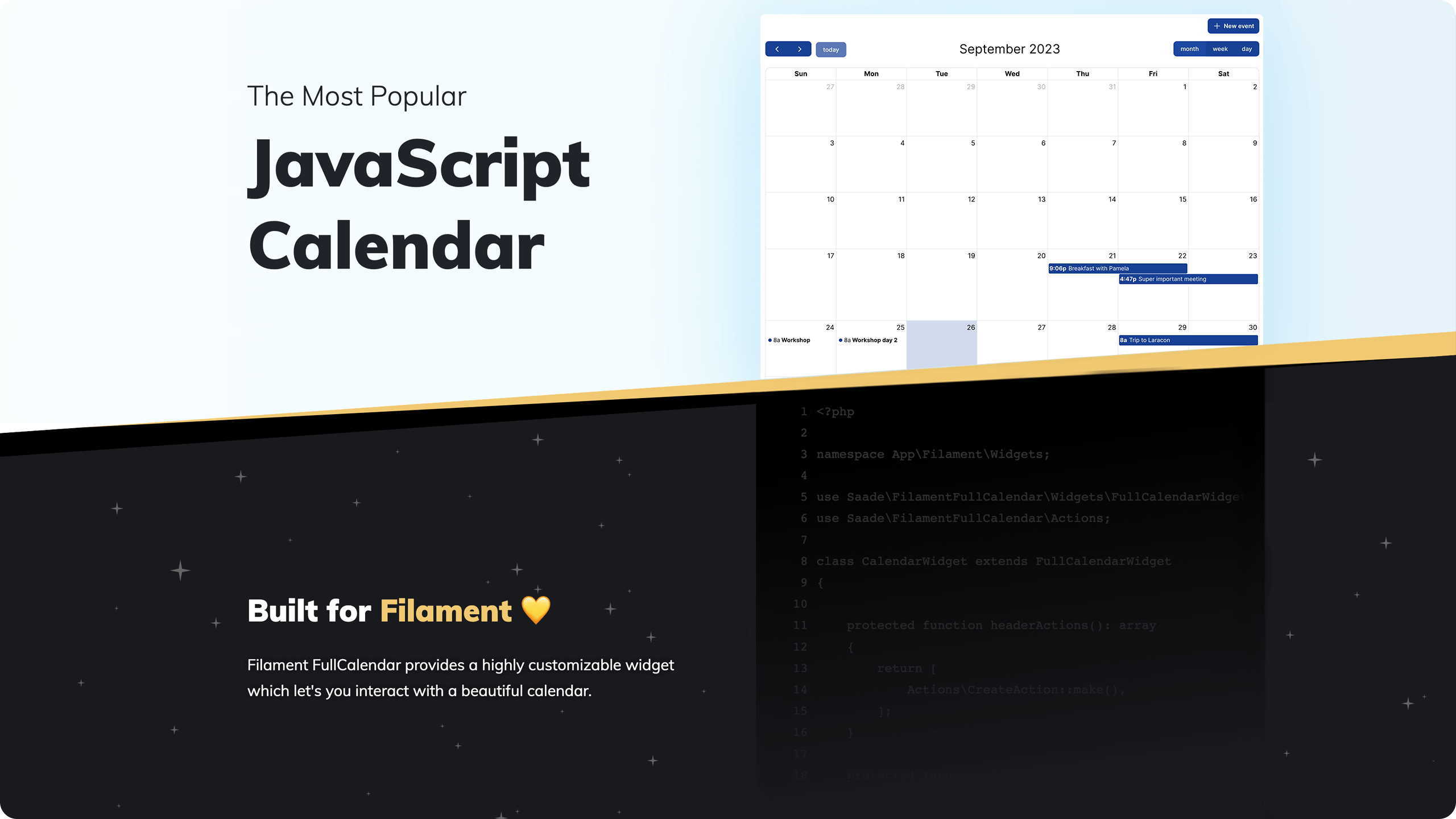
FullCalendar for Filament panels: show your models on a calendar and view, create, edit, drag and resize them with Filament actions.
Version compatibility
| Plugin | Filament | FullCalendar | Install |
|---|---|---|---|
| 5.x | 4.x, 5.x | 6.x | composer require saade/filament-fullcalendar:"^5.0" |
| 4.x | 4.x, 5.x | 6.x | composer require saade/filament-fullcalendar:"^4.0" |
| 3.x | 3.x | 6.x | composer require saade/filament-fullcalendar:"^3.0" |
| 2.x | 2.x | 5.x | composer require saade/filament-fullcalendar:"^2.0" |
Upgrading from 4.x? Read the upgrade guide. Coming from 3.x, follow the 4.x upgrade guide first.
Table of contents
- Filament FullCalendar
- Version compatibility
- Table of contents
- Installation
- Usage
- Configuration
- Interacting with actions
- Dragging and resizing events
- Dragging items onto the calendar
- Showing other calendars
- Filtering events
- Resource views
- Intercepting events
- Controlling the calendar
- More views and options
- Business hours and constraints
- JavaScript callbacks
- Testing
- Recipes
- Changelog
- Contributing
- Security Vulnerabilities
- Credits
- License
Installation
- Install the package via composer:
composer require saade/filament-fullcalendar:"^5.0"
- Add the plugin's styles to your panel's custom theme. If the panel does not have a custom theme yet, create one first by following the Filament docs.
@import '../../../../vendor/saade/filament-fullcalendar/resources/css/filament-fullcalendar.css';

@source '../../../../vendor/saade/filament-fullcalendar/resources/views/**/*.blade.php';
Then rebuild your assets with npm run build.
- Register the plugin on the panel to set options for all of its calendars. This step is optional: a calendar on a panel without the plugin uses the defaults.
use Filament\Panel;
use Saade\FilamentFullCalendar\FilamentFullCalendarPlugin;

public function panel(Panel $panel): Panel
{
    return $panel
        // ...
        ->plugin(FilamentFullCalendarPlugin::make());
}
Usage
Create a calendar widget:
php artisan make:filament-fullcalendar-widget CalendarWidget
It works like Filament's own make:filament-widget: it asks which panel the widget is for and whether it belongs to a resource, and puts the file where Filament would. It then asks which model holds the events and which attributes are the title, start and end, suggesting the model's columns, and writes a widget that shows, creates, edits, drags and resizes them. Leave the model empty for a calendar that is not backed by one.
Every answer can also be given as an option:
php artisan make:filament-fullcalendar-widget CalendarWidget --panel=admin --model=Event --title=name --start=starts_at --end=ends_at
| Option | Description |
|---|---|
--panel |
The panel to create the widget in. |
--resource, -R |
The resource to create the widget in. The widget then uses the resource's model. |
--resource-namespace, --cluster |
Where to look for the resource, as in Filament's command. |
--model, -M |
The model whose records are the events. |
--title, --start, --end |
The attributes of the model to use. Date-only columns give whole-day events. |
--force, -F |
Overwrite the widget if it exists. |
Without a model, this is the whole widget. It extends FullCalendarWidget, not Filament's Widget, and has no Blade view of its own:
<?php

namespace App\Filament\Widgets;

use Saade\FilamentFullCalendar\Data\FetchInfo;
use Saade\FilamentFullCalendar\Widgets\FullCalendarWidget;

class CalendarWidget extends FullCalendarWidget
{
    /**
     * FullCalendar calls this whenever it needs events, such as when the
     * user clicks prev/next or switches views.
     */
    public function fetchEvents(FetchInfo $info): array
    {
        return [];
    }
}
Returning events
fetchEvents() returns an array of FullCalendar event objects. $info holds the visible range, so only the events that overlap it need to be loaded. $info->overlapping() adds that condition to a query:
<?php

namespace App\Filament\Widgets;

use App\Models\Event;
use Saade\FilamentFullCalendar\Data\FetchInfo;
use Saade\FilamentFullCalendar\Widgets\FullCalendarWidget;

class CalendarWidget extends FullCalendarWidget
{
    public function fetchEvents(FetchInfo $info): array
    {
        return $info->overlapping(Event::query(), 'starts_at', 'ends_at')
            ->get()
            ->map(fn (Event $event): array => [
                'id' => $event->id,
                'title' => $event->name,
                'start' => $event->starts_at,
                'end' => $event->ends_at,
            ])
            ->all();
    }
}
FetchInfo has these properties:
| Property | Description |
|---|---|
$info->start |
Start of the visible range, as a CarbonImmutable in the application's timezone. |
$info->end |
End of the visible range (exclusive), as a CarbonImmutable in the application's timezone. |
$info->timezone |
The calendar's timezone. |
Note
If you write the condition yourself, make it an overlap test: the event starts before $info->end and ends after $info->start. Filtering with starts_at >= start and ends_at <= end hides every event that begins before or ends after the visible range.
Note
FullCalendar treats the end of an event as exclusive. An all-day event that should cover October 6th to 8th needs 2026-10-09 as its end.
The EventData class
Saade\FilamentFullCalendar\Data\EventData is a fluent way to build the same event objects:
use App\Filament\Resources\Events\EventResource;
use App\Models\Event;
use Saade\FilamentFullCalendar\Data\EventData;
use Saade\FilamentFullCalendar\Data\FetchInfo;

public function fetchEvents(FetchInfo $info): array
{
    return $info->overlapping(Event::query(), 'starts_at', 'ends_at')
        ->get()
        ->map(fn (Event $event): EventData => EventData::make()
            ->id($event->id)
            ->title($event->name)
            ->start($event->starts_at)
            ->end($event->ends_at))
        ->all();
}
| Method | Description |
|---|---|
id(int | string $id) |
Identifies the event. Required for the view, edit and delete actions to find the record. An event without one, such as a holiday, does nothing when clicked. |
title(string $title, bool $html = false) |
The text shown on the event. With html: true it is rendered as HTML and not escaped. |
start(DateTimeInterface | string $start) |
When the event begins. |
end(DateTimeInterface | string | null $end) |
When the event ends (exclusive). |
allDay(bool $allDay = true) |
Shows the event in the all-day section, without a time. |
url(string $url, bool $shouldOpenUrlInNewTab = false) |
Visits a URL when the event is clicked, instead of opening the view action. |
color(string $color) |
The name of a Filament color, such as success. The event is colored like a badge of that color. See Coloring events. |
backgroundColor(string $color), borderColor(string $color), textColor(string $color) |
CSS colors for this event. |
groupId(int | string $groupId) |
Events sharing a group are dragged and resized together. |
resourceId(int | string $resourceId), resourceIds(array $resourceIds) |
Associates the event with resources. |
tooltip(string | array $tooltip, bool $html = false) |
Text shown when the event is hovered. An array gives one line per item. With html: true it is rendered as HTML and not escaped. |
extendedProps(array $props) |
Your own data, available to the render hooks as event.extendedProps. |
extraProperties(array $properties) |
Any other event property, such as display, classNames, editable or rrule. |
Returning models
A model can describe its own event. Implement Eventable on it:
use Illuminate\Database\Eloquent\Model;
use Saade\FilamentFullCalendar\Contracts\Eventable;
use Saade\FilamentFullCalendar\Data\EventData;

class Event extends Model implements Eventable
{
    public function toCalendarEvent(): EventData
    {
        return EventData::make()
            ->title($this->name)
            ->start($this->starts_at)
            ->end($this->ends_at);
    }
}
toCalendarEvent() may also return a plain array. fetchEvents() can then return the models themselves, as an array, a collection, or a query that the calendar runs:
use Illuminate\Database\Eloquent\Builder;

public function fetchEvents(FetchInfo $info): Builder
{
    return $info->overlapping(Event::query(), 'starts_at', 'ends_at');
}
There is no id to set: the calendar gives each event one and remembers which record it stands for, so the view, edit and delete actions work without $model. Creating still needs $model, or a create action with its own model(). That reference is signed, so a user cannot swap it in the browser to reach a record the calendar never showed them. Models, EventData objects and plain arrays can be mixed in the same result.
Several events from one record
A record can also show up as more than one event, such as a rental with a pickup and a return, or a course whose sessions are stored on the course itself. Implement Eventables on the model and return a list:
use Illuminate\Database\Eloquent\Model;
use Saade\FilamentFullCalendar\Contracts\Eventables;
use Saade\FilamentFullCalendar\Data\EventData;
use Saade\FilamentFullCalendar\Data\FetchInfo;

class Rental extends Model implements Eventables
{
    public function toCalendarEvents(FetchInfo $info): array
    {
        return [
            EventData::make()
                ->title("Pickup: {$this->car}")
                ->start($this->pickup_at)
                ->color('success'),
            EventData::make()
                ->title("Return: {$this->car}")
                ->start($this->return_at)
                ->color('warning'),
        ];
    }
}
Return the models from fetchEvents() as you would Eventable ones. Every event stands for the same record, so clicking any of them opens it with the view, edit and delete actions. $info is the range being fetched, for a record that works out its events, such as one that repeats: return only the ones between $info->start and $info->end. An event may also be a plain array.
These events cannot be dragged or resized, because the calendar cannot tell which of the record's dates one of them stands for. To move them yourself, set editable on the event with extraProperties(['editable' => true]) and save the change in onEventDrop() or onEventResize(); with $startAttribute set and no handler of your own, the event moves back.
A model is either one event or several: implementing both Eventable and Eventables on the same model throws an exception.
Showing the calendar on its own page
The widget can be used anywhere a Filament widget can. To give it a page of its own, create a custom page and return the widget from getHeaderWidgets():
<?php

namespace App\Filament\Pages;

use App\Filament\Widgets\CalendarWidget;
use Filament\Pages\Page;

class Calendar extends Page
{
    protected function getHeaderWidgets(): array
    {
        return [
            CalendarWidget::class,
        ];
    }
}
Filament adds every discovered widget to the default dashboard. If your dashboard does not define its own getWidgets(), keep the calendar off it by registering your widgets explicitly on the panel with ->widgets([...]).
Showing the calendar on a resource page
On the edit and view pages of a resource, Filament passes the page's record to its widgets. Declare a $record property on the widget to receive it, and use it to load that record's events:
<?php

namespace App\Filament\Resources\Projects\Widgets;

use App\Models\Task;
use Illuminate\Database\Eloquent\Model;
use Saade\FilamentFullCalendar\Data\FetchInfo;
use Saade\FilamentFullCalendar\Widgets\FullCalendarWidget;

class ProjectCalendarWidget extends FullCalendarWidget
{
    public Model | string | null $model = Task::class;

    public ?Model $record = null;

    public function fetchEvents(FetchInfo $info): array
    {
        return $info->overlapping(Task::query()->whereBelongsTo($this->record), 'starts_at', 'ends_at')
            ->get()
            ->map(fn (Task $task): array => [
                'id' => $task->id,
                'title' => $task->name,
                'start' => $task->starts_at,
                'end' => $task->ends_at,
            ])
            ->all();
    }
}
Return the widget from the page's getHeaderWidgets() or getFooterWidgets(). The event a user clicked, dragged or resized is kept separately in $eventRecord, so $record always stays the page's record.
Using the calendar outside a panel
The calendar does not need a Filament panel, but it does need Filament. Its buttons, modals and forms are Filament components, so a page that shows it has to load Filament's styles and scripts, the same as any Filament form or action used on its own. Set that up by following Installing the individual components in the Filament docs, and import the calendar's CSS into that stylesheet as described under Installation. Then render the widget like any Livewire component:
@livewire(\App\Filament\Widgets\CalendarWidget::class)
Outside a panel there is no plugin to read options from, so set them on the widget with config() and the methods under Configuring a single widget. Policies are checked against the application's default guard.
Configuration
Plugin methods
Options set on the plugin are the defaults for every calendar in the panel. Each method except plugins() also accepts a closure:
use Saade\FilamentFullCalendar\FilamentFullCalendarPlugin;

$panel->plugin(
    FilamentFullCalendarPlugin::make()
        ->selectable()
        ->editable()
        ->timezone('America/Sao_Paulo')
        ->locale('pt-br')
        ->plugins(['multiMonth'])
        ->config([
            'firstDay' => 1,
        ]),
);
| Method | Default | Description |
|---|---|---|
selectable(bool | Closure $selectable = true) |
false |
Lets users click or drag over dates to create an event. See selectable. |
editable(bool | Closure $editable = true) |
false |
Lets users drag and resize events. See editable. |
timezone(string | Closure $timezone) |
config('app.timezone') |
The time zone dates are displayed in. See timeZone. |
locale(string | Closure $locale) |
The app locale | The language of the calendar. See locale. |
plugins(array $plugins, bool $merge = true) |
interaction, dayGrid, timeGrid, list, moment, momentTimezone |
FullCalendar plugins to enable. Pass false as the second argument to replace the defaults. |
schedulerLicenseKey(string | Closure | null $key) |
null |
Your FullCalendar Premium license key. See Premium plugins and licensing. |
config(array | Closure $config) |
[] |
Any other FullCalendar option. |
Available plugins: interaction, dayGrid, timeGrid, list, multiMonth, rrule, moment, momentTimezone, and the premium scrollGrid, timeline, adaptive, resource, resourceDayGrid, resourceTimeline, resourceTimeGrid.
Configuring a single widget
Override config() on a widget to set FullCalendar options for that calendar only. It is merged over the plugin's config():
public function config(): array
{
    return [
        'initialView' => 'timeGridWeek',
        'firstDay' => 1,
        'slotMinTime' => '08:00:00',
        'slotMaxTime' => '20:00:00',
        'selectable' => true,
        'editable' => true,
    ];
}
The timezone, locale, plugins and license key are methods on the widget, so one calendar can differ from the rest of the panel:
public function getTimezone(): string
{
    return auth()->user()->timezone;
}

public function getLocale(): string
{
    return 'pt-br';
}

public function getPlugins(): array
{
    return [...parent::getPlugins(), 'multiMonth'];
}

public function getSchedulerLicenseKey(): ?string
{
    return config('services.fullcalendar.license_key');
}
FullCalendar's own timeZone key in config() works as well. Whichever you use, the browser and the server read dates in the same timezone.
Options people ask about most often:
| Goal | Option |
|---|---|
| Choose which views the toolbar offers | toolbarButtons(), with view names such as dayGridMonth, timeGridWeek, timeGridDay, listWeek or multiMonthYear (needs the multiMonth plugin) |
| Choose the first view | initialView |
| Start the week on Monday | firstDay |
| Limit the events shown per day | dayMaxEvents |
| Stop users navigating or selecting outside a range, such as the past | validRange, selectConstraint |
| Highlight working hours | businessHours |
| 24-hour times | eventTimeFormat, slotLabelFormat |
config() is sent to the browser as JSON, so it cannot hold JavaScript functions. Those go in jsCallbacks().
Read-only calendars
To show events without letting anyone change them, make the calendar read-only:
protected bool $isReadOnly = true;
Events can still be clicked to view them, and navigation, filters and tabs keep working. Dragging, resizing, selecting dates and dropping items are turned off, and the create, edit and delete actions are hidden. All of this is refused on the server too, so it holds against requests that do not come from the calendar.
Override isReadOnly() to decide per user:
public function isReadOnly(): bool
{
    return ! auth()->user()->can('manage', Event::class);
}
Actions of your own that are not create, edit or delete actions are not affected; hide those yourself.
A different view on phones
The month grid is hard to read on a narrow screen. mobileInitialView opens the calendar in another view there, next to FullCalendar's own initialView:
public function config(): array
{
    return [
        'initialView' => 'dayGridMonth',
        'mobileInitialView' => 'listWeek',
    ];
}
It is not set by default, so nothing changes unless you ask for it. A screen counts as a phone below 768 pixels wide; change that with mobileBreakpoint. The view is chosen once, when the calendar loads, and the user can still switch to any view in the toolbar.
Premium plugins and licensing
This package is MIT licensed, and so are the standard views it uses: month, week, day, list and multi-month. The timeline, resource*, scrollGrid and adaptive plugins belong to FullCalendar Premium, which is licensed by FullCalendar, not by this package.
Do I need a license?
| You use | License |
|---|---|
| Only the standard views | None. Nothing premium is downloaded by the browser. |
| A premium plugin, to try it out | FullCalendar's trial key, CC-Attribution-NonCommercial-NoDerivatives. |
| A premium plugin in a commercial or internal product | A paid license from FullCalendar, per developer. |
| A premium plugin in a project that qualifies under FullCalendar's non-commercial or open-source terms | The key FullCalendar publishes for that case. |
The FullCalendar license terms decide which row is yours, and they are narrower than they sound, so read them before going to production. This table is a summary, not legal advice.
The premium code is only loaded by a calendar that lists a premium plugin, and the key is yours to provide:
FilamentFullCalendarPlugin::make()
    ->plugins(['resourceTimeline'])
    ->schedulerLicenseKey(config('services.fullcalendar.license_key'))
Keep the key in your environment file, not in the repository.
Interacting with actions
The calendar uses Filament Actions to view, create, edit and delete events. Tell the widget which model it works with and which fields the modals show:
<?php

namespace App\Filament\Widgets;

use App\Models\Event;
use Filament\Forms\Components\DateTimePicker;
use Filament\Forms\Components\TextInput;
use Filament\Schemas\Components\Grid;
use Filament\Schemas\Schema;
use Illuminate\Database\Eloquent\Model;
use Saade\FilamentFullCalendar\Widgets\FullCalendarWidget;

class CalendarWidget extends FullCalendarWidget
{
    public Model | string | null $model = Event::class;

    public function form(Schema $schema): Schema
    {
        return $schema->components([
            TextInput::make('name')
                ->required(),

            Grid::make()
                ->schema([
                    DateTimePicker::make('starts_at')
                        ->required(),

                    DateTimePicker::make('ends_at')
                        ->required(),
                ]),
        ]);
    }
}
That is all it takes: selecting dates on the calendar opens the form to create an event, clicking an event opens it, and the modal offers Edit and Delete. For a "New event" button, add a CreateAction to headerActions(). The form does not have to match the FullCalendar event object; add whichever fields your model has.
Viewing events with an infolist
Clicking an event shows the form with its fields disabled. To show the event with infolist entries instead, define infolist():
use Filament\Infolists\Components\TextEntry;
use Filament\Schemas\Schema;

public function infolist(Schema $schema): Schema
{
    return $schema->components([
        TextEntry::make('name'),

        TextEntry::make('starts_at')
            ->dateTime(),

        TextEntry::make('ends_at')
            ->dateTime(),
    ]);
}
Creating and editing keep using form().
Important
Each event returned from fetchEvents() needs an id that matches the model's key, so the actions can find the record.
Customizing actions
The calendar uses Filament's own CreateAction, EditAction, DeleteAction and ViewAction. The widget gives every action its model, the clicked event as its record, and the schema from form() or infolist(), and it refetches the events after any action other than viewing has run.
These are the defaults. Override a method to change its actions:
use Filament\Actions\Action;
use Filament\Actions\CreateAction;
use Filament\Actions\DeleteAction;
use Filament\Actions\EditAction;
use Filament\Actions\ViewAction;

protected function headerActions(): array
{
    return [];
}

protected function createAction(): Action
{
    return CreateAction::make();
}

protected function modalActions(): array
{
    return [
        EditAction::make()
            ->cancelParentActions(),

        DeleteAction::make()
            ->cancelParentActions(),
    ];
}

protected function viewAction(): Action
{
    return ViewAction::make()
        ->modalFooterActions(fn (ViewAction $action): array => [
            ...$this->getCachedFormActions(),
            $action->getModalCancelAction(),
        ]);
}
createAction() is the action opened when the user selects dates or drops something on the calendar. The calendar has no button for it by default. To add one, return a CreateAction from headerActions(), and it is shown in the widget's header:
use Filament\Actions\CreateAction;

protected function headerActions(): array
{
    return [
        CreateAction::make(),
    ];
}
That action then replaces createAction(), so the button and a date selection open the same modal, and anything you change on it applies to both.
Two parts of that are easy to lose when you replace an action:
modalFooterActions()is what puts the actions frommodalActions()in the footer of the view modal. To keep it while changing something else, start from the default:parent::viewAction()->modalHeading('Event').cancelParentActions()closes the view modal after an action that was run from inside it. Without it, deleting an event leaves the view modal open with nothing to show.
A custom action gets the clicked event as its record:
use App\Models\Event;
use Filament\Actions\Action;
use Filament\Actions\EditAction;

protected function modalActions(): array
{
    return [
        EditAction::make()
            ->cancelParentActions(),

        Action::make('cancelEvent')
            ->requiresConfirmation()
            ->action(fn (Event $record) => $record->cancel())
            ->cancelParentActions(),
    ];
}
Several models on one calendar
When the events come from models that implement Eventable, one calendar can show more than one model. Each clicked, dragged or resized event resolves to a record of its own model, and the actions use that model's label and policy:
public function fetchEvents(FetchInfo $info): array
{
    return [
        ...$info->overlapping(Meeting::query(), 'starts_at', 'ends_at')->get(),
        ...Task::query()->whereBetween('due_at', [$info->start, $info->end])->get(),
    ];
}
form() and infolist() receive a schema that knows the model, so they can branch on it:
public function form(Schema $schema): Schema
{
    return match ($schema->getModel()) {
        Meeting::class => $schema->components([/* ... */]),
        Task::class => $schema->components([/* ... */]),
    };
}
$model is still the model that the "New" button and a date click create. Add a create action for each of the others:
use Filament\Actions\CreateAction;

protected function headerActions(): array
{
    return [
        CreateAction::make(),
        CreateAction::make('createTask')->model(Task::class),
    ];
}
$startAttribute and $endAttribute apply to every model. When the columns differ, override getStartAttribute() and getEndAttribute() and decide from $this->getEventRecord().
Reusing a resource's form and infolist
If the widget defines no form(), the calendar uses the form of the model's resource in the current panel, and the same goes for infolist(). A calendar of a model that already has a resource needs neither method. What the widget defines always wins.
Authorizing actions
When the model has a policy, the actions follow it:
| Action | Policy method |
|---|---|
| View (clicking an event) | view |
| Create (the header button and date selection) | create |
| Edit (the modal button, dragging and resizing) | update |
| Delete | delete |
A user who is not allowed does not see the button, and the modal does not open. Models without a policy, or without that policy method, are not restricted. To use different rules, call authorize() on an action.
Records are looked up through getEloquentQuery(). Override it to limit which records a user can open at all:
use Illuminate\Database\Eloquent\Builder;

protected function getEloquentQuery(): Builder
{
    return parent::getEloquentQuery()->whereBelongsTo(auth()->user());
}
On a calendar with several models, getEloquentQuery() covers $model. Override getEventRecordQuery(string $model) to limit the others.
Multi-tenancy
In a panel with tenancy, records are scoped to the current tenant when the model has the panel's tenant ownership relationship. Set $tenantOwnershipRelationshipName on the widget if the relationship has another name, or $isScopedToTenant = false to turn the scope off:
protected static ?string $tenantOwnershipRelationshipName = 'organization';
fetchEvents() is your own query, so scope it to the tenant as well.
Dragging and resizing events
Enable editable to let users drag and resize events. Tell the widget which attributes of the model hold the start and the end, and it saves the new dates as soon as an event is dropped or resized:
protected ?string $startAttribute = 'starts_at';

protected ?string $endAttribute = 'ends_at';
The change is checked against the model's update policy. If the user is not allowed, nothing is saved and the event moves back.
To let the user review the change first, open the edit action with the new dates filled in. Saving it stores them, and cancelling it moves the event back:
protected bool $shouldConfirmEventChanges = true;
Without a $startAttribute, the widget cannot know where to put the dates, so it opens the edit action with the stored values and leaves filling in the new ones to you. They are in the action's arguments as $arguments['event']['start'] and $arguments['event']['end'].
Dates are converted from the calendar's timezone to the application's before they are saved. An all-day event is saved from the start of its first day to the end of its last day, so one that covers October 6th to 8th is stored as 2026-10-06 00:00:00 to 2026-10-08 23:59:59. FullCalendar itself reports the day after the last one as the end, and expects it back that way from fetchEvents():
EventData::make()
    ->allDay()
    ->start($event->starts_at->toDateString())
    ->end($event->ends_at->addDay()->toDateString())
Dragging items onto the calendar
Items from outside the calendar, such as a list of unscheduled tasks, can be dragged onto it. Turn droppable on in config():
public function config(): array
{
    return [
        'droppable' => true,
    ];
}
Then mark what can be dragged. It can be anywhere on the page, not only inside the widget, and there are three ways to do it. The first is to wrap it in the draggable component:
@foreach ($tasks as $task)
    <x-filament-fullcalendar::draggable
        :calendar="\App\Filament\Widgets\CalendarWidget::class"
        :record="$task"
        :title="$task->name"
        duration="01:30"
    >
        {{ $task->name }}
    </x-filament-fullcalendar::draggable>
@endforeach
| Attribute | Description |
|---|---|
record |
The record this item stands for. Its model has to implement Eventable. |
calendar |
The class of the widget the item can be dropped on. Required with record; without it, any droppable calendar on the page accepts the item. |
data |
An array of your own, passed on to the widget. |
title |
The text shown while dragging. Defaults to the item's own text. |
duration |
How long the item takes, as hours and minutes. Defaults to one hour on a time slot and one day on a day. |
The second is to put the attributes on an element of your own, such as a table row, with getDraggableAttributes(). It takes the same record, data, title and duration:
<tr {{ \App\Filament\Widgets\CalendarWidget::getDraggableAttributes(record: $task, duration: '01:30') }}>
    ...
</tr>
Called on your widget, the item is only accepted by that widget. Call it on FullCalendarWidget for an item that any calendar accepts.
The third is to write the attribute yourself, which is what the other two print. This suits items built in JavaScript. All keys are optional:
<li data-filament-fullcalendar-draggable='{"title": "Review", "duration": "01:30", "data": {"kind": "review"}}'>
    Review
</li>
A record cannot be written by hand, because it needs the signature that only the first two ways produce.
What happens on a drop depends on the item:
- With a
record, the record is saved with the dates it was dropped on, using$startAttributeand$endAttribute, and with the resource when$resourceAttributeis set. The model'supdatepolicy is checked first. - Without one, the create action opens with the dates filled in, and the item's
datain$arguments['data'].
The record is referenced by a signature made for that calendar, so the browser cannot make the calendar save a record that was not offered to it.
To do something else, override onExternalDrop():
use Saade\FilamentFullCalendar\Data\ExternalDropInfo;

protected function onExternalDrop(ExternalDropInfo $info): void
{
    // $info->date, $info->allDay, $info->selection, $info->record,
    // $info->data, $info->duration, $info->resource

    parent::onExternalDrop($info);

    $this->dispatch('task-scheduled');
}
A calendar only accepts elements that have the data-filament-fullcalendar-draggable attribute, and only those addressed to it or to no calendar in particular. To narrow that further for one calendar, set FullCalendar's dropAccept: a CSS selector in config(), or a function in jsCallbacks().
public function config(): array
{
    return [
        'droppable' => true,
        'dropAccept' => '.is-unscheduled',
    ];
}
The dragged item stays where it was. If it should disappear from its list once scheduled, re-render that list, for example from a Livewire event dispatched as above.
Showing other calendars
A calendar can show events from elsewhere next to its own, such as public holidays or a team's shared calendar. Return them from eventSources():
use Saade\FilamentFullCalendar\Data\EventSourceData;

public function eventSources(): array
{
    return [
        EventSourceData::iCalendar('https://example.com/holidays.ics')
            ->color('gray'),

        EventSourceData::googleCalendar('en.usa#holiday@group.v.calendar.google.com')
            ->backgroundColor('#0f9d58'),
    ];
}
These events are read-only: they cannot be dragged or resized, and clicking one does not open the calendar's modals. The JavaScript for each kind of source is only downloaded by calendars that use it.
| Method | Description |
|---|---|
id(int | string $id) |
Identifies the source, for use in JavaScript callbacks as event.source.id. |
color(string $color) |
The name of a Filament color for the events of this source, as on an event. |
backgroundColor(string $color), borderColor(string $color), textColor(string $color) |
CSS colors for the events of this source. |
className(string $className) |
A CSS class for the events of this source. |
cacheFor(int $minutes) |
How long an iCalendar feed is kept before it is read again. 15 minutes by default. |
extraProperties(array $properties) |
Any other event source option. |
eventSources() may also return plain arrays in FullCalendar's event source format, such as a JSON feed of your own.
iCalendar feeds
Any .ics address works, including the "secret address in iCal format" that Google Calendar, Outlook and others give for a private calendar.
The feed is read by your application, not by the browser, and served to the calendar from a route of this package. Browsers are not allowed to read most feeds directly, and this way the feed's address, which is often a secret in itself, never appears in the page. The route only serves addresses your application encrypted, it is rate limited, and the feed is cached between requests.
Google Calendar
A Google Calendar source reads a public calendar through Google's API, and needs a Google Calendar API key. Set it on the panel plugin:
FilamentFullCalendarPlugin::make()
    ->googleCalendarApiKey(config('services.google.calendar_api_key'))
The key is sent to the browser, so restrict it in the Google Cloud console to your site's address and to the Calendar API. For a private Google calendar, use its secret iCalendar address as an iCalendar feed instead. Clicking a Google Calendar event opens it on Google in a new tab.
Filtering events
Filter form
Define filtersSchema() to filter the calendar with form fields. They work like the filters of a Filament table: the filters tool of the toolbar, after the view buttons by default, opens them in a dropdown and shows how many filters are set, and the events are fetched again when the user applies them. The applied state is in $this->filters:
use App\Models\Event;
use App\Models\Room;
use Filament\Forms\Components\Select;
use Filament\Schemas\Schema;
use Illuminate\Database\Eloquent\Builder;
use Saade\FilamentFullCalendar\Data\FetchInfo;

public function filtersSchema(Schema $schema): Schema
{
    return $schema->components([
        Select::make('room_id')
            ->label('Room')
            ->options(fn (): array => Room::query()->pluck('name', 'id')->all()),
    ]);
}

public function fetchEvents(FetchInfo $info): Builder
{
    return $info->overlapping(Event::query(), 'starts_at', 'ends_at')
        ->when($this->filters['room_id'] ?? null, fn (Builder $query, $room) => $query->where('room_id', $room));
}
Filter layout
The filters are laid out with the same options as a table's. Set the layout on the widget:
use Filament\Tables\Enums\FiltersLayout;

protected FiltersLayout $filtersLayout = FiltersLayout::AboveContent;
| Layout | Where the filters are |
|---|---|
Dropdown |
In a dropdown opened by the filter button. The default. |
Modal |
In a modal opened by the filter button. |
AboveContent |
Above the calendar. |
AboveContentCollapsible |
Above the calendar, shown and hidden by the filter button. |
BelowContent |
Below the calendar. |
Hidden |
Not shown. |
The layouts that put a table's filters beside it are not supported.
The filter button is the filters tool. toolbarButtons() decides where it goes, and a toolbar without it has no filter button.
While the user is filling the form, its state is in $this->deferredFilters. "Apply filters" copies it to $this->filters, calls updatedFilters() and fetches the events again, and "Reset" puts the fields back to their defaults and does the same. With $hasDeferredFilters = false the fields write to $this->filters directly.
These properties and methods adjust the rest:
| Setting | What it does |
|---|---|
protected bool $hasDeferredFilters = false; |
Filters as each field changes, with no "Apply filters" button. |
protected int | array | null $filtersFormColumns = 2; |
The columns of the filter form. One in a dropdown or modal, and up to five above or below the calendar, by default. |
protected Width | string | null $filtersFormWidth = Width::Large; |
The width of the dropdown or modal. |
protected ?string $filtersFormMaxHeight = '400px'; |
The height at which the dropdown starts to scroll. |
protected FiltersResetActionPosition $filtersResetActionPosition = FiltersResetActionPosition::Footer; |
Moves the "Reset" link next to the "Apply filters" button. |
filtersTriggerAction(Action $action): Action |
Changes what the filter button opens: ->label() sets its tooltip, ->modalHeading() the modal's heading, and ->slideOver() opens the filters in a slide-over. To change the button itself, define a tool named filters. |
filtersApplyAction(Action $action): Action, filtersResetAction(Action $action): Action |
Change the "Apply filters" and "Reset" actions. |
getActiveFiltersCount(): int |
The number on the filter button. By default, the fields that have a value. |
Each property also has a getter, such as getFiltersLayout(), to override when the value depends on something.
Tabs
The tabs are shown above the calendar's card. Define getTabs() to filter with tabs, the same way as on the list page of a resource:
use Filament\Schemas\Components\Tabs\Tab;
use Illuminate\Database\Eloquent\Builder;

public function getTabs(): array
{
    return [
        'all' => Tab::make(),
        'confirmed' => Tab::make()
            ->modifyQueryUsing(fn (Builder $query) => $query->where('is_confirmed', true)),
        'tentative' => Tab::make()
            ->badge(fn (): int => Event::query()->where('is_confirmed', false)->count())
            ->modifyQueryUsing(fn (Builder $query) => $query->where('is_confirmed', false)),
    ];
}
When fetchEvents() returns a query, the active tab is applied to it for you. When it returns an array, apply the tab yourself with $this->modifyQueryWithActiveTab($query), or read $this->activeTab. The first tab is active by default; override getDefaultActiveTab() to choose another.
Remembering filters
The filters and the active tab are kept in the session, so they are still set when the user comes back. To start fresh on every visit:
protected bool $persistsFiltersInSession = false;
Resource views
The resource views (resourceTimeline, resourceTimeGrid, resourceDayGrid) lay events out by room, person, machine or whatever else your events belong to. They are premium plugins of FullCalendar.
Return the resources from fetchResources(), and give every event the id of its resource:
<?php

namespace App\Filament\Widgets;

use App\Models\Booking;
use App\Models\Room;
use Illuminate\Database\Eloquent\Model;
use Saade\FilamentFullCalendar\Data\EventData;
use Saade\FilamentFullCalendar\Data\FetchInfo;
use Saade\FilamentFullCalendar\Data\ResourceData;
use Saade\FilamentFullCalendar\Widgets\FullCalendarWidget;

class RoomTimelineWidget extends FullCalendarWidget
{
    public Model | string | null $model = Booking::class;

    protected ?string $startAttribute = 'starts_at';

    protected ?string $endAttribute = 'ends_at';

    protected ?string $resourceAttribute = 'room_id';

    public function getPlugins(): array
    {
        return [...parent::getPlugins(), 'resourceTimeline'];
    }

    public function getSchedulerLicenseKey(): ?string
    {
        return config('services.fullcalendar.license_key');
    }

    public function config(): array
    {
        return [
            'initialView' => 'resourceTimelineWeek',
            'resourceAreaHeaderContent' => 'Rooms',
        ];
    }

    protected function toolbarButtons(): array
    {
        return [
            'start' => [['prev', 'next'], 'today'],
            'center' => ['title'],
            'end' => [['resourceTimelineDay', 'resourceTimelineWeek', 'resourceTimelineMonth']],
        ];
    }

    public function fetchResources(?FetchInfo $info = null): array
    {
        return Room::query()
            ->orderBy('name')
            ->get()
            ->map(fn (Room $room): ResourceData => ResourceData::make()
                ->id($room->id)
                ->title($room->name))
            ->all();
    }

    public function fetchEvents(FetchInfo $info): array
    {
        return $info->overlapping(Booking::query(), 'starts_at', 'ends_at')
            ->get()
            ->map(fn (Booking $booking): EventData => EventData::make()
                ->id($booking->id)
                ->title($booking->title)
                ->start($booking->starts_at)
                ->end($booking->ends_at)
                ->resourceId($booking->room_id))
            ->all();
    }
}
The plugins and the license key can also be set once for the panel, as shown in Premium plugins and licensing. While you evaluate the premium views, FullCalendar's trial key CC-Attribution-NonCommercial-NoDerivatives removes the license warning.
The resources are sent with the page, so they cost no extra request. fetchResources() may also return plain arrays in the shape of FullCalendar's resource object.
| Method | Description |
|---|---|
id(int | string $id) |
Identifies the resource. Events point to it with resourceId(). |
title(string $title) |
The text shown for the resource. |
parentId(int | string | null $parentId) |
Nests the resource under another one. |
children(array $children) |
Nested resources, as ResourceData objects or arrays. |
eventColor(string $color), eventBackgroundColor(string $color), eventBorderColor(string $color), eventTextColor(string $color) |
Colors for the events of this resource. eventColor() takes the name of a Filament color, as color() does on an event, and the other three take CSS colors. |
extendedProps(array $props) |
Your own data, such as the values of extra resource columns. |
extraProperties(array $properties) |
Any other resource property, such as eventOverlap or eventConstraint. |
Moving events between resources
With $resourceAttribute set next to $startAttribute, an event dragged to another resource is saved with that resource's id. The resource a date was clicked or selected in is in $info->resource in onDateClick() and onDateSelect(), and in the resource argument of the create action.
Refreshing resources
refreshRecords() fetches the events again, not the resources. Call refreshResources() when the resources themselves changed:
$this->refreshResources();
If the resources depend on the dates being shown, turn on refetchResourcesOnNavigate in config(). fetchResources() then receives the visible range as $info each time the user navigates, at the cost of one more request per navigation.
Intercepting events
The widget has a method for each calendar interaction. Each one receives an object describing what happened. Override one to change what it does, and call the parent to keep the default behavior:
| Method | Called when | Default |
|---|---|---|
onEventClick(EventClickInfo $info) |
An event is clicked | Opens the view action |
onEventDrop(EventDropInfo $info): bool |
An event is dragged to another date or resource | Saves the new dates, or opens the edit action |
onEventResize(EventResizeInfo $info): bool |
An event is resized | Saves the new dates, or opens the edit action |
onDateClick(DateClickInfo $info) |
A single day or time slot is clicked or tapped | Calls onDateSelect() with that day or slot |
onDateSelect(DateSelectInfo $info) |
A range is selected by dragging | Opens the create action |
onEventDrop() and onEventResize() return a boolean. Return true to move the event back to where it was.
Date clicks and selections are only reported when the calendar is selectable.
use Saade\FilamentFullCalendar\Data\EventDropInfo;

protected function onEventDrop(EventDropInfo $info): bool
{
    if ($info->event->start->isPast()) {
        return true;
    }

    $this->eventRecord->update([
        'starts_at' => $info->event->start,
        'ends_at' => $info->event->end,
    ]);

    return false;
}
When the widget has a $model, the event's record is already in $this->eventRecord by the time these methods run.
The info classes are in Saade\FilamentFullCalendar\Data:
| Class | Properties |
|---|---|
EventClickInfo |
event |
EventDropInfo |
event, oldEvent, relatedEvents, delta, oldResource, newResource |
EventResizeInfo |
event, oldEvent, relatedEvents, startDelta, endDelta |
DateClickInfo |
date, allDay, selection, view, resource |
DateSelectInfo |
start, end, allDay, view, resource |
event and oldEvent are EventInfo objects with id, title, start, end, allDay and extendedProps. Dates are CarbonImmutable instances in the calendar's timezone, and the deltas are CarbonInterval instances. For an all-day selection, DateSelectInfo::$end is the end of the last selected day. DateClickInfo::$selection is the clicked day or slot as a DateSelectInfo.
Controlling the calendar
The widget has methods to drive its calendar. Call them from the widget itself, for example in an action, or from the browser with wire:click:
| Method | Effect |
|---|---|
refreshRecords() |
Fetches the events again. The built-in actions already do this after they run. |
goToDate(DateTimeInterface | string $date) |
Moves to a date |
changeView(string $view, $date = null) |
Switches view, for example to timeGridWeek, and goes to a date when one is given |
next(), previous(), today() |
Navigates |
scrollToTime(string $time) |
Scrolls a view with time slots to a time of day, as in 08:00 |
setOption(string $option, mixed $value) |
Changes a FullCalendar option of the calendar on screen |
use Filament\Actions\Action;

protected function headerActions(): array
{
    return [
        Action::make('thisWeek')
            ->action(function (): void {
                $this->changeView('timeGridWeek');
                $this->today();
            }),
    ];
}
These only affect the calendar they are called on, so several calendars on one page stay independent.
setOption() is for changing how the calendar looks in response to something, such as a filter:
public function updatedFilters(): void
{
    parent::updatedFilters();

    $this->setOption('weekends', (bool) ($this->filters['show_weekends'] ?? true));
}
The change lasts until the page is loaded again, so an option the calendar should start with belongs in config(). Options that take a function cannot be set this way, and neither can editable, selectable, droppable and timeZone, which the server has to know about: set those in config().
Other Livewire components and JavaScript can reach a calendar through browser events. An event without a calendar reaches every calendar on the page; pass a widget's Livewire id as calendar to reach only that one:
| Event | Effect |
|---|---|
filament-fullcalendar--refresh |
Fetches the events again |
filament-fullcalendar--prev, filament-fullcalendar--next, filament-fullcalendar--today |
Navigates |
filament-fullcalendar--goto with date |
Moves to a date |
filament-fullcalendar--view with view, and optionally date |
Switches view |
filament-fullcalendar--scroll with time |
Scrolls to a time of day |
filament-fullcalendar--option with option and value |
Changes an option |
filament-fullcalendar--refresh-resources |
Fetches the resources again |
$this->dispatch('filament-fullcalendar--refresh');
$this->dispatch('filament-fullcalendar--goto', date: '2026-12-01');
Refreshing automatically
To keep the calendar up to date with changes made by other people, set how often it fetches its events again, the same way as on Filament's own widgets:
protected ?string $pollingInterval = '30s';
The interval is a number followed by ms, s or m. It is off by default. The calendar skips a turn while its browser tab is in the background, while one of its modals is open, and while an event is being dragged or resized, so it never changes under the user's hands.
More views and options
Everything FullCalendar offers is reachable: plain values through config(), functions through jsCallbacks(). These are the ones that are asked for most and are easy to miss.
Views of your own length
FullCalendar's views can be given any duration. Define the view under views and name it in toolbarButtons():
public function config(): array
{
    return [
        'views' => [
            'dayGridThreeDay' => ['type' => 'dayGrid', 'duration' => ['days' => 3], 'buttonText' => '3 days'],
            'timeGridFourDay' => ['type' => 'timeGrid', 'duration' => ['days' => 4], 'buttonText' => '4 days'],
        ],
    ];
}

protected function toolbarButtons(): array
{
    return [
        'start' => [['prev', 'next'], 'today'],
        'center' => ['title'],
        'end' => [['dayGridMonth', 'dayGridThreeDay', 'timeGridFourDay']],
    ];
}
Such a view starts on the current date and moves by its own length, so three days from today shows today, tomorrow and the day after.
Yesterday, today and tomorrow
A view that is centered on a date needs to compute its range, which takes a function, so it goes in jsCallbacks():
public function jsCallbacks(): array
{
    return [
        'views' => <<<'JS'
            ({
                aroundToday: {
                    type: 'dayGrid',
                    buttonText: 'Around today',
                    dateIncrement: { days: 1 },
                    visibleRange: (currentDate) => {
                        const day = (offset) => new Date(Date.UTC(
                            currentDate.getUTCFullYear(),
                            currentDate.getUTCMonth(),
                            currentDate.getUTCDate() + offset,
                        ))

                        return { start: day(-1), end: day(2) }
                    },
                },
            })
        JS,
    ];
}
Name aroundToday in toolbarButtons() as above. views in jsCallbacks() replaces views in config(), so when you use it, define all your own views there.
A year at a glance
Add the multiMonth plugin and use the multiMonthYear view:
public function getPlugins(): array
{
    return [...parent::getPlugins(), 'multiMonth'];
}

public function config(): array
{
    return ['initialView' => 'multiMonthYear'];
}
Options worth knowing
| Goal | Option |
|---|---|
| A line at the current time | nowIndicator |
| Week numbers | weekNumbers |
| Day and week headings that open that day or week | navLinks |
| Shorter or longer time slots | slotDuration, snapDuration |
| The time the day opens at | scrollTime |
| A calendar as tall as its content, or filling a fixed height | height, contentHeight, expandRows |
| What "+2 more" does, and how many rows show before it | moreLinkClick, dayMaxEventRows |
| The order of events within a day | eventOrder |
| Right-to-left | direction |
| Group, sort and filter the rows of a resource view | resourceGroupField, resourceOrder, filterResourcesWithEvents |
Background events
An event with display set to background shades its dates instead of showing as an event:
EventData::make()
    ->start('2026-12-24')
    ->end('2026-12-27')
    ->extraProperties(['display' => 'background', 'backgroundColor' => 'red'])
When the view changes
viewDidMount runs in the browser when a view is put on the page:
'viewDidMount' => <<<'JS'
    ({ view, el }) => el.classList.toggle('is-list', view.type.startsWith('list'))
JS,
It does not run when the calendar moves between two views of the same kind, such as from the month to a three-day grid. To hear about every change of view or dates, use onDatesSet() on the server or a datesSet entry in jsCallbacks().
Business hours and constraints
FullCalendar can shade the hours you are closed and limit where events may go. Options that are plain values go in config(), and options that are functions go in jsCallbacks().
Business hours
businessHours shades everything outside the given hours. On its own it only changes how the calendar looks:
public function config(): array
{
    return [
        'businessHours' => [
            ['daysOfWeek' => [1, 2, 3, 4, 5], 'startTime' => '09:00', 'endTime' => '18:00'],
            ['daysOfWeek' => [6], 'startTime' => '09:00', 'endTime' => '13:00'],
        ],
    ];
}
Days are numbered from Sunday as 0. Pass true instead of an array for Monday to Friday, 9 to 5.
To also keep events inside those hours, point the constraints at them:
'selectConstraint' => 'businessHours', // where a new event can be selected
'eventConstraint' => 'businessHours', // where an event can be dragged or resized to
Both also accept hours of their own, in the same format as businessHours.
Limiting the dates
validRange stops the user from navigating or selecting outside a range. Either end can be left out:
'validRange' => [
    'start' => now()->toDateString(),
    'end' => now()->addMonths(6)->toDateString(),
],
To hide days or hours altogether, there are hiddenDays, weekends, and slotMinTime and slotMaxTime for the time grid:
'weekends' => false,
'slotMinTime' => '07:00',
'slotMaxTime' => '20:00',
Overlapping events
eventOverlap and selectOverlap decide whether an event may be moved onto, or a selection made over, another event:
'eventOverlap' => false,
'selectOverlap' => false,
Rules of your own
When the rule depends on the event, use the function forms in jsCallbacks(). selectAllow and eventAllow are asked for every position while the user drags, and return whether it is allowed:
public function jsCallbacks(): array
{
    return [
        'selectAllow' => <<<'JS'
            (selection) => selection.start >= new Date()
        JS,
        'eventAllow' => <<<'JS'
            (drop, event) => ! event.extendedProps.isLocked
        JS,
    ];
}
Warning
All of this runs in the browser, so it guides the user but does not protect your data. Validate dates again on the server: in the rules of your form fields, and in a policy for drags and resizes that save without a modal.
JavaScript callbacks
Many FullCalendar options take a function, which config() cannot carry because it is sent as JSON. Return those from jsCallbacks(), keyed by the option's name, as JavaScript:
public function jsCallbacks(): array
{
    return [
        'selectAllow' => <<<'JS'
            (info) => info.start >= new Date()
        JS,
        'dayCellClassNames' => <<<'JS'
            ({ date }) => [0, 6].includes(date.getUTCDay()) ? ['is-weekend'] : []
        JS,
    ];
}
Any option from the FullCalendar docs works, and these are merged over config().
The calendar handles eventClick, eventDrop, eventResize, dateClick, select, datesSet and loading itself. A callback of yours for one of these runs first, and returning false from it stops the calendar from doing its part, such as opening the modal:
'eventClick' => <<<'JS'
    ({ event }) => event.extendedProps.isLocked ? false : undefined
JS,
Warning
These strings are printed into the page as code. Never build them from data a user can change, such as an event title. Pass data through extendedProps and read it in the callback.
Render hooks
FullCalendar's event render hooks eventClassNames, eventContent, eventDidMount and eventWillUnmount also have methods of their own:
public function eventDidMount(): string
{
    return <<<'JS'
        function ({ event, timeText, isStart, isEnd, isMirror, isPast, isFuture, isToday, el, view }) {
            // Write your custom implementation here
        }
    JS;
}
Heading and header actions
The widget's card can have a heading and a description, like a table's, with the actions from headerActions() next to them. There are none by default; see Customizing actions to add a create button:
protected ?string $heading = 'Meetings';

protected ?string $description = 'Every room, in :title.';
:title is replaced with the period the calendar is showing, such as "October 2026", and follows the calendar as the user navigates. It works in both, so the heading alone can be the title:
protected ?string $heading = ':title';
The toolbar shows the title too, by default. Leave title out of toolbarButtons() to have it only in the heading. Override getHeading() and getDescription() when they depend on something.
Toolbar buttons
The toolbar above the calendar is drawn by the widget with Filament buttons, and works like the toolbar of Filament's rich editor: toolbarButtons() says which tools go where, by name.
protected function toolbarButtons(): array
{
    return [
        'start' => [['prev', 'next'], 'today'],
        'center' => ['title'],
        'end' => [['dayGridMonth', 'timeGridWeek', 'listWeek'], 'filters'],
    ];
}
The toolbar has three sections, start, center and end. Tools in an array are joined into one group of buttons, and a tool on its own is a separate button. Without toolbarButtons(), the toolbar is the one above with the day grid views.
These tools come with the calendar:
| Tool | What it does |
|---|---|
prev, next |
Move to the previous or next period. |
prevYear, nextYear |
Move a year back or forward. |
today |
Goes to today. Disabled while today is in view. |
title |
The current period, such as "October 2026". |
filters |
Opens the filters, with a count of the ones that are set. |
Any view name, such as dayGridMonth, timeGridWeek, listWeek, or a view defined in views |
Switches to that view. The button of the current view is highlighted. |
The labels of today and of the view buttons are FullCalendar's, so they follow the calendar's locale and its buttonText option. So are the tooltips, such as "Previous month" and "week view", which come from its buttonHints and viewHint options.
A name that matches no tool throws Toolbar button [name] cannot be found., and a tool that is not named in toolbarButtons() is not shown.
The toolbars are part of the widget's view, so they follow it: an action that becomes hidden, or a layout that depends on a property, changes the toolbar the next time the widget renders.
Actions in the toolbar
Every action in toolbarActions() is a tool with the action's name, label and icon. Name it in toolbarButtons() to show it:
use Filament\Actions\Action;
use Filament\Forms\Components\DatePicker;

protected function toolbarButtons(): array
{
    return [
        'start' => [['prev', 'next'], 'today', 'goToDate'],
        'center' => ['title'],
        'end' => [['dayGridMonth', 'dayGridWeek']],
    ];
}

protected function toolbarActions(): array
{
    return [
        Action::make('goToDate')
            ->label('Go to date')
            ->schema([
                DatePicker::make('date')->required(),
            ])
            ->action(fn (array $data) => $this->goToDate($data['date'])),
    ];
}
Clicking the button runs the action with its modal, form and confirmation like any other. An action that is hidden, disabled or not authorized gets no button.
An action can also run JavaScript in the browser or open a page, without a request to the server:
Action::make('print')
    ->alpineClickHandler('window.print()'),

Action::make('help')
    ->url('https://example.com/help', shouldOpenInNewTab: true),
Custom tools
Define tools() for a button that only acts in the browser, or that has a state an action cannot show, such as being pressed. A tool is a CalendarTool, the calendar's counterpart of the rich editor's RichEditorTool:
use Filament\Support\Icons\Heroicon;
use Saade\FilamentFullCalendar\Toolbar\CalendarTool;

protected function tools(): array
{
    return [
        CalendarTool::make('weekends')
            ->label('Weekends')
            ->icon(Heroicon::CalendarDays)
            ->jsHandler("calendar.setOption('weekends', ! calendar.getOption('weekends'))")
            ->activeJsExpression("calendar?.getOption('weekends')")
            ->toggle(),
    ];
}
The JavaScript runs in the calendar's Alpine component, so calendar (the FullCalendar instance) and $wire are in scope.
| Method | What it does |
|---|---|
label(string $label), hiddenLabel(bool $condition = true) |
The label. It is hidden by default and shown as a tooltip, so a tool is an icon button unless you call hiddenLabel(false). |
icon($icon), color(string $color) |
The icon and the Filament color. Tools are gray by default. |
jsHandler(string $handler) |
JavaScript to run when the tool is clicked. |
action(?string $action = null, ?string $arguments = null) |
Opens an action from toolbarActions(): the one with the tool's name, or the one named. $arguments is a JavaScript object passed to it. |
activeJsExpression(string $expression), toggle() |
When the tool is highlighted, and whether it is announced as a toggle. |
disabledJsExpression(string $expression) |
When the tool is disabled. |
labelJsExpression(string $expression) |
A label computed in the browser. |
tooltipJsExpression(string $expression) |
A tooltip computed in the browser. Without it, a tool with a hidden label shows the label as its tooltip. |
badgeJsExpression(string $expression) |
A number shown on the corner of the tool while it is not zero. |
heading() |
Shows the label as the toolbar's heading and not as a button. |
visible(bool $condition = true), hidden(bool $condition = true) |
Whether the tool is shown where it is named. |
A tool with the name of one that comes with the calendar replaces it.
A tool that opens an action
A tool is only a button: it has no modal, form or server code. An action has those. To give an action a button that looks or behaves differently from the one it gets by default, define a tool that opens it with action():
use Filament\Actions\Action;
use Filament\Forms\Components\DatePicker;
use Filament\Support\Icons\Heroicon;
use Saade\FilamentFullCalendar\Toolbar\CalendarTool;

protected function toolbarActions(): array
{
    return [
        Action::make('goToDate')
            ->schema([
                DatePicker::make('date')->required(),
            ])
            ->action(fn (array $data) => $this->goToDate($data['date'])),
    ];
}

protected function tools(): array
{
    return [
        CalendarTool::make('goToDate')
            ->label('Go to date')
            ->icon(Heroicon::CalendarDays)
            ->action(),
    ];
}
The tool has the action's name, so it replaces the action's own button, here with an icon button that shows "Go to date" as a tooltip. A tool with another name opens the action by naming it: ->action('goToDate').
| The button should | Define |
|---|---|
| Open a modal, run PHP or be authorized | An action in toolbarActions() |
| Only do something in the browser, or have a pressed or disabled state | A tool in tools() |
| Open an action, with its own icon, state or badge | Both, with the tool calling action() |
Dropdowns
ToolbarButtonGroup puts several tools behind one button:
use Saade\FilamentFullCalendar\Toolbar\ToolbarButtonGroup;

'end' => [
    ToolbarButtonGroup::make('View', ['dayGridMonth', 'timeGridWeek', 'timeGridDay', 'listWeek']),
],
Footer toolbar
footerToolbarButtons() lays out a second toolbar under the calendar, with the same sections, tools, actions and dropdowns. There is none by default:
protected function footerToolbarButtons(): array
{
    return [
        'start' => ['today'],
        'end' => [['prev', 'next']],
    ];
}
FullCalendar's own toolbar options
A calendar that sets FullCalendar's headerToolbar option and has no toolbarButtons() keeps its layout: the option is read the same way, with a space between buttons and a comma joining them. Buttons from customButtons work there too. 'headerToolbar' => false hides the toolbar.
FullCalendar's footerToolbar option is read the same way for the footer toolbar.
Reacting to navigation
Define onDatesSet() to be told on the server when the user navigates or switches views:
use Saade\FilamentFullCalendar\Data\DatesSetInfo;

protected function onDatesSet(DatesSetInfo $info): void
{
    // $info->view          'dayGridMonth'
    // $info->title         'October 2026'
    // $info->currentStart  first day of the month, week or day being shown
    // $info->currentEnd    the day after its last one
    // $info->start         start of the visible range, which in a month view begins in the month before
    // $info->end           end of the visible range (exclusive)
}
The browser only reports this when the method exists, since it costs a request on every navigation. For JavaScript that needs no server, use a datesSet entry in jsCallbacks().
Styling
The widget's own elements have classes to style from your theme. FullCalendar's elements keep their fc- classes, inside .fi-fc.
| Class | Element |
|---|---|
.fi-fc-tabs |
The tabs above the card. |
.fi-fc-toolbar, .fi-fc-footer-toolbar |
A toolbar, and the one under the calendar. |
.fi-fc-toolbar-section, .fi-fc-toolbar-start, .fi-fc-toolbar-center, .fi-fc-toolbar-end |
A section of a toolbar. |
.fi-fc-toolbar-heading |
The title tool. |
.fi-fc-tool, .fi-fc-tool.fi-active |
A tool, and one that is active. Each also has a data-tool attribute with its name. |
.fi-fc-tool-badge |
The number on a tool. |
.fi-fc-tool-group |
A dropdown of tools. |
.fi-fc-filters, .fi-fc-filters-heading, .fi-fc-filters-actions |
The filter form, its heading and its buttons. |
.fi-fc-filters-dropdown, .fi-fc-filters-modal, .fi-fc-filters-above-content, .fi-fc-filters-below-content |
The filter form in each layout. |
.fi-fc-filters-above-content-ctn |
The band that holds the filter form above the calendar. |
.fi-fc |
The calendar itself. It also has the .filament-fullcalendar class it had in 4.x. |
Loading state
While events are being fetched, the calendar has aria-busy="true" and its stylesheet dims the view. Style .fi-fc[aria-busy='true'] to change that, or add a loading entry to jsCallbacks().
Testing
The package adds helpers to Livewire's tests that do what a user does on the calendar, so a test does not have to write out what the browser sends:
use App\Filament\Widgets\CalendarWidget;
use App\Models\Event;
use Livewire\Livewire;

it('shows the events of this month', function () {
    $event = Event::factory()->create(['name' => 'Kickoff', 'starts_at' => now()]);

    Livewire::test(CalendarWidget::class)
        ->assertCalendarHasEvent('Kickoff')
        ->assertCalendarHasEvent($event)
        ->assertCalendarDoesNotHaveEvent('Retro');
});

it('creates an event on the selected days', function () {
    Livewire::test(CalendarWidget::class)
        ->selectCalendarDates('2026-10-06', '2026-10-08')
        ->assertActionMounted('create')
        ->fillForm(['name' => 'Offsite'])
        ->callMountedAction()
        ->assertHasNoFormErrors([], 'form');
});

it('moves an event', function () {
    $event = Event::factory()->create();

    Livewire::test(CalendarWidget::class)
        ->dropCalendarEvent($event, '2026-10-07T09:00:00Z', '2026-10-07T10:00:00Z');

    expect($event->refresh()->starts_at->toDateString())->toBe('2026-10-07');
});
| Helper | Description |
|---|---|
assertCalendarHasEvent($event, $start, $end) |
The calendar shows the event. $event is a title, a record, an array of values the event has to have (with dots for nested ones, as in 'extendedProps.status'), or a function that is given each event. |
assertCalendarDoesNotHaveEvent($event, $start, $end) |
The opposite. |
assertCalendarEventCount($count, $start, $end) |
How many events the calendar shows. |
getCalendarEvents($start, $end) |
The events as arrays, for assertions of your own. Ends the chain. |
clickCalendarEvent($event) |
Click an event. |
dropCalendarEvent($event, $start, $end, allDay: false, resource: null) |
Drag an event to new dates, and to a resource. |
resizeCalendarEvent($event, $start, $end, allDay: false) |
Resize an event. |
selectCalendarDates($start, $end, allDay: true, resource: null) |
Drag over a range. For whole days, give the first and the last day. |
clickCalendarDate($date, allDay: true, resource: null) |
Click a day or a time slot. |
$start and $end of the first four are the range to look in, a year either side of today by default. Where a helper takes an event, pass the record, its id, or the event as an array. Dates are strings or date objects.
Filters, tabs and actions are tested with Livewire's and Filament's own helpers. A filter is filled where the form keeps it and then applied, and a toolbar action is called by its name:
it('filters by room', function () {
    Livewire::test(CalendarWidget::class)
        ->set('deferredFilters.room_id', $room->getKey())
        ->call('applyFilters')
        ->assertCalendarEventCount(1)
        ->call('resetFilters')
        ->assertCalendarEventCount(3);
});

it('shows only confirmed events in their tab', function () {
    Livewire::test(CalendarWidget::class)
        ->set('activeTab', 'confirmed')
        ->assertCalendarDoesNotHaveEvent('Tentative');
});

it('goes to a date from the toolbar', function () {
    Livewire::test(CalendarWidget::class)
        ->callAction('goToDate', ['date' => '2026-12-01'])
        ->assertDispatched('filament-fullcalendar--goto');
});
Recipes
Filling the form from a date selection
Enable selectable() and tell the widget which attributes hold the start and the end. The create form then opens with the selected dates, and with the clicked resource when $resourceAttribute is set:
protected ?string $startAttribute = 'starts_at';

protected ?string $endAttribute = 'ends_at';
To fill other fields, use mountUsing(). Call fill() with no arguments first, so the fields keep their default() values, then set the ones you want:
use Filament\Actions\CreateAction;
use Filament\Schemas\Schema;

protected function headerActions(): array
{
    return [
        CreateAction::make()
            ->mountUsing(function (Schema $schema, array $arguments): void {
                $schema->fill();

                $schema->fillPartially(
                    ['is_all_day' => $arguments['allDay'] ?? false],
                    ['is_all_day'],
                );
            }),
    ];
}
Note
$schema->fill([...]) with an array replaces the whole state, so every field you leave out loses its default().
Opening a page when a date is clicked
Override onDateClick() to do something other than opening the create action, such as going to a resource's create page:
use App\Filament\Resources\Events\EventResource;
use Saade\FilamentFullCalendar\Data\DateClickInfo;

protected function onDateClick(DateClickInfo $info): void
{
    $this->redirect(EventResource::getUrl('create', [
        'date' => $info->date->toDateString(),
    ]));
}
Dragging over several days still opens the create action, through onDateSelect().
Saving extra data when creating
use Filament\Actions\CreateAction;

protected function headerActions(): array
{
    return [
        CreateAction::make()
            ->mutateDataUsing(fn (array $data): array => [
                ...$data,
                'user_id' => auth()->id(),
            ]),
    ];
}
Coloring events
Events look like Filament badges. Without a color they use the panel's primary color. Give color() the name of any color registered in Filament, and the event gets the background, border and text of a badge of that color, in light and dark mode:
EventData::make()
    ->id($event->id)
    ->title($event->name)
    ->start($event->starts_at)
    ->end($event->ends_at)
    ->color($event->status->isConfirmed() ? 'success' : 'warning')
An enum that implements Filament's HasColor fits directly: ->color($event->status->getColor()). In a plain array, set color.
color() on an event source and eventColor() on a resource work the same way.
color() only takes Filament colors. For any other color, register it in Filament or set CSS colors with backgroundColor(), borderColor() and textColor():
EventData::make()
    ->backgroundColor('#fde047')
    ->borderColor('transparent')
    ->textColor('#000')
CSS colors are used exactly as given, in light and dark mode. With a background color and no text color, the text is white, as in FullCalendar.
HTML in the event title
Titles are plain text. To format one, pass html: true:
EventData::make()
    ->title('<strong>' . e($event->name) . '</strong> ' . e($event->room->name), html: true)
Only the title is replaced, so the time and, in list views, the colored dot stay as they are. In a plain array, set isTitleHtml in extendedProps.
Warning
An HTML title is not escaped. Escape any user data in it yourself, with e().
To change more than the title, use the eventContent render hook.
Event tooltip on hover
Give the event a tooltip, as one line or several:
EventData::make()
    ->title($event->name)
    ->start($event->starts_at)
    ->tooltip([$event->name, $event->room->name])
The tooltip is Filament's own, and the text is escaped, so it is safe to put user data in it. To format it, pass html: true:
->tooltip("<strong>{$name}</strong><br>{$room}", html: true)
Warning
An HTML tooltip is not escaped. Escape any user data in it yourself, with e().
In a plain array, these are the tooltip and isTooltipHtml keys of extendedProps.
Recurring events
Enable the rrule plugin and pass an rrule with the event:
EventData::make()
    ->id($event->id)
    ->title($event->name)
    ->extraProperties([
        'rrule' => [
            'freq' => 'weekly',
            'byweekday' => ['mo', 'we'],
            'dtstart' => '2026-10-05T10:00:00',
        ],
        'duration' => '01:00',
    ])
An event that repeats on fixed weekdays does not need the plugin. FullCalendar's own recurrence properties are enough:
EventData::make()
    ->id($event->id)
    ->title($event->name)
    ->extraProperties([
        'daysOfWeek' => [1, 3],
        'startTime' => '10:00',
        'endTime' => '11:00',
        'startRecur' => '2026-10-01',
        'endRecur' => '2026-12-31',
    ])
What a user drags or resizes is one occurrence, and its dates say nothing about where the series starts. So a recurring event is never saved automatically: with $startAttribute set, it moves back. To support moving a series, handle it in onEventDrop(), where $info->event->isRecurring tells the two apart and $info->delta is how far the occurrence was moved:
use Saade\FilamentFullCalendar\Data\EventDropInfo;

protected function onEventDrop(EventDropInfo $info): bool
{
    if (! $info->event->isRecurring) {
        return parent::onEventDrop($info);
    }

    $series = $this->getEventRecord();

    $series->update([
        'starts_at' => $series->starts_at->add($info->delta),
        'ends_at' => $series->ends_at->add($info->delta),
    ]);

    $this->refreshRecords();

    return false;
}
Remembering the view and date
Store them in onDatesSet() and open the calendar with them:
use Saade\FilamentFullCalendar\Data\DatesSetInfo;

public function config(): array
{
    return [
        'initialView' => session('calendar.view', 'dayGridMonth'),
        'initialDate' => session('calendar.date'),
    ];
}

protected function onDatesSet(DatesSetInfo $info): void
{
    session([
        'calendar.view' => $info->view,
        'calendar.date' => $info->currentStart->toDateString(),
    ]);
}
Share your recipes
If you have a recipe to share, please open a PR and add it to this section.
Changelog
Please see CHANGELOG for more information on what has changed recently.
Contributing
Please see CONTRIBUTING for details.
Security Vulnerabilities
Please review our security policy on how to report security vulnerabilities.
Credits
License
The MIT License (MIT). Please see License File for more information.