pasksak / laravel-flatpickr
A laravel clone of the javascript flatpickr package
Fund package maintenance!
Requires
- php: ^8.0|^8.1
- illuminate/contracts: ^8.73|^9.0
- spatie/laravel-package-tools: ^1.9.2
Requires (Dev)
- nunomaduro/collision: ^5.10|^6.1
- nunomaduro/larastan: ^1.0|^2.0
- orchestra/testbench: ^6.22|^7.0
- pestphp/pest: ^1.21
- pestphp/pest-plugin-laravel: ^1.1
- phpstan/extension-installer: ^1.1
- phpstan/phpstan-deprecation-rules: ^1.0
- phpstan/phpstan-phpunit: ^1.0
- phpunit/phpunit: ^9.5
- spatie/laravel-ray: ^1.26
This package is not auto-updated.
Last update: 2026-04-14 10:39:19 UTC
README
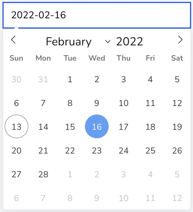
Using this package you can add a beautiful date or datetime picker into your project without touching any javascript with the power or laravel component. It is just a laravel component wrapper for the Flatpickr javascript library.
Created with ❤️ from Nepal 🇳🇵
Support
You can support me by subscribing to my YouTube channel - Laratips.
If you want me to continue developing this package and want me to develop other similar packages, then you help me financially by sending few bucks to my Wise account in Nepalese 🇳🇵 currency.
My Wise email: ashish.dhamala2015@gmail.com
If you decide to support me, the please send me your twitter handle in mail so that I can shout-out about you on twitter.
Installation
You can install the package via composer:
composer require asdh/laravel-flatpickr
You can publish the config file with:
php artisan vendor:publish --tag="flatpickr-config"
You can publish the assets with:
php artisan vendor:publish --tag="flatpickr-assets"
This is the contents of the published config file:
return [
    /**
     * The url to be used to serve css file.
     * If null, it will use the one shipped with package.
     */
    'css_url' => env('FLATPICKR_CSS_URL', null),

    /**
     * The url to be used to serve js file.
     * If null, it will use the one shipped with package.
     */
    'js_url' => env('FLATPICKR_JS_URL', null),

    /**
     * Determines if the styles shipped with the package should be used.
     * Setting it to false will remove the styling for the component.
     * The flatpickr css will be untouched.
     */
    'use_style' => env('FLATPICKR_USE_STYLE', true),
];
Usage
You need to include the css and js that ships with the package in your html or blade file.
Adding Css
Include this style at the head section of your page:
@include('flatpickr::components.style')
Or you can use laravel blade component syntax:
<x-flatpickr::style />
If you want to use different url for the css then you can change it from the .env file:
FLATPICKR_CSS_URL=https://cdnjs.cloudflare.com/ajax/libs/flatpickr/4.6.9/flatpickr.min.css
You can even change the url from the component itself:
<x-flatpickr::style
    url="https://cdnjs.cloudflare.com/ajax/libs/flatpickr/4.6.9/flatpickr.min.css"
/>
The url passed form the component will take more priority over the config file.
Adding Js
Similarly include this script at the bottom of your page:
@include('flatpickr::components.script')
Or you can use laravel blade component syntax:
<x-flatpickr::script />
If you want to use different url for the js then you can change it from the .env file:
FLATPICKR_JS_URL=https://cdnjs.cloudflare.com/ajax/libs/flatpickr/4.6.9/flatpickr.min.js
You can even change the url from the component itself:
<x-flatpickr::script
    url="https://cdnjs.cloudflare.com/ajax/libs/flatpickr/4.6.9/flatpickr.min.js"
/>
The url passed form the component will take more priority over the config file.
Using the component
Add it to your page.
<x-flatpickr />
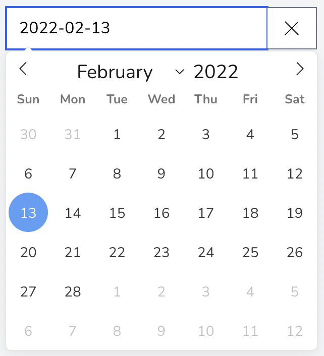
Yes, it's that simple. Now you have a beautiful looking date picker in your page without touching a single javascript at all.
Component props
I have made different props for this component that will be converted into the config options of the flatpickr. Make sure to look into the config options of the flatpickr.
Most of the description of the props written here are taken from the flatpickr documentation page.
id
Type: string
Set the id of the component. It will apply id to the underlying input tag. If no id is provided, it will use the autogenerated id.
Example:
<x-flatpickr id="laravel-flatpickr" />
dateFormat
Type: string
A string of characters which are used to define how the date will be displayed in the input box. Please check the flatpickr documentation page for the supported characters. By default the date format is Y-m-d but you can change it to other formats to like d/m/Y.
Example:
<x-flatpickr date-format="d/m/Y" />
altFormat
Type: string
Exactly the same as date format, but for the altInput field. If you want different format to be visible for the user then you can use this. By default it will use the same format as that of dateFormat.
Example:
<x-flatpickr alt-format="F j, Y" />
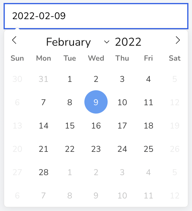
minDate
Type: string|Carbon
The minimum date that a user can start picking from.
You can pass a Carbon instance or a date format in string that is supported by Carbon or DateTime.
Example:
<x-flatpickr min-date="2022-02-13" />

OR

<x-flatpickr :min-date="today()" />

OR

<x-flatpickr :min-date="\Carbon\Carbon::parse('2022-02-13')" />
maxDate
Type: string|Carbon
The maximum date that a user can pick to.
You can pass a Carbon instance or a date format in string that is supported by Carbon or DateTime.
Example:
<x-flatpickr max-date="2022-09-18" />

OR

<x-flatpickr :max-date="today()" />

OR

<x-flatpickr :max-date="today()->subDays(20)" />
showTime
Type: bool
Shows the time picker.
Example:
<x-flatpickr show-time />
timeFormat
Type: string
A string of characters which are used to define how the time will be displayed in the input box. Please check the flatpickr documentation page for the supported characters. By default the time format is H-i but you can change it to other formats to like h:i.
Example:
<x-flatpickr show-time time-format="h:i" />
When you use show-time prop with alt-format, make sure to write both date and time format in the alt-format like this:
Example:
<x-flatpickr show-time time-format="h:i" alt-format="F j, Y, H:i" />
minTime
Type: string
The minimum time that a user can start picking from.
Example:
<x-flatpickr show-time min-time="13:25" />
maxTime
Type: string
The maximum time that a user can pick to.
Example:
<x-flatpickr show-time max-time="23:15" />
time24hr
Type: bool
Displays time picker in 24 hour mode without AM/PM selection when enabled. By default it is set to true. To show in 12 hour mode, set it to false.
Example:
Displays the time picker in 12 hour mode with am and pm.
<x-flatpickr show-time :time24hr="false" />
firstDayOfWeek
Type: int
Sets when the first day of the calendar should start. By default it is 0 (Sunday).
Example:
It sets the first day of the week as Monday.
<x-flatpickr :first-day-of-week="1" />
disableWeekend
Type: bool
Disable the weekend in the calendar. Saturday and Sunday are disabled.
Example:
<x-flatpickr disable-weekend />
disable
Type: array
Disable the provided dates. It can be array of date string or Carbon.
Example:
<x-flatpickr :disable="['2022-02-13', '2022-02-14']" />

OR

<x-flatpickr :disable="[today(), today()->addDay()]" />
enable
Type: array
Only enable the provided dates. It can be array of date string or Carbon. All the other dates other than provided in the enable array will be disabled when used.
Example:
<x-flatpickr :enable="['2022-09-18', '2022-02-14']" />

OR

<x-flatpickr :enable="[today(), today()->addDay()]" />
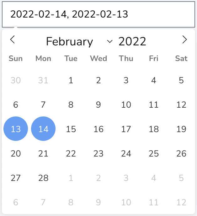
multiple
Type: bool
Sets the calendar mode to multiple. You will be able to select multiple dates.
Example:
<x-flatpickr multiple />
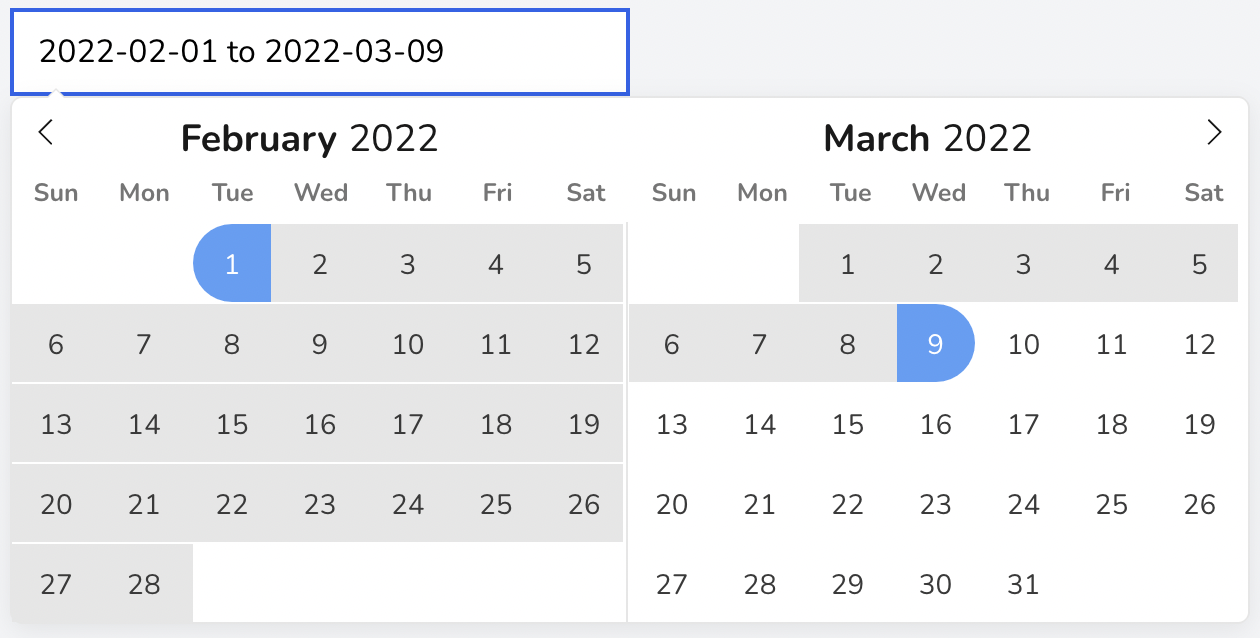
range
Type: bool
Sets the calendar mode to range. You will be able to select range of dates. If you use both multiple and range, the mode will be set to range.
By default 2 months will be visible in the dropdown when the mode is range. You can change that using visibleMonths prop.
Example:
<x-flatpickr range />
visibleMonths
Type: int
The number of months to be shown at the same time when displaying the calendar.
Example:
<x-flatpickr :visible-months="3" />
inline
Type: bool
Displays the calendar inline.
Example:
<x-flatpickr inline />
showWeekNumbers
Type: bool
Shows week numbers in calendar.
Example:
<x-flatpickr show-week-numbers />
value
Type: string|Carbon|array
Sets the initial selected date(s).
Example:
For a single picker, pass normal date string or Carbon instance.
<x-flatpickr value="2022-09-18" />

OR

<x-flatpickr :value="\Carbon\Carbon::parse('2022-09-18')" />
Example
For multiple picker, pass the data as array.
<x-flatpickr :value="['2022-09-18']" multiple />

OR

<x-flatpickr :value="[\Carbon\Carbon::parse('2022-09-18')]" multiple />
Example
For range picker, pass the 2 dates as string separated by to in between. Or pass 2 dates as array and it will select all the dates between and including them.
<x-flatpickr value="2022-09-18 to 2022-10-11" range />

OR

<x-flatpickr :value="['2022-09-18', '2022-10-11']" range />
clearable
Type: bool
Shows a clear icon on the right side of the date picker. Clicking on it will clear the selected value.
Example:
<x-flatpickr clearable />
locale
Type: string
Add locale language localization. Before that it's needed add the proper locale .js src line script in the script.blade.php file in the published vendor dir of the laravel project.
Example
For italian language add the following line just next the first <script src="{{ $url ?? config('flatpickr.js_url') ?? asset('vendor/flatpickr/js/flatpickr.js') }}"></script> at the script.blade.php file
<script src="https://npmcdn.com/flatpickr/dist/l10n/it.js"></script>
and add 'locale='it' at the flatpickr component
<x-flatpickr locale='it' />
Event Hooks
You can pass all the event hooks present in the flatpickr library like onChange, onOpen, onClose, etc. Please check all the hooks available in their documentation page.
Example:
<x-flatpickr clearable onChange="handleChange" />

<script>
    function handleChange(selectedDates, dateStr, instance) {
        console.log({ selectedDates, dateStr, instance });
    }
</script>
Testing
composer test
Changelog
Please see CHANGELOG for more information on what has changed recently.
Contributing
Please see CONTRIBUTING for details.
Security Vulnerabilities
Please review our security policy on how to report security vulnerabilities.
Credits
License
The MIT License (MIT). Please see License File for more information.

