
packstub / filament-rating

Star ratings for Filament v4 and v5: a form field, table column, infolist entry and average summarizer. Half stars, keyboard and screen-reader support, drop-in for mokhosh/filament-rating.
Fund package maintenance!
Requires
- php: ^8.2
- filament/filament: ^4.0 || ^5.0
- spatie/laravel-package-tools: ^1.92
Requires (Dev)
- larastan/larastan: ^3.0
- laravel/pint: ^1.24
- orchestra/testbench: ^9.0 || ^10.0 || ^11.0
- pestphp/pest: ^3.8 || ^4.0
- pestphp/pest-plugin-livewire: ^3.0 || ^4.0
- rector/rector: ^2.0
Suggests
None
Provides
None
Conflicts
None
Replaces
None
This package is auto-updated.
Last update: 2026-10-21 08:44:54 UTC
README

Star ratings for Filament v4 and v5: a form field, a table column you can rate from, an infolist entry, a rating filter, and average and distribution summarizers. It supports half stars, labels, colors by value, keyboard and screen readers, dark mode and RTL, and needs no npm build.
It is also a drop-in replacement for mokhosh/filament-rating: the same methods, the same data, and the old Mokhosh\FilamentRating\... imports keep working (see Migrating from mokhosh/filament-rating).
Features
- Form field: click or use the keyboard to rate, with half stars, zero and a clear button when you want them.
- Table column and infolist entry: averages drawn as partly filled stars, with the value and the number of ratings.
- Rate from the table: an editable column that saves each click.
- Labels and colors by value: a word per rating ("Poor" to "Excellent") and a color that follows it.
- Summarizers: the column's average as stars, or a bar per rating like a store's review breakdown.
- Filter: "4 stars & up", or one exact rating.
- Any color, any icon: Filament colors, Tailwind palette names or hex, and your own icons, with no theme build.
- Ready for everyone: validation built in, keyboard and screen reader support, dark mode, RTL, English and Romanian.
Compatibility
| Plugin | Filament | Livewire | Laravel | PHP |
|---|---|---|---|---|
| 0.x | 4.x, 5.x | 3.x, 4.x | 11.x – 13.x | 8.2+ |
Installation
composer require packstub/filament-rating
php artisan filament:assets
filament:assets publishes the plugin's CSS and its small Alpine component. Filament already runs it on composer update if you use its post-autoload-dump script. You don't need to register a panel plugin, rebuild a theme or run npm.
Outside a panel (a plain Livewire component using Filament forms), the assets load with the usual @filamentStyles and @filamentScripts directives in your layout.
Usage
Form field

use Packstub\FilamentRating\Components\Rating;

Rating::make('rating')
    ->required()
    ->default(5);
The state is an integer from 1 to stars() (or 0 with allowZero(), or 0.5 steps with allowHalf()), and null when nothing is picked. It fits an integer (or decimal) column.
Rating::make('rating')
    ->stars(10)          // default 5
    ->allowZero()        // adds a "no stars" button that stores 0
    ->allowHalf()        // 0.5 steps: the left half of a star picks the half value
    ->clearable()        // click the selected star again, press Delete, or use the × button
    ->size('lg')         // xs, sm, md (default), lg, xl, 2xl, or an IconSize
    ->color('warning')   // default primary
    ->readOnly();
Keyboard: arrow keys move by one step (they follow the reading direction in RTL), Home and End jump to the minimum and maximum, and Delete or Backspace clears when clearable().
The field validates itself: numeric, min (0 or the first step), max (the number of stars), and integer or multiple_of:0.5. Screen readers get a radiogroup of radio buttons (a slider in half-star mode) with "3 of 5 stars" labels, the stars take one tab stop, and the focused star shows a ring.
Table column

use Packstub\FilamentRating\Columns\RatingColumn;

RatingColumn::make('rating')
    ->sortable()
    ->searchable();
Show an average with its value and the number of ratings:
RatingColumn::make('reviews_avg_rating')
    ->avg('reviews', 'rating')
    ->showValue()                                                        // "4.3"
    ->precision(1)                                                       // max decimals, trailing zeros dropped
    ->showCount(fn (Product $record): int => $record->reviews_count)     // "(128)"
    ->placeholder('No reviews yet')
    ->tooltip(fn ($state): string => "Average of {$state}");
Labels
Give each rating a word. The field shows the word of the hovered or picked rating next to the stars, and every star is announced as "Very good, 4 of 5 stars":
Rating::make('rating')
    ->labels([
        1 => 'Poor',
        2 => 'Fair',
        3 => 'Good',
        4 => 'Very good',
        5 => 'Excellent',
    ]);
With allowHalf(), half values can have their own label ('3.5' => 'Pretty good'). Columns, entries and summarizers use the labels for screen readers, and showLabel() prints the label of the nearest rating next to the stars (an average of 3.7 shows "Very good").
Colors by value
Rating::make('rating')
    ->colors([
        1 => 'danger',   // 1 and 2
        3 => 'warning',  // 3
        4 => 'success',  // 4 and 5
    ]);
Each key is the lowest rating that uses its color; ratings below the lowest key use color(). In the field, the color follows the hover. Any value color() accepts works here too.
Editable table column
RatingInputColumn lets people rate records right in the table, like Filament's ToggleColumn. A click is validated (the same rules as the field) and saved to the record, and an invalid value is rolled back with the error shown on the stars.
use Packstub\FilamentRating\Columns\RatingInputColumn;

RatingInputColumn::make('rating')
    ->clearable()
    ->disabled(fn (Review $record): bool => auth()->user()->cannot('update', $record))
    ->afterStateUpdated(fn (Review $record, ?int $state) => $record->touch());
It takes every column option (stars, half stars, colors, labels, icons, size) plus rules(), beforeStateUpdated(), afterStateUpdated() and updateStateUsing(). Like Filament's own editable columns it does not check model policies, so use disabled() to decide who may change a rating.
Filter

use Packstub\FilamentRating\Filters\RatingFilter;

RatingFilter::make('rating');                    // 5 stars, 4 stars & up, … 1 star & up
RatingFilter::make('rating')->stars(10);
RatingFilter::make('rating')->exact();           // 5 stars, 4 stars, …
RatingFilter is a SelectFilter, so its options work as usual (label(), default(), query()). With exact(), half ratings count toward the star they fill (3.5 matches 3).
Average summarizer
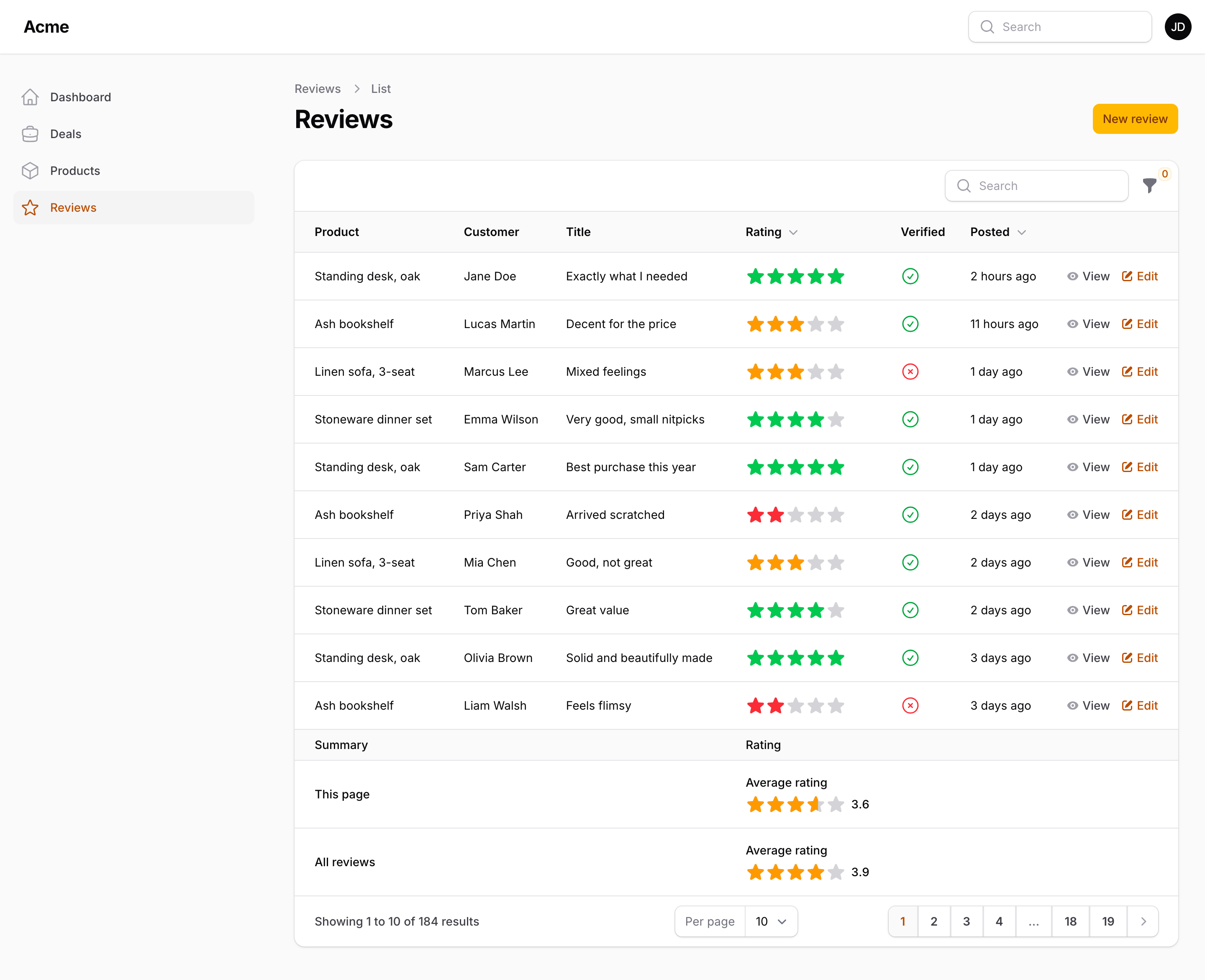
use Packstub\FilamentRating\Summarizers\RatingAverage;

RatingColumn::make('rating')
    ->stars(10)
    ->color('amber')
    ->summarize(RatingAverage::make());
RatingAverage draws the column's average as stars with the value next to them. It takes the column's stars, colors, icons and size unless you set them on the summarizer.
Rating distribution
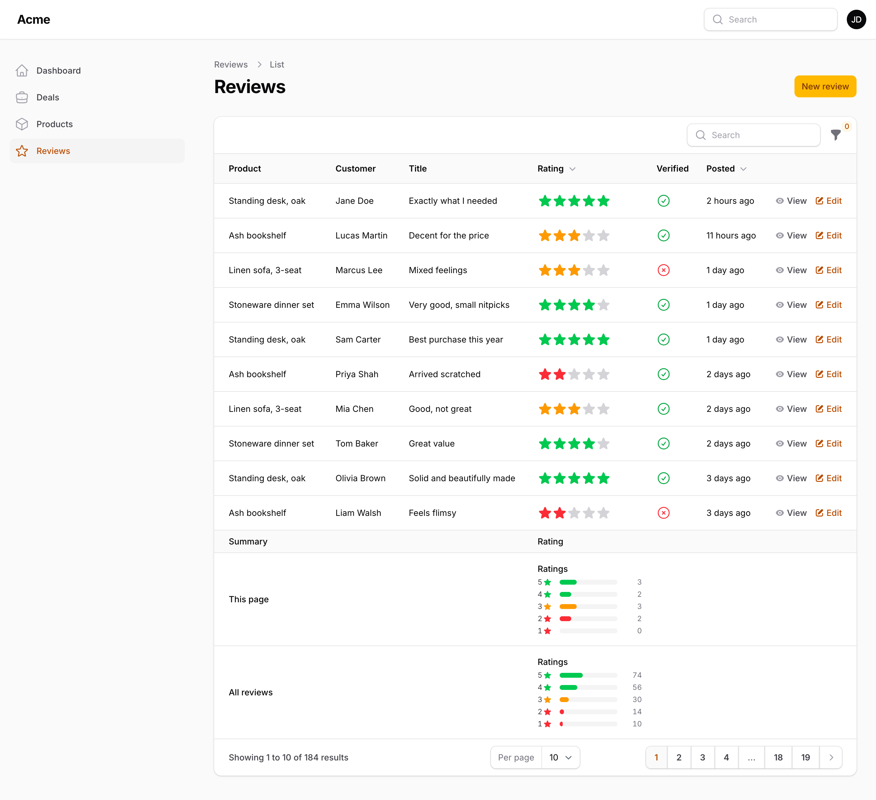
use Packstub\FilamentRating\Summarizers\RatingDistribution;

RatingColumn::make('rating')
    ->summarize(RatingDistribution::make()); // ->percentages() for "40%" instead of counts
Pass both summarizers (->summarize([RatingAverage::make(), RatingDistribution::make()])) to show the average above the bars. RatingDistribution draws a bar for each rating from the highest down, with its count (or share with percentages()). Half ratings count toward the star they fill, and a zero row is added with allowZero(). It takes the column's stars, colors (including colors()), icon and labels.
Infolist entry

use Packstub\FilamentRating\Entries\RatingEntry;

RatingEntry::make('rating')
    ->showValue()
    ->size('lg');
Customization
All options are available on the field, the column, the entry and the summarizer, and each one accepts a closure.
| Method | Default | Notes |
|---|---|---|
stars(int) |
5 |
Number of stars, also the validation max. |
allowZero(bool) |
false |
Allows 0; the field shows a "no stars" button, displays show a no-symbol icon. |
allowHalf(bool) |
false |
Half-star steps in the field. |
size(string|IconSize) |
md |
xs 12px, sm 16px, md 24px, lg 32px, xl 40px, 2xl 48px. |
color(string|array) |
primary |
Registered color, Tailwind palette name, Color::Amber, or #f59e0b. |
emptyColor(string|array) |
gray |
Color of the unfilled part. |
icon(...) |
solid star | Any icon Filament accepts: a Blade icon name, a Heroicon case, an Htmlable. |
emptyIcon(...) |
the filled icon | For example emptyIcon('heroicon-o-star') for outlined empty stars. |
theme(RatingTheme) |
Simple |
HalfStars: half steps in the field and rounded-down halves in displays (kept from mokhosh). |
colors(array) |
none | Color per rating: [min rating => color]. |
labels(array) |
none | A word per rating, used by the field's caption and screen readers. |
showValue(), precision(int), showCount(int), showLabel() |
off, 1, none, off |
Column, entry and summarizer only. |
clearable() |
off | Field and RatingInputColumn. |
readOnly() |
off | Field only. |
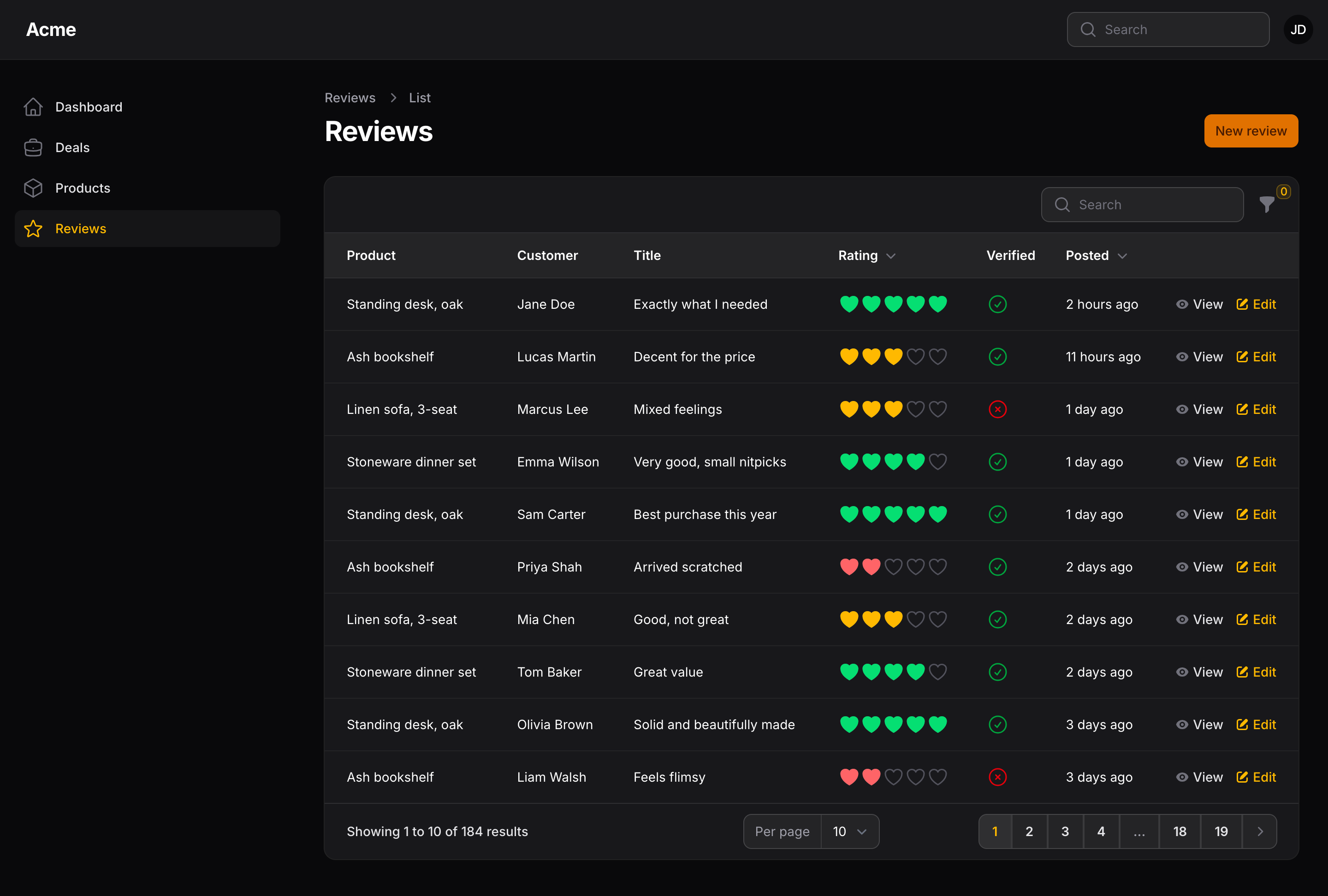
To change the icons everywhere, register their aliases in a service provider:
use Filament\Support\Facades\FilamentIcon;
use Packstub\FilamentRating\RatingIcon;

FilamentIcon::register([
    RatingIcon::Star => 'heroicon-s-heart',
    RatingIcon::StarEmpty => 'heroicon-o-heart',
]);
The stars use their own plain CSS, so there's nothing to add to a custom theme. If you style the fi-rating-* classes with Tailwind in your theme, add the views to its sources:
@source '../../../../vendor/packstub/filament-rating/resources/views/**/*';
The strings (screen reader labels, the clear button, the filter and summarizer captions) live in a language file, with English and Romanian included. Publish them with php artisan vendor:publish --tag=filament-rating-translations.
Migrating from mokhosh/filament-rating
The plugin keeps mokhosh v2's public API, so moving over takes three steps:
composer remove mokhosh/filament-rating
composer require packstub/filament-rating
php artisan filament:assets
- Your existing
use Mokhosh\FilamentRating\...imports keep working: the package aliases those five classes to its own. Aliases are created lazily and only when mokhosh itself isn't installed. - When convenient, switch the imports to the new namespace (a search and replace of
Mokhosh\FilamentRatingwithPackstub\FilamentRating). - Delete the old published assets,
public/css/mokhoshandpublic/js/mokhosh.
| mokhosh v2 | packstub/filament-rating |
|---|---|
Mokhosh\FilamentRating\Components\Rating |
Packstub\FilamentRating\Components\Rating |
Mokhosh\FilamentRating\Columns\RatingColumn |
Packstub\FilamentRating\Columns\RatingColumn |
Mokhosh\FilamentRating\Entries\RatingEntry |
Packstub\FilamentRating\Entries\RatingEntry |
Mokhosh\FilamentRating\RatingTheme |
Packstub\FilamentRating\RatingTheme (same cases) |
Mokhosh\FilamentRating\FilamentRatingPlugin |
Packstub\FilamentRating\FilamentRatingPlugin (same id, optional) |
stars(int), getStars(), getStarsArray() |
same, also accepts a closure |
allowZero(), shouldAllowZero() |
same |
size('xs'…'xl'), getSize() |
same sizes in pixels, plus 2xl and IconSize |
color('primary'), getColor() |
same, plus palette names, Color::* arrays and hex |
theme(RatingTheme::HalfStars), getTheme() |
same; allowHalf() is the explicit spelling |
php artisan filament-rating:install |
same command (publishes the assets) |
A few things behave differently:
- Integer ratings look the same as before: the same sizes, filled stars in the chosen color and empty stars in light gray.
- A decimal like 3.7 in a column or entry now fills 70% of the fourth star. mokhosh showed three full stars. Use
theme(RatingTheme::HalfStars)to round down to halves. - The field now validates its range (
min,max,integerormultiple_of:0.5). If you stored values outside1..stars, raisestars()or addallowZero(). - Published mokhosh views in
resources/views/vendor/filament-ratingare not used, because the view names are different.
Documentation
The full guide lives at packstub.dev/docs/filament-rating, and the same page is in the docs/ directory of this repository.
Testing
composer test         # Pest
composer lint         # Pint
composer analyse      # Larastan
composer refactor     # Rector
Changelog
See CHANGELOG.
Contributing
See CONTRIBUTING.
Security
See our security policy.
Credits
- Ion Caliman and Packstub
- The API follows mokhosh/filament-rating by Mo Khosh, whose plugin made star ratings in Filament a one-liner.
- All contributors
License
The MIT License (MIT). See LICENSE.