milenmk / laravel-simple-datatables
Simple Table component to create datatables for Livewire components
Package info
github.com/milenmk/laravel-simple-datatables-and-forms
pkg:composer/milenmk/laravel-simple-datatables
Requires
- php: ^8.2|^8.3|^8.4
- blade-ui-kit/blade-heroicons: ^2.6
- blade-ui-kit/blade-icons: ^1.8
- illuminate/contracts: ^10.0|^11.0|^12.0
- illuminate/pagination: ^10.0|^11.0|^12.0
- illuminate/support: ^10.0|^11.0|^12.0
- illuminate/view: ^12.2
- livewire/livewire: ^3.0|dev-main
Requires (Dev)
- brianium/paratest: ^7.8
- laravel/pint: ^1.10
- nunomaduro/collision: ^6.0|^7.0|^8.0|^9.0
- orchestra/testbench: ^10.2
- phpunit/phpunit: ^11.5
- squizlabs/php_codesniffer: ^3.11
- symfony/process: ^7.2
- tightenco/duster: ^3.1
Suggests
- barryvdh/laravel-dompdf: Required for PDF export functionality (^2.0)
- phpoffice/phpspreadsheet: Required for Excel export functionality (^1.28)
Conflicts
- laravel/framework: <10.0
- dev-develop
- 2.1.9
- 2.1.7
- 2.1.6
- 2.1.5
- 2.1.4
- 2.1.3
- 2.1.2
- 2.1.1
- 2.1.0
- 2.0.1
- 1.13.1
- 1.13.0
- 1.12.1
- 1.12.0
- 1.11.1
- 1.11.0
- 1.10.9
- 1.10.8
- 1.10.7
- 1.10.6
- 1.10.5
- 1.10.4
- 1.10.3
- 1.10.2
- 1.10.1
- 1.10.0
- 1.9.2
- 1.9.1
- 1.9.0
- 1.8.3
- 1.8.2
- 1.8.0
- 1.7.1
- 1.7.0
- 1.6.4
- 1.6.3
- 1.6.2
- 1.6.1
- 1.6.0
- 1.5.0
- 1.4.2
- 1.4.1
- 1.4.0
- 1.3.1
- 1.3.0
- 1.2.4
- 1.2.3
- 1.2.2
- 1.2.1
- 1.2.0
- 1.1.0
- 1.0.0
This package is auto-updated.
Last update: 2025-08-29 05:44:07 UTC
README
A lightweight, easy-to-use Laravel package for creating interactive data tables and dynamic forms with Livewire integration.
Overview
Laravel Simple Datatables And Forms provides two powerful components for your Laravel applications:
📊 Data Tables
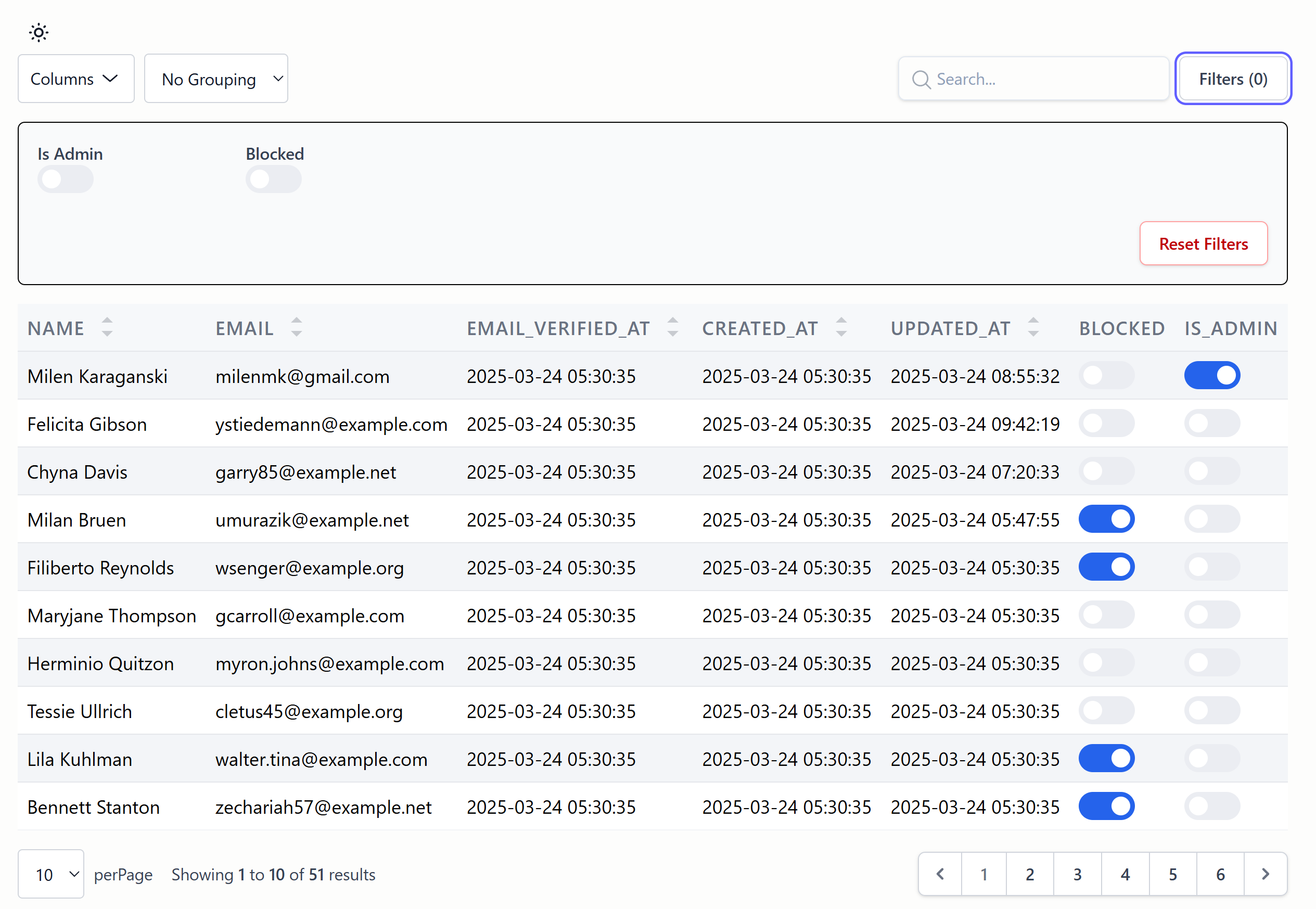
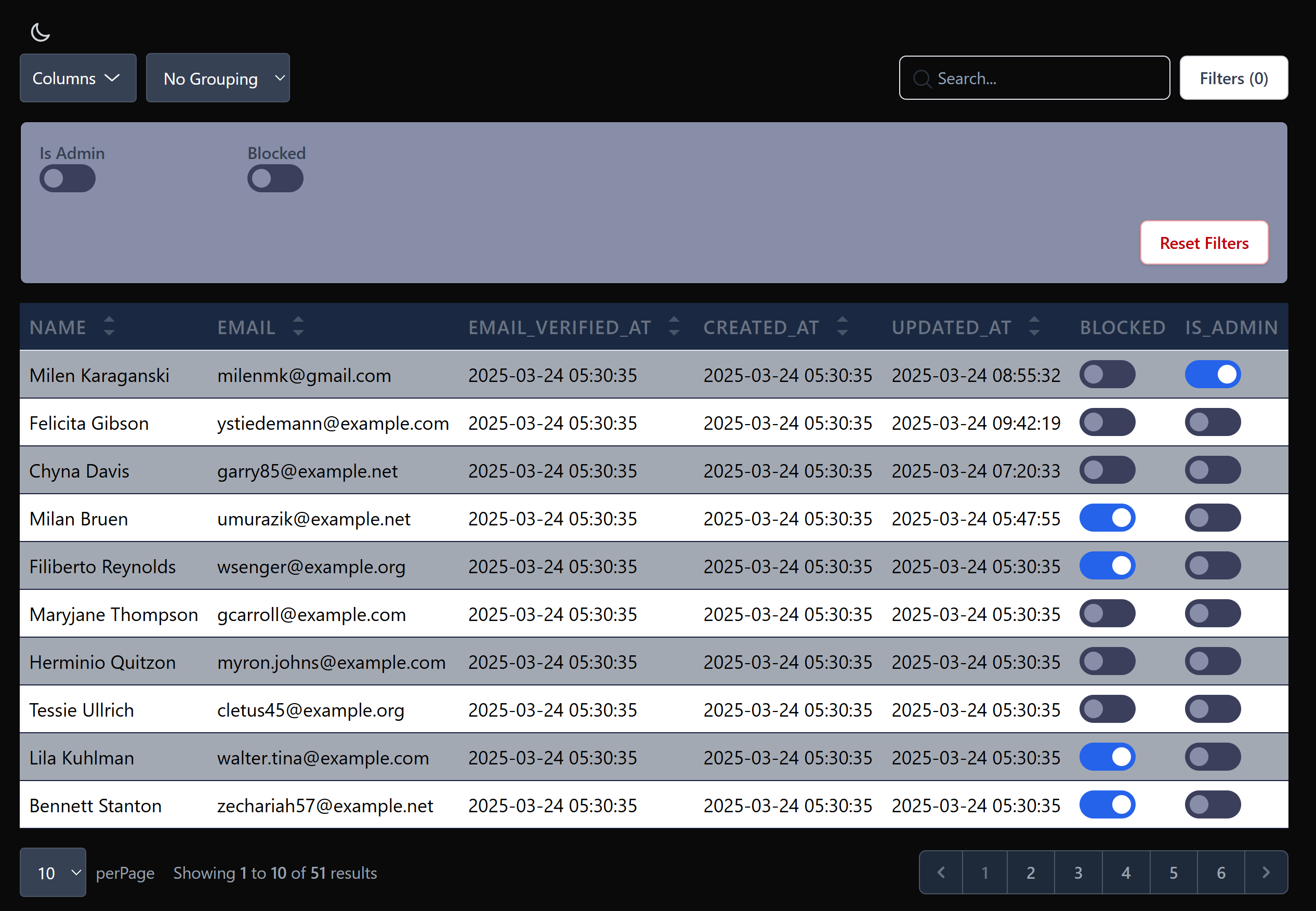
Create interactive, feature-rich data tables with minimal code. Includes advanced search, sorting, filtering, grouping, and export capabilities.
📝 Dynamic Forms
Build dynamic forms with fluent API, multiple field types, validation, and model binding support.
Key Features
- 🔍 Advanced Search - Debounced search with minimum character requirements
- 🔄 Column Sorting - Click-to-sort functionality for table columns
- 🧹 Filtering & Grouping - Multiple filter types with advanced grouping options
- 📤 Data Export - Export to CSV, Excel, and PDF formats
- 📝 Dynamic Forms - Fluent features for building complex forms
- 🔧 Multiple Field Types - Input, Select, Checkbox, Toggle, Textarea, and more
- ✅ Validation Integration - Built-in Laravel validation support
- 📱 Responsive Design - Mobile-friendly components
- ⚡ Performance Optimized - Intelligent caching and query optimization
- 🔒 Security Features - CSRF protection and input sanitization
- 🧩 Seamless Livewire Integration - Built specifically for Livewire 3.x
Requirements
- PHP 8.2 or higher (compatible with PHP 8.3 and 8.4)
- Laravel 10.x or higher (compatible with Laravel 11.x and 12.x)
- Livewire 3.x or higher
Quick Start
Installation
composer require milenmk/laravel-simple-datatables-and-forms
Publish Configurations
php artisan vendor:publish --tag=laravel-simple-datatables-and-forms-config
Publish Assets
php artisan simple-datatables-and-forms:publish-assets
Include Assets in Your Layout
<head>
    @SimpleDatatablesStyle
</head>
<body>
    <!-- Your content -->
    @SimpleDatatablesScript
</body>
Create Your First Data Table
Generate a table component:
php artisan make:milenmk-datatable UserList User --generate
Or create manually:
use Milenmk\LaravelSimpleDatatablesAndForms\Traits\HasTable;

class UserList extends Component
{
    use HasTable;

    public function table(Table $table): Table
    {
        return $table
            ->query(User::query())
            ->schema([
                TextColumn::make('name')->searchable()->sortable(),
                TextColumn::make('email')->searchable(),
                ToggleColumn::make('is_active')->label('Active'),
            ])
            ->striped()
            ->paginate();
    }
}
Create Your First Form
Generate a form component:
php artisan make:milenmk-form CreateUser create User --generate
Or create manually:
use Milenmk\LaravelSimpleDatatablesAndForms\Traits\HasForm;

class CreateUser extends Component
{
    use HasForm;

    public function form(Form $form): Form
    {
        return $form->model(User::class)->schema([
            InputField::make('name')->required(),
            InputField::make('email')->email()->required(),
            SelectField::make('role')
                ->options(['admin' => 'Admin', 'user' => 'User'])
                ->required(),
        ]);
    }
}
Documentation
📚 Complete Documentation
- Documentation Hub - Complete documentation index and navigation guide
- Troubleshooting Guide - Common issues and solutions
📊 Data Tables Documentation
- Getting Started - Quick start guide for tables
- Column Types - Complete reference for all column types
- Configuration - Configuration guide and options
- Advanced Features - Search, filtering, export, and caching
📝 Forms Documentation
- Getting Started - Quick start guide for forms
- Field Types - Complete reference for all field types
- Validation - Validation rules and techniques
- Advanced Features - Model binding and relationships
Tailwind CSS Integration
Add the package views to your Tailwind configuration:
// tailwind.config.js
module.exports = {
    content: [
        // ... your existing content paths
        './vendor/milenmk/laravel-simple-datatables-and-forms/resources/views/**/*.blade.php',
    ],
    // ... rest of your configuration
};
Contributing
Contributions are welcome! Please visit our GitHub repository to:
- Report bugs or request features
- Submit pull requests
- Browse existing issues
- Join discussions
Support
- Documentation - Comprehensive guides and examples
- GitHub Issues - Bug reports and feature requests
- Email Support - Direct support for complex issues
Changelog
Please see CHANGELOG.md for more information on what has changed recently.
Support My Work
If this package saves you time, you can support ongoing development:
👉 Become a Patron
Other Packages
Check out my other Laravel packages:
- Laravel GDPR Cookie Manager - GDPR-compliant cookie consent management with user preference tracking
- Laravel Blacklist - A Laravel package for blacklist validation of user input
- Laravel Email Change Confirmation - Secure email change confirmation system
- Laravel GDPR Exporter - GDPR-compliant data export functionality
- Laravel Locations - Add Countries, Cities, Areas, Languages and Currencies models to your Laravel application
- Laravel Rate Limiting - Advanced rate limiting capabilities with exponential backoff
License
This package is licensed under the MIT License. See the LICENSE file for more details.
Disclaimer
This package is provided "as is", without warranty of any kind, express or implied, including but not limited to warranties of merchantability, fitness for a particular purpose, or noninfringement.
The author(s) make no guarantees regarding the accuracy, reliability, or completeness of the code, and shall not be held liable for any damages or losses arising from its use.
Please ensure you thoroughly test this package in your environment before deploying it to production.


