
koassi / filament-rail

A Filament v5 panel theme: full-height accent sidebar, breadcrumbs in the topbar, compact tables, light and dark.
Requires
- php: ^8.3
- blade-ui-kit/blade-icons: ^1.6
- filament/filament: ^5.0
Requires (Dev)
- orchestra/testbench: ^11.0
- pestphp/pest: ^4.0
- pestphp/pest-plugin-laravel: ^4.0
Suggests
None
Provides
None
Conflicts
None
Replaces
None
README
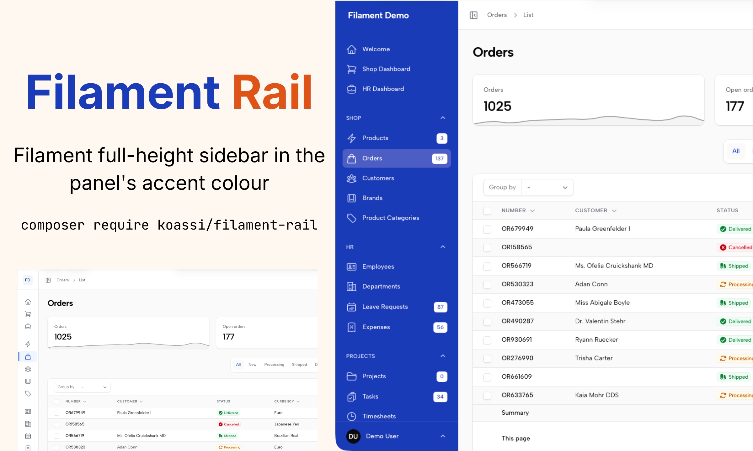
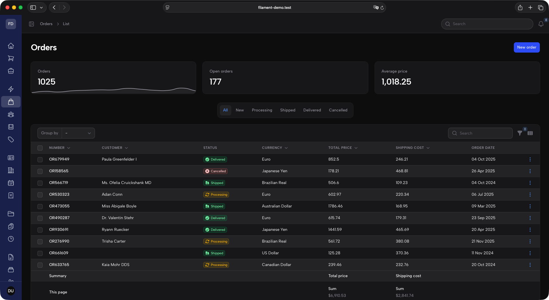
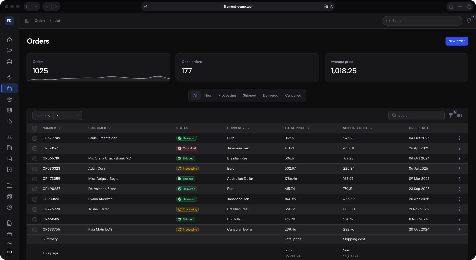
A layout theme for Filament v5 panels, built around a full-height sidebar rail.
- Full-height sidebar in the panel's accent color, holding the logo, the navigation and the user menu.
- Topbar starting where the sidebar ends, with the collapse toggle and breadcrumbs on the left, global search and notifications on the right.
- Compact tables with uppercase column titles.
- Light and dark mode, and an accent color that can be any of Filament's 26 palettes without breaking text contrast.
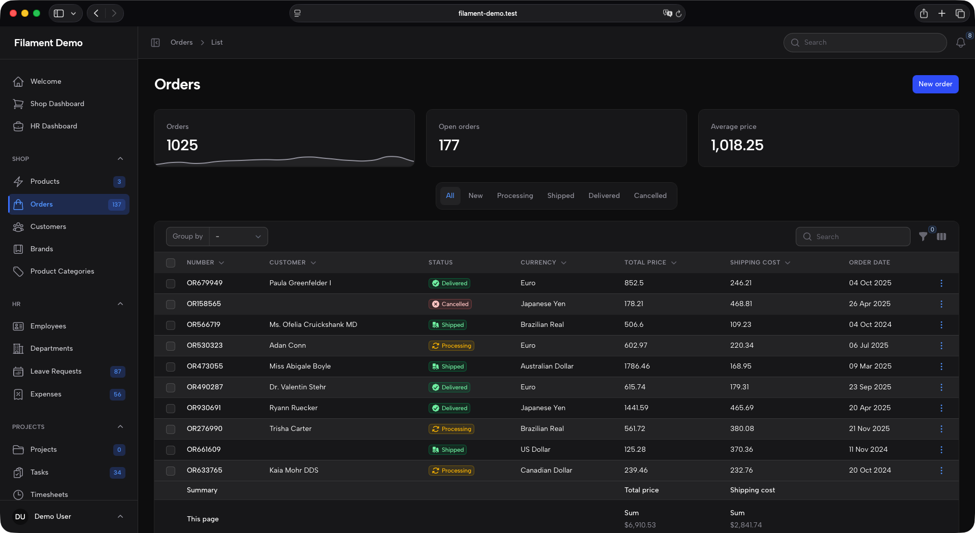
- A neutral sidebar variant: same layout, but the sidebar takes the surface color and the accent moves onto the active navigation item.
Screenshots
| Light | Dark | |
|---|---|---|
| Expanded | 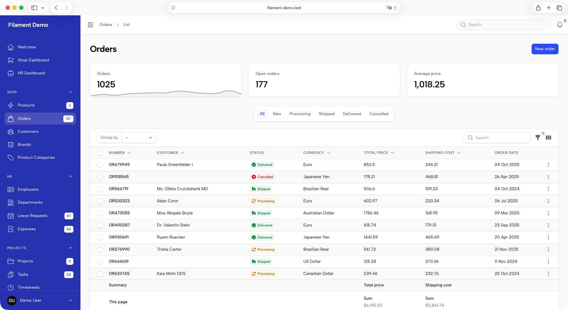 |
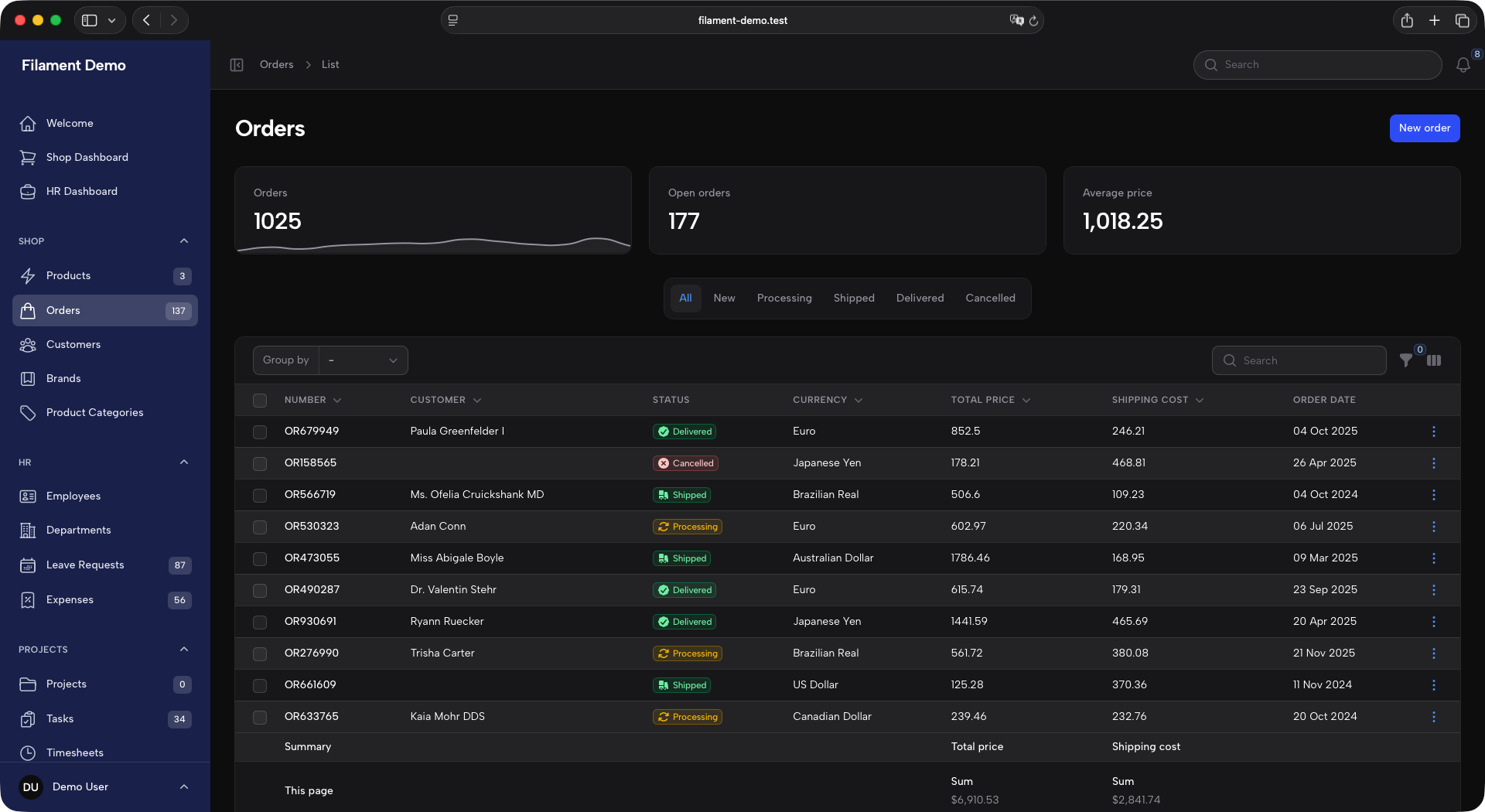 |
| Collapsed | 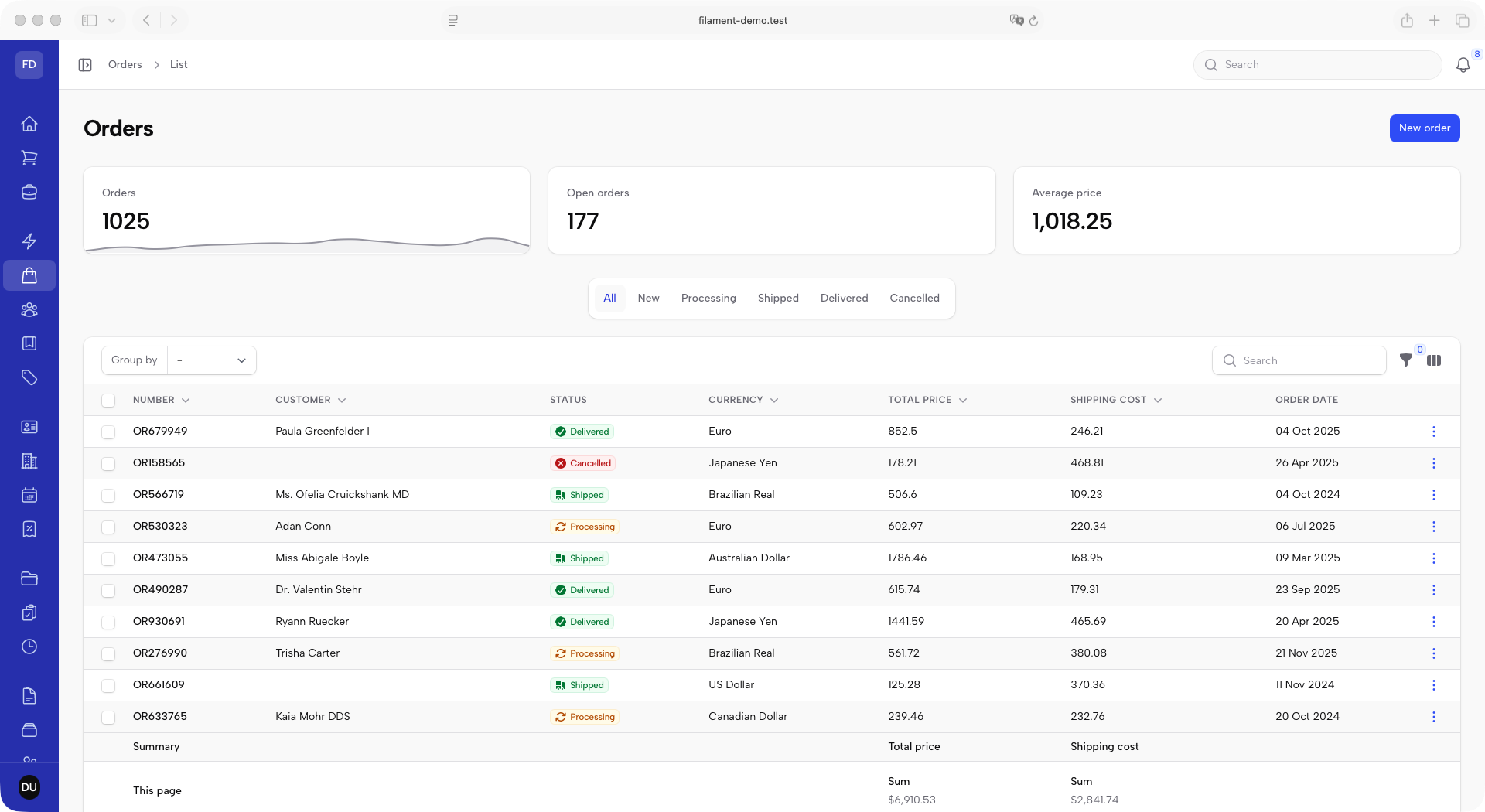 |
 |
Requirements
| PHP | ^8.3 |
filament/filament |
^5.0 |
blade-ui-kit/blade-icons |
^1.6 |
The stylesheet uses @apply and Tailwind v4 syntax, so it is compiled by the host application's Tailwind rather than shipped pre-built.
Installation
composer require koassi/filament-rail
Publish the stylesheet entry point:
php artisan vendor:publish --tag=filament-rail-css
This writes resources/css/filament/admin/theme.css. If your panel is not named admin, move the file to match Filament's convention: resources/css/filament/{panel-id}/theme.css.
vendor:publishskips an existing file and still exits successfully. If the panel already has a stylesheet, nothing was written — add the import by hand instead.
Register the entry point as a Vite input:
// vite.config.js
laravel({
  input: [
    "resources/css/app.css",
    "resources/js/app.js",
    "resources/css/filament/admin/theme.css",
  ],
});
Point the panel at it and register the plugin:
use Filament\Support\Colors\Color;
use Koassi\FilamentRail\ThemePlugin;

public function panel(Panel $panel): Panel
{
    return $panel
        ->viteTheme('resources/css/filament/admin/theme.css')
        ->plugins([
            ThemePlugin::make()->accentColor(Color::Indigo),
        ]);
}
Then build: npm run build.
Configuration
ThemePlugin::make()
    ->accentColor(Color::Amber)        // default: Color::Indigo
    ->sidebarWidth('17rem')            // default: 17rem
    ->collapsedSidebarWidth('4.75rem') // default: 4.75rem
    ->collapsedBrandLogo(asset('img/mark.svg')) // default: the brand name's initials
collapsedBrandLogo() accepts an image URL, an Htmlable (an inline SVG, say) or a closure returning either. It is boxed to 2.25rem square, so give it square artwork.
Beyond those four setters, anything the panel sets after ->plugins([...]) overrides the theme — that is the escape hatch for every option the plugin sets on your behalf.
The plugin also configures the panel (collapsible sidebar, global search and notifications in the topbar, user menu in the sidebar) and registers a few global defaults for tables and schemas (compact pagination, striped, deferLoading, session persistence, d M Y date formats). Both lists, and how to override them, are in IMPLEMENTATION_NOTE.md.
Customization
The published entry point is a couple of imports; your own rules and token overrides go below them and win, because the theme adds no !important and no @layer:
@import "../../../../vendor/filament/filament/resources/css/theme.css";
@import "../../../../vendor/koassi/filament-rail/resources/css/theme.css";

@source '../../../../app/Filament/**/*';
@source '../../../../resources/views/filament/**/*';

/* project-specific overrides go here */
The sidebar palette is driven by --sidebar-* custom properties, all derived from --sidebar-bg — re-pointing that one token repaints the whole sidebar. The full token table is in IMPLEMENTATION_NOTE.md; note the contrast floor before lowering any of the text mixes.
Neutral sidebar variant
Same layout, but the sidebar takes the app's own surface color — white in light mode, gray-900 in dark — and the accent moves onto the active navigation item and the badges.
| Light | Dark | |
|---|---|---|
| Expanded | 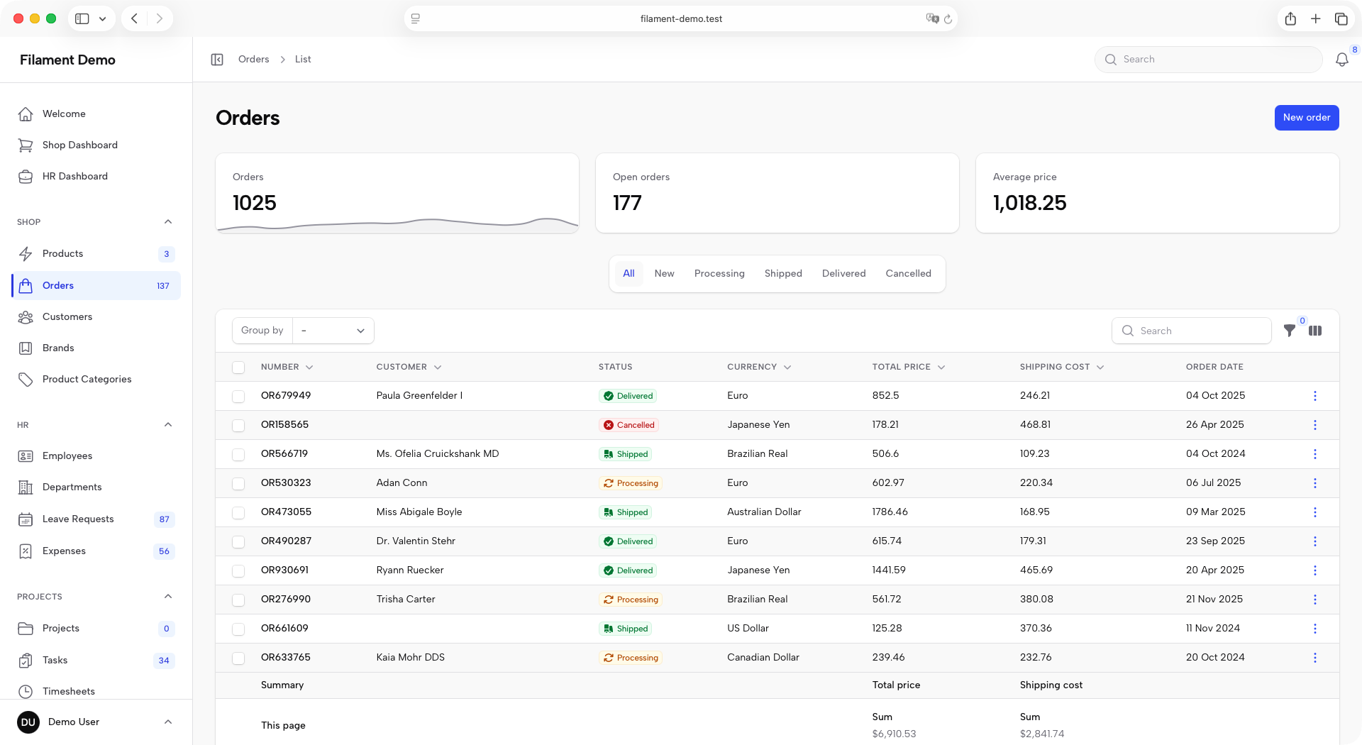 |
 |
| Collapsed | 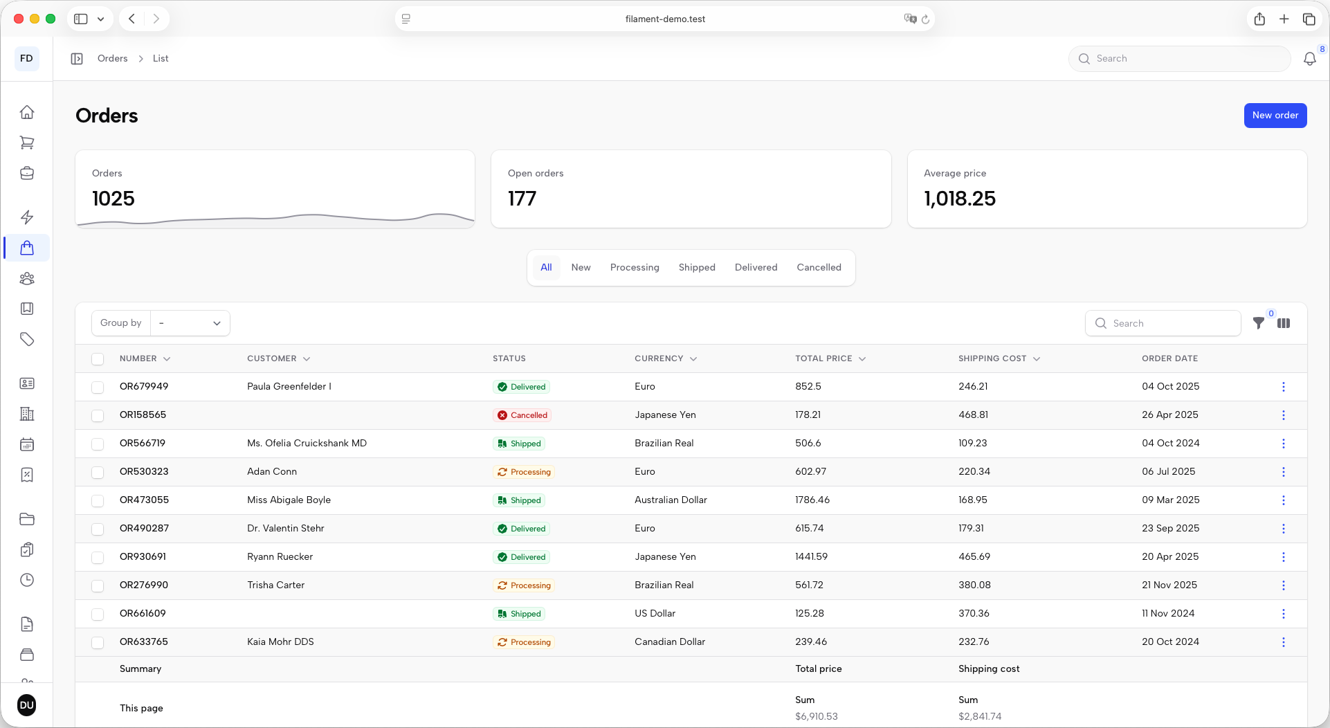 |
 |
Publish its entry point instead of the base one:
php artisan vendor:publish --tag=filament-rail-neutral-sidebar-css
The two tags write the same file, so publish one or the other, never both. If you already have an entry point, just add the variant import after the base one — order is the whole mechanism:
@import "../../../../vendor/filament/filament/resources/css/theme.css";
@import "../../../../vendor/koassi/filament-rail/resources/css/theme.css";
@import "../../../../vendor/koassi/filament-rail/resources/css/variants/neutral-sidebar.css"; /* ← */
The variant is chosen at build time, not from PHP. Its token table is in IMPLEMENTATION_NOTE.md.
Testing
composer test
Further reading
IMPLEMENTATION_NOTE.md documents the design tokens, the contrast measurements, the layout decisions behind the stylesheet, and the known limitations.
License
MIT.