jeffersongoncalves / filament-flux
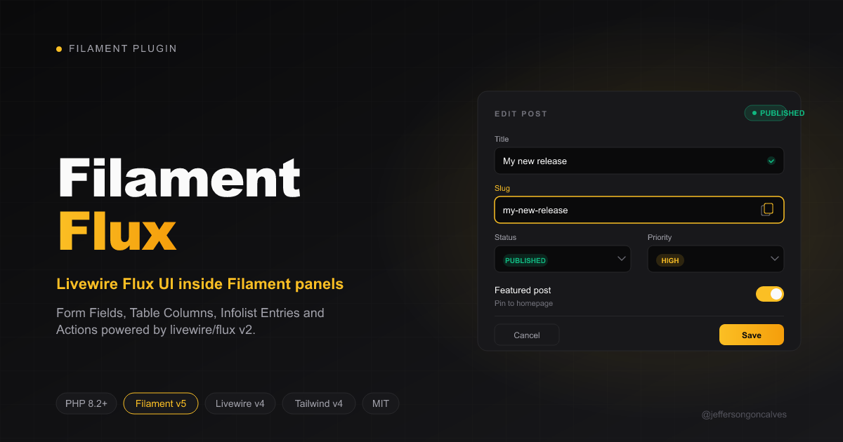
Filament v5 plugin exposing Livewire Flux UI components as native Form Fields, Table Columns, Infolist Entries and Actions.
Maintainers
Package info
github.com/jeffersongoncalves/filament-flux
pkg:composer/jeffersongoncalves/filament-flux
Requires
- php: ^8.2
- filament/filament: ^5.0
- livewire/flux: ^2.14
- spatie/laravel-package-tools: ^1.16
Requires (Dev)
- larastan/larastan: ^3.0
- laravel/pint: ^1.18
- orchestra/testbench: ^9.0 || ^10.0 || ^11.0
- pestphp/pest: ^3.0 || ^4.0
- pestphp/pest-plugin-laravel: ^3.0 || ^4.0
README
Filament Flux
Filament v5 plugin exposing Livewire Flux UI components as native Form Fields, Table Columns, Infolist Entries, and Actions.
Filament v5 only. Single
1.xbranch tracks Filament v5. No backports to v3/v4.
Compatibility
| Branch | Filament | Laravel | PHP | Livewire | Flux |
|---|---|---|---|---|---|
1.x |
^5.0 | ^11 / ^12 / ^13 | ^8.2 | ^4.0 | ^2.14 |
Installation
composer require jeffersongoncalves/filament-flux
php artisan make:filament-theme admin
php artisan filament-flux:install --panel=admin
npm run build
filament-flux:install patches resources/css/filament/{panel}/theme.css idempotently:
@import "tailwindcss";
@import "../../../../vendor/livewire/flux/dist/flux.css";
@import "../../../../vendor/jeffersongoncalves/filament-flux/dist/filament-flux.css";
Tailwind v4 picks up Flux + this package's view scanning automatically.
Register the plugin
use Filament\Panel;
use Jeffersongoncalves\FilamentFlux\FilamentFluxPlugin;

public function panel(Panel $panel): Panel
{
    return $panel->plugins([
        FilamentFluxPlugin::make(),
    ]);
}
Plugin options
FilamentFluxPlugin::make()
    ->scopeClass('filament-flux-scope')   // wrapper class on every page; pass null to disable
    ->injectAppearance(true)              // controls @fluxAppearance in <head>
    ->injectScripts(true);                // controls @fluxScripts before </body>
The plugin also installs a JavaScript bridge between Filament's theme switcher and Flux's appearance store, so toggling theme in either system stays in sync (including cross-tab via storage events).
Use Flux everywhere (auto-replace Filament Form Fields)
Existing Resources keep calling TextInput::make(), Select::make(), etc. — they receive the matching Flux subclass automatically. No code changes in your Resources.
FilamentFluxPlugin::make()->useEverywhere();
Granular opt-out per field:
FilamentFluxPlugin::make()->useEverywhere([
    'select' => false,    // keep Filament's <select> with client-side searchable, etc.
    'otp' => false,
]);
Available slugs (all default to true when useEverywhere() is called):
| Slug | Filament class | Flux replacement |
|---|---|---|
input |
TextInput |
FluxInput |
textarea |
Textarea |
FluxTextarea |
select |
Select |
FluxSelect |
checkbox |
Checkbox |
FluxCheckbox |
checkboxList |
CheckboxList |
FluxCheckboxGroup |
radio |
Radio |
FluxRadio |
toggle |
Toggle |
FluxSwitch |
otp |
OneTimeCodeInput |
FluxOtpInput |
Each Flux subclass extends the matching Filament native, so every method it exposes — autocomplete(), mask(), revealable(), length(), searchable(), relationship(), etc. — keeps working. Only the rendered markup changes.
Use Flux navigation (sidebar + topbar)
Replace Filament's sidebar and topbar items with <flux:navlist.item> / <flux:navlist.group> and <flux:navbar.item> markup, while keeping Filament's data layer (active state, badges, child items, registered Resources/Pages/custom items) intact.
FilamentFluxPlugin::make()->useFluxNavigation();
Granular per-area opt-out:
FilamentFluxPlugin::make()->useFluxNavigation([
    'sidebar' => true,
    'topbar' => false,         // keep Filament's topbar items as-is
    'shell' => true,           // see "Full panel shell" below
    'themeSwitcher' => true,   // see "Theme switcher" below
]);
The plugin prepends per-area hint paths to the filament-panels view namespace; missing files fall back to the vendor copies, so upgrading Filament minors stays safe as long as the overridden views (sidebar item, sidebar group, topbar item, layout index, livewire sidebar) still match the prop signatures of the active Filament minor.
Full panel shell (shell toggle)
Off by default — the shell slug rewrites the panel's outer <aside> shell into <flux:sidebar> and wraps the main content in <flux:main>, including the sidebar Livewire view. Header, logo, tenant menu, global search, render hooks and footer behaviors are all preserved.
FilamentFluxPlugin::make()->useFluxNavigation([
    'shell' => true,
]);
This is the most invasive override — opt in only after you've confirmed your panel's render hooks and customizations still render correctly. The Filament version that ships with each filament-flux release is the one that's been verified.
Theme switcher (themeSwitcher toggle)
Off by default. Replaces the three-button theme switcher (light / dark / system) with a single <flux:dropdown> carrying a <flux:menu> of the three modes. Filament's theme-changed event is dispatched on selection, so the existing dark mode listener and the bridge into flux.appearance (Phase 1) keep working unchanged.
FilamentFluxPlugin::make()->useFluxNavigation([
    'themeSwitcher' => true,
]);
Use Flux Blade components (useFluxComponents())
Replace Filament's atomic <x-filament::*> Blade components with <x-flux::*>. Each slug is opt-in.
FilamentFluxPlugin::make()->useFluxComponents();
// or granular:
FilamentFluxPlugin::make()->useFluxComponents([
    'badge' => true,
    'avatar' => true,
    'icon' => true,
    'link' => true,
    // omit/false → keep Filament's view
]);
Available slugs:
| Slug | Filament view | Flux replacement |
|---|---|---|
badge |
filament::components.badge |
<flux:badge> (color map: primary→blue, success→lime, warning→amber, danger→red, info→cyan, gray→zinc) |
avatar |
filament::components.avatar |
<flux:avatar> |
icon |
filament::components.icon |
<flux:icon> (falls back to native HTML for non-string icons) |
iconButton |
filament::components.icon-button |
<flux:button square icon> (icon HTML wrapped as slot for non-string icons) |
link |
filament::components.link |
<flux:link> |
breadcrumbs |
filament::components.breadcrumbs |
<flux:breadcrumbs> + <flux:breadcrumbs.item> |
callout |
filament::components.callout |
<flux:callout> + <flux:callout.text> (variant mapped from color) |
card |
filament::components.card |
<flux:card> |
fieldset |
filament::components.fieldset |
<flux:fieldset> + <flux:legend> |
section |
filament::components.section |
<flux:card> with header via <flux:heading> + <flux:text>; collapsible/persist preserved via Alpine |
dropdown |
filament::components.dropdown + dropdown.list + dropdown.list.item |
<flux:dropdown> + <flux:menu> + <flux:menu.item> (Filament placement → flux position/align) |
dropdownHeader |
filament::components.dropdown.header |
<flux:heading size="sm"> with optional leading icon |
modalHeading |
filament::components.modal.heading |
<flux:heading size="lg"> (envelope, events and Action machinery stay on Filament) |
modalDescription |
filament::components.modal.description |
<flux:text> |
schemaText |
filament-schemas::components.text |
<flux:text> (badge variant still delegates to <x-filament::badge>) |
statsCard |
filament-widgets::stats-overview-widget.stat |
<flux:card> + <flux:heading size="xl"> + <flux:subheading> + <flux:text> (chart Alpine canvas + URL anchor preserved) |
notifications |
filament-notifications::notifications |
<flux:toast.group> envelope (Filament alignment + verticalAlignment mapped to Flux position); each Notification keeps its own Filament-styled markup inside the group |
pagination |
filament::components.pagination.index |
<flux:pagination> (drops Filament-only pageOptions per-page dropdown, extremeLinks, and cursor-paginator chevron special-casing — disable the slug if you rely on those) |
The plugin prepends per-slug hint paths to the filament, filament-schemas (for schemaText), filament-widgets (for statsCard) and filament-notifications (for notifications) view namespaces; missing files fall back to vendor copies. Feature complexity (delete buttons on badges, key bindings, loading indicators, deferred badges, form-tag dropdown items, secondary/divided/aside section variants) doesn't fully map to Flux primitives — disable a slug if you rely on the Filament-only affordances.
Mixed icon sets (Heroicons + Font Awesome / Tabler / Lucide / etc.)
Filament users frequently register icons from non-heroicon Blade Icons sets. The bundled HeroiconNormalizer detects known prefixes (fontawesome-, tabler-, lucide-, phosphor-, mdi-, octicon-, bi-, feather-, simple-icons-, eos-icons-, bxl-, bxs-, bx-, gmdi-, css-gg-, fa[brs]?-) and falls back to \Filament\Support\generate_icon_html() so those icons keep rendering through Blade Icons. Bare names (no prefix) and heroicon-{o,s,m,c,mini,micro,outline,solid}-* are routed through <flux:icon> with the correct variant.
Notifications and user menu
Filament's notifications system and user-menu use deep DSL surfaces that don't map cleanly onto Flux primitives. The recommended path:
- For Flux-style toasts in Custom Pages, use
Jeffersongoncalves\FilamentFlux\Components\FluxToastto dispatchtoast-showLivewire events. Pair with<x-flux::toast.group>in your panel layout'sbody.startrender hook. - The Filament user-menu remains the most flexible affordance for tenant menus, profile links, and dynamic items. Keep it as-is.
Form Fields
use Jeffersongoncalves\FilamentFlux\Forms\Components\{FluxInput, FluxTextarea, FluxSelect, FluxCheckbox, FluxCheckboxGroup, FluxRadio, FluxRadioGroup, FluxSwitch};

FluxInput::make('email')
    ->email()
    ->fluxIcon('envelope')
    ->fluxClearable()
    ->fluxCopyable()
    ->required();

FluxTextarea::make('bio')->rows(8)->resize('vertical');

FluxSelect::make('status')
    ->options(['draft' => 'Draft', 'published' => 'Published'])
    ->required();

FluxCheckbox::make('terms')->required();

FluxCheckboxGroup::make('tags')
    ->fluxVariant('cards')                // default | cards | pills | buttons
    ->options(Tag::pluck('name', 'id'));

FluxRadioGroup::make('plan')
    ->fluxVariant('segmented')            // default | segmented | cards
    ->options(['free' => 'Free', 'pro' => 'Pro']);

FluxSwitch::make('notifications')->fluxAlign('right');
Actions
use Jeffersongoncalves\FilamentFlux\Actions\{FluxAction, FluxDropdown};

FluxAction::make('publish')
    ->fluxVariant('primary')              // outline | filled | primary | danger | ghost | subtle
    ->fluxIcon('rocket-launch')
    ->fluxKbd('cmd+enter')
    ->fluxLoading()                       // bool or wire:target string
    ->fluxTooltip('Publish now')
    ->requiresConfirmation()              // delegates to Filament's native modal
    ->action(fn (Post $record) => $record->publish());

FluxDropdown::make([
    FluxAction::make('edit'),
    FluxAction::make('archive'),
    FluxAction::make('delete'),
])
    ->label('Actions')
    ->fluxIcon('ellipsis-horizontal');
Note on modals: Action confirmation/forms reuse Filament's native modal system (consistent with the rest of the panel).
<flux:modal>is not available in Flux free; use Filament modals or roll your own with Alpine in Custom Pages.
Table Columns
use Jeffersongoncalves\FilamentFlux\Tables\Columns\{FluxBadgeColumn, FluxAvatarColumn, FluxIconColumn};

FluxBadgeColumn::make('status')
    ->fluxColor([
        'draft' => 'zinc',
        'published' => 'lime',
        'archived' => 'red',
    ])
    ->fluxIcon(fn ($state) => $state === 'published' ? 'check-circle' : null)
    ->fluxBadgeVariant('pill');

FluxAvatarColumn::make('user.avatar')
    ->fluxName(fn ($state, $record) => $record->user->name)
    ->fluxColor(fn ($state, $record) => $record->user->is_admin ? 'blue' : 'zinc')
    ->fluxSize('sm')
    ->fluxBadge('green');                 // status dot

FluxIconColumn::make('priority')
    ->fluxColor(fn ($state) => $state === 'high' ? 'red' : 'zinc')
    ->fluxIconVariant('solid');
Infolist Entries
use Jeffersongoncalves\FilamentFlux\Infolists\Components\{FluxBadgeEntry, FluxAvatarEntry, FluxIconEntry, FluxTextEntry};

FluxBadgeEntry::make('role')
    ->fluxColor('blue')
    ->fluxIcon('shield-check');

FluxAvatarEntry::make('avatar')
    ->fluxName(fn ($state, $record) => $record->name)
    ->fluxSize('lg');

FluxIconEntry::make('priority')
    ->fluxIconVariant('solid')
    ->fluxColor('red');

FluxTextEntry::make('description')
    ->fluxSize('lg')
    ->fluxColor('zinc');
Color resolver
fluxColor() accepts three forms:
->fluxColor('lime')                                  // fixed
->fluxColor(['draft' => 'zinc', 'done' => 'lime'])   // state map
->fluxColor(fn ($state, $record) => 'blue')          // closure
Valid Flux colors: zinc, red, orange, amber, yellow, lime, green, emerald, teal, cyan, sky, blue, indigo, violet, purple, fuchsia, pink, rose.
FluxIcon helper
use Jeffersongoncalves\FilamentFlux\Support\FluxIcon;

// Inline rendering inside Blade or Closures.
echo FluxIcon::make('star')->fluxVariant('outline')->class('size-6');
OTP input
use Jeffersongoncalves\FilamentFlux\Forms\Components\FluxOtpInput;

FluxOtpInput::make('code')
    ->length(6)
    ->private()                  // mask the digits
    ->required();
Link Action / Column / Entry
use Jeffersongoncalves\FilamentFlux\Actions\FluxLinkAction;
use Jeffersongoncalves\FilamentFlux\Tables\Columns\FluxLinkColumn;
use Jeffersongoncalves\FilamentFlux\Infolists\Components\FluxLinkEntry;

FluxLinkAction::make('docs')
    ->url('https://example.com/docs')
    ->external()
    ->fluxIcon('book-open');

FluxLinkColumn::make('homepage')
    ->href(fn ($state, $record) => $record->homepage_url)
    ->external()
    ->fluxVariant('subtle');

FluxLinkEntry::make('homepage')
    ->href(fn ($state, $record) => $record->homepage_url)
    ->external();
Schema components
Drop-in for forms and infolists.
use Jeffersongoncalves\FilamentFlux\Schemas\Components\{
    FluxHeading,
    FluxSubheading,
    FluxSeparator,
    FluxSpacer,
    FluxCallout,
    FluxFieldset,
    FluxCard,
    FluxSkeleton,
    FluxProgress,
};

FluxHeading::make('Account')->level('2')->size('xl');
FluxSubheading::make('Profile details')->size('sm');
FluxSeparator::make()->orientation('horizontal')->variant('subtle')->text('OR');
FluxSpacer::make();

FluxCallout::make()
    ->variant('warning')                // success | danger | warning | secondary
    ->fluxIcon('exclamation-triangle')
    ->heading('Heads up')
    ->text('Action required.');

FluxFieldset::make('Personal info')->schema([
    FluxInput::make('first_name'),
    FluxInput::make('last_name'),
]);

FluxCard::make()->schema([
    FluxInput::make('email'),
]);

FluxSkeleton::make()->class('h-10 w-full');

FluxProgress::make()->value(72)->fluxColor('lime');
Modal helper for Custom Pages
<x-flux::modal name="confirm-delete" variant="floating" position="right">
    <x-flux::heading>Confirm deletion</x-flux::heading>
    <x-flux::text>This action cannot be undone.</x-flux::text>
</x-flux::modal>

<x-flux::modal.trigger name="confirm-delete">
    <x-flux::button variant="danger">Delete</x-flux::button>
</x-flux::modal.trigger>
Programmatic open/close from Livewire:
use Jeffersongoncalves\FilamentFlux\Components\FluxModal;

$this->dispatch(...array_values(FluxModal::openEvent('confirm-delete')));
Action confirmation modals reuse Filament's native modal system (
->requiresConfirmation()). Use<flux:modal>only in Custom Pages where you control the markup directly.
Toast notifications
use Jeffersongoncalves\FilamentFlux\Components\FluxToast;

$this->dispatch(...FluxToast::success('Saved!')->heading('Done')->dispatchArgs());
Breadcrumbs and pagination
use Jeffersongoncalves\FilamentFlux\Components\FluxBreadcrumbs;
use Jeffersongoncalves\FilamentFlux\Components\FluxPagination;

{!! FluxBreadcrumbs::make()
    ->add('Home', '/')
    ->add('Posts', '/posts', 'document-text')
    ->add('Edit') !!}

{!! FluxPagination::make($posts) !!}
Custom Pages — direct Blade usage
Components that don't have a Filament wrapper (page-level layout, not Form/Schema primitives) are still available via Flux's anonymous Blade components in any Custom Page:
<x-flux::accent>, <x-flux::aside>, <x-flux::brand>, <x-flux::container>, <x-flux::main>, <x-flux::header>, <x-flux::footer>, <x-flux::navbar>, <x-flux::navlist>, <x-flux::navmenu>, <x-flux::sidebar>, <x-flux::profile>, <x-flux::label>, <x-flux::legend>, <x-flux::error>, <x-flux::field>, <x-flux::description>, <x-flux::link>, <x-flux::heading>, <x-flux::subheading>, <x-flux::text>, <x-flux::tooltip>, <x-flux::with-field>, <x-flux::with-tooltip>.
Theme bridge
dist/filament-flux.css maps Filament's design tokens (--fi-color-primary-*, --fi-color-gray-*) to Flux's tokens (--color-accent, --color-zinc-*) inside .filament-flux-scope. Disable the wrapper to keep Flux's native zinc palette:
FilamentFluxPlugin::make()->scopeClass(null);
Troubleshooting
Components render unstyled (look like raw HTML).
Tailwind v4 isn't scanning Flux's source. Re-run php artisan filament-flux:install --panel=admin and npm run build. Confirm the two @import lines are present in resources/css/filament/{panel}/theme.css.
Theme toggle doesn't propagate to Flux components.
The plugin injects a bridge script. If you disabled injectAppearance(false), you also disabled the bridge. Re-enable it or wire your own listener for theme-changed.
auth.json warning during install.
Only relevant for filament-flux-pro (sister package). Ignore for filament-flux.
Validation error appears twice.
Filament's wrapper renders the error message; the Flux component renders a red border via :invalid. They are not duplicates — the border is visual only.
Testing
composer test
composer analyse
composer format
Credits
License
The MIT License (MIT). See License File.