
hoceineel / filament-quick-action-dock

A floating launcher for the Filament actions people reach for most, on every page of a panel.
Package info
github.com/HoceineEl/filament-quick-action-dock
pkg:composer/hoceineel/filament-quick-action-dock
Requires
- php: ^8.3
- filament/filament: ^4.0|^5.0
- illuminate/contracts: ^11.0|^12.0|^13.0
- spatie/laravel-package-tools: ^1.16
Requires (Dev)
- larastan/larastan: ^3.0
- laravel/pint: ^1.24
- orchestra/testbench: ^10.0|^11.0
- pestphp/pest: ^4.0
- pestphp/pest-plugin-laravel: ^4.0
- pestphp/pest-plugin-livewire: ^4.0
Suggests
None
Provides
None
Conflicts
None
Replaces
None
README
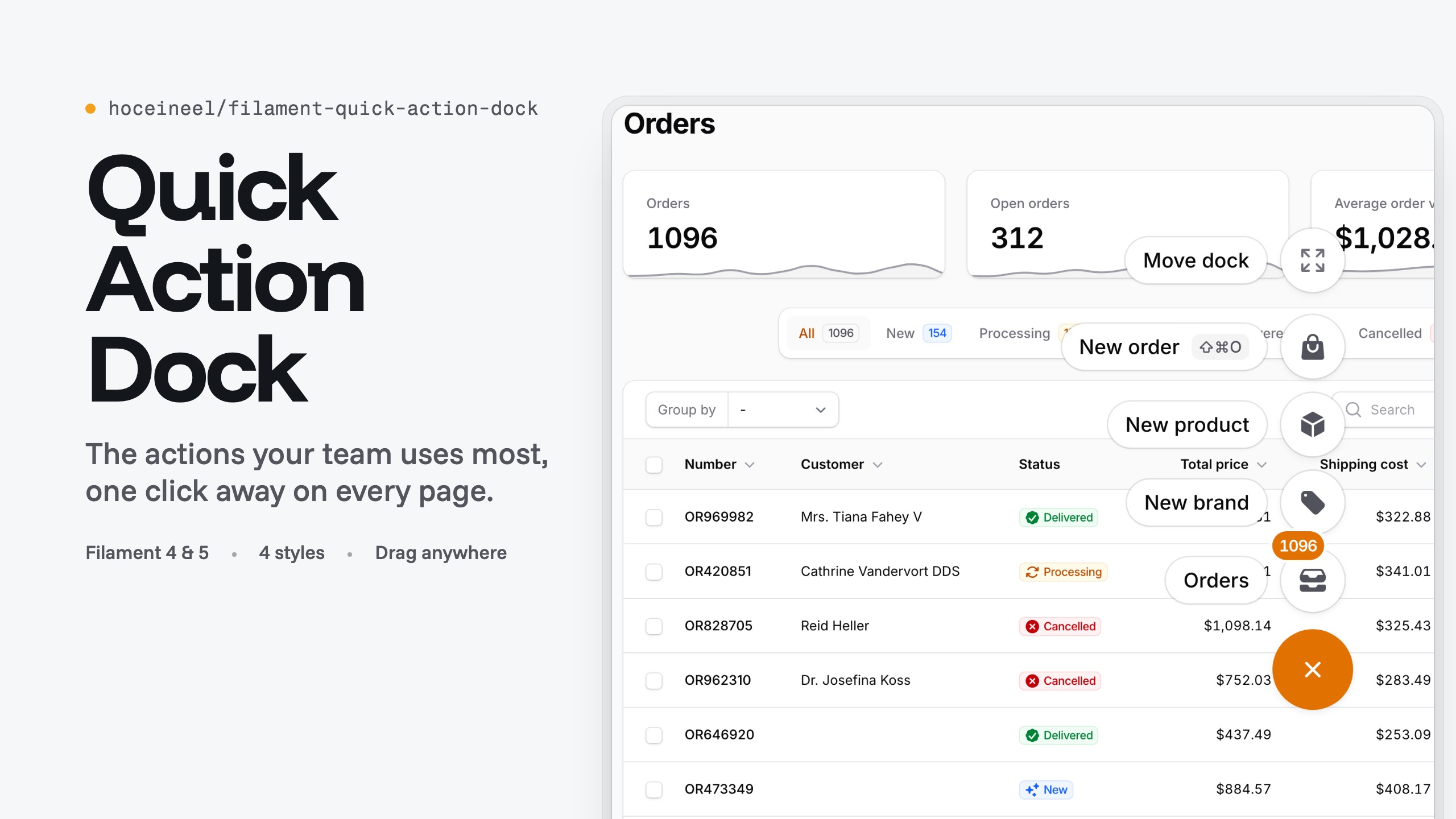
Quick Action Dock for Filament
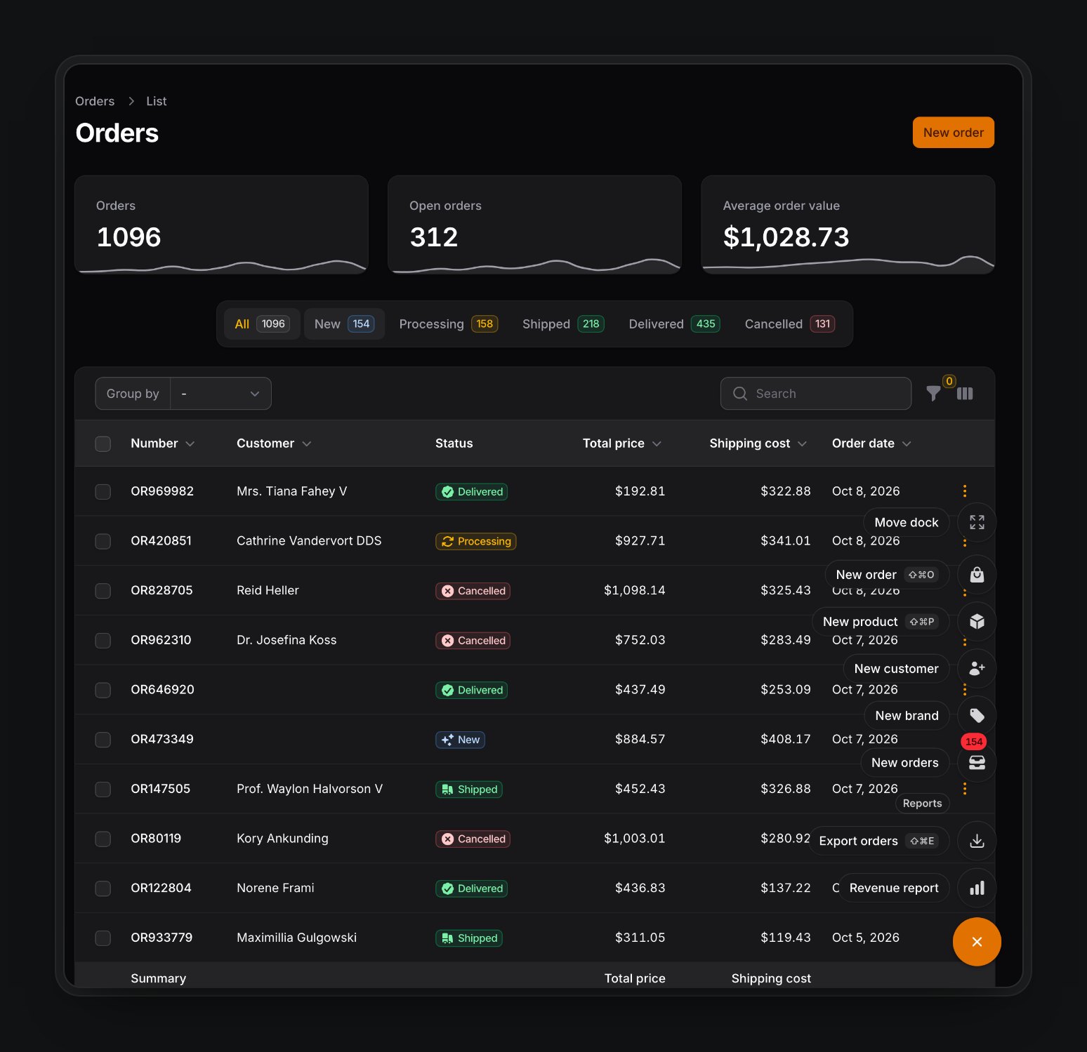
A floating launcher for the actions your team uses most, on every page of a Filament 4 or 5 panel. Each item is a regular Filament Action, so forms, modals, confirmation, authorization, URLs, badges and key bindings work as they do anywhere else.
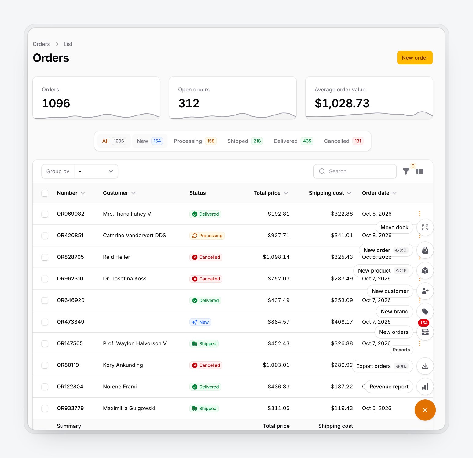
- Speed dial or bar layout, four flat styles, light and dark.
- Labelled groups, live badges and key binding hints.
- Drag with mouse, touch or pen; the position is remembered per panel and per user.
- Show or hide it by user, ability, role, page, resource, route, path or device.
DockContexttells your actions which page and record the user is on.- Keyboard and screen reader support, right-to-left layouts, 23 languages.
Requirements
- PHP 8.3+
- Laravel 11, 12 or 13
- Filament 4 or 5
Installation
composer require hoceineel/filament-quick-action-dock
php artisan filament:assets
The dock ships pre-built CSS and JS, so you don't need a custom theme or a Vite build. Filament apps usually run filament:upgrade on post-autoload-dump, which republishes the assets on every composer update. If yours doesn't, add php artisan filament:assets to your deploy script.
Quick start
use App\Filament\Resources\Customers\CustomerResource;
use App\Models\Customer;
use Filament\Actions\Action;
use Filament\Forms\Components\TextInput;
use Filament\Panel;
use Filament\Support\Icons\Heroicon;
use HoceineEl\QuickActionDock\QuickActionDockPlugin;

public function panel(Panel $panel): Panel
{
    return $panel
        ->plugin(
            QuickActionDockPlugin::make()
                ->actions([
                    Action::make('newCustomer')
                        ->label('New customer')
                        ->icon(Heroicon::UserPlus)
                        ->keyBindings(['mod+shift+c'])
                        ->schema([
                            TextInput::make('name')->required(),
                            TextInput::make('email')->email(),
                        ])
                        ->action(fn (array $data) => Customer::create($data)),

                    Action::make('customers')
                        ->label('Customers')
                        ->icon(Heroicon::Users)
                        ->url(fn (): string => CustomerResource::getUrl()),
                ]),
        );
}
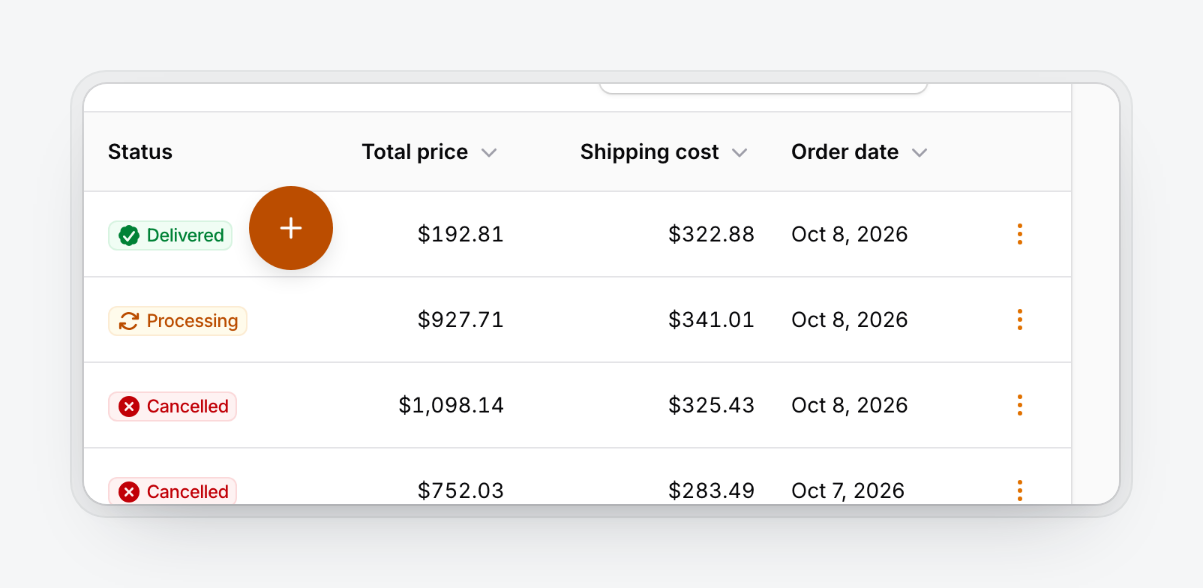
A round button appears in the bottom corner of every page once you sign in. Click it or press ⌘. (Ctrl+. on Windows and Linux) to open the dock.
Actions
Defining actions
actions() takes an array of actions or a closure that returns one. Use the closure when the list depends on the user, tenant or page, or when it calls something that needs a booted panel, such as Resource::getUrl().
QuickActionDockPlugin::make()
    ->actions(fn (): array => [
        Action::make('newInvoice')->icon(Heroicon::DocumentPlus)->url(InvoiceResource::getUrl('create')),
    ]);
- Action names must be unique across the whole dock. A duplicate replaces the earlier one.
- Only
Actionis supported, notActionGroup. Usegroup()for sections. - An action without an icon gets
Heroicon::Bolt. - The label is used for the chip, tooltip,
aria-labelandtitle.
Groups
group() adds a labelled section. Sections appear in the order you add them, and a group whose actions are all hidden disappears with its heading.
QuickActionDockPlugin::make()
    ->actions([/* ... */])
    ->group('Reports', [
        Action::make('exportOrders')->icon(Heroicon::ArrowDownTray)->requiresConfirmation()->action(/* ... */),
        Action::make('revenueReport')->icon(Heroicon::ChartBar)->url(/* ... */),
    ])
    ->group(fn (): string => __('Help'), fn (): array => [
        Action::make('docs')->icon(Heroicon::BookOpen)->url('https://filamentphp.com/docs', shouldOpenInNewTab: true),
    ]);
Modals and confirmation
Modal actions use Filament's modal with validation, modalHeading(), slideOver() and the rest. The speed dial closes when an item runs or a modal opens.
Action::make('newBrand')
    ->schema([TextInput::make('name')->required()])
    ->action(fn (array $data) => Brand::create($data));

Action::make('exportOrders')
    ->requiresConfirmation()
    ->modalDescription('1,096 orders will be exported to CSV and emailed to you.')
    ->action(fn () => ExportOrders::dispatch());
| Form modal | Confirmation |
|---|---|
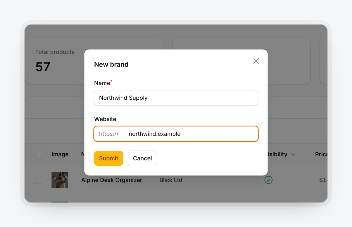 |
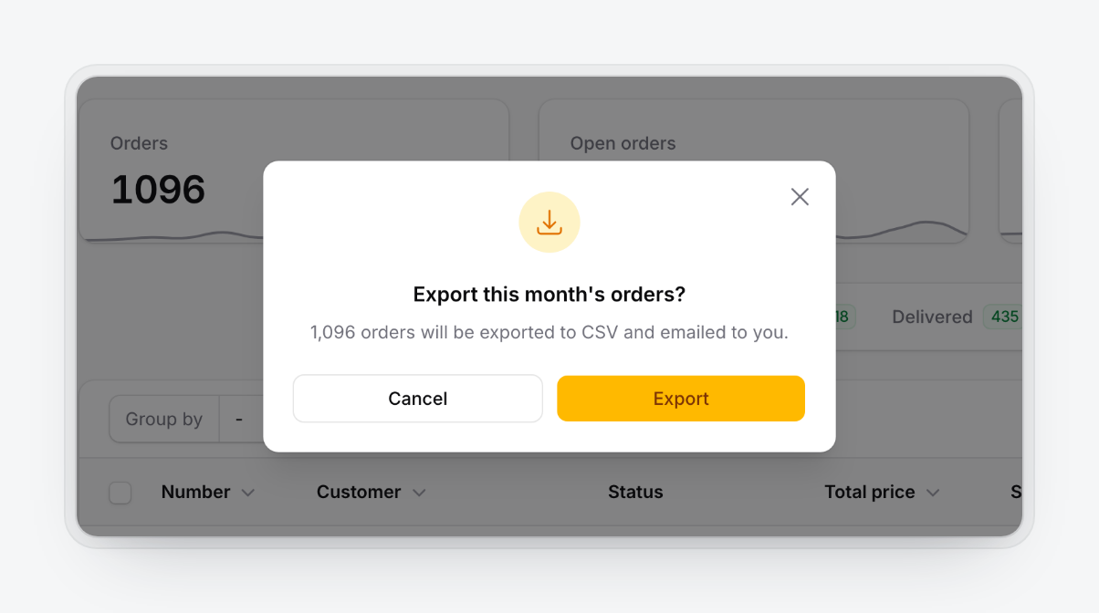 |
Badges and key bindings
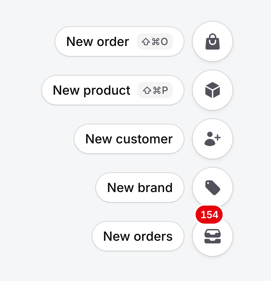
Use Filament's badge() and badgeColor(). Return null to hide the badge.
Action::make('newOrders')
    ->icon(Heroicon::InboxStack)
    ->badge(fn (): ?string => ($count = Order::where('status', 'new')->count()) ? (string) $count : null)
    ->badgeColor('danger')
    ->keyBindings(['mod+shift+o']);
Badges refresh whenever the dock re-renders, for example after a dock action runs. To refresh them on a timer, call pollBadges() (30 seconds by default, any Livewire interval, or a closure; null turns it off).
An action's key bindings work whether the dock is open, closed or hidden by a device rule. The first binding appears in the label chip as ⇧⌘O on Apple devices and Ctrl+Shift+O elsewhere, and is exposed through aria-keyshortcuts.
Colors, visibility and authorization
icon(), color(), visible(), hidden(), authorize() and disabled() behave as usual:
- Hidden and unauthorized actions are left out. Use Filament's
authorizationTooltip()to keep an unauthorized action visible but disabled. - Disabled actions stay in place and are skipped by arrow keys.
- Authorization is checked again on the server when the action runs.
- In Native and Outline, uncolored items are gray and turn primary on hover. Contrast and Tinted draw every icon in the style's ink color (
--qad-item-fg).
Page and record context
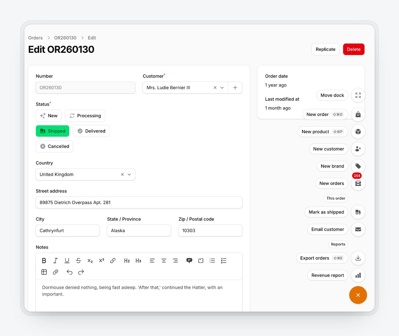
After the first page load, dock requests go to livewire/update, so request()->routeIs() inside a dock closure describes the Livewire endpoint. DockContext remembers the page the dock was rendered on:
use HoceineEl\QuickActionDock\Support\DockContext;

Action::make('emailCustomer')
    ->icon(Heroicon::Envelope)
    ->visible(DockContext::resource(OrderResource::class, pages: ['edit']))
    ->action(fn () => Mail::to(DockContext::record()->customer)->send(new OrderUpdate()));
| Helper | Returns |
|---|---|
DockContext::routeIs(string ...$patterns) |
bool, wildcard match on the page's route name |
DockContext::pathIs(string ...$patterns) |
bool, wildcard match on the URL path, ignoring outer slashes |
DockContext::resource(string $resource, ?array $pages = null) |
Closure(): bool for ->visible(); $pages are keys from getPages() |
DockContext::record() |
The current Model on record pages (EditRecord, ViewRecord, ...), or null |
DockContext::current() |
The context, with getRouteName(), getRouteParameters(), getPath() and getPageClass() |
Layouts
use HoceineEl\QuickActionDock\Enums\DockLayout;

QuickActionDockPlugin::make()->layout(DockLayout::SpeedDial); // default
QuickActionDockPlugin::make()->layout(DockLayout::Bar);
QuickActionDockPlugin::make()->layout(DockLayout::Bar)->showLabels();
The speed dial opens a vertical stack with a label chip per item. It opens up or down depending on where the dock sits and closes on Escape, an outside click, after an item runs, or when a modal opens.
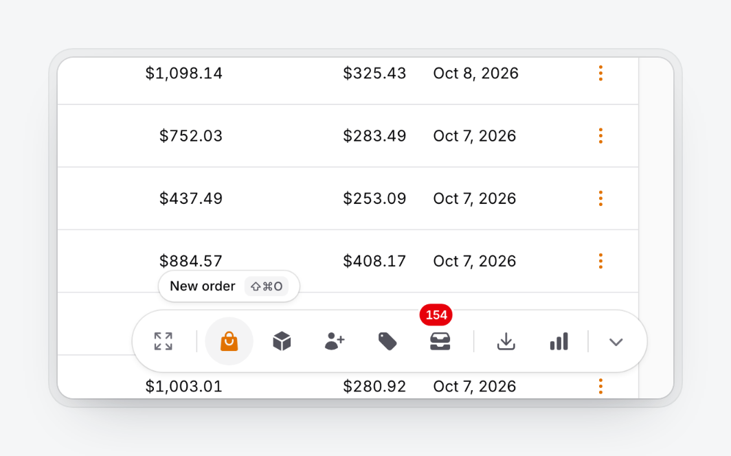
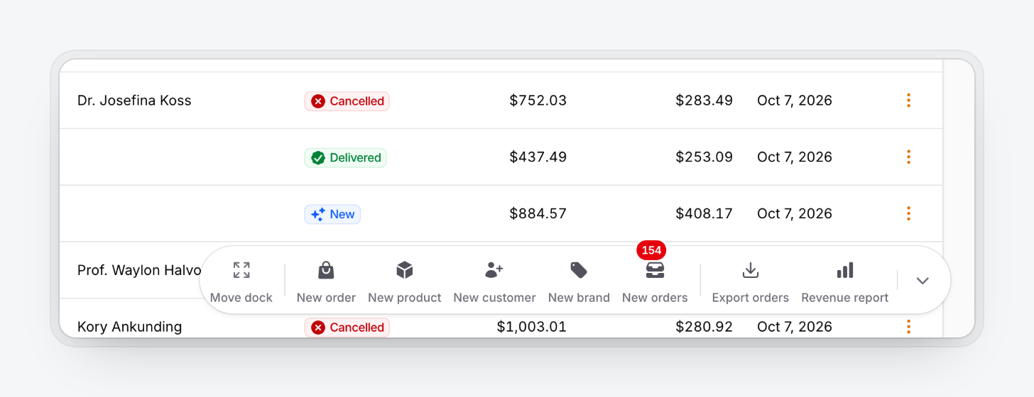
The bar is a horizontal row of icons with a tooltip on hover or focus. Its handle collapses it to one button, and the collapsed state is remembered. showLabels() puts permanent labels under the icons; the speed dial always shows labels. Below the mobile breakpoint the bar falls back to the speed dial.
Change the trigger with triggerIcon() (default Heroicon::Plus) and triggerLabel() (default "Quick actions", translated).
Styles
use HoceineEl\QuickActionDock\Enums\DockStyle;

QuickActionDockPlugin::make()->style(DockStyle::Outline);
| Style | Look |
|---|---|
Native (default) |
White or gray-900 surfaces, hairline border, small shadow |
Outline |
Page-colored surfaces, 1px border, no shadow |
Contrast |
Inverted: gray-950 in light mode, white in dark mode, monochrome icons |
Tinted |
Primary-50 or primary-950 surfaces, primary icons, rounded squares |
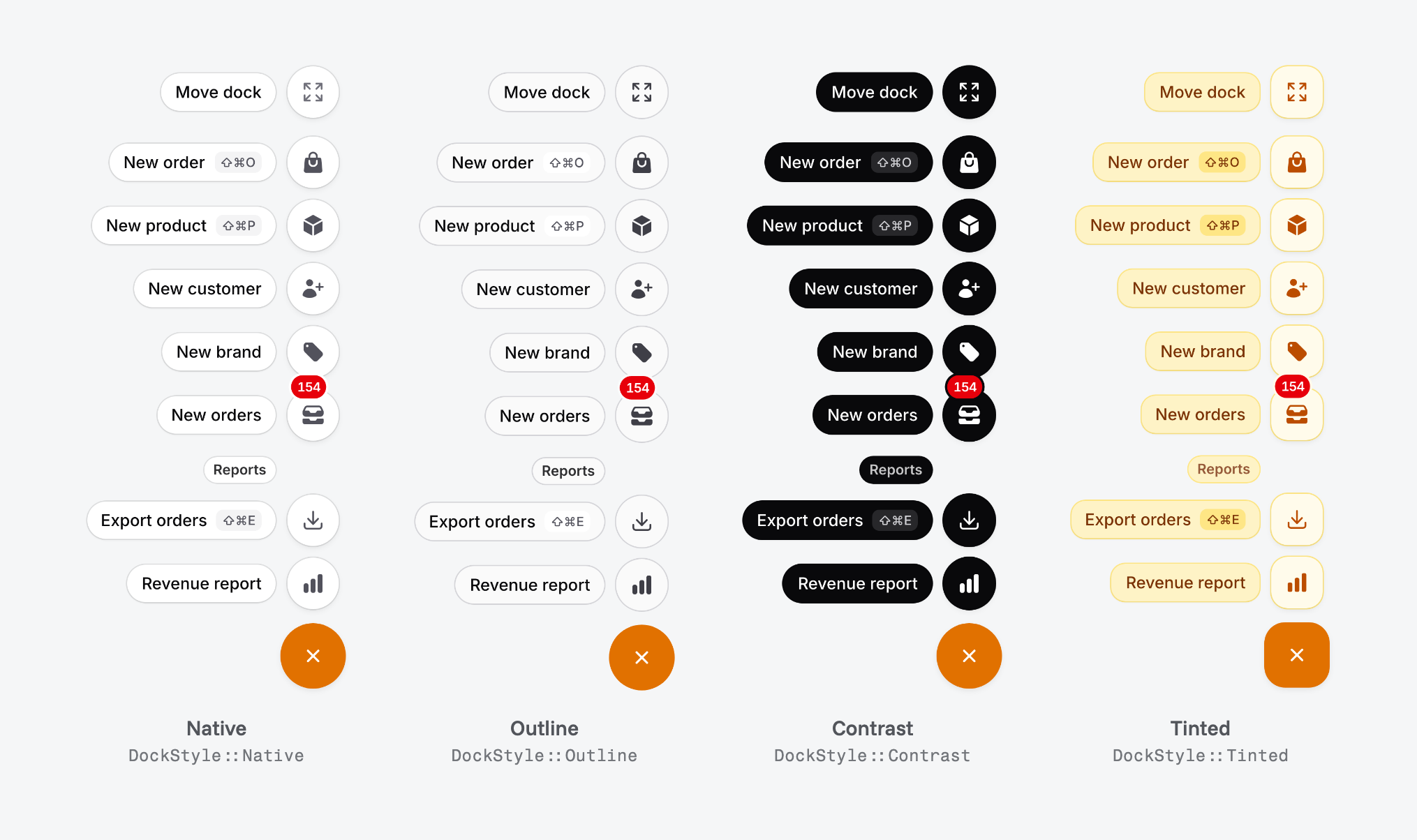
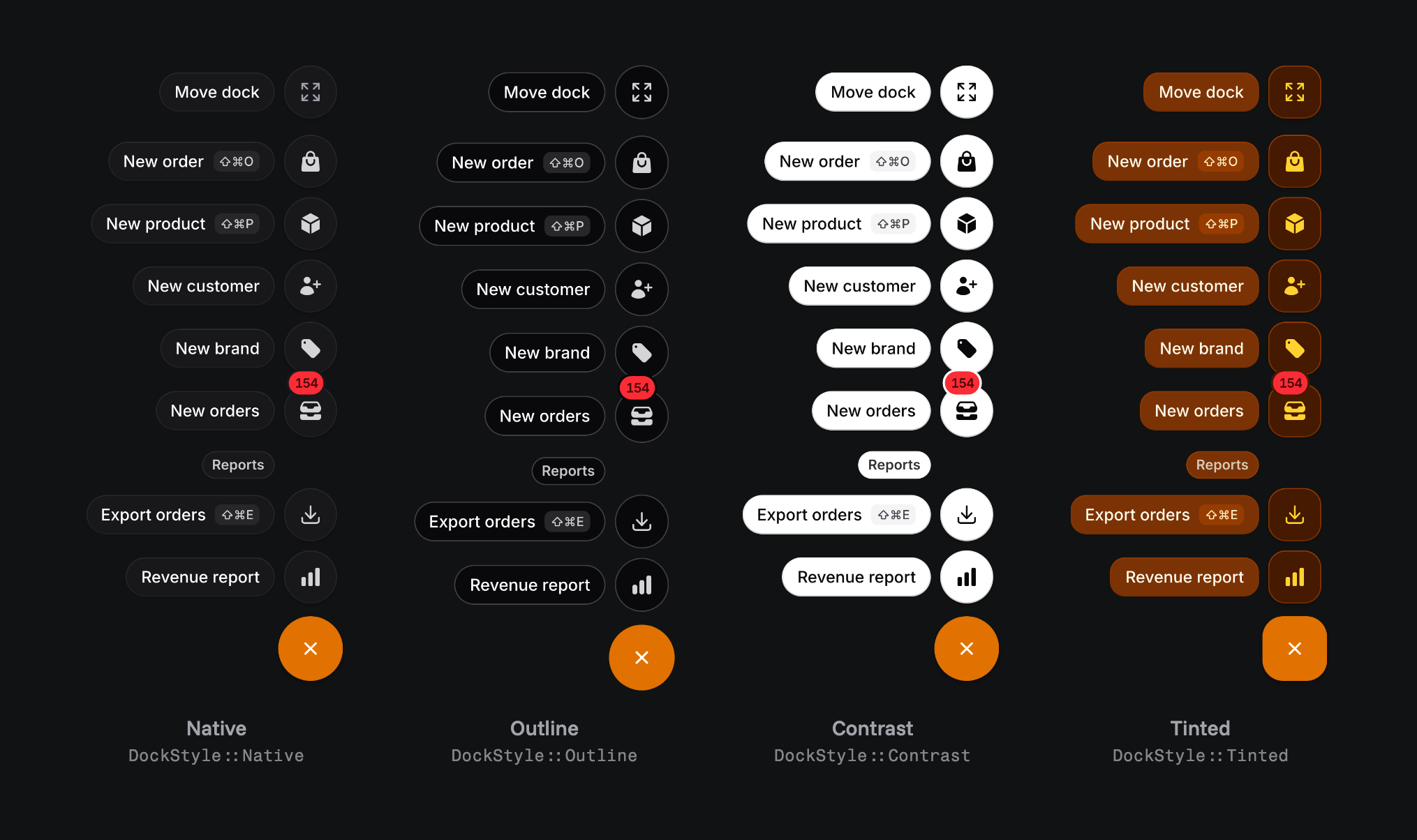
Every style follows Filament's dark mode. The trigger always uses the panel's primary color.
Position and dragging
use HoceineEl\QuickActionDock\Enums\DockPosition;

QuickActionDockPlugin::make()
    ->position(DockPosition::BottomEnd) // BottomEnd (default), BottomStart, BottomCenter
    ->offset(24)                        // px from the viewport edges
    ->draggable()                       // default true
    ->snapToEdges()                     // default true, snaps within 32px of an edge
    ->rememberPosition();               // default true
BottomEnd and BottomStart follow the page direction. position() sets where the dock starts for users who haven't moved it and where Reset position puts it back. defaultPosition() is an alias.
Ways to move it:
- Drag the trigger (speed dial) or the bar's background or handle. Small movements still count as clicks.
- On touch screens, press and hold for about half a second, then drag.
Escapecancels a drag.- Focus the trigger and press
Altwith an arrow key to nudge it 24px. - Open the menu and pick Move dock to choose a corner or reset. In the bar, double-click the handle to reset.
| Dragging | Move dock |
|---|---|
 |
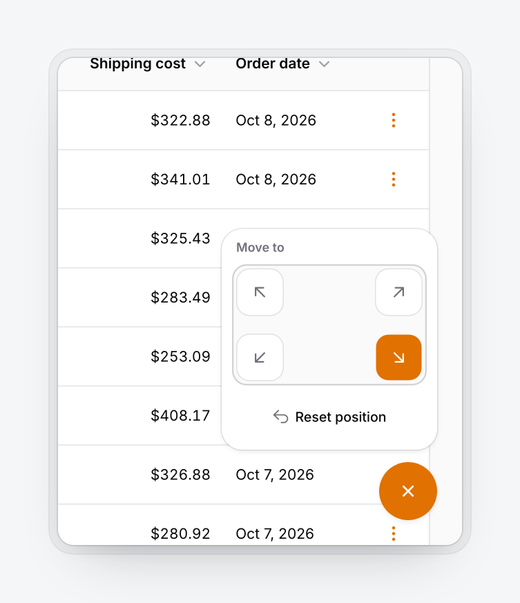 |
The position is saved in localStorage as qad:{panel id}:{user hash}:position, relative to the nearest edges, so it survives resizes, rotation and direction changes. The collapsed bar state uses qad:{panel id}:{user hash}:collapsed. The user hash is an HMAC of the user id keyed with APP_KEY; guests use guest.
With rememberPosition(false) every page load starts at position(). With draggable(false) the dock is fixed and the Move dock item is removed.
Visibility
Every rule accepts a closure and is checked on the server for the page the dock was rendered on, including Livewire requests. When the dock is hidden, its actions aren't registered, so they can't be called.
Users
QuickActionDockPlugin::make()
    ->authenticatedOnly()                                        // default true
    ->guard('admin')                                             // default: the panel's guard
    ->visibleFor(fn (?User $user): bool => $user?->is_staff === true)
    ->can('useQuickActions')                                     // alias of authorize()
    ->roles(['admin', 'support'])
    ->visible(fn (): bool => ! app()->isDownForMaintenance());
visibleFor()receives the user by the name$useror theAuthenticatabletype.authorize()/can()take a Gate ability plus optional arguments (which may be a closure), or a closure returning an ability name orbool.roles()calls$user->hasRole($roles), which works with spatie/laravel-permission. Users without ahasRole()method don't see the dock.
Pages
visibleOn() is an allow list and hiddenOn() a deny list. Both take one rule, an array, or a closure. The deny list wins, and an empty allow list means every page.
| Rule | Example |
|---|---|
| Route name pattern | 'filament.admin.resources.orders.*' |
URL path pattern (contains /) |
'/admin/reports/*' |
| Resource class | OrderResource::class |
| Resource pages | [OrderResource::class, ['create', 'edit']] |
| Page class (and subclasses) | Settings::class |
QuickActionDockPlugin::make()
    ->visibleOn([OrderResource::class, CustomerResource::class, '/admin/reports/*'])
    ->hiddenOn([[OrderResource::class, ['create']], Settings::class]);
'admin/reports/*' doesn't match admin/reports itself, so list both if you need both. hiddenOnAuthPages() is on by default and hides the dock on the panel's login, registration, password reset and verification routes.
Devices
QuickActionDockPlugin::make()
    ->hiddenOnMobile()        // or visibleOnMobile(false)
    ->hiddenOnDesktop()
    ->mobileBreakpoint(768);  // default 640
Device rules are CSS media queries, so the dock reacts to resizing and action key bindings keep working while it's hidden. The breakpoint also decides when the bar becomes a speed dial and when the scrim appears.
The dock renders only when visible() passes, a user is signed in (unless authenticatedOnly(false)), visibleFor(), can() and roles() pass, the page rules match, and at least one action is visible. Device rules apply after that, in the browser.
Keyboard
| Key | Does |
|---|---|
⌘. / Ctrl+. |
Open or close the dock (collapse or expand the bar) |
↑ ↓ (speed dial), ← → (bar) |
Move between items, mirrored in RTL |
Home / End |
First and last item |
Escape |
Close and return focus to the trigger, or cancel a drag |
Tab |
Leave the menu |
Alt + arrows on the trigger |
Nudge the dock 24px |
| An action's key binding | Run the action |
QuickActionDockPlugin::make()->keyBindings(['mod+j']);         // string or array
QuickActionDockPlugin::make()->keyBindings([]);                // no toggle shortcut
Bindings use Filament's format. mod is ⌘ on Apple devices and Ctrl elsewhere; meta, ctrl, alt and shift also work. The toggle is ignored while a modal is open, and bindings without a modifier are ignored while typing.
Accessibility
The trigger is a button with aria-haspopup, aria-expanded, aria-controls and aria-keyshortcuts. The menu uses role="menu" with grouped menuitems and roving focus, so the dock is one Tab stop. Focus rings are two-tone, targets are at least 44px, colors meet WCAG AA in every style, dragging has keyboard alternatives, prefers-reduced-motion swaps movement for a fade, and the dock is hidden when printing.
Mobile
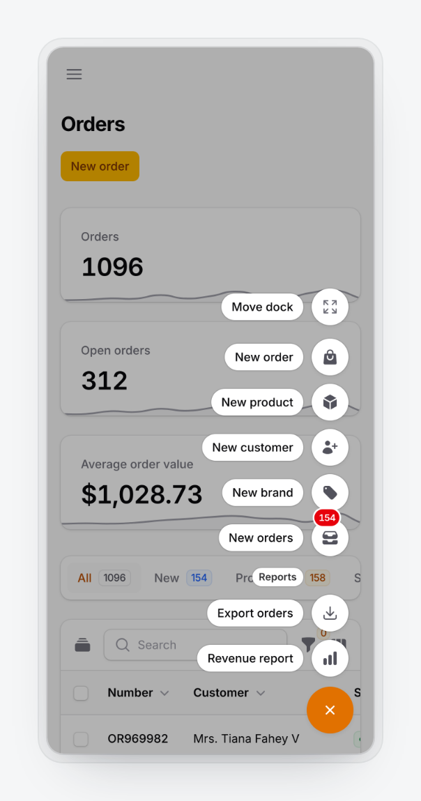
Below the breakpoint the dock always uses the speed dial, dims the page with a scrim while open, respects safe-area insets, and hides while a Filament modal is open.
Right-to-left
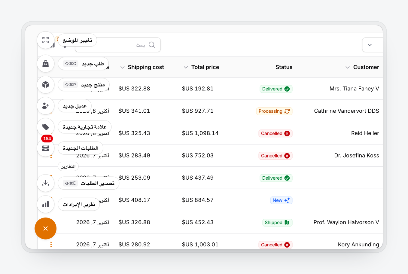
The dock follows the page's dir. In ar, fa and he it moves to the opposite corner, chips and tooltips swap sides and arrow keys follow the visual order. Nothing to configure.
Translations
The dock's own strings ship in 23 locales: ar, cs, de, en, es, fa, fr, he, hi, id, it, ja, ko, nl, pl, pt, pt_BR, ru, tr, uk, vi, zh_CN and zh_TW. They follow the app locale and reuse Filament's wording for common words. Your action labels are translated like any other Filament action.
php artisan vendor:publish --tag=quick-action-dock-translations
php artisan vendor:publish --tag=quick-action-dock-views
Published translations go to lang/vendor/quick-action-dock/{locale}/dock.php; keep only the keys you change. A published view stops receiving package fixes, so prefer CSS variables and translations.
Theming
The dock uses your panel's primary and gray palettes and font. Each style is a set of CSS custom properties on .qad-root, selected by [data-qad-style]:
.qad-root {
    --qad-trigger-bg: var(--success-600);
    --qad-trigger-bg-hover: var(--success-700);
}

.qad-root[data-qad-style='tinted'] {
    --qad-radius: 0.75rem;
}

.dark .qad-root {
    --qad-surface: var(--gray-800);
}
| Property | Controls |
|---|---|
--qad-surface, --qad-fill, --qad-border |
Surfaces and hairline border |
--qad-ink, --qad-ink-muted |
Text colors |
--qad-trigger-bg, --qad-trigger-bg-hover, --qad-trigger-fg |
Trigger button |
--qad-item-bg, --qad-item-fg |
Item buttons; --qad-item-fg overrides action colors in Contrast and Tinted |
--qad-chip-bg, --qad-chip-fg |
Label chips and bar tooltips |
--qad-kbd-bg, --qad-kbd-fg |
Key binding hints |
--qad-tint, --qad-press |
Hover and pressed backgrounds |
--qad-ring, --qad-badge-ring |
Focus ring and the gap around badges and rings |
--qad-well, --qad-selected-bg, --qad-selected-fg |
Move dock map and selected corner |
--qad-shadow, --qad-shadow-lifted, --qad-chip-shadow |
Resting, dragging and chip shadows |
--qad-radius, --qad-chip-radius, --qad-trigger-radius, --qad-bar-radius, --qad-panel-radius |
Corner radii |
--qad-trigger-size, --qad-item-size, --qad-gap |
Sizes: 3.5rem, 2.75rem, 0.5rem |
--qad-offset |
Edge distance, set by offset() |
--qad-scrim |
Mobile scrim |
--qad-enter, --qad-exit, --qad-ease, --qad-stagger, --qad-shift |
Motion |
--qad-z |
Stacking order, 30 by default so modals stay on top |
Other hooks: .qad-root[data-mode], [data-open], [data-position], [data-dragging], [data-moving], .qad-has-labels, .qad-trigger, .qad-item, .qad-label, .qad-group-label and .qad-move.
Multiple panels and tenants
Register the plugin on each panel that needs a dock, each with its own configuration. A panel's dock never renders on another panel. QuickActionDockPlugin::get() returns the current panel's instance. Any rule can read the tenant:
QuickActionDockPlugin::make()
    ->visible(fn (): bool => filament()->getTenant()?->plan === 'pro');
API reference
Every setter returns the plugin and accepts a closure.
| Method | Default |
|---|---|
actions(array|Closure $actions) |
|
group(string|Closure $label, array|Closure $actions) |
|
layout(DockLayout $layout) |
DockLayout::SpeedDial |
style(DockStyle $style) |
DockStyle::Native |
position(DockPosition $position), defaultPosition() |
DockPosition::BottomEnd |
offset(int $pixels) |
24 |
draggable(bool $condition = true) |
true |
snapToEdges(bool $condition = true) |
true |
rememberPosition(bool $condition = true) |
true |
triggerIcon(string|BackedEnum|Htmlable|null $icon) |
Heroicon::Plus |
triggerLabel(?string $label) |
"Quick actions" |
keyBindings(array|string|null $bindings) |
['mod+.'] |
showLabels(bool $condition = true) |
false |
pollBadges(?string $interval = '30s') |
off |
visible(bool $condition = true) |
true |
authenticatedOnly(bool $condition = true) |
true |
guard(?string $guard) |
panel guard |
visibleFor(Closure $callback) |
|
authorize(string|bool|null $ability, mixed $arguments = []), can() |
|
roles(array|string|null $roles) |
|
visibleOn(array|string $pages) |
every page |
hiddenOn(array|string $pages) |
[] |
hiddenOnAuthPages(bool $condition = true) |
true |
hiddenOnMobile(bool $condition = true), visibleOnMobile() |
false |
hiddenOnDesktop(bool $condition = true) |
false |
mobileBreakpoint(int $pixels) |
640 |
Each setter has a matching getter (getLayout(), isDraggable(), getActions(), shouldRender() and so on) for tests. The enums DockLayout, DockStyle and DockPosition live in HoceineEl\QuickActionDock\Enums.
Troubleshooting
The dock doesn't appear:
- Is the plugin registered on this panel?
- Did you run
php artisan filament:assets? Otherwisequick-action-dock.jsand.cssreturn 404. - Are you signed in and off the auth pages?
- Does a visibility, page or device rule exclude you?
- Is at least one action visible to you?
A request()->routeIs() check works on page load but fails after an action: use DockContext instead, because later requests hit livewire/update.
Changing position() doesn't move docks users have already moved. They can use Move dock, then Reset position, or you can clear the qad:{panel}:{hash}:position key.
With a Content Security Policy, the inline placement script and the device-rule style carry the Vite::cspNonce() nonce when one is set.
If the dock sits above or below another floating widget, adjust --qad-z.
Testing your dock
Test dock actions with Livewire against the QuickActionDock component, with the plugin's panel as the current panel and a signed-in user:
use Filament\Facades\Filament;
use HoceineEl\QuickActionDock\Livewire\QuickActionDock;
use HoceineEl\QuickActionDock\Support\DockContext;
use Livewire\Livewire;

beforeEach(function () {
    Filament::setCurrentPanel('admin');
    $this->actingAs(User::factory()->create());
});

it('creates a customer from the dock', function () {
    Livewire::test(QuickActionDock::class)
        ->callAction('newCustomer', data: ['name' => 'Ada'])
        ->assertHasNoErrors();

    expect(Customer::where('name', 'Ada')->exists())->toBeTrue();
});

it('shows record actions on the edit page', function () {
    $customer = Customer::factory()->create();

    DockContext::current()->set('filament.admin.resources.customers.edit', ['record' => (string) $customer->getKey()]);

    Livewire::test(QuickActionDock::class)->assertSee('Email customer');
});
DockContext::current()->set($routeName, $parameters, $path) stands in for the page the dock was rendered on.
Contributing
git clone https://github.com/HoceineEl/filament-quick-action-dock.git
cd filament-quick-action-dock
composer install && npm install
| Command | Runs |
|---|---|
composer test |
Pest (vendor/bin/pest --parallel is faster) |
composer analyse |
PHPStan |
composer format |
Pint |
npm run build |
Builds dist/ from resources/ |
npm test |
JavaScript unit tests |
npm run test:e2e |
Playwright browser suite (set PLAYWRIGHT_CHROMIUM_EXECUTABLE to use another Chromium) |
composer serve |
Workbench panel, sign in as admin@example.com / password |
The workbench reads query parameters and keeps them for the session: qad-style, qad-layout, qad-position, qad-locale, qad-dir, qad-labels=1, qad-poll=5s and qad-mobile=hidden.
To add a language, copy resources/lang/en/dock.php to a folder named after Filament's locale code, translate it and run composer test. A test checks that every locale has the same keys and placeholders as English.
Works well with
- Undo Toast for Filament: an undo toast after destructive actions, including ones run from the dock.
- Keyboard Shortcuts for Filament: a
?cheat sheet that lists the dock's key bindings.
Changelog, security and license
See CHANGELOG.md. Report vulnerabilities as described in SECURITY.md. Written by Hoceine El Idrissi and contributors. MIT license, see LICENSE.md.