dahmen / automad-bulma
A responsive multi-purpose theme for the Automad CMS based on the Bulma CSS framework.
Package info
github.com/marcantondahmen/automad-bulma
Type:automad-package
pkg:composer/dahmen/automad-bulma
Requires
- automad/meta-tags: ^1.1 || dev-master
- automad/package-installer: ^1.1 || dev-master
- components/jquery: ^3.3
This package is auto-updated.
Last update: 2026-04-15 19:50:00 UTC
README
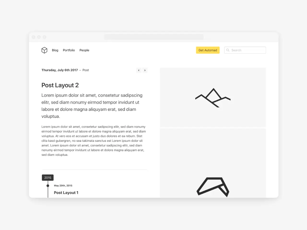
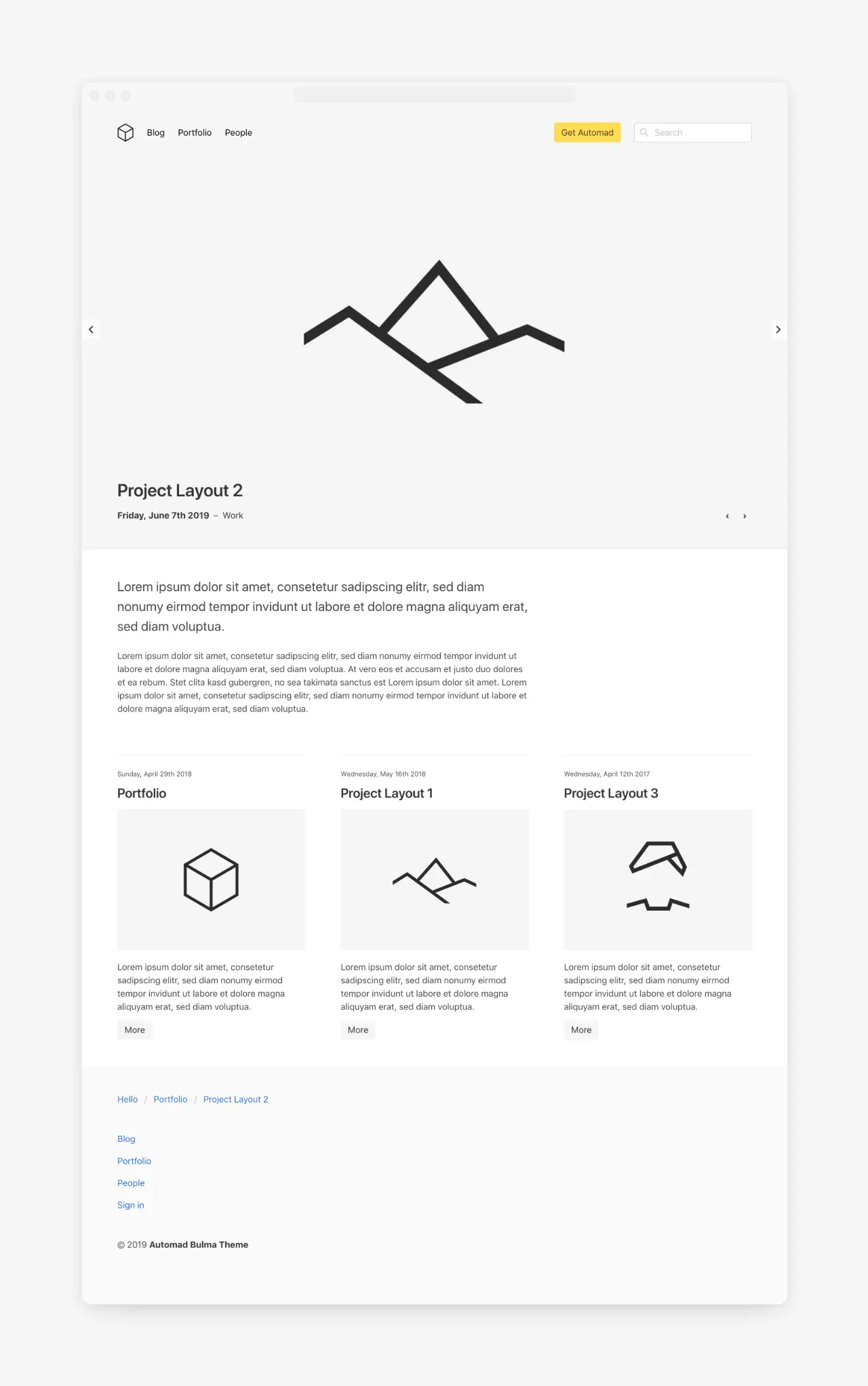
A responsive multi-purpose markdown-only theme for the Automad CMS based on the Bulma CSS framework. Check out the demo page and all available templates here.
Options
There are multiple variables used by this theme for configuration. Find below a list of available options to control the look and feel of your site.
Custom Bulma CSS
Since the theme is fully based on the Bulma framework, it is possible to use a customized version of Bulma. You can use the bulmaCss variable to provide an alternative URL for the .css file. A custom .css file can simply be uploaded in the shared data section of the dashboard. You can find more information about customizing Bulma here.
Styling Hero Content
You can add text or HTML markup to a hero banner using the textHero variable. Hero banner content can be styled using Bulma elements and modifiers. Take a look at the docs to find out more about working with Bulma.
Hero And Navbar Settings
There are several checkboxes to control the look of the hero section and the navbar.
logo: The path to your logo. By default the/shared/logo*.*pattern is used.logoHeight: Define the height of your logo.checkboxHeroFullHeight: Set the height of the hero section to 100% of the viewport.checkboxNavbarOpaque: Make the navbar background opaque.checkboxNavbarDark: Apply a dark theme to the navbar to be used with dark hero images.checkboxNavbarRight: Place menu items on the right of the navbar.checkboxHideSecondLevelNavbar: Hide the second level (dropdowns) of the navbar menu.
Slideshow Images
You can use the images variable to define a set of images to be used in a hero section or carousel slideshow. A * can be used in file patterns to represent zero or more characters. Multiple patterns can be separated by a comma. A typical pattern looks like:
*.jpg, *.png, *.gif
Search
The search field in the navbar can be enabled by defining a page as a results page. Therefore simply enter the internal URL of one of your pages for the urlSearchResults variable in the Shared Data & Settings section of the Dashboard. Note that the selected page needs to have a template including a pagelist like Blog or Portfolio.
Navbar Action Button
To highlight a certain action of your site you can define an internal or external URL for the urlActionButton. A primary button will then appear in your navbar.
Sorting Pagelists
By default, pagelists are sorted by date descending. You can change that behavior by adding a value for the sortPages variable on a blog or portfolio page. To define the sorting of pages in the list, you have to provide a combination of the variable to sort the pages by and a sorting order like date desc or title asc.
Template Filters
You can use a regex for the templateFilter variable to filter a pagelist by the templates of the pages.
Open Graph Images
Title and description are automatically used for open graph tags to be used as preview when sharing a page. You can also define a pattern to be used for the preview image used as the value for the og:image property. A good pattern would be *.jpg, *.png, /shared/og.png. With this pattern, the first JPG or PNG image would be used as preview image while using a file called og.png in the shared files section as a fallback for pages without any image.


