automad / standard-v1
The official Automad Standard theme v1.
Maintainers
Package info
github.com/automadcms/automad-standard-v1
Language:Less
Type:automad-package
pkg:composer/automad/standard-v1
Requires
- automad/meta-tags: ^1.1 || dev-master
- automad/package-installer: ^1.1 || dev-master
README
A clean and elegant multi-purpose theme for Automad that comes with a light and dark flavor. It provides several options to display your content. Please read below more about the main concepts of this theme.
- Templates
- Colors
- Writing Content
- Overriding Theme Styles
- Pagelist Configuration
- Title, Navigation, Filtering and Sorting
- Transparent Navbars
- Logo and Brand
- Labels
- Date Formats
- Social Media Cards
- Header and Footer Items
- Slideshows
Templates
The following templates are included in this theme.
| Name | Description |
|---|---|
| Blog | A blog page grid template. Articles are displayed along with their teaser image, date, tags and the first paragraph. |
| Blog Classic | A classic blog template. Articles are stacked vertically and displayed along with their teaser image, date, tags and the first paragraph. |
| Portfolio | A portfolio page grid template. Projects are displayed along with their teaser image, date and tags. |
| Post | A blog post template. Related pages are displayed below the main content. |
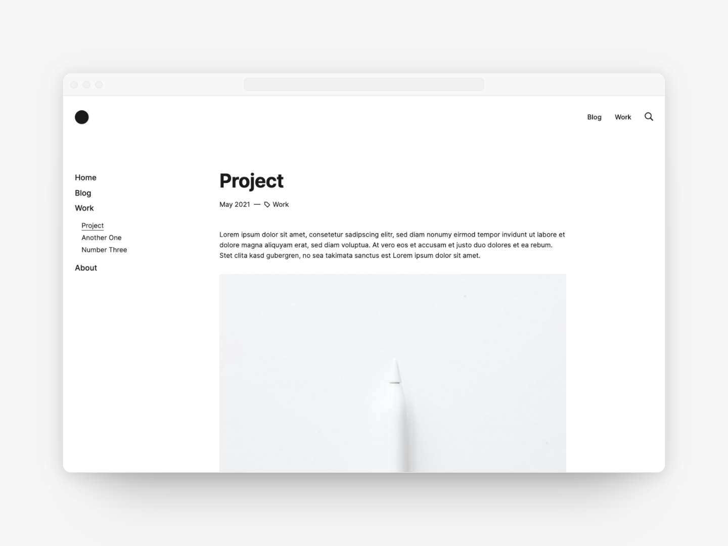
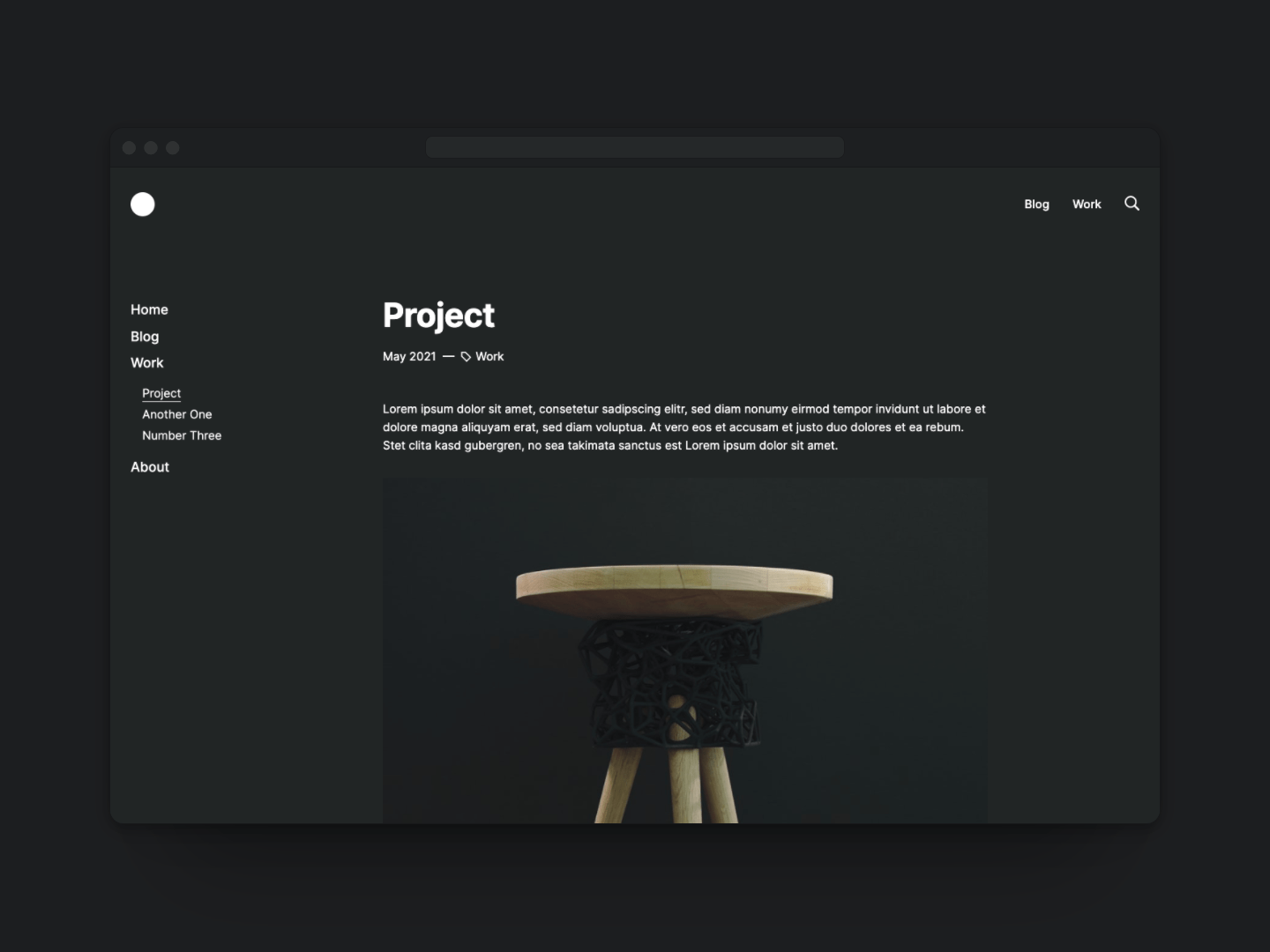
| Project | A project page template. Related pages are displayed below the main content. |
| Sidebar Left | A multi-purpose template with a navigation sidebar on the left. |
| Sidebar Right | A multi-purpose template with a navigation sidebar on the right. |
Colors
While there is a light and a dark theme serving as presets, all the colors used in the templates are fully customizable.
| Name | Description |
|---|---|
| Color Page Text | A custom override text color for a page |
| Color Page Background | A custom override background color for a page |
| Color Page Border | A custom override border color for a page |
| Color Navbar Text | A custom override text color for a navbar |
| Color Navbar Background | A custom override background color for a navbar |
| Color Navbar Border | A custom override border color for a navbar |
| Color Card Text | A custom override text color for cards |
| Color Card Background | A custom override background color for cards |
| Color Card Border | A custom override border color for cards |
| Color Code Background | A custom override background color for code blocks |
Writing Content
There are two block areas — the teaser and the main area.
| Name | Description |
|---|---|
| +Hero | The hero section. Note that you can stretch that area to the full width of a page. |
| +Main | The main content block area. |
Overriding Theme Styles
Apart from colors, also other styles can be overriden using CSS custom properties.
Those overrides can be easily defined by adding a <style> tag to the Items Header variable of
either a page or in the Shared Data and Settings section of the dashboard.
The following example demonstrates how to change the font weight of the h1 and h2 headlines:
<style>
    :root {
        --h1-font-weight: 500;
        --h2-font-weight: 480;
    }
</style>
It is also possible to change the font family for headings by embedding some Google fonts as well:
<link rel="preconnect" href="https://fonts.gstatic.com">
<link href="https://fonts.googleapis.com/css2?family=Lobster&display=swap" rel="stylesheet">
<style>
    :root {
        --heading-font-family: 'Lobster', cursive;
    }
</style>
There are many other custom properties available. A full list can be found here.
Pagelist Configuration
This theme offers multiple options and two templates — Blog and Portfolio — to create pagelists. The following options can be used to control the content of such a pagelist. Pagelist templates can also be used to create a search results page.
| Name | Description |
|---|---|
| Show All Pages In Pagelist | If checked, the pagelist includes all pages instead of just the direct children. |
| Filter Pagelist By Url | Filters the pagelist by URLs matching a given regular expression like for example (/portfolio | /blog). |
| Notification No Search Results | The notification text for empty search results. |
| Items Per Page | The maximum number of pages to be displayed in a pagelist at once. In case there are more pages to be shown, a pagination navigation will show up below automatically. |
| Url Show Pages Below | Show only direct children of a custom local URL like /custom/page |
| Url Search Results | The local URL of the pagelist page to be used as the search results page. Note that the search field in the menu is only enabled in case an URL is defined. |
| Url Tag Link Target | The target page to navigate to when clicking a tag. By default the parent page is used. |
| Image Teaser | The filename or glob pattern for the image to be used as the teaser image in a pagelist. |
| Hide Thumbnails | Hide teaser images in page grid. |
| Sort Pagelist | Sorting of the pages in a portfolio or blog pagelist. Note that the sorting and filtering buttons should be hidden in case this variable is defined! The default is 'date desc'. You can choose any other page variable in combination with an order (asc or desc) like ':path asc'. |
| Sort Related Pages | Sorting of the pagelist with related pages. The default is 'date desc'. You can choose any other page variable in combination with an order (asc or desc). |
| Use Alternative Pagelist Layout | Use an alternative layout for blog, portfolio or related pages pagelists. |
Related Pages
Related pages are pages having one or more tags in common with the current page. By default they show up at the bottom below the page content.
They can be disabled by checking the Hide Related Pages checkbox.
Title, Navigation, Filtering and Sorting
The following checkboxes can be used to control the visibility of pages and elements.
| Name | Description |
|---|---|
| Hide Filters | Hide the filter and search reset buttons on a blog page. |
| Hide Filters And Sort | Hide filter, sort and search reset buttons on a portfolio page. |
| Hide In Menu | Hide the page from the main menu. |
| Hide Prev Next Nav | Hide the previous and next arrow navigation around the title. |
| Hide Title | Hide the page title. |
| Show In Footer | Add the page to the footer menu. |
| Show In Navbar | Add the page to the navbar menu. |
Transparent Navbars
By default the navbar inherits its background color from the page. In order to have a nice stretched
teaser image that also serves as background for your navbar, you can toggle the Make Transparent Navbar
checkbox to make the navbar fully transparent on load.
Logo and Brand
To set the brand name, a navbar logo and favicons, use the following options.
| Name | Description |
|---|---|
| Brand | The brand HTML, SVG or text to be used instead of a logo. |
| Image Logo | The path to your logo - this variable should be defined globally in the shared data section. |
| Logo Height | The height of your logo - this variable should be defined globally in the shared data section. |
| Favicon | The local path to the icon to be used as favicon. |
| Image Apple Touch Icon | The image to be used as the Apple touch icon. |
| Icon Panel | A little SVG icon representing a page in a pagelist card. |
| Icon Nav | A little SVG icon representing a page in a menu. |
Labels
All labels, button text, placeholders and notification texts can be overriden or translated as needed. The following variables are therefore available.
| Name | Description |
|---|---|
| Label Clear Search | Button text for clearing search results. |
| Label Realated | Label for related pages section. |
| Label Show All | Label text for filter button when no filter is selected. |
| Label Sort Date Asc | Label text in dropdown for sorting pages by date ascending. |
| Label Sort Date Desc | Label text in dropdown for sorting pages by date descending. |
| Label Sort Title Asc | Label text in dropdown for sorting pages by title ascending. |
| Label Sort Title Desc | Label text in dropdown for sorting pages by title descending. |
| Notification No Search Results | Notification text for an empty list of search results. |
| Placeholder Search | Placeholder text for the search field of the main menu. |
Date Formats
This theme uses two different date formats. One for blog posts and another one for project pages. It is possible to override those formats to change the way a date appears on a page. Both, ICU and date() formats are supported.
Note that the locale option can be only used together with the ICU syntax. Therefore whenever you want your dates to be localized, you must use the ICU syntax.
| Name | Description |
|---|---|
| Format Date Post | The format for displaying the date of a post. |
| Format Date Project | The format for displaying the date of a project page. |
| Locale | The locale information to format date and time according to like en_EN or de_DE |
Social Media Cards
This theme automatically generates preview cards when a page is linked in Twitter, Facebook or other social networks. The following options can be used to control the content of those cards.
| Name | Description |
|---|---|
| Meta Description | An optional meta description to be used for Twitter, Facebook or similar social network cards. |
| Meta Title | An optional meta title to be used for the browser title bar and links used on Twitter, Facebook or similar social networks. |
| Og Image | A glob pattern to select a preview image for Twitter, Facebook or similar social network cards. This could be for example *.png, *.jpg. |
Header and Footer Items
Sometimes it is required to add custom Javascript or CSS to one or more pages.
This could be for example the case if you would want to add a Google Analytics tracking snippet to your site.
Therefore this theme provides two variables for that purpose.
The Items Header variable lets you add all kind of header items right before the closing </head> tag.
To add any HTML or JS right before the closing </body> tag you can use the Items Footer variable.
| Name | Description |
|---|---|
| Items Header | Items to be inserted before the closing </head> tag. |
| Items Footer | Items to be inserted before the closing </body> tag. |
Slideshows
As described before, it is either possible to used the block editor or the traditional Markdown editor to create content. Since the markdown editor is not able to create content like a slideshow, there are two separate variables available for project pages and posts to insert a slideshow right after the teaser when using Markdown.
| Name | Description |
|---|---|
| Images Slideshow | One or more glob patterns to define the images showing up in the slideshow. |
| Slideshow Height | The relative height of the slideshow depending on the width. |