rifrocket / filament-alert-box
A modern, customizable alert box plugin for FilamentPHP with render hooks support. Create beautiful alerts with a fluent, chainable API across 4 different layout types.
Maintainers
Requires
- php: ^8.1
- filament/filament: ^3.0
- illuminate/support: ^10.0|^11.0
Requires (Dev)
- laravel/pint: ^1.0
- orchestra/testbench: ^8.0|^9.0
- pestphp/pest: ^2.0
- pestphp/pest-plugin-laravel: ^2.0
- phpunit/phpunit: ^10.0|^11.0
README
Alert Box
A modern, customizable alert box plugin for FilamentPHP with render hooks support. Create beautiful alerts with a fluent, chainable API across 4 different card styles.
Features
- 🎨 4 Beautiful Card Styles - Banner, Card with Border, Modern Card, and Minimalist
- 🔗 Fluent Chainable API -
AlertBox::make('Title')->success()->modernCard()->show() - 🎯 FilamentPHP Render Hooks - Perfectly integrated with Filament's architecture
- 💾 In-Memory Storage - No database or session dependencies
- 🎭 Auto-Hide & Permanent - Configure timeout or make alerts persistent
- 🎪 Customizable Icons & Colors - Full control over appearance with 5 icon sizes (xs, s, m, lg, xl)
- ⚡ Zero Configuration - Works out of the box
- 📱 Responsive Design - Works on all screen sizes
Installation
Install the package via Composer:
composer require rifrocket/filament-alert-box
Register the plugin in your Panel provider:
use RifRocket\FilamentAlertBox\AlertBoxPlugin;

public function panel(Panel $panel): Panel
{
    return $panel
        ->plugins([
            AlertBoxPlugin::make(),
        ]);
}
Optionally, publish the views:
php artisan vendor:publish --tag=alert-box-views
Usage
Basic Usage
use RifRocket\FilamentAlertBox\Facades\AlertBox;

// Simple success alert
AlertBox::make('Operation Successful')
    ->success()
    ->show();

// Error alert with description
AlertBox::make('Error Occurred')
    ->message('Something went wrong while processing your request.')
    ->danger()
    ->permanent()
    ->show();
Card Styles
Choose from 4 beautiful card styles:
// Style 1: Simple Banner (default)
AlertBox::make('Welcome')->success()->bannerStyle()->show();

// Style 2: Card with Border
AlertBox::make('Information')->info()->cardWithBorder()->show();

// Style 3: Modern Card
AlertBox::make('Warning')->warning()->modernCard()->show();

// Style 4: Minimalist
AlertBox::make('Update Available')->info()->minimalistStyle()->show();

// Or use the generic method
AlertBox::make('Custom')->success()->cardStyle(2)->show();
Position-Based Methods
Use position-specific methods to control WHERE alerts appear:
AlertBox::make('Header Alert')->success()->pageHeaderAfter()->show();
AlertBox::make('Sidebar Alert')->warning()->sidebarNavEnd()->show();
AlertBox::make('Topbar Alert')->info()->topBarStart()->show();
AlertBox::make('Footer Alert')->info()->footer()->show();
Combining Style and Position
Mix card styles with positions for complete control:
// Modern card in header position
AlertBox::make('Welcome')->success()->modernCard()->pageHeaderAfter()->show();

// Minimalist style in topbar
AlertBox::make('Quick Notice')->info()->minimalistStyle()->topBarStart()->show();

// Bordered card at page end
AlertBox::make('Done!')->success()->cardWithBorder()->pageEnd()->show();
Alert Types
// Success alerts
AlertBox::make('Success!')->success()->show();

// Error/Danger alerts
AlertBox::make('Error!')->danger()->show();
AlertBox::make('Error!')->error()->show(); // Alias for danger

// Warning alerts
AlertBox::make('Warning!')->warning()->show();

// Info alerts (default)
AlertBox::make('Information')->info()->show();
Advanced Configuration
AlertBox::make('Custom Alert')
    ->message('This is the main message')
    ->description('Additional description text')
    ->icon('heroicon-o-check-circle')
    ->iconColor('#10b981')
    ->titleColor('#059669')
    ->success()
    ->modernCard() // Use modern card style
    ->pageHeaderAfter() // Position in header
    ->canBeClose(true)
    ->autoDisappear(10) // Auto-hide after 10 seconds
    ->classes('custom-alert-class')
    ->style('border: 2px solid red;')
    ->show();
Auto-Hide vs Permanent
// Auto-hide after 5 seconds
AlertBox::make('Auto Hide')
    ->success()
    ->autoDisappear(5)
    ->show();

// Permanent alert (user must close)
AlertBox::make('Important Notice')
    ->warning()
    ->permanent()
    ->show();

// Closeable control
AlertBox::make('Closeable Alert')
    ->info()
    ->canBeClose(false) // Cannot be closed by user
    ->show();
Quick Static Methods
Convenience methods for rapid alert creation:
// Quick success alert
AlertBox::success('Operation completed successfully!')->show();

// Quick error alert
AlertBox::error('Something went wrong!')->show();

// Quick warning alert
AlertBox::warning('Please check your input.')->show();

// Quick info alert
AlertBox::info('Here is some information.')->show();

// Chain additional methods with quick methods
AlertBox::success('Data saved!')
    ->modernCard()
    ->autoDisappear(5)
    ->pageHeaderAfter()
    ->show();
API Reference
AlertBuilder Methods
| Method | Description | Example |
|---|---|---|
make(string $title = null) |
Create new alert builder | AlertBox::make('Title') |
title(string $title) |
Set alert title | ->title('Alert Title') |
message(string $message) |
Set alert message (alias for description) | ->message('Alert message') |
description(string $description) |
Set alert description | ->description('Alert description') |
cardStyle(int $style) |
Set card style (1-4) | ->cardStyle(2) |
bannerStyle() |
Simple banner style | ->bannerStyle() |
cardWithBorder() |
Card with border style | ->cardWithBorder() |
modernCard() |
Modern card style | ->modernCard() |
minimalistStyle() |
Minimalist style | ->minimalistStyle() |
icon(string $icon) |
Set alert icon | ->icon('heroicon-o-check') |
noIcon(bool $state = true) |
Disable alert icon | ->noIcon() |
iconColor(string $color) |
Set icon color | ->iconColor('#10b981') |
iconSize(string $size) |
Set icon size (xs, s, m, lg, xl) | ->iconSize('lg') |
iconXS() |
Set extra small icon | ->iconXS() |
iconS() |
Set small icon | ->iconS() |
iconM() |
Set medium icon (default) | ->iconM() |
iconLG() |
Set large icon | ->iconLG() |
iconXL() |
Set extra large icon | ->iconXL() |
titleColor(string $color) |
Set title color | ->titleColor('#059669') |
descriptionColor(string $color) |
Set description color | ->descriptionColor('#6b7280') |
success() |
Set as success alert | ->success() |
danger() |
Set as danger alert | ->danger() |
error() |
Alias for danger | ->error() |
warning() |
Set as warning alert | ->warning() |
info() |
Set as info alert | ->info() |
canBeClose(bool $closeable = true) |
Set closeable | ->canBeClose(false) |
autoDisappear(int $seconds) |
Auto-hide timeout | ->autoDisappear(10) |
permanent(bool $permanent = true) |
Make permanent | ->permanent() |
classes(string $classes) |
Add CSS classes | ->classes('my-class') |
style(string $style) |
Add inline styles | ->style('color: red;') |
position(string $position) |
Set custom position | ->position('custom-hook') |
renderHook(string $hook) |
Set render hook | ->renderHook(PanelsRenderHook::PAGE_START) |
show() |
Display the alert | ->show() |
Position Methods
| Method | Description | Hook |
|---|---|---|
pageHeaderAfter() |
After page header widgets | PAGE_HEADER_WIDGETS_AFTER |
pageStart() |
At page start | PAGE_START |
sidebarNavEnd() |
End of sidebar navigation | SIDEBAR_NAV_END |
topbarStart() |
Start of topbar | TOPBAR_START |
pageEnd() |
At page end | PAGE_END |
footer() |
In footer | FOOTER |
Manager Methods
use RifRocket\FilamentAlertBox\AlertBoxManager;

// Get alerts for position
$alerts = AlertBoxManager::getAlerts('position');

// Clear alerts for position
AlertBoxManager::clearAlerts('position');

// Clear all alerts
AlertBoxManager::clearAll();

// Get alert count
$count = AlertBoxManager::getAlertCount();
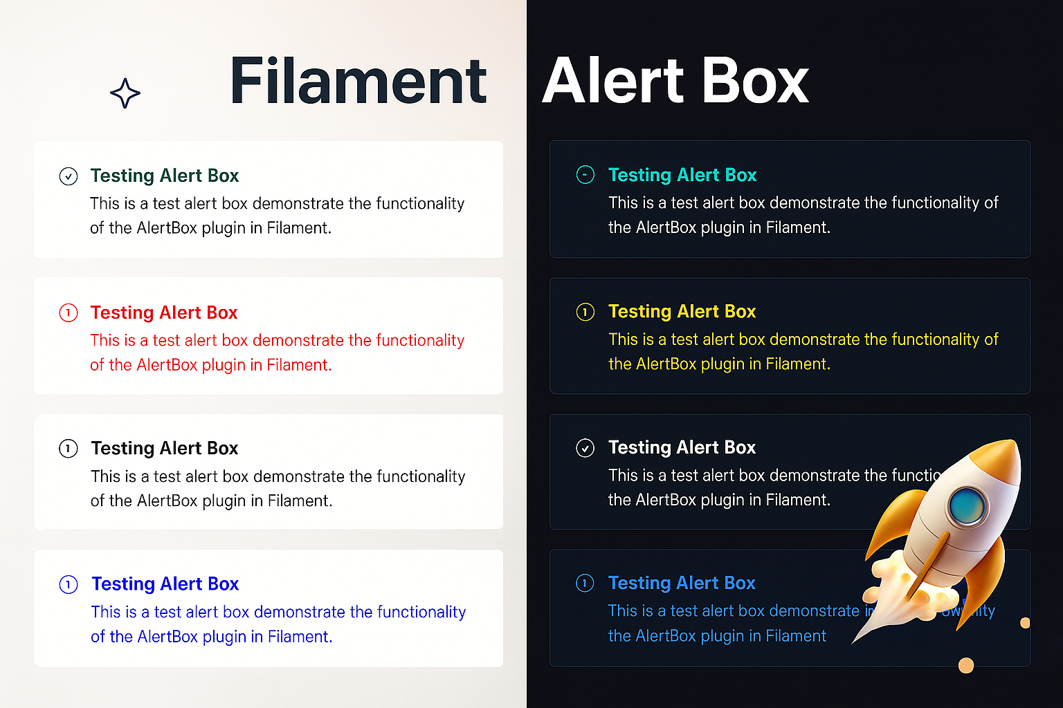
Card Style Previews
Style 1: Simple Banner
Clean, simple banner-style alert with a colored left border. Perfect for basic notifications.
Style 2: Card with Border
Enhanced card with a full border, more padding, and refined styling. Great for important messages.
Style 3: Modern Card
Premium card design with gradient top border, enhanced shadows, and sophisticated styling. Best for key announcements.
Style 4: Minimalist
Compact, clean design with minimal styling. Perfect for subtle notifications and inline messages.
Customization
Publishing Views
php artisan vendor:publish --tag=alert-box-views
The alert styles use Tailwind CSS utility classes exclusively. You can customize the appearance by publishing and modifying the Blade views at resources/views/vendor/alert-box/.
Custom Icons
Use any Heroicon or custom icon with different sizes:
AlertBox::make('Custom Icon')
    ->icon('heroicon-o-star')
    ->iconSize('lg') // or ->iconLG()
    ->success()
    ->show();
Icon Sizes
Choose from 5 different icon sizes:
// Extra Small (3x3)
AlertBox::make('Minimal Alert')->iconXS()->info()->show();

// Small (4x4)
AlertBox::make('Small Alert')->iconS()->warning()->show();

// Medium (6x6) - Default
AlertBox::make('Normal Alert')->iconM()->success()->show();

// Large (8x8)
AlertBox::make('Important Alert')->iconLG()->danger()->show();

// Extra Large (10x10)
AlertBox::make('Critical Alert')->iconXL()->error()->show();
Requirements
- PHP 8.1+
- FilamentPHP 3.0+
- Laravel 10.0+ or 11.0+
Contributing
Contributions are welcome! Please feel free to submit a Pull Request.
License
The MIT License (MIT). Please see License File for more information.
Credits
Support
If you find this package helpful, please consider starring the repository!