pojow / laravel-form-components
Ready-to-use and customizable form components.
Requires
- php: 8.1.*|8.2.*|8.3.*|8.4.*
- illuminate/contracts: ^9.0|^10.0|^11.0
Requires (Dev)
- brianium/paratest: ^6.4
- laravel/pint: ^1.1
- nunomaduro/collision: ^6.0
- nunomaduro/larastan: ^2.0
- orchestra/testbench: ^7.0|^8.0
- phpmd/phpmd: ^2.11
- phpstan/phpstan-mockery: ^1.0
- roave/security-advisories: dev-latest
README
This project is a maitained fork of okipa/laravel-form-components
Save time and take advantage of a set of dynamical, ready-to-use and fully customizable form components.
Components can be used with the following UI frameworks:
- Bootstrap 5
- TailwindCSS 3 (upcoming feature)
Compatibility
| Laravel | PHP | Package |
|---|---|---|
| ^9.0 | ^10.0 | ^11.0 | 8.1.* | 8.2.* | 8.3.* | ^1.0 |
Usage example
Just call the components you need in your views and let this package take care of the HTML generation time-consuming part.
<x:form::form class="row" method="PUT" :action="route('user.update', $user)" :bind="$user">
    <div class="col-md-6">
        <x:form::input name="name"/>
        <x:form::input type="email" name="email"/>
        <x:form::textarea name="biography" :locales="['fr', 'en']"/>
    </div>
    <div class="col-md-6">
        <x:form::select name="hobbies" :options="[1 => 'Sport', 2 => 'Cinema', 3 => 'Literature', 4 => 'Travel']" caption="Select your favorite hobbies." multiple/>
        <x:form::checkbox name="technologies" :group="[1 => 'Laravel', 2 => 'Bootstrap', 3 => 'Tailwind', 4 => 'Livewire']" inline/>
        <x:form::radio name="gender" :group="[1 => 'Male', 2 => 'Female', 3 => 'Other']" inline/>
        <x:form::toggle-switch name="active"/>
    </div>
    <div class="col-12 mt-2">
        <x:form::button.link class="btn-secondary me-3">{{ __('Cancel') }}</x:form::button.link>
        <x:form::button.submit/>
    </div>
</x:form:form>
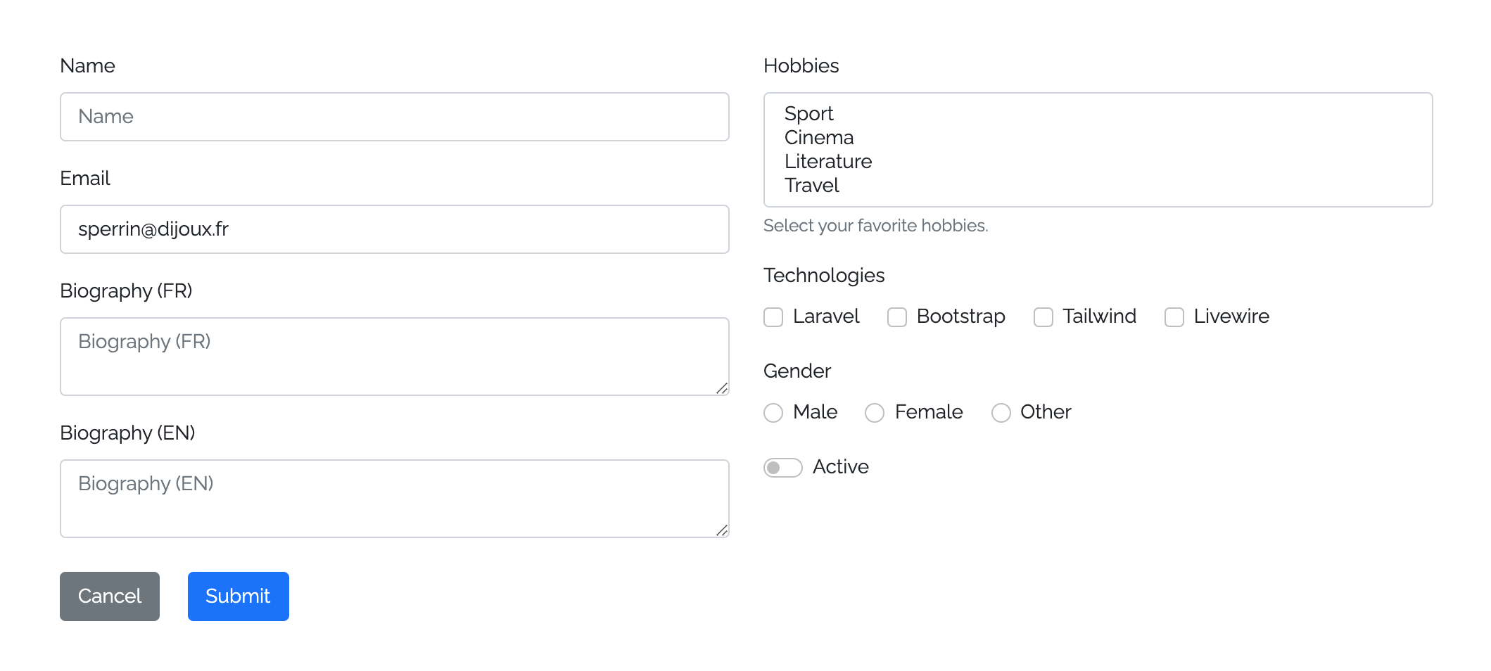
And get these components displayed:
Table of Contents
Installation
You can install the package via composer:
composer require pojow/laravel-form-components
Configuration
You can publish the config file with:
php artisan vendor:publish --tag=form-components:config
Among its configurations, this package allows you to choose which UI framework will be use.
Please note that you'll have to install and configure the UI framework you want to use before using this package.
Views
You can publish the package views to customize them if necessary:
php artisan vendor:publish --tag=form-components:views
Components
Form
Components can be wrapped into a form component.
If no custom method is set, a GET method will be set by default.
Hidden CSRF and spoofing method fields will be automatically generated when needed, according to the defined form method :
- You won't need to define a
@method()directive, declare yourPUT,PATCHorDELETEaction directly in theactionattribute - You won't need to define a
@csrf()directive, it will be automatically declared withPOST,PUT,PATCHandDELETEactions
Forms are generated with a default novalidate HTML attribute, which is preventing browser validation in favor of a server-side validation (which is a good practice for security matters).
<x:form::form method="PUT">
    <x:form::input name="first_name"/>
    ...
</x:form::form>
Input and Textarea
Add inputs and textarea into your forms.
If you don't set a custom type to an input, it will take a default text type.
Radio, checkbox and button inputs must be used with their own components because of their different behaviour.
Textarea component can be used the same way as an input component but without declaring a type.
<x:form::input type="file" name="avatar"/>
<x:form::input name="first_name"/>
<x:form::input type="email" name="email"/>
...
<x:form::textarea name="description"/>
Select
Set select components in your forms.
Auto generate options by providing an associative value/label array.
HTML select elements natively don't accept placeholder attributes, however the select component allows you to handle a placeholder-like option is prepended to the other ones. This placeholder will behave as for the other components.
By default, this select placeholder option is selected, disabled and hidden. However, you'll be able to allow it to be selected in case you need to set a nullable field for example. To do that, just add the allowPlaceholderToBeSelected attribute to your component.
In multiple mode, this package will take care about converting the name into an array name, so you don't have to add it manually.
@php($options = [1 => 'Laravel', 2 => 'Bootstrap', 3 => 'Tailwind'])
<x:form::select name="hobby" placeholder="What is your hobby prefered hobby?" :options="$options" selected="1"/>
<x:form::select name="hobbies" :options="$options" :selected="[2, 3]" allowPlaceholderToBeSelected multiple/> {{-- You'll be able to selected the placeholder and the name will be converted to hobbies[] --}}
Checkboxes, Toggle switches and Radios
Checkbox, toggle switch and radio components are available for you to use.
Because radio inputs are never used alone, you'll have to declare a required group attribute when using them, awaiting a value/label associative array from which the radio fields will be generated.
Regarding checkbox and toggle switch inputs, you will be able to use them in single or in group mode. To use them in group mode, you'll have to declare a group attribute too.
In group mode, this package will take care about converting the name into an array name, so you don't have to add it manually.
If you want to display these input components inline, just define an inline attribute.
<x:form::checkbox name="newsletter_subscription" :checked="true"/> {{-- 1 generated checkbox --}}
<x:form::checkbox name="technologies" :group="['laravel' => 'Laravel', 'bootstrap' => 'Bootstrap']" :checked="laravel"/> {{-- 2 generated checkboxes --}}
<x:form::toggle-switch name="active" :checked="false" inline/> {{-- 1 generated toggle switch with inline mode --}}
<x:form::toggle-switch name="technologies" :group="['tailwind' => 'Tailwind', 'livewire" => 'Livewire']" :checked="livewire"/> {{-- 2 generated toggle switches --}}
<x:form::radio name="gender" :group="['female' => 'Female', 'male' => 'Male']" :checked="male" inline/> {{-- 2 generated radios with inline mode --}}
Buttons
Submit and link button components are available.
Submit button allows you to trigger a form and will provide a default __('Submit') body if none is defined.
Link button allows you to set actions like Back or Cancel in your forms by providing a link with a button-like display. As this component is an HTML link, it will provide a default title by analysing its body.
By default, both components will set a base background color if no custom class attribute is defined.
<x:form::form>
    ...
    <div class="d-grid">
        <x:form::button.submit>Submit this form</x:form::submit> {{-- Will provide `btn-primary` class with Bootstrap UI --}}
        <x:form::button.link class="btn-secondary" href="{{ back() }}"> {{-- Will auto-generate `title="Back"` --}}
            <i class="fas fa-undo fa-fw"></i>
            Back
        </x:form::submit>
    </div>
</x:form::form>
How to
Deal with attributes and classes
Provided component are built using Blade components.
Following how Blade components work, you can set any HTML attributes and classes:
- Attributes will replace default ones
- Classes will be merged to existing ones
Set id
Define components ids as you would do for any HTML element.
If no custom id is set, an id will be generated using the kebab cased <type>-<name> values.
<x:form::input id="custom-id" name="first_name"/> {{-- Default id: `input-first-name` --}}

<x:form::textarea id="custom-id" name="first_name"/> {{-- Default id: `textarea-first-name` --}}
Enable or disable inputs margin bottom
By default, all input components will declare a bottom margin in order to correctly position themselves in a form.
You'll sometimes need to disable this default bottom margin: you'll can do this by setting the marginBottom attribute to false.
<x:form::input name="first_name"/> {{-- Will declare a bottom margin --}}

<x:form::textarea name="first_name" :marginBottom="false"/> {{-- Will not declare any bottom margin --}}
Manage label and placeholder
You can define labels on all input components (except for Radio).
If no custom label is defined, labels will take the __('validation.attributes.<name>) default value.
Following the same behaviour, all input components that are allowing the use of a placeholder (Select included) will provide a default placeholder that will take the label value.
You can override this default value by setting a custom placeholder.
You also can hide auto-generated label and placeholder by them to false.
<x:form::input name="first_name" label="First Name" placeholder="Please fill your first name..."/> {{-- Will display the custom label and placeholder --}}
<x:form::input name="last_name" :label="false" :placeholder="false"/> {{-- Will hide the label and placeholder --}}
<x:form::input type="tel" name="phone_number"/> {{-- Will display default auto-generated label and placeholder --}}
Handle floating label displaying
This package allows you to enable or disable floating labels displaying.
You can set the global floating label behaviour with config('form-components.floating_label') config.
You will be able to override this global behaviour at form level for all contained components.
<x:form::form :floatingLabel="true">
    <x:form::input name="first_name"/> {{-- Will display a floating label even if it has been disabled in config --}}
</x:form::form>
Finally, you'll also can override all other defined behaviour on components themselves.
<x:form::input name="first_name" :floatingLabel="true"/>
Set addons
You can define prepend and append HTML addons on input and textarea components.
    <x:form::input name="" prepend="<i class="fas fa-code fa-fw"></i>"/>
    <x:form::input name="search" append="<i class="fas fa-search fa-fw"></i>"/>
Note: you may use HTML directly instead of components for complex addon's management.
Bind data
You can bind Eloquent Models, objects, collections or arrays in order to autofill bound components values.
Binding data on the form component will trigger the binding of all of its contained components.
You can bind data directly on a component and override the form binding.
In case of validation error, components will be repopulated by old values that will override bound values.
For specific use case, you also can use the @bind($boundDataBatch) and the @endbind Blade directives to bind a group of components.
@php
    $dataBatch1 = ['description' => 'A wonderful description'];
    $dataBatch2 = ['first_name' => 'John', 'last_name' => 'Bonham'];
@endphp
<x:form::form :bind="$user">
    <x:form::input type="email" name="email"/> {{-- Will set the value from `$user->email` --}}
    <x:form::textarea name="description" :bind="$dataBatch1"/> {{-- Will set the value from `$dataBatch1['description`] --}}
    @bind($dataBatch2)
        <x:form::input name="first_name"/> {{-- Will set the value from `$dataBatch2['first_name`] --}}
        <x:form::input name="last_name"/> {{-- Will set the value from `$dataBatch2['last_name`] --}}
    @endbind
</x:form::form>
Set custom value
Data binding can be overridden by setting custom values on components.
@php($data = ['description' => 'A wonderful description'];)
<x:form::form :bind="$user">
    ...
    <x:form::textarea
        name="description"
        :bind="$user"
        :value="$data['description']"/> {{-- Will set the value from `$data['description`] --}}
</x:form::form>
Handle validation statuses and errors
Components will be able to display or hide their success/error statuses and error message when a validation error is triggered:
- If the validation success displaying is activated, components will only be marked as valid when other components in the form are detected as invalid
- If the validation failure displaying is activated, components in error will be marked as invalid and will display their related error message
You can control this behaviour at different levels:
- Define the global default behaviour with
config('form-components.display_validation_success')andconfig('form-components.display_validation_failure') - Customize this behaviour on a form and apply it locally for all its contained components
- Set a specific behaviour directly on a component
<x:form::form displayValidationSuccess="false" displayValidationFailure="false">
    <x:form::input type="email" name="email"/> {{-- Disabled success/error statuses and error message --}}
    <x:form::textarea
        name="description"
        displayValidationSuccess="true"
        displayValidationFailure="true"/> {{-- Enabled success/error statuses and error message --}}
</x:form::form>
You also can customize the error bag that should be used to determine components success/error statuses and error messages on form components.
<x:form::form errorBag="form_error_bag"> {{-- Error bag for all components within the form --}}
    @errorbag('group_error_bag') {{-- Error bag for a group of components --}}
        <x:form::input name="first_name"/>
        <x:form::input name="last_name"/>
    @enderrorbag
    <x:form::input type="email" name="email" errorBag="component_error_bag"/> {{-- Error bag for a specific component --}}
    ...
</x:form::form>
Add captions
Help users and display additional instructions under you components by adding captions.
<x:form::input name="name" caption="Please fill this input with your full name."/>
Activate multilingual mode
Activate multilingual mode on input and textarea components to benefit from the following features:
- Component duplication: one component per locale will be displayed
- Name localization:
name="description"will be transformed intoname="description[<locale>]" - Default label and error message localization:
__(validation.attributes.name)translation used to generate default label and error message will be appended with(<LOCALE>)
<x:form::input name="name" :locales="['fr', 'en']"/>
<x:form::textarea name="description" :locales="['fr', 'en']"/>
Testing
composer test
Changelog
Please see CHANGELOG for more information on what has changed recently.
Contributing
Please see CONTRIBUTING for details.
Security Vulnerabilities
Please review our security policy on how to report security vulnerabilities.
Credits
License
The MIT License (MIT). Please see License File for more information.


