hawkiq / admlte
AdminLTE v4 integration for Laravel
Requires
- components/font-awesome: 6.5.2
- components/jquery: 3.7.1
- hawkiq/adminltev4: ^4.0
- twbs/bootstrap: 5.3.3
README
- This Package Heavely Inspired by Laravel-AdminLTE for AdminLTEv3, I used thier Components with few modifications to make it suitable for AdminLTEv4.
Hawkiq AdmLTE is a Laravel package designed for seamless integration of the AdminLTE v4 beta template, providing a robust foundation for admin dashboards. This package simplifies the installation, configuration, and usage of AdminLTE with Bootstrap 5 and related components.
Table of Contents
- Installation
- Configuration
- Usage
- Using with Vite
- Language Selector
- Plugins
- Widgets
- Contribution
- License
Installation
Follow these steps to install and set up the Hawkiq AdmLTE package:
Step 1: Require the Package
Add the package to your Laravel project via Composer:
composer require hawkiq/admlte
Step 2: Publish Assets, Lang, and Configurations
Run the following Artisan command to publish the package's assets,language and configuration files:
php artisan admlte:install
This will:
- Copy AdminLTE assets (CSS, JS, images) to
public/vendor. - Publish the configuration file to
config/admlte.php. - Publish Languages files to
lang/orresources/lang/.
Step 3: Replace Auth Views ( Optional )
If you would like to use AdminLTE Auth views you can run below command to replace views:
php artisan admlte:install --only=auth_views
this step is safe since its taking backup in storage folder for current views so if anything wrong happened you can always restoring old views.
Configuration
Customize the package by editing the configuration file located at:
config/admlte.php
Key configurations include:
- Sidebar links and permissions.
- Navbar components.
- Custom assets and scripts.
Example config/admlte.php:
return [
    'sidebar' => [
        [
            'type' => 'header',
            'text' => 'main.navigation',
            'permission' => null,
        ],
        [
            'type' => 'link',
            'text' => 'Dashboard',
            'route' => 'test1',
            'icon' => 'fas fa-home',
            'permission' => null,
        ],
          [
            'type' => 'link',
            'text' => 'Test Link',
            'route' => 'test2',
            'icon' => 'fas fa-cog',
            'permission' => null,
        ],
    ],
];
Username Login
Sometimes you might prefer username to login this settings will make login via username and it will add username field to register page. Remember you should override method username() in LoginController.php or change Anything in RegisterControler related to username, this setting just to show Username or email in forms it has nothing to do with controllers.
set 'username_enabled' => true, then in app\Http\Controllers\AuthLoginController.php add
    /**
     * Get the login username to be used by the controller.
     *
     * @return string
     */
    public function username()
    {
        return 'username';
    }
edit app\Http\Controllers\Auth\RegisterController.php
return Validator::make($data, [
'name' => ['required', 'string', 'max:255'],
'username' => ['required', 'string', 'max:255'], // << Add this to validator >>
'phone' => ['string', 'max:255', 'unique:users'],
'email' => ['required', 'string', 'email', 'max:255', 'unique:users'],
'password' => ['required', 'string', 'min:6', 'confirmed'],
]);


return User::create([
'name' => $data['name'],
'username' => $data['username'],// << Add this to create User Model >>
'phone' => $data['phone'],
'email' => $data['email'],
'password' => Hash::make($data['password']),
]);
Usage
Include the Layout
To use the package's layout, extend the base layout in your Blade files:
@extends('admlte::page')
If you want to include auth layout just use AdmLTE auth layouts:
for login page
@extends('admlte::auth.login')
for register page
@extends('admlte::auth.register')
Customizing Views
If you need to customize views,
php artisan admlte:install --only=views
- Publish customizable views to
resources/views/vendor/admlte.
Using with Vite
if you prefer to Use asset bundling using vite you have to make few adjestments to your project.
No need to install more packages just small change to your vite.config.js file.
add this
import path from "path";

export default defineConfig({
    plugins: [
        laravel({
            input: ["resources/css/app.css", "resources/js/app.js"],
            refresh: true,
        }),
    ],
    resolve: { // Add this block resolve
        alias: {
            "@vendor": path.resolve(__dirname, "public/vendor"),
        },
    },
});
then go to resources folder in your project edit app.css and app.js .
app.css
@import "@vendor/adminlte/css/adminlte.min.css";
@import "@vendor/font-awesome/css/all.min.css";
app.js
import "@vendor/jquery/jquery.min.js"; // Add this if You want to use jquery
import "@vendor/bootstrap/js/bootstrap.bundle.min.js";
import "@vendor/adminlte/js/adminlte.js";
then run command npm run dev , dont forget to activate vite option in config/admlte.php
    /*
    |--------------------------------------------------------------------------
    | Assets Bundling ( Experimental )
    |--------------------------------------------------------------------------
    |
    | Default behavouir is assets from public vendor as files But If you prefer.
    | Using vite bundling you can mark this option as true.notice this is just
    | Test feature done during testing filament So it might works as you desire .
    |
    */

    'vite' => true,
Add new colors
what if you like to add new colors for Adminlte library like (purple,lime,indigo etc...) you can do this by using vite just add these parameters and it will works perfectly ( this approch is temprorary wait until adminlte release their final version).
import path from "path";
export default defineConfig({
    plugins: [
        laravel({
            input: ["resources/css/app.scss", "resources/js/app.js"],// change app.css to app.scss
            refresh: true,
        }),
    ],
    resolve: {
        alias: {
            "@vendor": path.resolve(__dirname, "public/vendor"),
            "@adminlte": path.resolve(
                __dirname,
                "vendor/hawkiq/adminltev4/src/scss"
            ), // Add this Line
        },
    },
});
in app.css add
@import "@vendor/font-awesome/css/all.min.css";
Create file in resources/css called app.scss
@import 'app.css';
@import "bootstrap/scss/functions";
@import "bootstrap/scss/variables";

$custom-colors: (
    "purple": #6f42c1,
    "teal": #20c997,
    "orange": #fd7e14,
    "pink": #d63384,
    "lime": #cddc39,
    "cyan": #17a2b8,
    "brown": #795548,
    "indigo": #6610f2
    // add more colors if you like
);

$theme-colors: map-merge($theme-colors, $custom-colors);

@import "@adminlte/adminlte.scss";

@each $color, $value in $custom-colors {
    .bg-#{$color} {
        background-color: $value !important;
    }

    .text-#{$color} {
        color: $value !important;
    }

    .btn-#{$color} {
        background-color: $value;
        color: white;

        &:hover {
            background-color: darken($value, 10%);
        }
    }
}
Final step is change vite config to app.scss
    /*
    |--------------------------------------------------------------------------
    | Assets Bundling ( Experimental )
    |--------------------------------------------------------------------------
    |
    | Default behavouir is assets from public vendor as files But If you prefer.
    | Using vite bundling you can mark this option as true.notice this is just
    | Test feature done during testing filament So it might works as you desire .
    |
    */

    'vite' => true,
    'vite_css' => 'resources/css/app.scss',
    'vite_js' => 'resources/js/app.js',
app.js still same as before step
import "@vendor/jquery/jquery.min.js";
import "@vendor/bootstrap/js/bootstrap.bundle.min.js";
import "@vendor/adminlte/js/adminlte.js";
Language Selector
You can add language selector with one click in admlte.php by set two options
 'navbar' => [
        //Navbar Widgets
        //...
        'language_selector_widget' => true, // Set if you want to show language selector in navbar.
and you can add more than language in option
    /*
    |--------------------------------------------------------------------------
    | App Local
    |--------------------------------------------------------------------------
    |
    | List of Supported Langauges for Admin Panel.
    | This will only set language to middleware you still have to translate
    | project by yourself by adding phrases to main.php or your language folder.
    |
    |
    */

    'app_locals' => [
        //Text => Locale Code
        'arabic' => 'ar',
        'english' => 'en',
        'french' => 'fr',
    ],
one last step you still have to add Admlte middleware to your bootstrap/app.php add
use Hawkiq\Admlte\Http\Middleware\LanguageMiddleware;

->withMiddleware(function (Middleware $middleware) {
        $middleware->append(LanguageMiddleware::class); // This will be Added only
    })
Plugins
if you wish to integrate js plugins into your project you can follow below tutorial. we will test this using Summernote WYSIWYG text editor.
first download combiled css,js from their official website https://summernote.org/getting-started/
extract files into public folder for example vendor/summernote.
open config/admlte.php and edit Plugins section, add Summernote for it like this
'plugins' => [
    /// *** Other Plugins
    'Summernote' => [
        'active' => false,
        'files' => [
            [
                'type' => 'css',
                'asset' => true, // Set this to true if you host files (Optional)
                'location' => 'vendor/summernote/summernote-lite.css',
            ],
            [
                'type' => 'js',
                'asset' => true,
                'location' => 'vendor/summernote/summernote-lite.js',
            ],
        ],
    ],
],
Last step is to activate Plugin in your page By including it
@extends('admlte::page')
@section('plugins.Summernote', true)

@section('content')
    <div class="row-12">
        <div class="md-12">
            <div id="summernote"></div>
        </div>
    </div>
@endsection

@push('js')
    <script>
        $('#summernote').summernote({
            placeholder: 'Hello Artisans from AdmLTE Dashboard',
            tabsize: 2,
            height: 100
        });
    </script>
@endpush
and thats it 😊
- Remember if you used Vite you should import files into app.css. app.js
@import "@vendor/summernote/summernote-lite.css";
import "@vendor/summernote/summernote-lite.js";
Widgets
I've created few widget for easy use in your project, I'll try to make more in near future. all widgets use bootstrap 5 color names ( primary - success - danger - warning - light - dark - secondary ), till now there are no AdminLTE colors.
Card
To create Cards with minimal efforts you can use Card widget and pass the required informations to make it works, here are few examples, when I create a wiki page I will give full details on each component.
<x-admlte-card icon="fas fa-users" theme-mode="full" title="Header Card" theme="primary">
    A card with header using primary color ...
</x-admlte-card>

<x-admlte-card theme="danger" theme-mode="outline">
    A card without header has red border ...
</x-admlte-card>

<x-admlte-card icon="fas fa-cog" title="No theme-mode" theme="warning">
    A card with header using warning color but without theme-mode attribute...
</x-admlte-card>
Info Box
For display small infos with icons or progress bar
<x-admlte-info-box class="shadow" title="CPU Traffic" text="424" icon-theme="primary"
    icon="fas fa-lg fa-cog" theme="light" />

<x-admlte-info-box title="Downloads" text="1205" icon="fas fa-lg fa-download"
    icon-theme="danger" />

<x-admlte-info-box title="User Registrations" text="251" icon="fas fa-lg fa-user-plus"
    theme="success" />

<x-admlte-info-box title="Tasks" text="75/100" icon="fas fa-lg fa-tasks" theme="warning"
    progress=75 progress-theme="dark" description="75% of the tasks have been completed" />

<!-- Updatable -->
<x-admlte-info-box title="Reputation" text="0/1000" icon="fas fa-lg fa-medal text-dark"
    theme="danger" id="ibUpdatable" progress=0 progress-theme="teal"
    description="0% reputation completed to reach next level" />
you can test updateable Info box with this js code
<script>
    $(document).ready(function() {

        let iBox = new _AdminLTE_InfoBox('ibUpdatable');

        let updateIBox = () => {
            // Update data.
            let rep = Math.floor(1000 * Math.random());
            let idx = rep < 100 ? 0 : (rep > 500 ? 2 : 1);
            let progress = Math.round(rep * 100 / 1000);
            let text = rep + '/1000';
            let icon = 'fas fa-lg fa-medal ' + ['text-primary', 'text-light', 'text-warning'][idx];
            let description = progress + '% reputation completed to reach next level';

            let data = {
                text,
                icon,
                description,
                progress
            };
            iBox.update(data);
        };

        setInterval(updateIBox, 5000);
    })
</script>
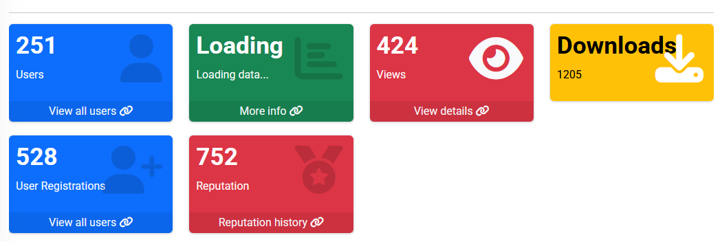
Small Box
For display one info with beautiful UI
<x-admlte-small-box theme="primary" title="251" text="Users" icon="fas fa-user" url="#"
    url-text="View all users" url-icon="fas fa-link" />


<x-admlte-small-box title="Loading" text="Loading data..." icon="fas fa-chart-bar" theme="success"
    url="#" url-text="More info" />

<x-admlte-small-box title="424" text="Views" icon="fas fa-eye text-light" theme="danger"
    url="#" url-text="View details" />

<x-admlte-small-box title="Downloads" text="1205" icon="fas fa-download text-white"
    theme="warning" />

<x-admlte-small-box title="528" text="User Registrations" icon="fas fa-user-plus text-teal"
    theme="primary" url="#" url-text="View all users" />

<x-admlte-small-box title="0" text="Reputation" icon="fas fa-medal" theme="danger"
    url="#" url-text="Reputation history" id="sbUpdatable" />
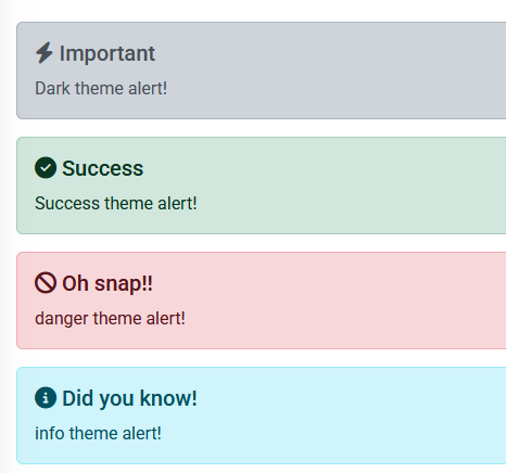
Alert
For display alerts
<x-admlte-alert theme="dark" title="Important">
    Dark theme alert!
</x-admlte-alert>

<x-admlte-alert theme="success" title="Success">
    Success theme alert!
</x-admlte-alert>


<x-admlte-alert theme="danger" title="Oh snap!!">
    danger theme alert!
</x-admlte-alert>


<x-admlte-alert theme="info" title="Did you know!">
    info theme alert!
</x-admlte-alert>
Contribution
Contributions are welcome! Feel free to fork the repository and submit a pull request.
License
This package is open-sourced software licensed under the MIT license.


