gridprinciples / blade-forms
CSS-agnostic form rendering via Laravel Blade
Fund package maintenance!
Requires
- php: ^8.2
- illuminate/contracts: ^12.0
Requires (Dev)
- laravel/pint: ^1.14
- nunomaduro/collision: ^8.1.1
- orchestra/testbench: ^10.0.0
- phpunit/phpunit: ^11.1
- symfony/dom-crawler: ^7.0
- dev-main
- v0.3.0
- v0.2.3
- v0.2.2
- v0.2.1
- v0.2.0
- 0.1
- dev-dependabot/composer/laravel/pint-1.29.1
- dev-dependabot/github_actions/dependabot/fetch-metadata-3.1.0
- dev-dependabot/github_actions/actions/checkout-6
- dev-dependabot/github_actions/stefanzweifel/git-auto-commit-action-7
- dev-laravel12-update
- dev-develop
This package is auto-updated.
Last update: 2026-04-27 03:47:22 UTC
README
A set of Laravel Blade components useful for rendering basic, fully-accessible HTML forms in a Laravel app. The approach is barebones: CSS and JS is not included, but Tailwind (and possibly other framework) presets are planned.
Installation
You can install the package via composer:
composer require gridprinciples/blade-forms
You can publish the config file with:
php artisan vendor:publish --tag="blade-forms-config"
Optionally, you can publish the views using
php artisan vendor:publish --tag="blade-forms"
Usage
<x-form :post="route('form-submission-route')">

    <x-form::input
        name="name"
        label="Your name"
        help="What should we call you?"
        required
        />

    <x-form::radio-buttons
        name="weekday"
        label="Preferred weekday"
        :options="[
            'mo' => 'Monday',
            'tu' => 'Tuesday',
            'we' => 'Wednesday',
            'th' => 'Thursday',
            'fr' => 'Friday',
        ]"
        required
        />

    <x-form::checkbox
        name="agree"
        label="I agree with the terms"
        />

</x-form>
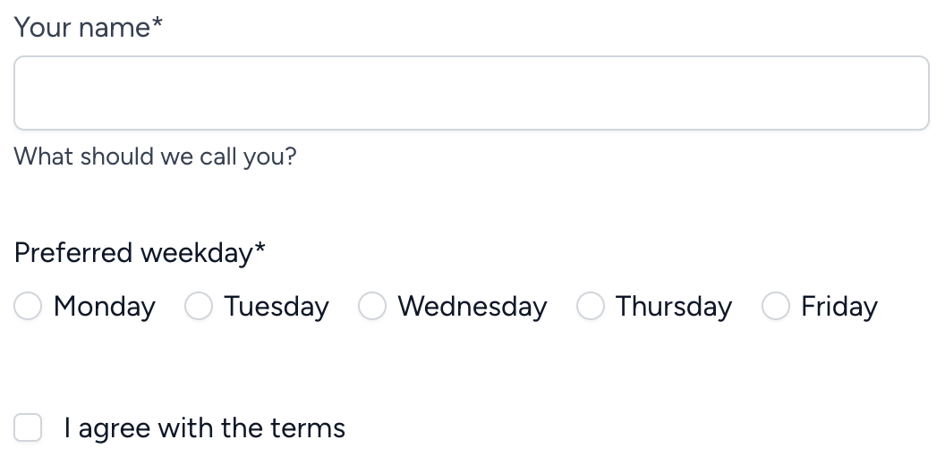
Result:
Text Input
Text inputs are, perhaps, the simplest form element. As with all elements, we can call it using the x-form Blade prefix:
<x-form::input name="username" />
We can continue to decorate this input (and apply some readable indentation):
<x-form::input
    name="username"
    label="Please provide your username"
    help="If you don't have a username yet, use your email."
    required
    />
This gives us an input that's ready to use:
We can further customize the attributes of the wrapping <div>s and the <label>:
<x-form::input
    name="username"
    label="Please provide your username"
    help="If you don't have a username yet, use your email."
    required
    :wrapperAttributes="[
        'class' => 'form-group-wrapper',
        'id' => 'username-field',
    ]"
    :labelAttributes="['class' => 'form-label']"
    :inputGroupAttributes="['class' => 'form-input-wrapper']"
    />
Results in:
<div class="form-group-wrapper" id="username-field">
    <label for="username_01" class="form-label">
        Please provide your username*
        <span class="sr-only">(required)</span>
    </label>
    <div class="form-input-wrapper">
        <input id="username_01" name="username" type="text" aria-describedby="username_01_feedback" required="">
    </div>
    <div id="username_01_feedback">
        <div>If you don't have a username yet, use your email.</div>
    </div>
</div>
Textarea
The textarea is used nearly identically to the Input component above:
<x-form::textarea
    name="message"
    label="What would you like to say?"
    rows="2"
    />
Radio buttons
Radio controls should be rendered as a set, with options:
<x-form::radio-buttons
    name="choice"
    label="Do you think so?"
    :options="[
        'yes' => 'Yes',
        'no' => 'No',
        'maybe' => 'Maybe',
    ]"
    value="maybe" {{-- pre-selected option --}}
    />
You can customize the option attributes by passing an array instead of a string as the label. Here's how to disable the "Maybe" option:
<x-form::radio-buttons
    name="choice"
    label="Do you think so?"
    :options="[
        'yes' => 'Yes',
        'no' => 'No',
        'maybe' => [
            'label' => 'Maybe',
            'disabled' => true,
        ],
    ]"
    />
Checkbox
A single checkbox can stand alone:
<x-form::checkbox
    name="remember"
    label="Remember me"
    id="remember_checkbox"
    />
Or, you can render a list of options:
<x-form::checkbox-list
    name="fields"
    label="Which fields can be exported?"
    :options="[
        'name' => 'Full name',
        'email' => 'Email address',
        'phone' => 'Phone number',
        'zip' => 'ZIP code',
    ]"
    />
Select
Select menu inputs must have options, and can be written in a very similar way to radio and checkbox lists:
<x-form::select
    name="frequency"
    label="How frequently would you like to receive updates?"
    :options="[
        'sync' => 'As soon as anything happens',
        'daily' => 'Daily updates',
        'weekly' => 'Weekly updates',
        'monthly' => 'Monthly updates',
    ]"
    />
Form
You can optionally create <form> elements using this component, which includes some shortcuts to make things cleaner. Laravel apps typically have something like this:
<form method="POST" action="{{ route('submission-route') }}">
    @csrf
    @method('PUT')
    {{-- form elements --}}
</form>
Using the <x-form> component, we can simplify things:
<x-form :put="route('submission-route')">
    {{-- form elements --}}
</x-form>
The component will automatically:
- add the CSRF field
- add the method based on which variable you fill with your submission URL. You can pass your URL using
get,post,put,patch, ordelete, and the method will be set for you.
Testing
composer test
Changelog
Please see CHANGELOG for more information on what has changed recently.
Contributing
Please see CONTRIBUTING for details.
Security Vulnerabilities
Please review our security policy on how to report security vulnerabilities.
Credits
License
The MIT License (MIT). Please see License File for more information.


