ffhs/filament-package_ffhs_custom_forms

Custom forms for Fernfachhochschule Schweiz (FFHS)

1.0.0 2025-07-10 07:04 UTC

This package is auto-updated.

Last update: 2025-07-10 07:45:49 UTC


README

This plugin enables you to create and manage nested forms within FilamentPHP.
It provides a wide range of customizable form fields and supports behavioral rules and templates.

Latest Version on Packagist Total Downloads

Features:

  • βœ… Multiple Form Types: Bind forms to different use cases (e.g. entities) through customizable form types.
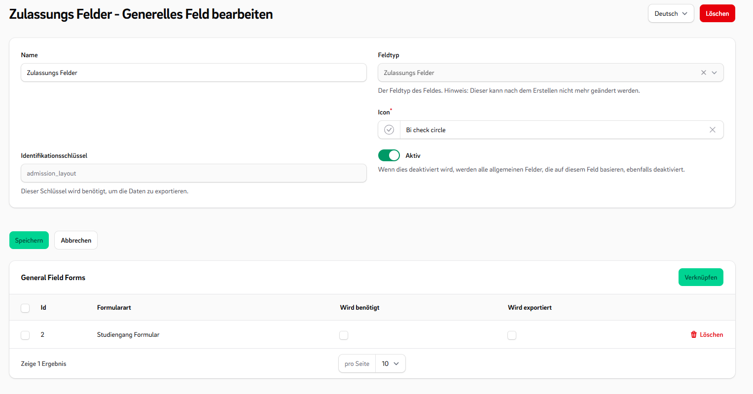
  • 🧩 General Fields: Define general fields for exports and reusability across form types.
  • πŸ›  Configurable Field Types: Includes various fields like Repeaters to add additional inputs dynamically.
  • 🀏 drag & drop Use an intuitive form builder.
  • πŸ” Reactive Rules: Set up rules that react to answers by changing field visibility or modifying selectable options.
  • 🌟 Prioritized Select Field: Use enhanced select fields with prioritized or sorted options.
  • πŸ“„ Template Snippets: Create reusable form templates to maximize reusability.
  • 🧱 Custom Components: Easily embed CustomForms into your application using Filament components.
  • πŸ‘οΈ Multiple View Modes: Switch rendering styles based on where the form is used.
  • πŸ”§ Extensible Architecture: Everything is designed to be customizable β€” add your own fields, rules, and templates.
  • ⬇️ Import/Export: You can import and export custom forms directly from the UI..

Screenshots

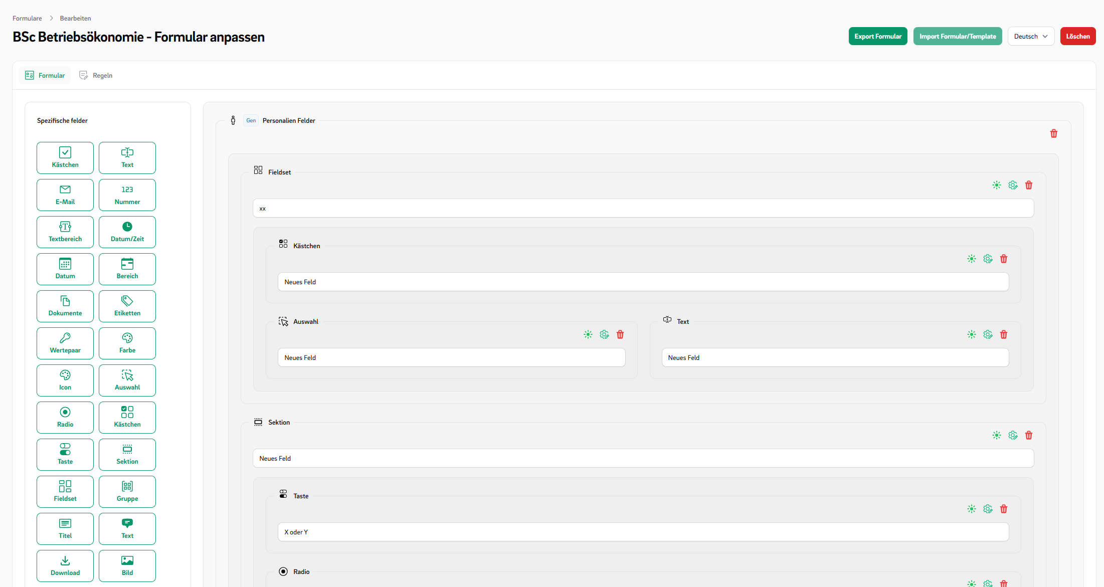
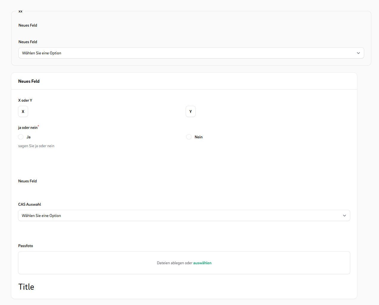
Editor

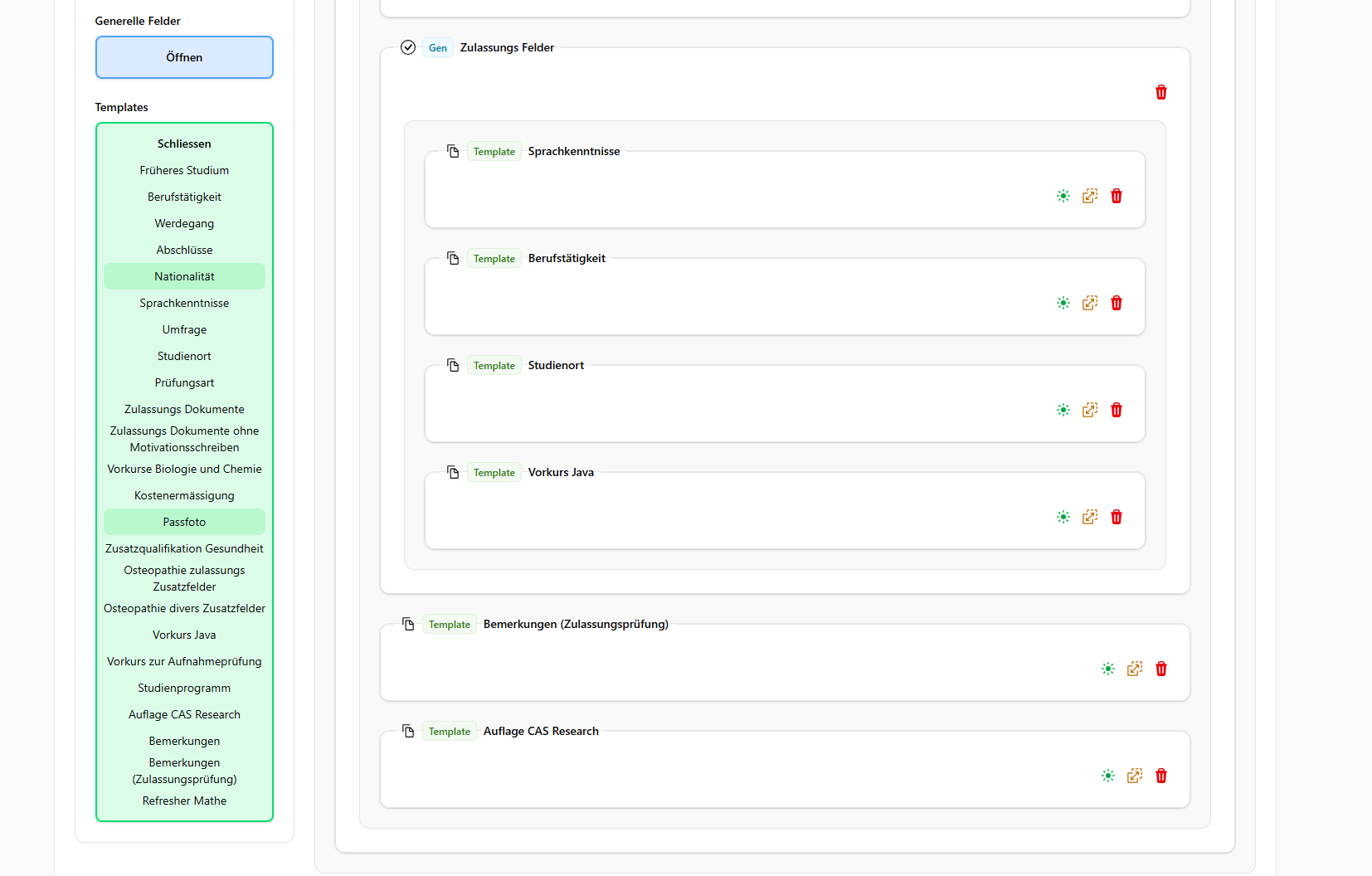
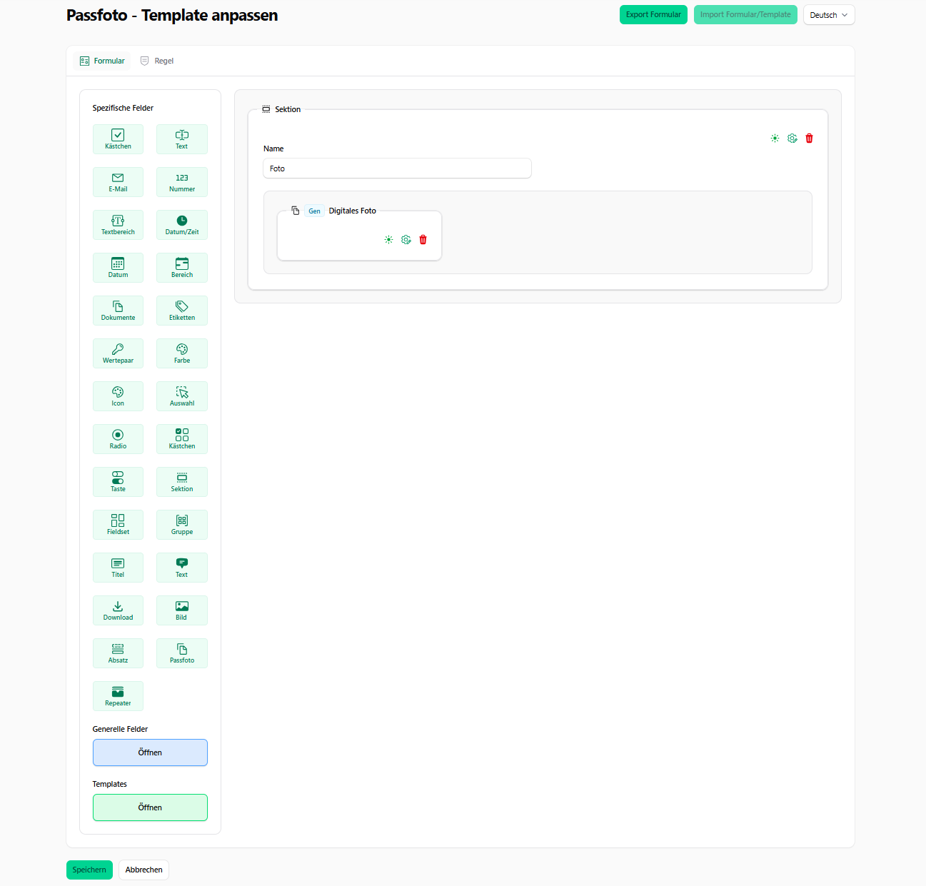
Templates

Fill Form

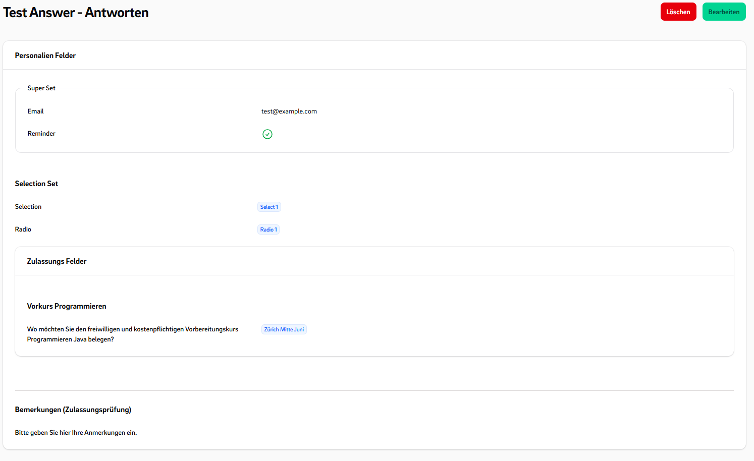
View Form

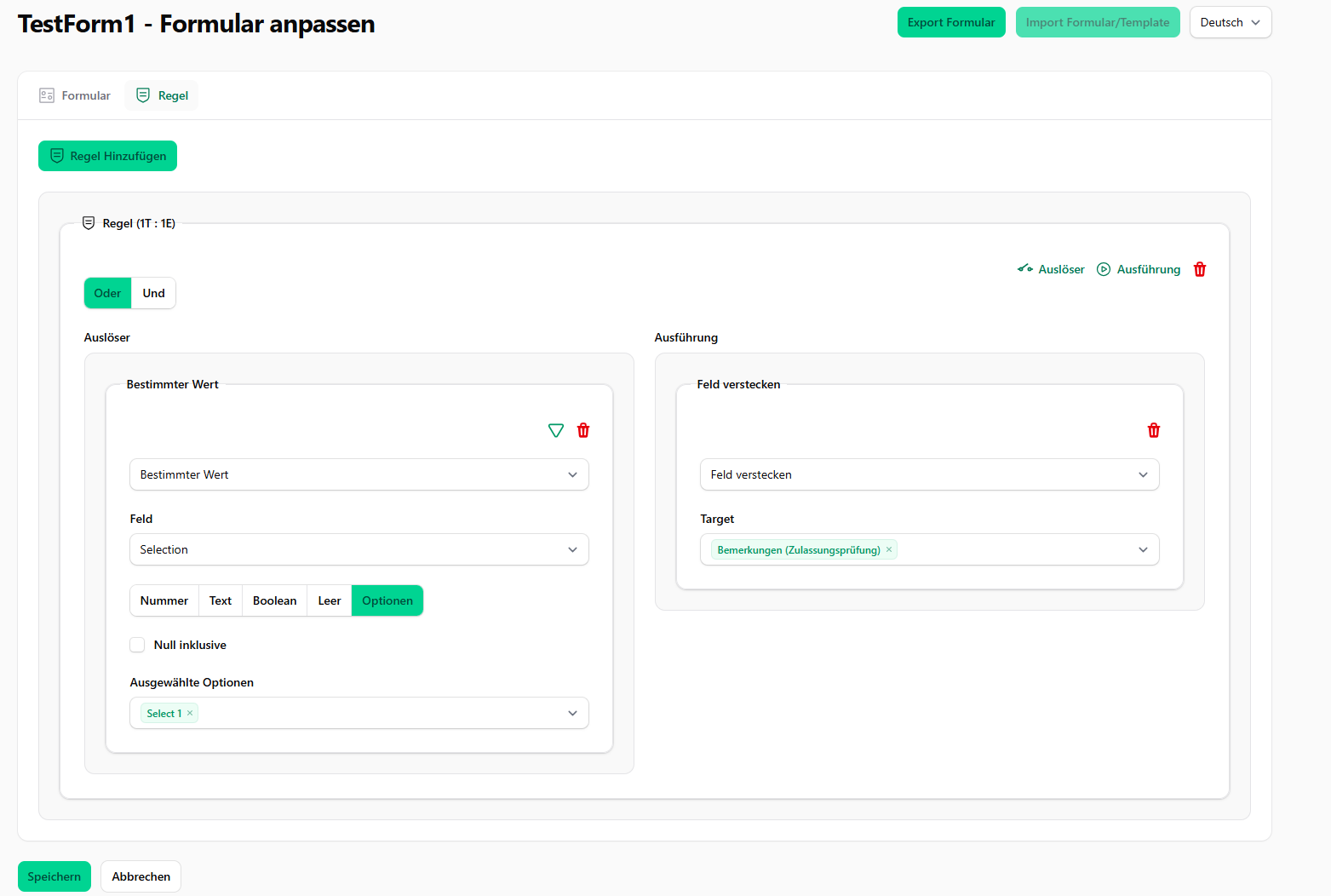
Rule Editor

General Fields

Installation

Install the package via composer:

composer require ffhs/filament-package_ffhs_custom_forms

Publish and run the migrations:

php artisan vendor:publish --tag="filament-package_ffhs_custom_forms-migrations"
php artisan migrate

Publish the config file with:

php artisan vendor:publish --tag="filament-package_ffhs_custom_forms-config"

The CustomForm plugin needs Icon Picker Plugin You can publish the config file with:

php artisan vendor:publish --tag="filament-icon-picker-config"  

Optionally, you can publish the views using

php artisan vendor:publish --tag="filament-package_ffhs_custom_forms-views"

Usage

1. Register the Plugin

Add the plugin to your PanelProvider:

// App/Providers/Filament/xxPanelProvider 

->plugins([CustomFormPlugin::make()])

2. Overview

A CustomForm is composed of two main parts:

  • CustomFormConfiguration – The blueprint that defines the forms behavior, fields, and validation rules.

  • CustomFields – Dynamic fields rendered within the form.

3. CustomFormConfiguration

Define multiple form configurations to serve different purposes.
For example:

  • A registration form with specific dependencies and validations.
  • A survey form with its own layout and logic.

To define a new form, extend the CustomFormConfiguration class:

use Ffhs\FilamentPackageFfhsCustomForms\CustomForms\CustomForm\FormConfiguration\CustomFormConfiguration;  

class SimpleForm extends CustomFormConfiguration {  

	public static function identifier(): string     {         
		return 'simple_form';     
	}      
	
	public static function displayName(): string
	{         
		return __('Simple Form');     
	} 
}

Key methods:

  • identifier() – Uniquely links saved form entries to the corresponding configuration.
  • displayName() – Shown in Filament’s form selection dropdown.

After creating a new configuration, register it in the ffhs_custom_forms config file:

// config/ffhs_custom_forms.php 
'forms' => [ SimpleForm::class, ],`

Notes:

  • Add each configuration class to the forms array.
  • Run php artisan config:clear.

Features explained

βœ… Form Configurations (FormTypes)

You can create different FormTypes, each with its own set of available FieldTypes and required GeneralFields. This allows you to customize forms for different application scenarios.

For example, you might have custom forms for requests and custom forms for applications. Now you can create two different FormTypes:

  • One requires a general field for the study location
  • The other does not include this field

This makes the form system flexible and reusable across various use cases.

CustomFormConfiguration.php

Other functions to overwrite

Method Signature Description
formFieldTypes(): array Returns the available custom field types that can be used in the form editor.
- Source: CustomFieldType::getSelectableFieldTypes()
- Purpose: Determines which field types are selectable when building or editing forms.
getRuleTriggerTypes(): array Returns the list of trigger types used in form rule definitions.
- Source: config('ffhs_custom_forms.rule.trigger')
- Example values: on_change, on_submit, etc.
getRuleEventTypes(): array Returns the list of event types that define what happens when a rule is triggered.
- Source: config('ffhs_custom_forms.rule.event')
- Example values: show_field, hide_field, set_value, etc.
editorFieldAdder(): array Returns the available field adders used in the form editor interface.
- Source: config('ffhs_custom_forms.editor.field_adders')
- Purpose: Defines which buttons or UI elements are available for adding fields in the editor.
overwriteViewModes(): array Returns an array of custom view modes that override the default ones.
- Default: An empty array, meaning no overrides by default.
- Use case: Can be extended by child classes to customize how the form is rendered.
abstract public static function identifier(): string An abstract method that must be implemented by each concrete FormType class.
- Purpose: Returns a unique identifier string for the FormType (e.g. "application", "registration").
displayViewMode(): string Returns the view mode to use when displaying the form.
- Default: Uses defaultViewMode().
displayEditMode(): string Returns the edit mode to use when modifying the form.
- Default: Uses defaultViewMode().
displayCreateMode(): string Returns the create mode to use when creating a new instance of the form.
- Default: Uses defaultViewMode().
defaultViewMode(): string Returns the default mode name, which is "default" unless overridden.

CustomFields

A CustomField consists of:

  • A FieldType – Defines the type and logic of the field (e.g. TextType, SelectType, etc.).
  • A set of Options – Configuration values such as placeholder text, min/max values, selectable choices, etc.
  • A FieldTypeView – Which can change on a different ViewMode

Predefined Field Types

πŸ“₯ Input Fields

  • TextType::class
  • EmailType::class
  • NumberType::class
  • TextAreaType::class
  • DateTimeType::class
  • DateType::class
  • DateRangeType::class
  • FileUploadType::class

πŸ”˜ Choice Fields

  • SelectType::class
  • RadioType::class
  • CheckboxListType::class
  • ToggleButtonsType::class

✨ Special Fields

  • TagsType::class
  • KeyValueType::class
  • ColorPickerType::class
  • IconSelectType::class

πŸ“ Layout Components

  • SectionType::class
  • FieldsetType::class
  • GroupType::class
  • TitleType::class
  • TextLayoutType::class
  • DownloadType::class
  • ImageLayoutType::class
  • SpaceType::class

Create your own CustomFieldType

Create your own reusable field type by implementing a CustomFieldType and a matching ViewComponent.

  1. Define the Field Type Class
class MyType extends CustomFieldType  
{  
	public function getTranslatedName(): string  
	{  
	    return __('type.label');  
	}

    public static function identifier(): string  
    {  
        return 'text';  
    }  
  
    public function viewModes(): array  
    {  
        return [  
            'default' => MyTypeView::class,  
        ];  
    }  
  
    public function icon(): string  
    {  
        return 'bi-input-cursor-text';  
    }  
} 
  1. Register Type in Config
// config/ffhs_custom_forms.php
'custom_field_types' => [  
    MyType::class,
    [..]
]
  1. Define the FieldTypeView
class MyTypeView implements FieldTypeView  
{  
    use HasDefaultViewComponent;  
  
    public function getFormComponent(  
        CustomFieldType $type,  
        CustomField $record,  
        array $parameter = []  
    ): FormsComponent {  
        /** @var TextInput $input */  
        return $input = $this->makeComponent(TextInput::class, $record);  
    }  
  
    public function getInfolistComponent(  
        CustomFieldType $type,  
        CustomFieldAnswer $record,  
        array $parameter = []  
    ): InfolistsComponent {  
        /** @var TextEntry $input */  
        return $input = $this->makeComponent(TextEntry::class, $record);  
    }  
}

Other Functions

These optional methods can be overridden in your custom CustomFieldType class to control behavior during field editing, rendering, saving, and cloning.

Method Signature Description
canBeDeactivate(): bool Returns true if this field type can be deactivated (Hidden), otherwise false.
generalTypeOptions(): array Returns a list of general type options for this field type.
extraTypeOptions(): array Returns additional, type options specific to this field type.
beforeSaveField(CustomField $field, array $data): void Called before a field is saved. Use it to preprocess or validate field data before it’s persisted.
afterSaveField(CustomField $field, array $data): void Called after the field has been saved. Use it to trigger post-save logic such as logging or syncing related data.
afterCreateField(CustomField $field, array $data): void Called after a new field is created. Useful for generating default options or setting up linked records.
afterDeleteField(CustomField $field): void Called after a field has been deleted. Can be used to clean up orphaned records or perform audits.
mutateOnCloneField(array $data, CustomField $original): array Allows you to modify data when a field is cloned (on dissolve template). Example: Reset values or generate unique identifiers.
isFullSizeField(): bool Returns true if the field should take the full width of the form layout. Useful for large inputs like TextArea or FileUpload. Default: false.
getEditorFieldBadge(array $rawData): ?string Returns an optional badge label shown in the field editor. Return null for no badge. Used to identify general fields and templates.
getEditorFieldTitle(array $rawData, CustomForm $form): string Returns the title shown for the field in the form editor. Useful for showing the question label, field name, or summary.
fieldEditorExtraComponent(array $rawData): ?string Returns a reference to a custom editor UI component (e.g. Vue or Blade). Rendered in the field's editor panel. Return null to disable.
getEditorActions(string $key, array $rawData): array Returns a list of editor actions (buttons, dropdowns) for the field editor.
Example: Returns delete, edit, and activation actions, with visibility depending on canBeDeactivate().

TypeOptions

The TypeOptions are options components which can add to a field-type to modify the components. The TypeOptions can automatically apply some effects if the return $input = $this->makeComponent(TextInput::class, $record); is used in the TypeView.

Predefined Type Option Classes

These classes define configurable TypeOptions used in CustomFormFields.

  1. ActionLabelTypeOption.php
  2. AlpineMaskOption.php
  3. BooleanOption.php
  4. ColumnsOption.php
  5. ColumnSpanOption.php
  6. DateFormatOption.php
  7. HelperTextTypeOption.php
  8. IconOption.php
  9. ImaginaryTypeOption.php
  10. InLineLabelOption.php
  11. InlineOption.php
  12. MaxAmountOption.php
  13. MaxLengthOption.php
  14. MaxSelectOption.php
  15. MaxValueOption.php
  16. MinAmountOption.php
  17. MinLengthOption.php
  18. MinSelectOption.php
  19. MinValueOption.php
  20. NewLineOption.php
  21. RelatedFieldOption.php
  22. ReorderableTypeOption.php
  23. RequiredOption.php
  24. ShowAsFieldsetOption.php
  25. ShowInViewOption.php
  26. ShowLabelOption.php
  27. ValidationAttributeOption.php
  28. ValidationMessageOption.php

Using TypeOptions in a CustomFieldType

You can add extra type options to your custom field by overriding extraTypeOptions() or generalTypeOptions():

// MyType.php
public function extraTypeOptions(): array  
{  
    return [  
       'alpine_mask' => AlpineMaskOption::make()
	       ->modifyDefault(fn($oldDefault) => '...'),  
       'max_length' => MaxLengthOption::make()
	       ->modifyOptionComponent(fn($component) => $component->columnStart(1)),    
       'min_length' => MinLengthOption::make(),  
    ];  
}
  • Each key represents the option name.
  • The value is an instance of a TypeOption, usually created via ::make().
  • You can customize how the option behaves using methods like modifyDefault() or modifyOptionComponent().

Creating a custom TypeOption

To create your own option, extend the TypeOption class:

class MyTypeOption extends TypeOption  
{  
  
    public function getDefaultValue(): mixed  
    {  
        return null;  
    }  
  
    public function getComponent(string $name): Component  
    {  
        return Toggle::make($name)  
            ->label('MyTypeOption')  
            ->columnSpanFull()  
            ->live();  
    }  
    
	public function modifyFormComponent(FormsComponent $component, mixed $value): FormsComponent  
	{  
	    return $component->modify(...);  
	}  
	  
	public function modifyInfolistComponent(InfolistComponent $component, mixed $value): InfolistComponent  
	{  
	    return $component->modify(...);  
	}
}

Other optional functions

Method Purpose
mutateOnFieldSave() Modify data before it's saved to the field
mutateOnFieldLoad() Modify data when it's loaded
beforeSaveField() Hook before the field is saved (via reference)
afterSaveField() Hook after the field is saved (via reference)
afterCreateField() Triggered right after the field is created
beforeDeleteField() Hook before the field is deleted
afterDeleteField() Hook after the field is deleted
mutateOnFieldClone() Modify option data when cloning the field
canBeOverwrittenByNonField() Whether this option can be overwritten globally or externally (default: true)

Use FastTypeOption

FastTypeOption allows you to quickly add custom options directly in your FieldType and react to them in your FieldTypeView.

//MyType.php
public function extraTypeOptions(): array  
{  
    return [  
       'my_option' => FastTypeOption::makeFast(  
		    default: false,  
		    Toggle::make('my_option')
		)
    ];  
}
// MyTypeView.php
$myOption = $this->getOptionParameter($record, 'my_option');

/** @var TextInput $input */  
$input = $this->makeComponent(TextInput::class, $record);

if($myOption){
	$input->modify(...);
}

return $input

OptionsGroups

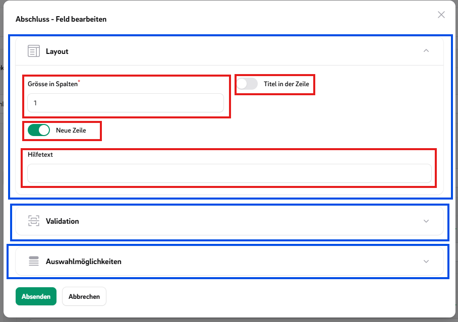
OptionsGroups help organize multiple related TypeOptions into logical collections, making your field configuration cleaner and easier to manage.

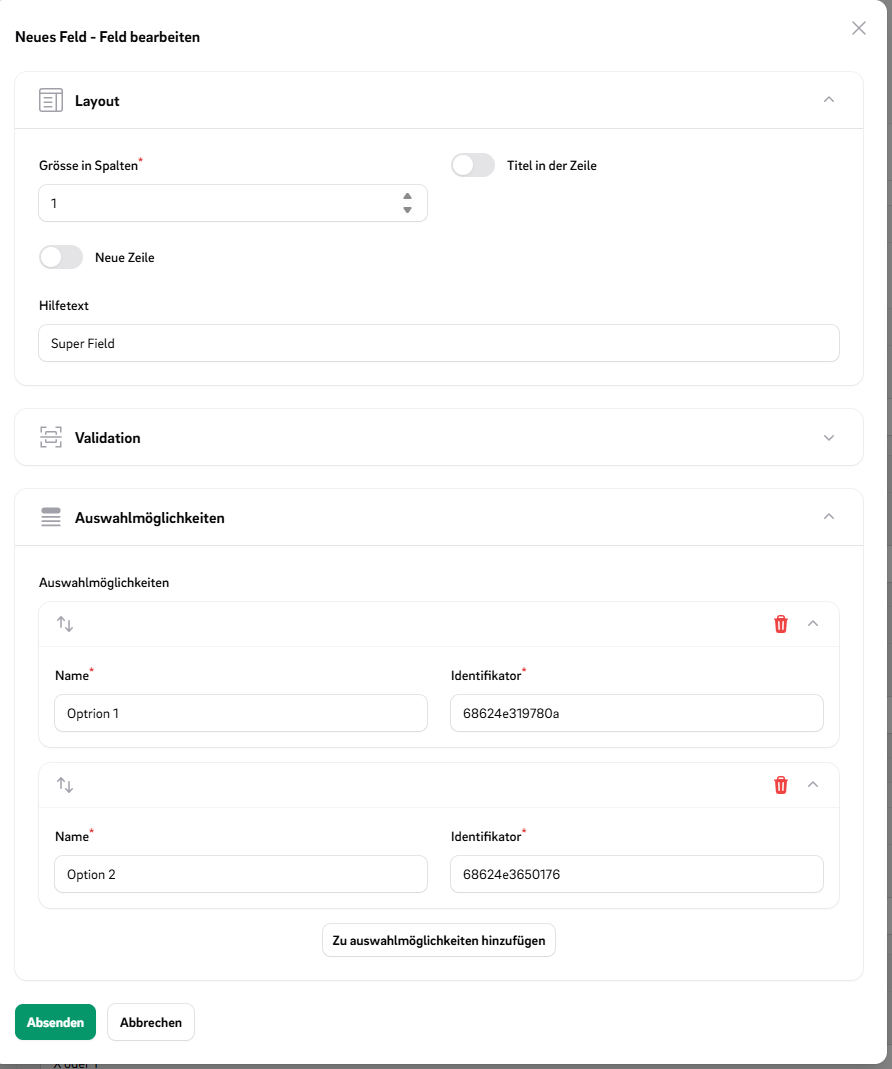
In the image TypeOptions are marked red and the OptionGroups are marked blue.
How to use OptionGroups?

//MyType.php
public function extraTypeOptions(): array  
{  
    return [  
        TypeOptionGroup::make('MyGroup', [  
		    'alpine_mask' => AlpineMaskOption::make(),  
			'max_length' => MaxLengthOption::make(),  
			'min_length' => MinLengthOption::make(),
		]),
		ValidationTypeOptionGroup::make(),  
	    LayoutOptionGroup::make()
		    ->mergeTypeOptions([  
			    'my_option' => MyTypeOption::make(),  
			])
			->removeTypeOption('...'),
    ];  
}

Rules: Events and Triggers

Rules can be divided into events and triggers. Triggers cause events to be executed. A rule can consist of multiple triggers that can be combined using 'AND' or 'OR' logic and can execute multiple events.

Predefined Events

  • HideEvent
  • VisibleEvent
  • DisabledEvent
  • RequiredEvent
  • ChangeOptionsEvent

Predefined Triggers

  • IsInfolistTrigger
  • ValueEqualsRuleTrigger
  • AlwaysRuleTrigger

Create own Trigger

  1. Create an MyTrigger class
// MyTrigger.php
class MyTrigger extends FormRuleTriggerType  
{  
	use HasTriggerEventFormTargets; // <= Adds an CustomField Select
	
    public static function identifier(): string  
    {  
        return 'my_trigger';  
    }  
  
    public function getDisplayName(): string  
    {  
        return 'My Trigger';  
    }  
  
    public function isTrigger(array $arguments, mixed &$target, RuleTrigger $rule): bool  
    {  
      return ...;
    }  
  
    public function getFormSchema(): array  
    {  
        return [  
            Toggle::make('option for my trigger'),
            this->getTargetSelect() // <= Adds an CustomField Select
        ];  
    }  
}
  1. Add your trigger class in the config file:
// config/ffhs_custom_forms.php
'trigger' => [
	MyTrigger::class
	...
]  

Create own Event

  1. Create an MyEvent class
// MyTrigger.php
class MyEvent extends FormRuleEventType  
{  
	use HasTriggerEventFormTargets; // <= Adds an CustomField Select
	
    public static function identifier(): string  
    {  
        return 'my_event';  
    }  
  
    public function getDisplayName(): string  
    {  
        return 'My Event';  
    }  
  
    public function getFormSchema(): array  
    {  
        return [  
            Toggle::make('option for my trigger'),
            this->getTargetSelect() // <= Adds an CustomField Select
        ];  
    }  

	// Implement one or more handler functions below depending on your use case:
    // - handleAnswerLoadMutation
    // - handleAnswerSaveMutation
    // - handleBeforeRender
    // - handleAfterRenderForm
    // - handleAfterRenderInfolist
}
  1. Add your event class in the config file:
// config/ffhs_custom_forms.php
'event' => [
	MyEvent::class
	...
],  

Embed CustomForms

You can embed CustomForms or their answers in various parts of your application using specialized components. Below are examples of usage patterns and customization options.

Editor

Embed the form editor in your layout using CustomFormEditor:

CustomFormEditor::make('custom_forms')
	->relationship('customForm')

Form Answer Edit

Embed a form for editing its answer using EmbeddedCustomForm. Basic usage:

EmbeddedCustomForm::make('custom_form_answer')
	->relationship('customFormAnswer')

With automatic saving:

EmbeddedCustomForm::make('custom_form_answer')
	->relationship('customFormAnswer')
	->autoSave()

Split layout by section type:

use Ffhs\FilamentPackageFfhsCustomForms\CustomFieldType\LayoutType\Types;

EmbeddedCustomForm::make('custom_form_answer')
	->relationship('customFormAnswer')
	->useLayoutTypeSplit()
	->layoutTypeSplit(SectionType::make())

Split layout by specific fields:

EmbeddedCustomForm::make('custom_form_answer')
	->relationship('customFormAnswer')
	->useFieldSplit()
	->fieldSplit(CustomField....)

Split layout by pose (e.g. question number range):

EmbeddedCustomForm::make('custom_form_answer')
	->relationship('customFormAnswer')
	->usePoseSplit()
	->poseSplitStart(5)
	->poseSplitEnd(10)

View answer on an infolist

Embed a view for its answer using EmbeddedCustomForm.

Basic usage:

EmbeddedAnswerInfolist::make('custom_form_answer')
	->relationship('customFormAnswer')

Split layout by section type:

EmbeddedAnswerInfolist::make('custom_form_answer')
	->relationship('customFormAnswer')
	->useLayoutTypeSplit()
	->layoutTypeSplit(SectionType::make())

Split layout by specific fields:

EmbeddedAnswerInfolist::make('custom_form_answer')
	->relationship('customFormAnswer')
	->useFieldSplit()
	->fieldSplit(CustomField....)

Split layout by pose (e.g. question number range):

EmbeddedAnswerInfolist::make('custom_form_answer')
	->relationship('customFormAnswer')
	->usePoseSplit()
	->poseSplitStart(5)
	->poseSplitEnd(10)

Testing

composer install
./vendor/bin/testbench vendor:publish --tag="filament-package_ffhs_custom_forms-migrations"  
./vendor/bin/testbench workbench:build
./vendor/bin/pest test  

Changelog

Please see CHANGELOG for more information on what has changed recently.

Postcards

We highly appreciate you sending us a postcard. You'll find our address on our page.

License

The MIT License (MIT). Please see License File for more information.