dne / storefront-dark-mode
Storefront Dark Mode
Package info
github.com/smittreiter/DneStorefrontDarkMode
Type:shopware-platform-plugin
pkg:composer/dne/storefront-dark-mode
Requires
- shopware/core: ~v6.5.0
Suggests
- shopware/administration: Require '6.5'. Allows you to to set up the plugin easily
- shopware/storefront: Require '6.5'.
Conflicts
- shopware/administration: <6,>=7
- shopware/storefront: <6,>=7
README
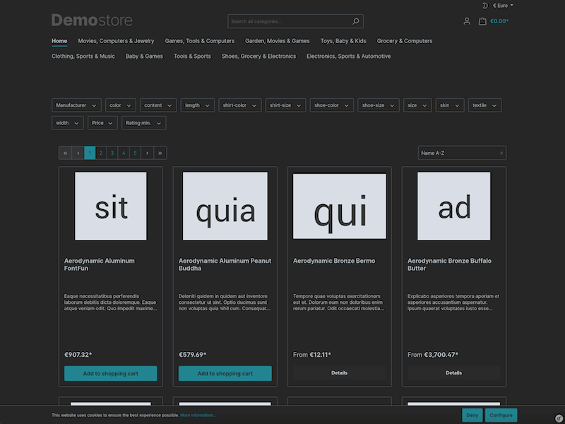
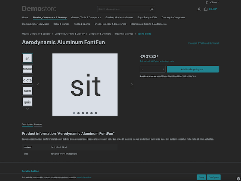
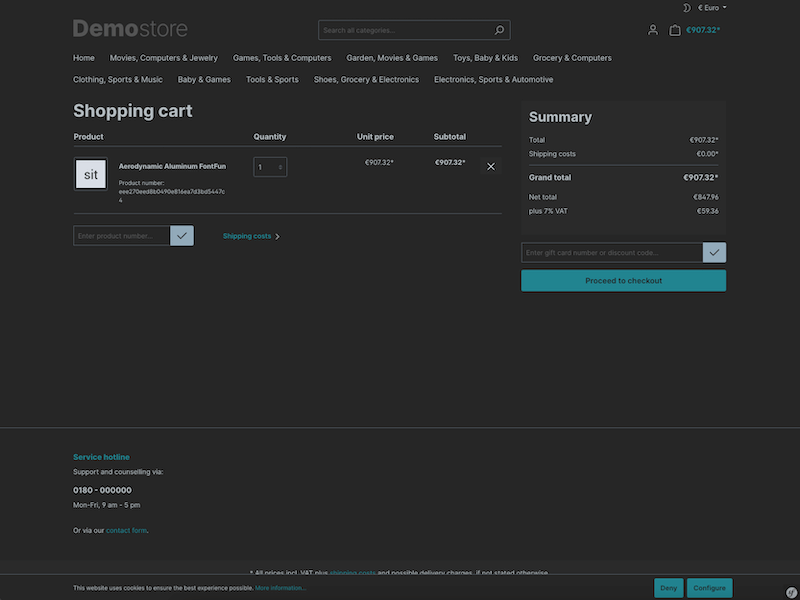
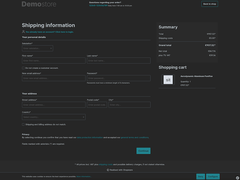
This plugin for Shopware 6 adds a dark mode with auto-detection and/or toggle to the storefront.
The plugin offers the following features:
- Compatible with all themes
- Threshold for colors to be altered by saturation
- Set a minimum level of lightness for reduced contrast
- Tint grayscale for warmer/colder appearance
- Exclude colors from being inverted
- Auto-detect preferred color scheme
- Toggle between light and dark mode within storefront
Requirements
- 2.0.0
- Shopware >= 6.5.0
- 1.0.0
- Shopware >= 6.4.18
Development
Using immutable colors
By declaring CSS variables using the suffix -immutable, color values may be stored that are supposed to be immutable, disregarding whether dark or light mode is used.
:root {
    --white-immutable: #fff;
}

body {
    background-color: var(--white-immutable);
}
In this example --white-immutable will be #fff in both light and dark mode.
Custom rules for dark mode
If you want to introduce rules specifically for the dark mode, you may use the [data-theme="dark"] selector on the root element.
:root[data-theme="dark"] {
    h1 {
        background: none;
    }
}
Customize dark/light mode toggle
By default, the button for the dark/light toggle will be shown in the top bar of the storefront. You may want to place it at some other place in the storefront layout.
- To hide the original toggle button go to the configuration of the plugin in the administration and enable “Hide switch for dark mode in storefront”.
- Use the following element where you want to place the toggle button instead.
<button class="btn dne-storefront-dark-mode-btn"
        type="button"
        aria-label="Dark/Light Mode"
        data-dne-storefront-dark-mode-toggle="true"
        data-dne-storefront-dark-mode-detection-disabled="{{ config('DneStorefrontDarkMode.config.deactivateAutoDetect') }}">
    {% sw_icon 'moon' style {'size': 'xs', 'class': 'theme-dark'} %}
    {% sw_icon 'sun' style {'size': 'xs', 'class': 'theme-light'} %}
</button>
- If you prefer text to the icons you can use the classes
icon-theme-lightandicon-theme-darkfor the content of the button respectively.
<span class="icon-theme-light">light theme</span>
<span class="icon-theme-dark">dark theme</span>


