
solar-icons / blade

A package to easily make use of Solar Icons in your Laravel Blade views.
Requires
- php: ^8.1
- blade-ui-kit/blade-icons: ^1.6
- illuminate/support: ^9.0|^10.0|^11.0|^12.0|^13.0
Requires (Dev)
- ext-dom: *
- ext-fileinfo: *
- laravel/pint: ^1
- orchestra/testbench: ^7.0|^8.0|^9.0|^10.0|^11.0
- phpunit/phpunit: ^9.0|^10.5|^11.0|^12.0
- spatie/phpunit-snapshot-assertions: ^4.2.14|^5.0
Suggests
None
Provides
None
Conflicts
None
Replaces
None
This package is auto-updated.
Last update: 2026-10-16 16:35:54 UTC
README
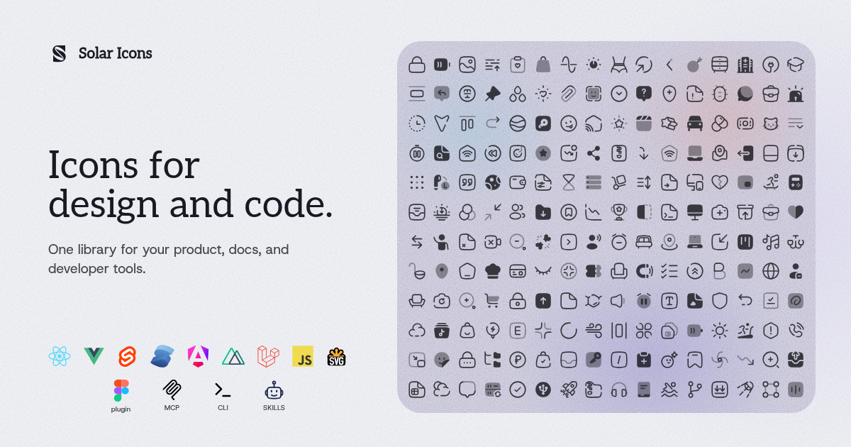
Solar Icons for Laravel Blade
A package to easily make use of Solar Icons in your Laravel Blade views.
For a full list of available icons see the SVG directory or preview them at solar-icons.vercel.app/icons.
Requirements
- PHP 8.1 or higher
- Laravel 9.0 or higher
Installation
composer require solar-icons/blade
Blade Icons
Solar Icons Blade uses Blade Icons under the hood. Please refer to the Blade Icons readme for additional functionality. We also recommend to enable icon caching with this library — the package ships over 8,000 SVGs, so caching keeps rendering fast.
Usage
Icons are available in six styles — linear, bold, broken, outline, bold-duotone and line-duotone — as self-closing Blade components which compile to SVG icons:
<x-solar-linear-heart />
<x-solar-bold-heart />
<x-solar-line-duotone-heart />
You can also pass classes to your icon components:
<x-solar-linear-heart class="w-6 h-6 text-gray-500" />
And even use inline styles:
<x-solar-linear-heart style="color: #555" />
Dynamic icons
One component covers every icon and style — handy for switching styles server-side or rendering icon names coming from the database:
<x-solar-icon name="heart" weight="linear" />
<x-solar-icon name="heart" weight="bold-duotone" class="w-6 h-6" />
<x-solar-icon :name="$menuItem->icon" weight="linear" />
Duotone styles (bold-duotone, line-duotone) expose a second color via CSS variables, which the browser resolves at render time:
<x-solar-line-duotone-heart style="--solar-secondary-color: #2563eb; --solar-secondary-opacity: 0.5" />
Raw SVG Icons
If you want to use the raw SVG icons as assets, you can publish them using:
php artisan vendor:publish --tag=solar-icons-blade --force
Then use them in your views like:
<img src="{{ asset('vendor/solar-icons-blade/linear-heart.svg') }}" width="10" height="10" />
Keep in mind these files are normalized for framework use: like the components,
they ship without a baked stroke-width (the default 1.5 is applied once at
render time from the package config). A standalone <img> therefore renders
with the SVG default stroke width. Prefer the components, or @solar-icons/static
when you need the raw artwork with its own defaults.
Configuration
This package also offers the ability to use features from Blade Icons like default classes, default attributes, etc. If you'd like to configure these, publish the config file:
php artisan vendor:publish --tag=solar-icons-blade-config
Documentation, issues and icon requests
Full documentation lives on the Solar Icons docs site. Please report PHP-specific bugs here, and open general issues and icon requests in the main repository so everything stays in one place.
Changelog
Check out the CHANGELOG in this repository for all the recent changes.
License
Package code is MIT. Icons by 480 Design (CC BY 4.0) plus curated Solar extensions — see the main repository for full attribution.