neos / form-builder
Flow Form Framework integration into Neos CMS
Fund package maintenance!
- dev-main
- 3.0.5
- 3.0.4
- 3.0.3
- 3.0.2
- 3.0.1
- 3.0.0
- 2.3.x-dev
- 2.3.7
- 2.3.6
- 2.3.5
- 2.3.4
- 2.3.3
- 2.3.2
- 2.3.1
- 2.3.0
- 2.2.0
- 2.1.0
- 2.0.0
- 1.3.x-dev
- 1.3.0
- 1.2.x-dev
- 1.2.2
- 1.2.1
- 1.2.0
- 1.1.1
- 1.1.0
- 1.0.x-dev
- 1.0.5
- 1.0.4
- 1.0.3
- 1.0.2
- 1.0.1
- 1.0.0
- dev-bugfix/select-option-values
- dev-bugfix/unique-identifier
- dev-bugfix/render-options
- dev-dependabot/npm_and_yarn/Resources/Private/Styles/minimatch-3.0.8
- dev-revert-148-dlubitz-patch-1
- dev-dependabot/npm_and_yarn/Resources/Private/PlaceholderInsert/esbuild-0.25.0
- dev-select-option-collection
This package is auto-updated.
Last update: 2026-04-25 11:48:20 UTC
README
This package adds a builder for the Flow Form Framework to the Neos CMS backend. It also comes with Fusion prototypes that allow for dynamic Fusion based Form definitions.
Related Packages
Make sure to have a look at the other Flow Form Framework Related Packages
Usage
Install this package using composer:
composer require neos/form-builder
Note: This package requires the
neos/neospackage in version 3.1 or higher
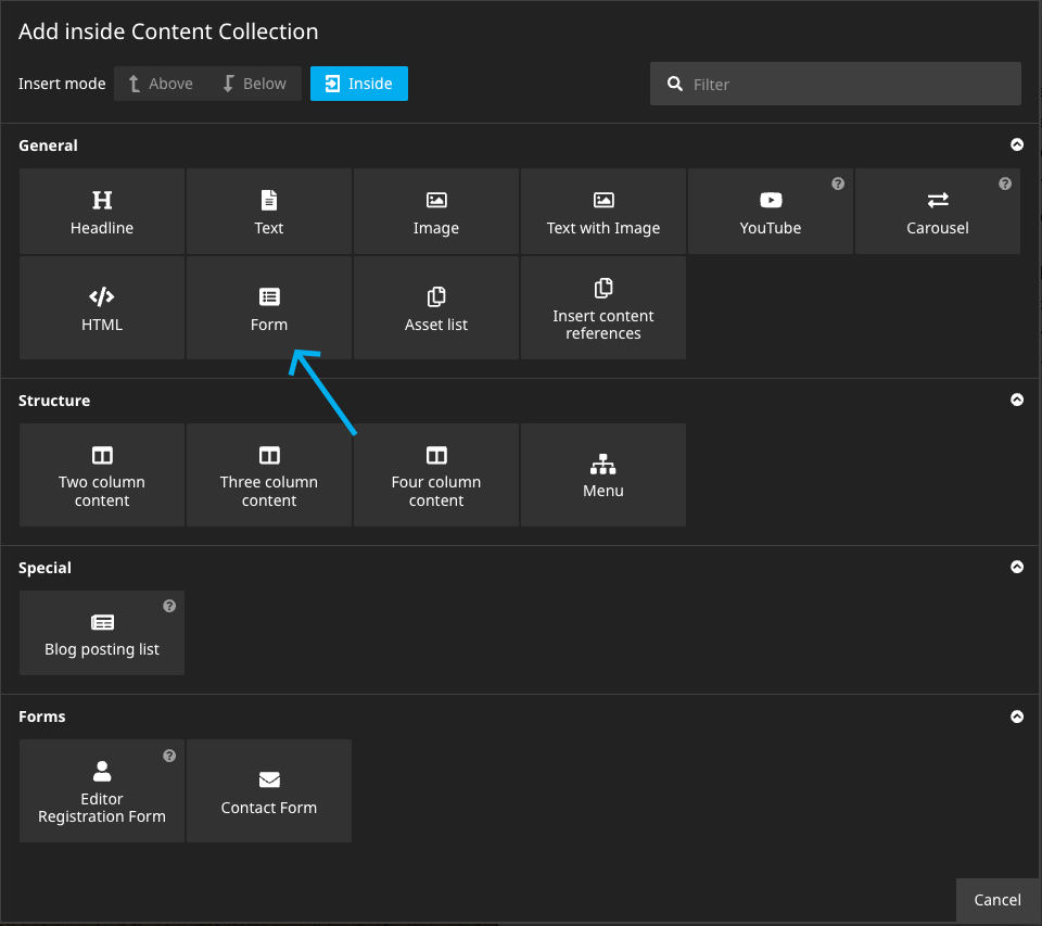
In the Neos backend there's now a new Content Element type that can be used:
Note: If you have the
Neos.NodeTypespackage installed, there are two types of Forms that can be inserted. The following snippet can be added to the sitesNodeTypes.yamlin order to disable the Neos.NodeTypes Form:
'Neos.NodeTypes:Form': ~
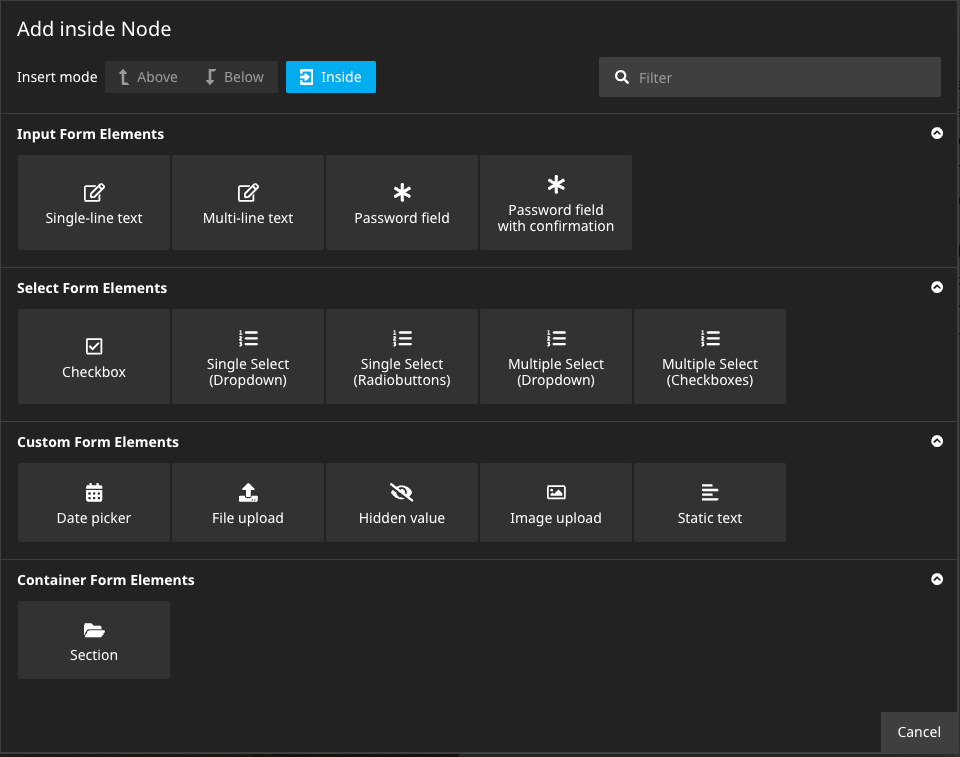
Now, Form Elements can be added to the Form:
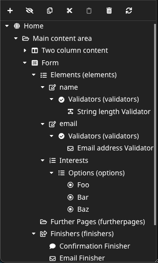
To each Form Element Validators can be added and some elements allow to create child Form Elements or Select Options. Besides, every form allows to create Further Form Pages that can contain elements themselves. And, of course, Form Finishers can be added to the Form.
So there are quite a lot of Content Collections and they are easily confused. One solution is to use the Structure Tree when working on complex forms:
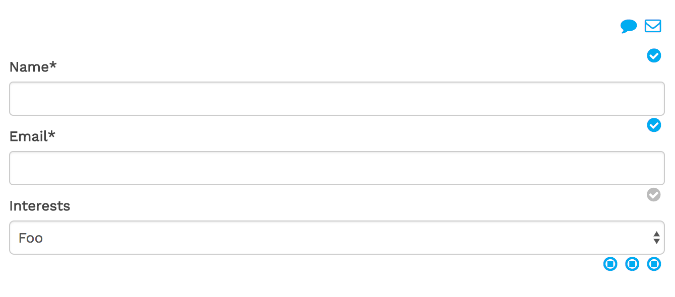
In addition this package comes with some custom StyleSheet that should make the Form Builder more accessible:
Adjust appearance of the Form Builder
This package provides some CSS that can be included in order to adjust the
styling of the Form Builder within the Neos Backend.
The following Fusion snippet can be added in order to include the custom CSS
when in the Neos Backend (as long as the page Fusion prototype extends from Neos.Neos:Page):
prototype(Neos.Neos:Page) {
    head.formBuilderStyles = Neos.Fusion:Tag {
        tagName = 'link'
        attributes {
            rel = 'stylesheet'
            href = Neos.Fusion:ResourceUri {
                path = 'resource://Neos.Form.Builder/Public/Styles/Backend.css'
            }
        }
        @position = 'end'
        @if.isInBackend = ${documentNode.context.inBackend}
    }
}
As a result the form will look something like this in the Backend:
Build forms with Fusion
The main purpose of this package is its integration to the Neos Backend, using Content Repository Nodes to represent the definition of a Form. But in some cases it can be very useful to define Forms in pure Fusion:
prototype(Some.Package:ContactForm) < prototype(Neos.Form.Builder:Form) {
    presetName = 'default'
    firstPage {
        elements {
            name = Neos.Form.Builder:SingleLineText.Definition {
                label = 'Name'
                validators {
                    stringLength = Neos.Form.Builder:StringLengthValidator.Definition {
                        options.minimum = 5
                    }
                }
                properties.placeholder = 'Your name'
            }
            email = Neos.Form.Builder:SingleLineText.Definition {
                label = 'Email'
                validators {
                    emailAddress = Neos.Form.Builder:EmailAddressValidator.Definition
                }
                properties.placeholder = 'Your email address'
            }
            interests = Neos.Form.Builder:MultipleSelectCheckboxes.Definition {
                label = 'Interests'
                required = ${false}
                properties.options {
                    neos = 'Neos CMS'
                    flow = 'Neos Flow'
                    chicken = 'Chickens'
                }
            }
            comment = Neos.Form.Builder:MultiLineText.Definition {
                label = 'Message'
                properties.placeholder = 'Your Comment'
            }
        }
    }
    finishers {
        confirmationFinisher = Neos.Form.Builder:ConfirmationFinisher.Definition {
            options {
                message = 'Thank you for your comment, {name}!'
            }
        }
    }
}
To create multi-page forms the furtherPages field can be used:
prototype(Some.Package:ContactForm) < prototype(Neos.Form.Builder:Form) {
    // ...
    furtherPages {
        page2 = Neos.Form.Builder:FormPage.Definition {
            elements {
                elementOnPage2 = Neos.Form.Builder:SingleLineText.Definition {
                    label = 'Element on page 2'
                }
            }
        }
        preview = Neos.Form.Builder:PreviewPage.Definition
    }
}
Now the Some.Package:ContactForm prototype can be used just like any other
Content Element (or even as Document).
In this case the result is just a static contact Form, so there is not much difference to YAML-based Form Definitions. But obviously use all the Fusion and Eel power can be used to create dynamic forms. For example Form fields could be pre-filled with the authenticated user's data:
// ...
    someFormField = Neos.Form.Builder:SingleLineText.Definition {
        defaultValue = ${Security.account.accountIdentifier}
        // ...
In order to set options based on the current Fusion context, the values have to be added to the Forms context explicitly in order to make them available in the elements/finisher configuration:
prototype(Some.ContactForm:Contact) < prototype(Neos.Form.Builder:Form) {

    // Redirect to the first child node of type "Some.Target:NodeType" upon form submission
    @context.redirectUri = Neos.Neos:NodeUri {
        node = ${q(documentNode).children('[instanceof Some.Target:NodeType]').get(0)}
    }

    // ...

    finishers {
        redirectFinisher = Neos.Form.Builder:RedirectFinisher.Definition {
            options {
                uri = ${redirectUri}
            }
        }
    }
}
Caching
By default, all Neos.Form.Builder:Form implementations are not cached.
This is done in order to avoid nasty bugs when assumed otherwise.
To optimize performance, this behavior can be changed for individual forms to make them (partially) cached. I.e. the static form above could be changed as follows:
prototype(Some.Package:ContactForm) < prototype(Neos.Form.Builder:Form) {
    @cache {
        mode = 'dynamic'
        entryIdentifier {
            node = ${node}
        }
        entryTags {
            1 = ${Neos.Caching.nodeTag(node)}
        }
        entryDiscriminator = ${request.httpRequest.methodSafe ? 'static' : false}
        context {
            1 = 'node'
            2 = 'documentNode'
        }
    }
    // ...
With that in place, the initial Form rendering is cached and the mode is changed to "uncached" when the Form is submitted (= unsafe request).
Note: The
dynamicCache mode only works reliably with Neos versions 2.3.15+ and 3.1.5+
Custom Form Elements
The Form Elements defined in the default preset (and available in this package) are
meant as a quickstart to simple Forms.
The main strength of the Flow Form Framework comes with it's easy creation of
custom Form Elements, Validators and Finishers (see documentation).
To allow custom Form Elements to be used in the Form Builder, a corresponding
NodeType has to be defined:
'Some.Package:SomeFormElementNodeType':
  superTypes:
    'Neos.Form.Builder:FormElement': TRUE
  ui:
    label: 'Some label'
    # add the new item in the "Custom Form Elements" section. Other options are form.elements, form.select and form.container
    group: 'form.custom'
Form Element Mapping
For the Form Element nodes, a corresponding Fusion Prototype named <NodeType>.Definition
is assumed to define the Form Element. (The .Definition suffix is used in order to
prevent naming conflicts with prototypes that render the Form Element).
The corresponding Fusion Prototype for the Node Type specified above could look something like this:
prototype(Some.Package:SomeFormElementNodeType.Definition) < prototype(Neos.Form.Builder:FormElement.Definition) {
    formElementType = 'Some.Package:SomeFormElement'
}
Alternatively the mapping to a Form Element Type can be specified via the options.form.formElementType
setting in the Node Type configuration if no custom Fusion Prototype is required:
'Some.Package:SomeFormElementNodeType':
  // ...

  options:
    form:
      formElementType: 'Some.Package:SomeFormElement'
If that option is set, the regular Neos.Form.Builder:FormElement.Definition Fusion Prototype
is used to evaluate the definition of that Form Element.
In any case that Form Element must be existent in the configured Form Preset in order to be rendered correctly.
Example: Custom "title" selector
A title selector is a common requirement for contact forms.
Instead of adding a generic select element and having to add the options
manually for every instance, we can easily create a custom element for that.
First, a new NodeType is required:
NodeTypes.yaml:
'Some.Package:Title':
  superTypes:
    'Neos.Form.Builder:FormElement': TRUE
  ui:
    label: 'Title'
    group: 'form.custom'
The corresponding Fusion maps the Form Element and specifies the selectable options:
Title.fusion:
prototype(Some.Package:Title.Definition) < prototype(Neos.Form.Builder:FormElement.Definition) {
    # we map this to the existing SingleSelectDropdown Form Element
    formElementType = 'Neos.Form:SingleSelectDropdown'
    properties {
        options = Neos.Form.Builder:SelectOptionCollection {
            mrs = 'Mrs.'
            mr = 'Mr.'
            miss = 'Miss'
            ms = 'Ms.'
            dr = 'Dr.'
            prof = 'Prof.'
        }
    }
}
Note: In this case we map the new Element to the
SingleSelectDropdownForm Element from the Neos.Form package. We could useSingleSelectRadioButtonsinstead, or to a custom element. Or have a dynamic mapping like in the following example
Example: Custom selector with dynamic Form Element type mapping
In this example we create a selector for Newsletter categories.
It's pretty similar to the previous example. But in this case we want
to give the editor a bit more control and allow them to specify whether
multiple categories can be selected.
So we create the NodeType with a property multiple:
NodeTypes.yaml:
'Some.Package:NewsletterCategories':
  superTypes:
    'Neos.Form.Builder:FormElement': TRUE
    'Neos.Form.Builder:DefaultValueMixin': FALSE
  ui:
    label: 'Newsletter Category Selector'
    group: 'form.select'
  properties:
    'multiple':
      type: boolean
      ui:
        label: 'Allow multiple'
        inspector:
          group: 'formElement'
..and map the Form Element depending on that property in the Fusion prototype:
NewsletterCategories.fusion:
prototype(Some.Package:NewsletterCategories.Definition) < prototype(Neos.Form.Builder:FormElement.Definition) {
    # depending on the "multiple" property this will render checkboxes or radio buttons
    formElementType = ${this.properties.multiple ? 'Neos.Form:MultipleSelectCheckboxes' : 'Neos.Form:SingleSelectRadiobuttons'}
    properties {
        options = Neos.Form.Builder:SelectOptionCollection {
            events = 'Events'
            corporate = 'Corporate'
            marketing = 'Marketing'
        }
    }
}
Dynamic options
Instead of hard-coding the options in the fusion prototype, we can use
FlowQuery to retrieve them from the Content Repository.
The following snippet will for example make any NewsletterCategory node
selectable:
NewsletterCategories.fusion:
    // ...
    properties {
        options = Neos.Form.Builder:SelectOptionCollection {
            items = ${q(site).children('[instanceof Some.Package:NewsletterCategory]')}
            itemRenderer = Neos.Fusion:DataStructure {
                value = ${item.aggregateId}
                label = ${q(item).property('title')}
            }
        }
    }
Upgrade to version 3
Neos.Form.Builder:SelectOptionCollection
The Neos.Form.Builder:SelectOptionCollection prototype has been changed and uses now items instead of collection.
Also, the way how dynamic options got collected has been changed. Instead of defining the property path, you now need to
use a renderer to render the value and label of your option.


