markhuot / craft-keystone
A modern page builder
Package info
github.com/markhuot/craft-keystone
Type:craft-plugin
pkg:composer/markhuot/craft-keystone
Requires
- craftcms/cms: ^4.5.7
- nikic/php-parser: ^4.17
- sebastian/comparator: ^5.0@dev
Requires (Dev)
- craftcms/craft: dev-main
- laravel/pint: ^1.13
- markhuot/craft-pest-core: dev-main
- phpstan/phpstan: ^1.10
This package is auto-updated.
Last update: 2026-04-29 01:26:38 UTC
README
The page builder experience for Craft CMS! Build complex pages without even touching a single template. Keystone allows you to organize your content in to components that can be endlessly nested and styled all from the Craft control panel.
Default Components
Keystone ships with a few default components to get you started, but it really should be extended per-site to provide all the components your site needs. The foundational components that come out-of-the-box are,
- Asset
- Heading
- Link
- Section
- Text
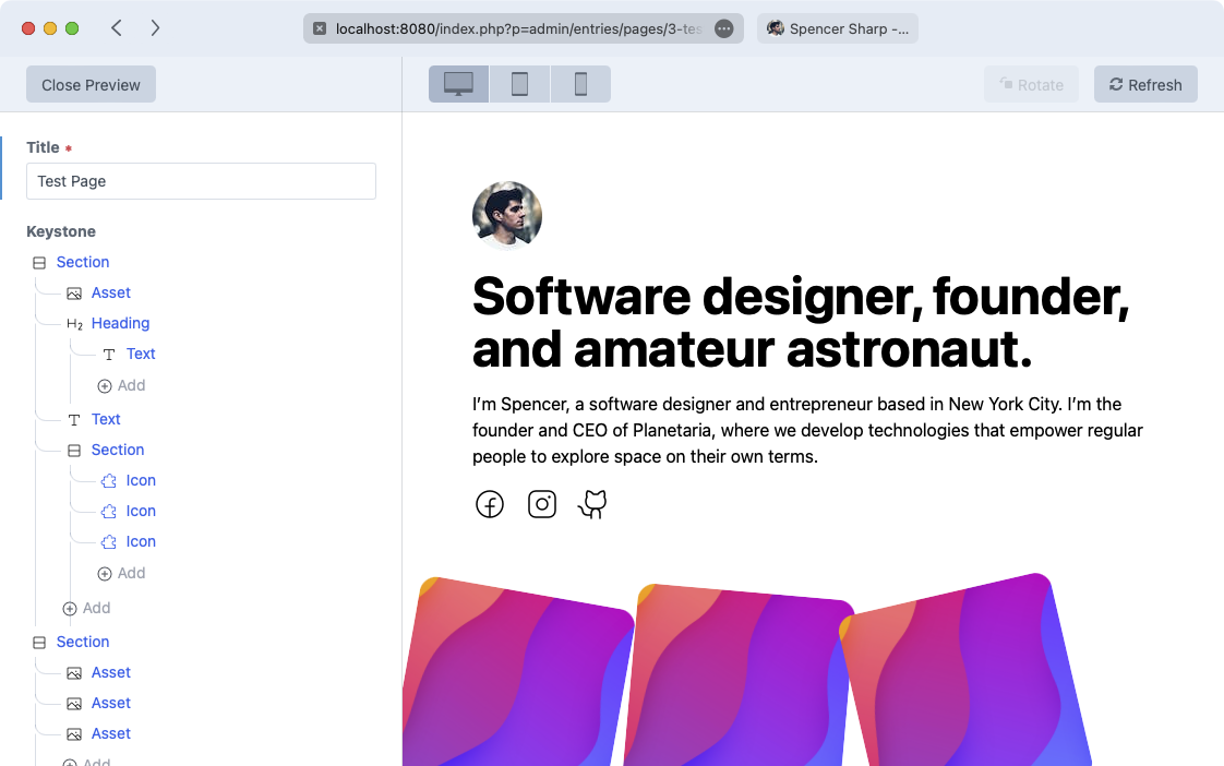
By combining those you can create a page that looks like the above screenshot. Notice how the text is nested within a heading because, like HTML, components can take any number of children to make vibrantly rich experiences.
Creating your own components
Creating a component is as simple as adding a .tiwg file to your site's templates directory. Say you wanted to build a
card component. You would create a file in the templates/components directory named card.twig. Keystone automatically
picks up any components in that directory.
The card.twig file could contain something like this,
<div {{ attributes }}>
    <div>{% slot "media" %}{% endslot %}</div>
    <div>{{ props.heading }}</div>
    <div>{% slot %}{% endslot %}</div>
</div>
That would create a new "Card" component that has a heading field and two slots. The heading field could be updated in
a normal Craft plain text field and the two slots would take any nested components you wanted to place in them.
It could also contain something much more complex, like this,
{# The default name would be `Card` based on the filename of `card.twig` #}
{% export name = "My Great Card" %}

{# The default icon would be a puzzle piece, but you can override that with any SVG here #}
{% export icon %}<svg...>{% endexport %}

{# Any `prop` that is accessed below will automatically become a plain text field #}
{# If you want to override that you can export propTypes for any field you want to #}
{# provide more information for. #}
{% export propTypes = {
    heading: field('plaintext')
} %}

{# The `attributes` array will come out of the Keystone "Design" tab. You can provide #}
{# defaults for the user via `attributes.merge()`. #}
<div {{ attributes.merge({class: 'border-2 border-gray-500 rounded-lg p-2 space-y-2'}) }}>

    {# Slots can be restricted to only allow specific component types so you can tell #}
    {# an area like that that it should only display assets #}
    <div>{% slot "media" allow ["keystone/asset"] %}{% endslot %}</div>

    {# Any field accessed on `props` will be available to edit in the Craft CP #}
    <div class="text-2xl font-bold">{{ props.heading }}</div>

    {# The default `slot` #}
    <div>{% slot %}{% endslot %}</div>
</div>
Design
The Keystone Designer is configured out of the box to work with Tailwind CSS. Any design
attributes set in the UI such as a padding of 4rem will be converted in to a Tailwind class of p-[4rem].

