ktrfo / filament-shadcn-theme
Shadcn-style theme for Filament v4 with inverted primary colors between light and dark modes
Installs: 1
Dependents: 0
Suggesters: 0
Security: 0
Stars: 0
Watchers: 0
Forks: 0
Open Issues: 0
Language:CSS
pkg:composer/ktrfo/filament-shadcn-theme
Requires
- php: ^8.2|^8.3|^8.4
- filament/filament: ^4.0
README
A beautiful Shadcn-style theme for Filament v4 with inverted primary colors between light and dark modes.
Features
✨ Unique Inverted Color System - Dark buttons in light mode, light buttons in dark mode 🌓 Perfect Dark Mode Support - Optimized for both light and dark themes 🎨 Shadcn Aesthetic - Clean, modern, professional design 🔘 Optimized Toggle Switches - Better visibility in dark mode with subtle backgrounds 🏷️ Subtle Badge Styling - Light backgrounds with borders, matching the Shadcn design language 🔗 Transparent Link-Style Buttons - Action buttons with opacity hover effects 📦 Minimal CSS - Only ~110 lines of focused, well-documented CSS ⚡ Built for Modern Stack - Filament v4 + Tailwind CSS v4
Preview
Data Tables
 Posts table in light mode showing inverted dark buttons
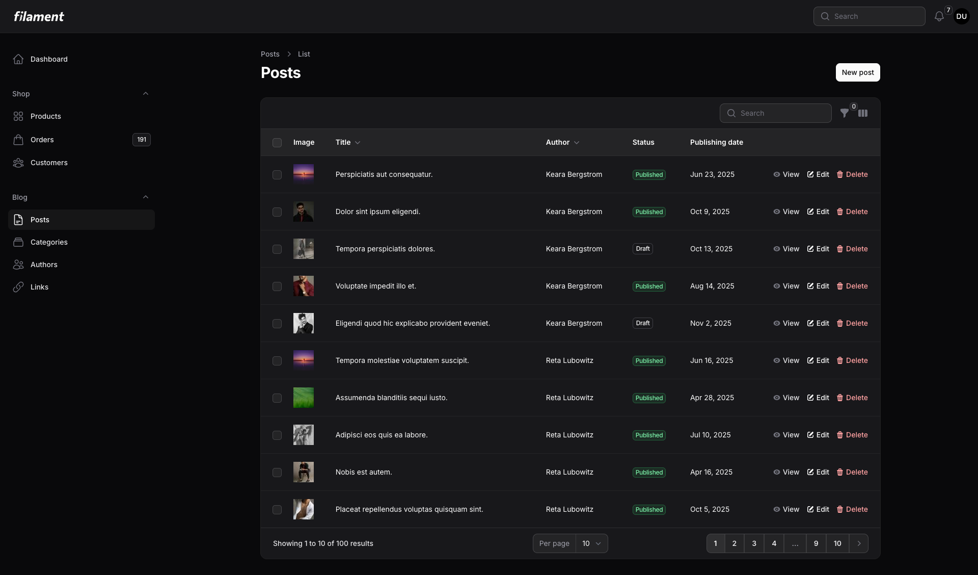 Posts table in dark mode with inverted light buttons
Forms & Badges
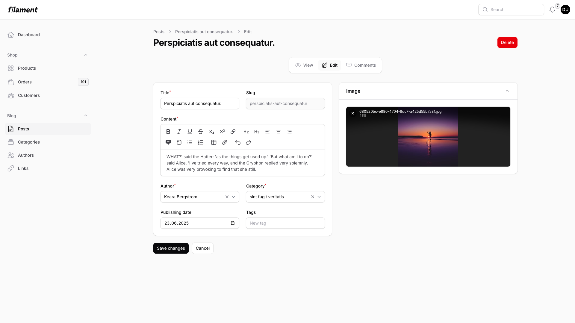 Edit form in light mode with subtle badges and form fields
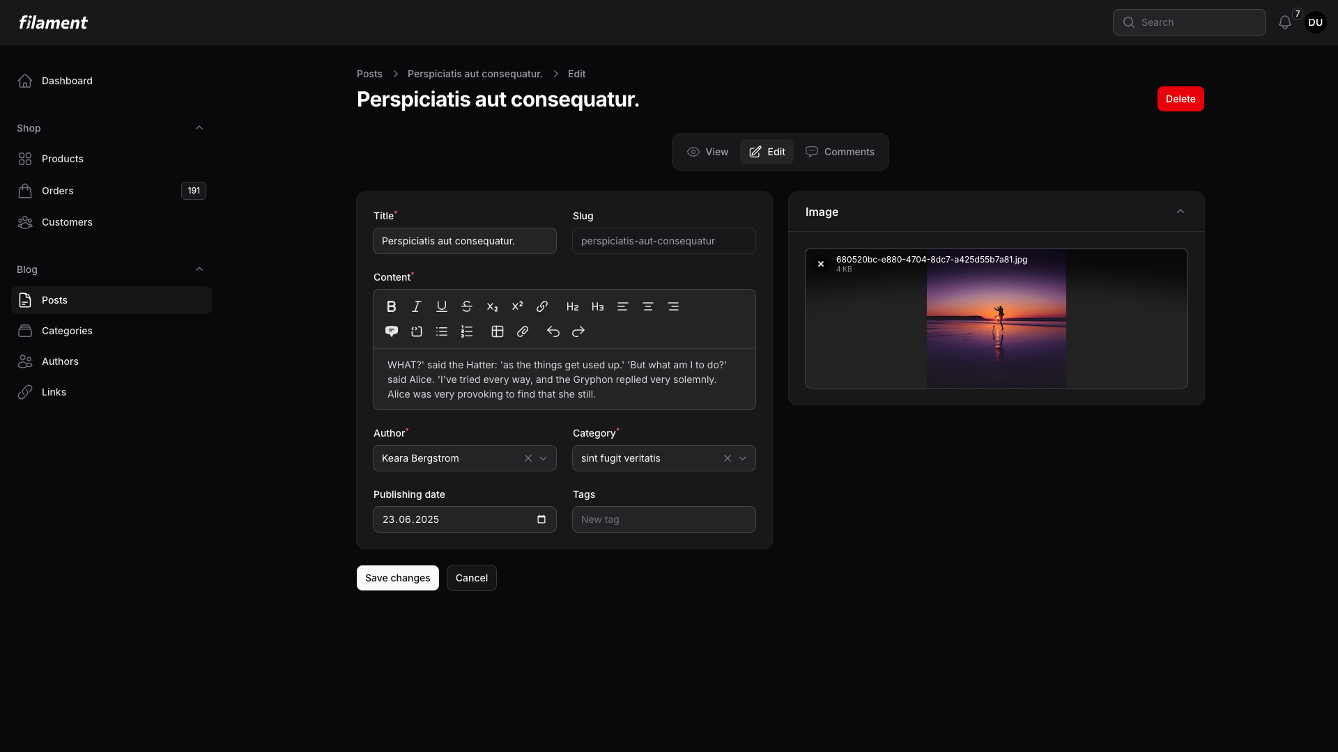 Edit form in dark mode showing optimized toggle switches
Complex Tables with Multiple Badge Types
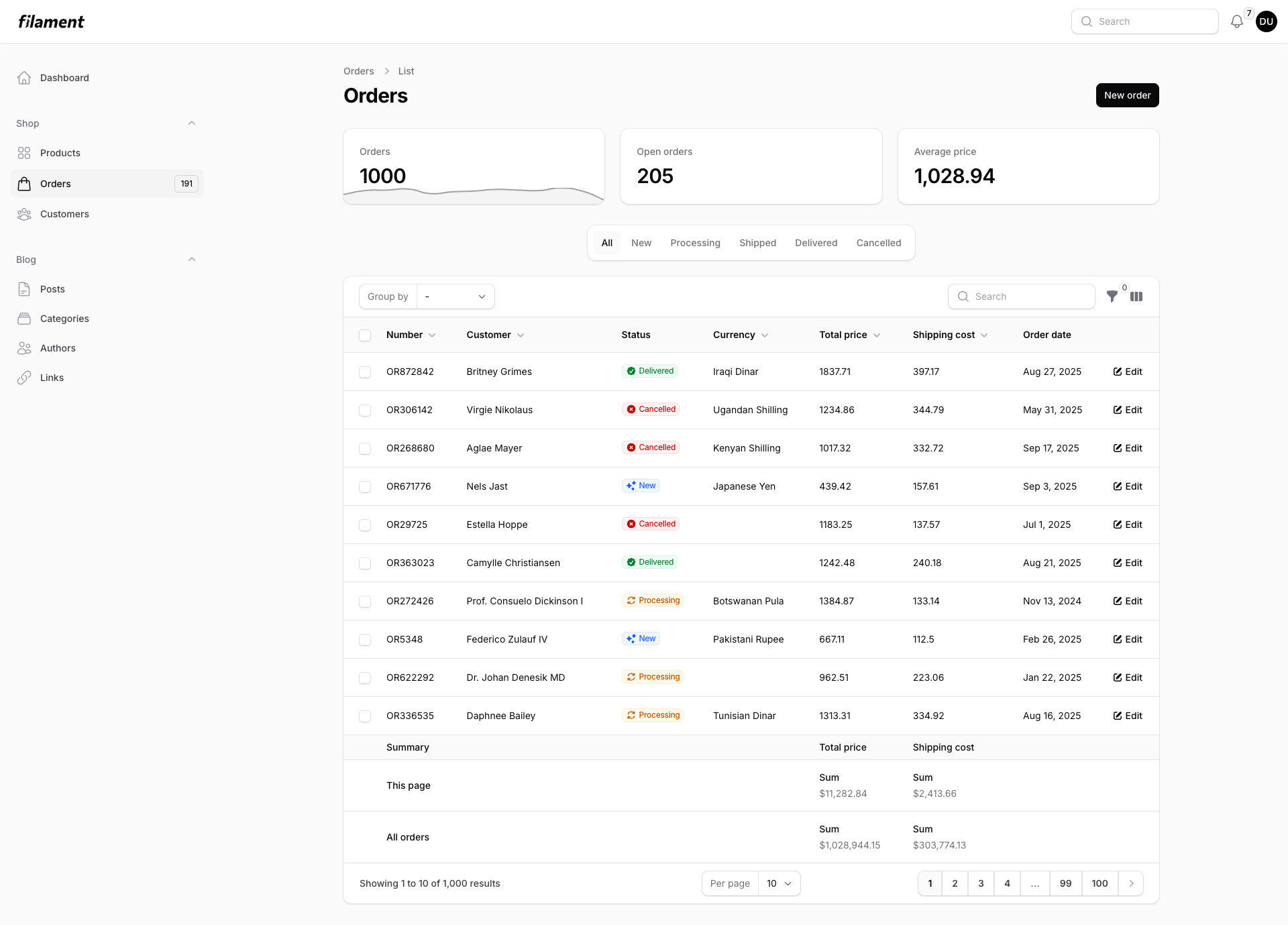 Orders table demonstrating multiple badge colors and types
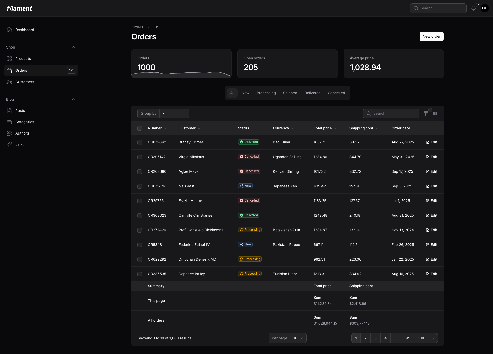 Orders table in dark mode with enhanced visibility
Requirements
- PHP 8.2 or higher
- Filament v4.0 or higher
- Tailwind CSS v4
Installation
Step 1: Install via Composer
composer require ktrfo/filament-shadcn-theme
Step 2: Register Primary Colors in Panel Provider
In your AdminPanelProvider (or your custom panel provider), register the grayscale color palette:
use Filament\Panel;

public function panel(Panel $panel): Panel
{
    return $panel
        // ... other configuration
        ->colors([
            'primary' => [
                50 => '250, 250, 250',
                100 => '244, 244, 245',
                200 => '228, 228, 231',
                300 => '212, 212, 216',
                400 => '161, 161, 170',
                500 => '113, 113, 122',
                600 => '82, 82, 91',
                700 => '63, 63, 70',
                800 => '39, 39, 42',
                900 => '24, 24, 27',
                950 => '9, 9, 11',
            ],
        ]);
}
Step 3: Create Custom Theme
Create a custom Filament theme that imports the Shadcn theme CSS. Follow Filament's custom theme documentation.
Quick setup:
- Create
resources/css/filament/admin/theme.css:
@import 'filament/filament/resources/css/theme.css';
@import 'ktrfo/filament-shadcn-theme/resources/css/theme.css';

@config './tailwind.config.js';
- Create
resources/css/filament/admin/tailwind.config.js:
export default {
    content: [
        './app/Filament/**/*.php',
        './resources/views/filament/**/*.blade.php',
        './vendor/filament/**/*.blade.php',
        './vendor/ktrfo/filament-shadcn-theme/resources/**/*.css',
    ],
}
- Update
vite.config.jsto compile the theme:
export default defineConfig({
    plugins: [
        laravel({
            input: [
                'resources/css/app.css',
                'resources/js/app.js',
                'resources/css/filament/admin/theme.css', // Add this
            ],
            refresh: true,
        }),
    ],
});
- Build the CSS:
npm run build
- Register the theme in your panel provider:
public function panel(Panel $panel): Panel
{
    return $panel
        // ... other configuration
        ->viteTheme('resources/css/filament/admin/theme.css');
}
How It Works
This theme uses CSS variable inversion to achieve the unique Shadcn-style appearance:
Light Mode
--primary-950=9, 9, 11(black) → Dark buttons--primary-50=250, 250, 250(white) → Light text
Dark Mode (Inverted)
--primary-950=250, 250, 250(white) → Light buttons--primary-50=9, 9, 11(black) → Dark text
This inversion creates a unique visual identity where primary buttons always stand out against their background, similar to Shadcn UI.
Customization
Changing Colors
You can customize the color palette by modifying the colors() array in your panel provider. The theme will automatically adapt to your chosen grayscale values.
->colors([
    'primary' => [
        // Your custom grayscale palette
        50 => '...',
        // ... other shades
        950 => '...',
    ],
])
Excluding Tree Overrides
If you don't use the Filament Tree package or want to style it yourself, you can create your theme without the tree overrides:
@import 'filament/filament/resources/css/theme.css';
/* Don't import tree-overrides - create your own theme.css instead */
Then manually copy the CSS from vendor/ktrfo/filament-shadcn-theme/resources/css/theme.css (excluding the tree import).
What Gets Styled
- ✅ Primary Buttons - Inverted colors with hover states
- ✅ Badges - Subtle backgrounds with borders
- ✅ Toggle Switches - Optimized for dark mode visibility
- ✅ Link-Style Action Buttons - Transparent with opacity hover
- ✅ Tree Navigation (optional) - Enhanced drag-and-drop styling
Browser Support
This theme uses modern CSS features and is tested on:
- Chrome/Edge (latest)
- Firefox (latest)
- Safari (latest)
Credits
License
The MIT License (MIT). Please see License File for more information.
Contributing
Contributions are welcome! Please feel free to submit a Pull Request.
Support
If you discover any issues, please open an issue on GitHub.
