kanuni / filament-cards
Package info
github.com/KanuniLab/filament-cards
Type:filament-plugin
pkg:composer/kanuni/filament-cards
Requires
- php: ^8.1
- filament/filament: ^4.0
README
Filament Cards Plugin
- Intro
- Screenshot
- Installation
- Creating a Cards Page
- Dynamically Adding Card Items to the Cards Page
- Adding Custom Link as Card Item
- Grouping Panel Items
- Defining a Custom URL and/or Open Link in New Tab
- Customizing the Display of Card Items
- Configuring Breadcrumbs for Pages Opened from the Cards Page
Intro
The Filament Cards plugin enables you to create a page containing cards. Card items can be other Filament pages or custom item with a link and can be organized into logical groups for easier navigation, if you have a lots of cards. Each card can have title, an icon and description. When Filament page is added as an item, the cards page automatically applied the page's title, icon and URL, although you can customize these properties as needed.
The best use case for this plugin would be application control panel or settings hub, where you can organize all of the application settings on one page.
Screenshot
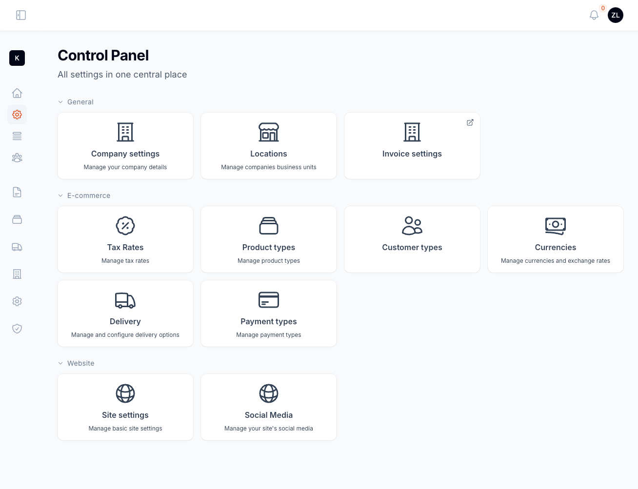
Default view of the Cards Page with items organized into groups and displayed as individual cards
Installation
Install the plugin using Composer:
composer require kanuni/filament-cards
For Filament v3 version install 0.x version of the package:
composer require kanuni/filament-cards:^0.4
In an effort to align with Filament's theming methodology you will need to use a custom theme to use this plugin.
Note If you have not set up a custom theme and are using a Panel follow the instructions in the Filament Docs v3.x first. Check it out here for Filament Docs v4.x. The following applies to both the Panels Package and the standalone Forms package.
For Filament v4.x
Add the plugin's views directory to your theme.css file:
@source '../../../../app/Filament';
@source '../../../../resources/views/filament';

/* Add this to your theme.css */
@source '../../../../vendor/kanuni/filament-cards/resources/views';
For Filament v3.x
Add the plugin's views to your tailwind.config.js file.
content: [
    './vendor/kanuni/filament-cards/resources/**/*.blade.php',
]
Rebuild the assets with npm command:
npm run build
Creating a cards page
As an example, we will create a custom Filament page that will serve as an application control panel. Start by creating a Filament page at App\Filament\Pages\ControlPanel.php. Instead of extending the default Filament page class, this page should extend the Kanuni\FilamentCards\Filament\Pages\CardsPage class.
Additionally, we need to define a private static method, getCards(), which returns an array of CardItem objects.
namespace App\Filament\Pages;

use Kanuni\FilamentCards\Filament\Pages\CardsPage;
use Kanuni\FilamentCards\CardItem;
use App\Filament\Pages\CompanySettings;

class ControlPanel extends CardsPage
{
    protected static string|BackedEnum|null $navigationIcon = 'heroicon-o-cog-8-tooth';

    protected static function getCards(): array
    {
        return [
            CardItem::make(CompanySettings::class)
        ];
    }
}
In above example we added CompanySettings page as card item on our control panel page. The card item will inherit title and icon from that page. If you want to override that convention or add optional description you can use methods title(), icon() and description() on CardItem object.
Note that if the page provided to the card item belongs to a Filament resource, the title and icon will automatically be derived from the resource class.
Dynamically Adding Card Items to the Cards Page
The CardsPage class includes a static addCards() method, allowing you to dynamically add card items to the page from outside the class. This is especially useful in modular applications or when building packages that need to register their own cards.
This means you can register additional cards for your ControlPanel page from a service provider, boot method, or another context, without modifying the class itself.
For example, in a service provider (like AppServiceProvider or a dedicated one), you can do:
use App\Filament\Pages\ControlPanel;
use Kanuni\FilamentCards\CardItem;
use App\Filament\Pages\UserManagement;

public function boot(): void
{
    // ControlPanel page extends CardsPage class
    ControlPanel::addCards([
        CardItem::make(UserManagement::class)
            ->title('User Accounts')
            ->icon('heroicon-o-users')
            ->description('Manage roles, permissions, and user accounts'),
    ]);
}
This allows better modularity, where each domain or feature can register its own card on the control panel, promoting separation of concerns.
You can also pass a Closure to the title(), description(), icon() and url() methods. This allows you to return values conditionally or dynamically. For example:
CardItem::make('/some/path')
    ->title(fn () => __('user-accounts.title'))
    ->icon(fn () => __('user-accounts.icon'))
    ->description(fn () => __('user-accounts.description')),
Adding Custom Link as Card Item
You can add custom link as a card item by passing URL to CardItem's make() method. See following example:
use Kanuni\FilamentCards\CardItem;

protected static function getCards(): array
{
    return [
        CardItem::make('/path/to/docs')
            ->title('Documentation')
            ->icon('heroicon-o-document-text')
            ->description('Read the docs')
    ];
}
Grouping Panel Items
Organize card items into collapsible groups by using the group() method on a CardItem object:
use Kanuni\FilamentCards\CardItem;

protected static function getCards(): array
{
    return [
        CardItem::make(CompanySettings::class)->group('General')
    ];
}
The group() method now also accepts a Closure as the group name argument. This allows the group name to be lazily evaluated at render time:
use Kanuni\FilamentCards\CardItem;

protected static function getCards(): array
{
    return [
        CardItem::make(CompanySettings::class)
            ->group(fn () => __('company.group')),
    ];
}
Collapse Groups
By default, all groups on the card's page are expanded when you open the page. However, you can specify which groups should be collapsed initially. To do this, use the $collapsedGroups property on the card's page instance and pass an array of group names to be collapsed.
use Kanuni\FilamentCards\Filament\Page\CardsPage;

class ControlPanel extends CardsPage
{
    protected static array $collapsedGroups = ['General', 'Advanced'];

    protected static function getCards(): array
    {
        return [...];
    }
}
In this example, the "General" and "Advanced" groups will be collapsed by default, allowing users to expand them only when needed. This feature helps keep the page organized, especially when there are multiple groups containing lots of items.
If you need to conditionaly collapse some of the groups you can override getCollapsedGroups() on your page and return list of groups that should be collapsed, for example:
use Kanuni\FilamentCards\Filament\Page\CardsPage;

class ControlPanel extends CardsPage
{
    public function getCollapsedGroups(): array
    {
        if (auth()->user()->role !== 'admin') {
            // For non-admin users collapse 'Advanced' group
            return ['Advanced'];
        }

        return [];
    }
}
Prevent Groups from Collapsing
You can control the collapse functionality for groups by overriding the protected static property $disableGroupsCollapse. This property can either be:
- A
bool, to enable or disable collapsing for all groups - An
arrayof specific group names, to prevent only those groups from being collapsed
To completely disable the ability to collapse groups, set $disableGroupsCollapse to true:
use Kanuni\FilamentCards\Filament\Page\CardsPage;

class ControlPanel extends CardsPage
{
    // Disable collapsing for all groups
    protected static bool|array $disableGroupsCollapse = true;
}
To disable collapsing only for certain groups, define an array of group names:
use Kanuni\FilamentCards\Filament\Page\CardsPage;

class ControlPanel extends CardsPage
{
    // Disable collapsing for the 'General' group
    protected static bool|array $disableGroupsCollapse = ['General'];
}
Defining a Custom URL and/or Open Link in New Tab
By default, when your card item is a Filament page the card item uses that page's URL. However, you can specify a custom URL with the url() method on the CardItem object:
use Filament\FilamentCards\CardItem;

private static function getCards(): array
{
    return [
        CardItem::make(CompanySettings::class)
            // Override page URL
            ->url('https://www.google.com')
            // Will open link in new tab
            ->openInNewTab()
    ];
}
You can also use absolute URL's like in the above example. Optionally you can change to open the link in new browser tab using openInNewTab() method.
Customizing the Display of Card Items
By default, the content of each card item (title, icon, and description) is stacked and centered. Customize this alignment with the $itemsAlignment property on the card's page. The property must be an enum value from Kanuni\FilamentCards\Enums\Alignment. Possible values are Alignment::Start, Alignment::Center and Alignment::End.
use Kanuni\FilamentCards\Filament\Page\CardsPage;
use Kanuni\FilamentCards\Enums\Alignment;

class ControlPanel extends CardsPage
{
    // Change alignment of card's title, icon and description
    protected static Alignment $itemsAlignment = Alignment::Start;
}
Changing the Icon Size
You can customize the icon size by overriding $iconSize property on the card's page. This property must be value from the Filament\Support\Enums\IconSize enum. There are three sizes IconSize::Small, IconSize::Medium and IconSize::Large. Default size is medium.
use Kanuni\FilamentCards\Filament\Page\CardsPage;
use Filament\Support\Enums\IconSize;

class ControlPanel extends CardsPage
{
    // Change the size of card's icons
    protected static IconSize $iconSize = IconSize::Small;
}
Inlining the Icon with the Card Title
To display an item's icon inline with its title, override the $iconInlined property on the card's page.
use Kanuni\FilamentCards\Filament\Page\CardsPage;
use Filament\Support\Enums\IconSize;

class ControlPanel extends CardsPage
{
    // Inline the card's icon with title
    protected static bool $iconInlined = true;
}
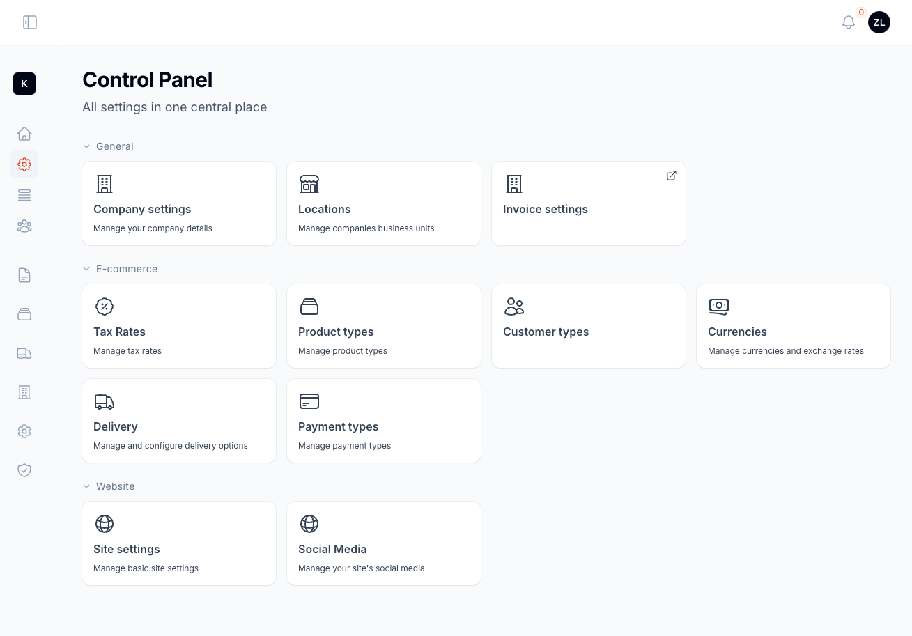
In the screenshot below, the icons are aligned with the title and set to a small size.
Configuring Breadcrumbs for Pages Opened from the Cards Page
By default, pages opened from the cards page will display the standard breadcrumbs. If you want to customize the breadcrumbs for pages accessed through the cards page, you can add the Kanuni\FilamentCards\Concerns\HasOriginBreadcrumb trait in your page class.
namespace App\Filament\Pages;

use Filament\Pages\Page;
use Kanuni\FilamentCards\Concerns\HasOriginBreadcrumb;

class CompanySettings extends Page
{
    use HasOriginBreadcrumb;
}
When this trait is applied, the breadcrumbs will be set according to the card item, but only if the page is accessed from the card's page. This allows you to customize the navigation for card-related pages while keeping default behavior for other pages.


