dft / silverstripe-fancy-top-nav
Simple, styled, full width theme with an afixed top header/navbar
Package info
github.com/Dean-Forest-Tech/silverstripe-fancy-top-nav
Language:Scheme
Type:silverstripe-theme
pkg:composer/dft/silverstripe-fancy-top-nav
Requires
- dft/silverstripe-deferedimages: ^1
- silverstripe/framework: ^4 || ^5
This package is auto-updated.
Last update: 2026-05-07 19:11:50 UTC
README
Simple, styled, full width theme with an afixed header/navbar at the top using Bootstrap 4 with the following features:
- Full width images
- Modern luuking galleries
- Styling for blog pages and posts
- Dropdown navigation in the main menu
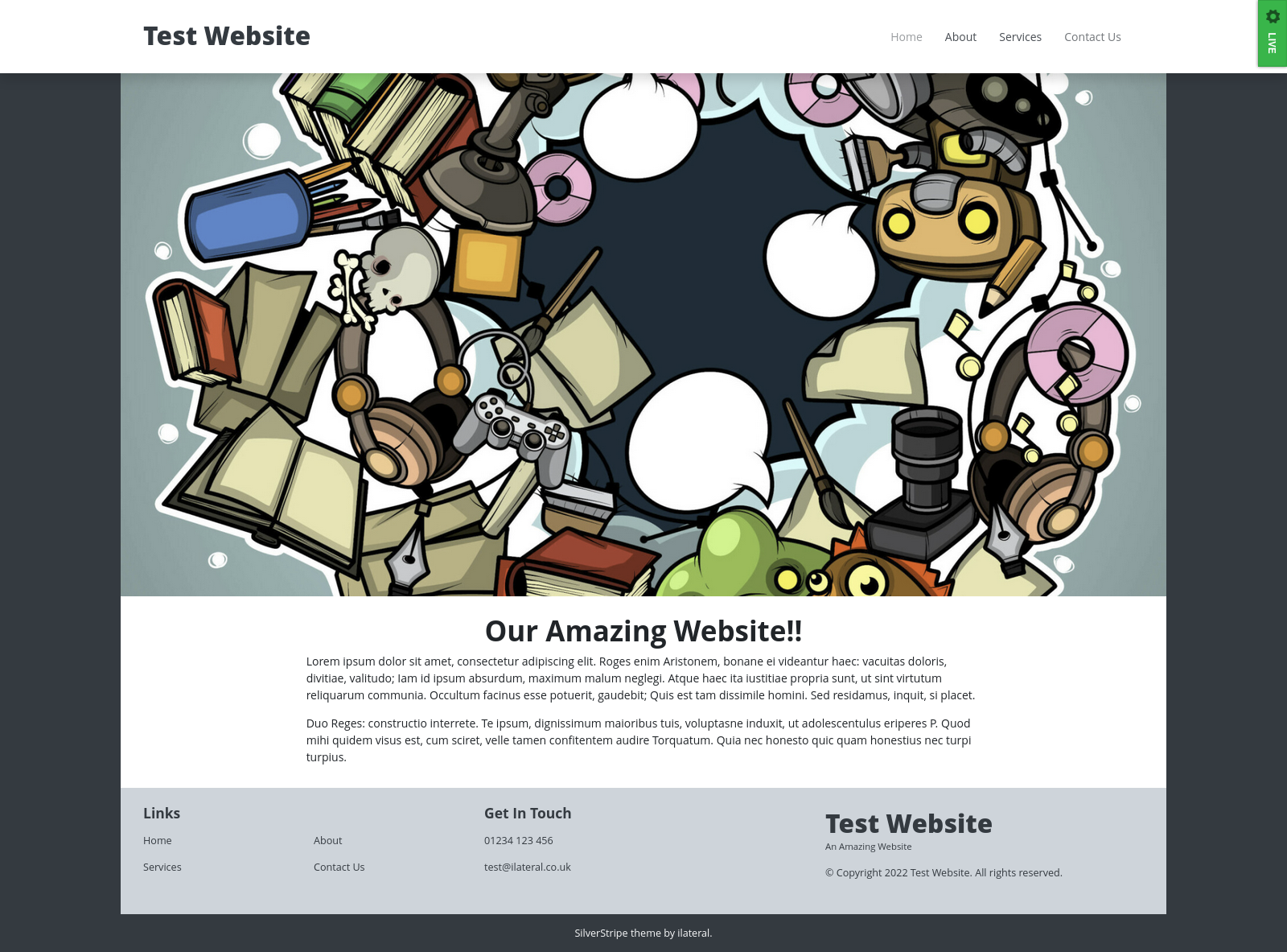
Apperance
Instalation
Install via composer:
composer require ilateral/silverstripe-fancy-top-nav
Requirements
This theme uses the ilateral\silverstripe-deferedimages module as well as heyday/silverstripe-responsive-images module quite extensivley. In order to work correctly
you will need to add some extra configuration to your project (covered below).
Supported Page Types
By default, this theme provides templates to support the following Page Types:
- Page
- Blog & Blog Post (official blog module)
- Child Hub Page (
i-lateral/silverstripe-child-hub-page) - Userforms
- Gallery Hub/Page (
i-lateral/silverstripe-gallery)
Setup
This theme makes some assumptions about your project setup:
1. FeaturedImage is available on all Pages
By default FeaturedImage is available on the blog, but you will also need to add the following code to yout Page.php
class Page extends SiteTree
{
    private static $has_one = {
        'FeaturedImage' => Image::class
    }
}
Every page template in this theme supports FeaturedImage, so to get the best
out of it, adding FeaturedImage to all pages will help.
You can alternatively rely on a module, such as i-lateral/silverstripe-featuredimage
2. Image size configuration
As mentioned above, this module makes use of the heyday/silverstripe-responsive-images module. You will need to add some additional
YML config to your project to define a valid image size, or else you will get errors:
---
Name: myimages
After: 'silverstripe-responsive-images/*'
---
Heyday\ResponsiveImages\ResponsiveImageExtension:
  default_method: FocusFill
  sets:
    FullwidthBanner:
      arguments:
        '(min-width: 1200px) and (min-device-pixel-ratio: 2.0)': [3840, 1500] # xl
        '(min-width: 1200px)': [1920, 750]
        '(min-width: 992px) and (min-device-pixel-ratio: 2.0)': [2400, 1200] # lg
        '(min-width: 992px)': [1200, 600]
        '(min-width: 768px) and (min-device-pixel-ratio: 2.0)': [1948, 1100] # md
        '(min-width: 768px)': [992, 600]
      default_arguments: [540, 750] # xs
    ContentBanner:
      arguments:
        '(min-width: 1200px) and (min-device-pixel-ratio: 2.0)': [2400, 1200] # xl
        '(min-width: 1200px)': [1200, 600]
        '(min-width: 992px) and (min-device-pixel-ratio: 2.0)': [1948, 1000] # lg
        '(min-width: 992px)': [992, 500]
        '(min-width: 768px) and (min-device-pixel-ratio: 2.0)': [1536, 1000] # md
        '(min-width: 768px)': [768, 500]
      default_arguments: [540, 540] # xs
NOTE: These are defaults, you can amend these sizes to suit your project needs. Also, an example of this config is provided with this module
Banner Images / Titles
This theme loads the title, breadcrumbs and any featured
images into a Banner include. This means you can
breakout and style the banner seperatly to the main site
Layout
You can also make the banner span the full width of the
site by adding FullWidthBanner to true in your Pages
or Controllers, eg:
class PageController extends ContentController
{
    public function getFullWidthBanner()
    {
        return true;
    }
}
Page Layout
As more complex websites need more sophisticated markup,
the $Layout variable is broken out into a seperate
include (called from Page.ss master template).
This allows the layout to be overwritten and altered
without having to make changes to the core Page.ss
master template (which allows for a slightly smoother
upgrade path)
Webpack
Core CSS/JS is transpiled and minified via webpack and all bootstrap classes are injected into the webpack bundle.
If you want to make use of webpack you will need to install Yarn
Edit This Theme Directly
If you are not using version control (eg: git) or have added this theme to your project's repo directly work with this theme. First navigate to the theme directory:
# cd /path/to/my/project/themes/bootstrap
Now install dependencies:
# yarn install
This will add node_modules to your theme and you can transpile dependencies using webpack:
# yarn dev
# yarn build
Using a Sub Theme
As of SilverStripe 4 you can use a sub theme to extend this theme, and you can use webpack to include SCSS/JS from this theme in your own custom theme.
Step 1: Create your theme Start off creating a theme with this structure (you can copy package.json and webpack.*.js out of the parent theme):
/themes/custom
    - src
        - javascript
            - script.js
        - scss
            - _variables.scss
            - mystyles.scss
            - bundle.scss
            - editor.scss
    - package.json
    - webpack.common.js
    - webpack.dev.js
    - webpack.prod.js
Step 2: Install dependencies As above, you must run the following:
# cd /path/to/project/themes/custom
# yarn install
Step 3: Setup your Bundle and/or Editor
In bundle.scss you can import you own variable overwrites, and custom styles and
bring them inline with the parent theme's by adding something like this:
themes/custom/src/scss/bundle.scss
@import "../../node_modules/bootstrap/scss/functions";

@import "global/fonts";
@import "global/variables";

/**
 * Parent theme includes. Enable, re-name as required
 * to custom parent theme
 */
//@import '../../../[THEME]/src/scss/global/variables';

@import "../../node_modules/bootstrap/scss/variables";

/**
 * Import core bootstrap modules (only two provided as an example)
 */
@import "../../node_modules/bootstrap/scss/mixins";
@import "../../node_modules/bootstrap/scss/root";

/**
 * Parent theme imports (enable, re-name as required)
 */
@import '../../../[PARENTTHEME]/src/scss/global/typography';
@import '../../../[PARENTTHEME]/src/scss/global/global';
@import '../../../[PARENTTHEME]/src/scss/global/header';
@import '../../../[PARENTTHEME]/src/scss/global/body';
@import '../../../[PARENTTHEME]/src/scss/global/footer';
@import '../../../[PARENTTHEME]/src/scss/global/misc';
@import '../../../[PARENTTHEME]/src/scss/layout/homepage';

/**
 * Import custom styles
 */
@import "mystyles.scss";
NOTE You may want to also add something similar to toyr editor.scss
Step 4 (optional): Add JS
If you need to add custom Javascript, you can either add it to your theme's
script.js or add additional JS files.
Step 4: Check Webpack Config The theme's webpack config wil be used to transpile and minify all the SCSS/JS.
For the most part, you shouldn't need to change this, but if you add new JS files or make more complex changes you might need to update mappings
Step 5: Run a build Once everything is ready, you can transpile and minify your CSS/JS. You can do this via:
# yarn dev
OR
# yarn build
yarn dev is quick, performs less checks and doesn't minify, good for development.
yarn build performs linting and also minifies compiled code.

