arkounay / ux-collection
Collection for Symfony forms
Maintainers
Package info
github.com/Arkounay/ux-collection
Language:JavaScript
Type:symfony-bundle
pkg:composer/arkounay/ux-collection
Requires
- symfony/flex: >=1.3.1
- symfony/form: >=5.4.0
- symfony/twig-bundle: >=5.4.0
Requires (Dev)
- symfony/framework-bundle: ^5.4|^6.0
- symfony/webpack-encore-bundle: ^1.13
README
Symfony Collections that works out of the box with Symfony UX

Note: Incompatible with Live Components for now - use the provided LiveCollectionType from LiveComponent instead.
Installation
Before you start, make sure you have StimulusBundle configured in your app.
Install the bundle using Composer and Symfony Flex:
composer require arkounay/ux-collection
If you're using WebpackEncore, install your assets and restart Encore (not needed if you're using AssetMapper):
npm install --force
npm run watch

# or use yarn
yarn install --force
yarn watch
If you're using bootstrap 5, you should disable the sandalone CSS import in assets\controllers.json :
"@arkounay/ux-collection": {
    "collection": {
        "enabled": true,
        "fetch": "eager",
        "autoimport": {
            "@arkounay/ux-collection/src/style.css": true,
            "@arkounay/ux-collection/src/style-when-not-using-bootstrap-5.css": false
        }
    },
    "tabbed_collection": {
        "enabled": true,
        "fetch": "eager",
        "autoimport": {
            "@arkounay/ux-collection/src/tabbed-style.css": true
        }
    }
}
Usage
In a form, use UxCollectionType. It works like a classic CollectionType except it has more options : e.g:
    use Arkounay\Bundle\UxCollectionBundle\Form\UxCollectionType;

    // ...

    public function buildForm(FormBuilderInterface $builder, array $options)
    {
        $builder
            // ...
            ->add('myCollection', UxCollectionType::class, [
                'entry_type' => MyEntryType::class,
                'allow_add' => true,
                'allow_delete' => true,
                'allow_drag_and_drop' => true,
                'drag_and_drop_filter' => 'input,textarea,a,button,label',
                'display_sort_buttons' => true,
                'add_label' => 'Add an item',
                'min' => 3,
                'max' => 10,
            ])
        ;
    }
Options
- allow_add: will display the Add button (default true)
- allow_delete: will display the Delete button (default true)
- allow_drag_and_drop: will allow the user to change item positions using drag and drop (default true)
- drag_and_drop_filter: when drag and drop is allowed, selectors that do not lead to dragging (default true)
- drag_and_drop_prevent_on_filter: when drag and drop is allowed, calls
event.preventDefault()when triggeredfilter(default false) - display_sort_buttons: will display arrow up and down buttons to change item positions (default true)
- display_insert_button: will display an insert button under every collection items (so items can be inserted inside the middle of the collection for example), only if
allow_addis set to true (default false) - add_label: The add button label (default "Add")
- insert_label: The insert button label (default "Insert")
- add_wrapper_class: The class used on the add button wrapper (default "mb-3")
- add_class: The class used on the add button (default "btn btn-outline-secondary collection-add")
- insert_class: The class used on the insert button (default "btn btn-outline-secondary btn-collection-insert collection-add")
- position_selector: If a dom selector is specified and it's targetting an input that is located inside a collection item, it will change this input's value and insert its current position (starting from 0) instead of changing the input's name. (ex:
'.position') - min: The number of minimum items within the collection. When a collection has
allow_addset totrueand has less items thanminupon creation, empty items will be added and the remove button will remain hidden until more items are created. (default 1) - max: The number of maximum items within the collection. When the collection reaches the maximum number of items, the add button will be hidden. (default null - no limit)
Nested collections
- When using nested collections, remember to change the
prototype_nameof the child's collection. It needs to be different than the parent's collection (that defaults to__name__) - If you're using
position_selectorin both parent and child collections, make sure they are different
Extend the default behavior
UxCollection allows you to extend its default behavior using a custom Stimulus controller, ie custom_collection_controller.js:
import { Controller } from '@hotwired/stimulus';

export default class extends Controller {

    connect() {
        this.element.addEventListener('ux-collection:connect', this._onConnect);
        this.element.addEventListener('ux-collection:change', this._onChange);
        this.element.addEventListener('ux-collection:add', this._onAdd);
        this.element.addEventListener('ux-collection:remove', this._onRemove);
    }

    disconnect() {
        this.element.removeEventListener('ux-collection:connect', this._onConnect);
        this.element.removeEventListener('ux-collection:change', this._onChange);
        this.element.removeEventListener('ux-collection:add', this._onAdd);
        this.element.removeEventListener('ux-collection:remove', this._onRemove);
    }

    _onConnect() {
        console.log('The custom collection was just created');
    }

    _onChange() {
        console.log('The custom collection changed');
    }

    _onAdd(event) {
        console.log('An element was added', event.detail);
    }

    _onRemove(event) {
        console.log('An element was removed', event.detail);
    }

}
Then in your form, add your controller as an HTML attribute:
public function buildForm(FormBuilderInterface $builder, array $options)
{
    $builder
        // ...
        ->add('collection', UxCollectionType::class, [
            'attr' => ['data-controller' => 'custom-collection']
        ])
        // ...
    ;
}
Listening to changes from a parent stimulus controller
If you have a parent stimulus controller and want to monitor changes in the collection (such as updating a total number of items or adjusting prices in a cart), you can utilize the ux-collection:change dispatched event and directly invoke a parent's controller method. For example if you have a stimulus controller called parent wrapping the collection with a onCollectionChange method, it will be called if you add the proper action in the form:
$builder->add('collection', UxCollectionType::class, [
    // ...
    'attr' => ['data-action' => 'ux-collection:change->parent#onCollectionChange']
]);
Note about File inputs
If your collection contains File inputs, depending on how you use FileType (e.g if you use a collection of VichUploaderBundle), you might have issues when adding/removing/moving items related to how positionning work. Use either the position_selector option to fix this, or disable sorting by setting allow_drag_and_drop and display_sort_buttons to false: this way the form name will not change.
EasyAdmin integration
For easyadmin 3+ you need to manually specify the form theme by overriding configureCrud in your DashboardController to add the theme @ArkounayUxCollection/ux_collection_form_theme.html.twig
public function configureCrud(): Crud
{
    return Crud::new()->addFormTheme('@ArkounayUxCollection/ux_collection_form_theme.html.twig');
}
You will need to configure your admin to use WebpackEncore so Symfony UX is taken into account, for example:
public function configureAssets(Assets $assets): Assets
{
    return parent::configureAssets($assets)
        ->addWebpackEncoreEntry('app');
}
QAG integration
This bundle is already included in QAG and works out of the box
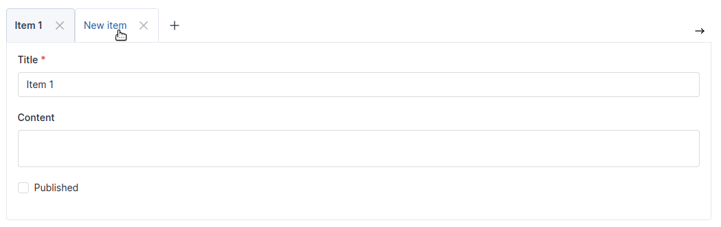
Extra collections type
There is also UxHorizontalCollectionType for collections that need to move horizontally, and UxTabbedCollectionType that creates a tab-type collection (works only when bootstrap's used in your project for now, and you will probably need to override the base css a bit for this one - here's a QuickAdminGeneratorBundle integration example)