wbrowar / craft-grid
A field that lets you content manage CSS Grid in Craft CMS.
Package info
Type:craft-plugin
pkg:composer/wbrowar/craft-grid
Requires
- craftcms/cms: ^3.5.0
This package is auto-updated.
Last update: 2026-04-27 11:08:19 UTC
README
Grid
A field that lets you content manage CSS Grid in Craft CMS.
Note: The license fee for this plugin is $49.00 via the Craft Plugin Store.
As of Oct. 2019: Grid will not be ported to Craft 4. Grid will be supported for Craft 3.x until Craft 3 EOL.
Requirements
This plugin requires Craft CMS 3.1.7 or later. A browser that support CSS Grid Layout and CSS Custom Properties. For more information on browser support, see Browser Support, below.
Installation
To install the plugin, you can find it in the Craft Plugin Store, or follow these instructions.
-
Open your terminal and go to your Craft project:
cd /path/to/project -
Then tell Composer to load the plugin:
composer require wbrowar/craft-grid -
In the Control Panel, go to Settings → Plugins and click the “Install” button for Grid.
Grid Overview
Grid is a field that lets content editors lay out content connected through matrix and other relation fields (entries, assets, etc...).
Grid‘s settings let you define CSS grid rules for different layout breakpoints.
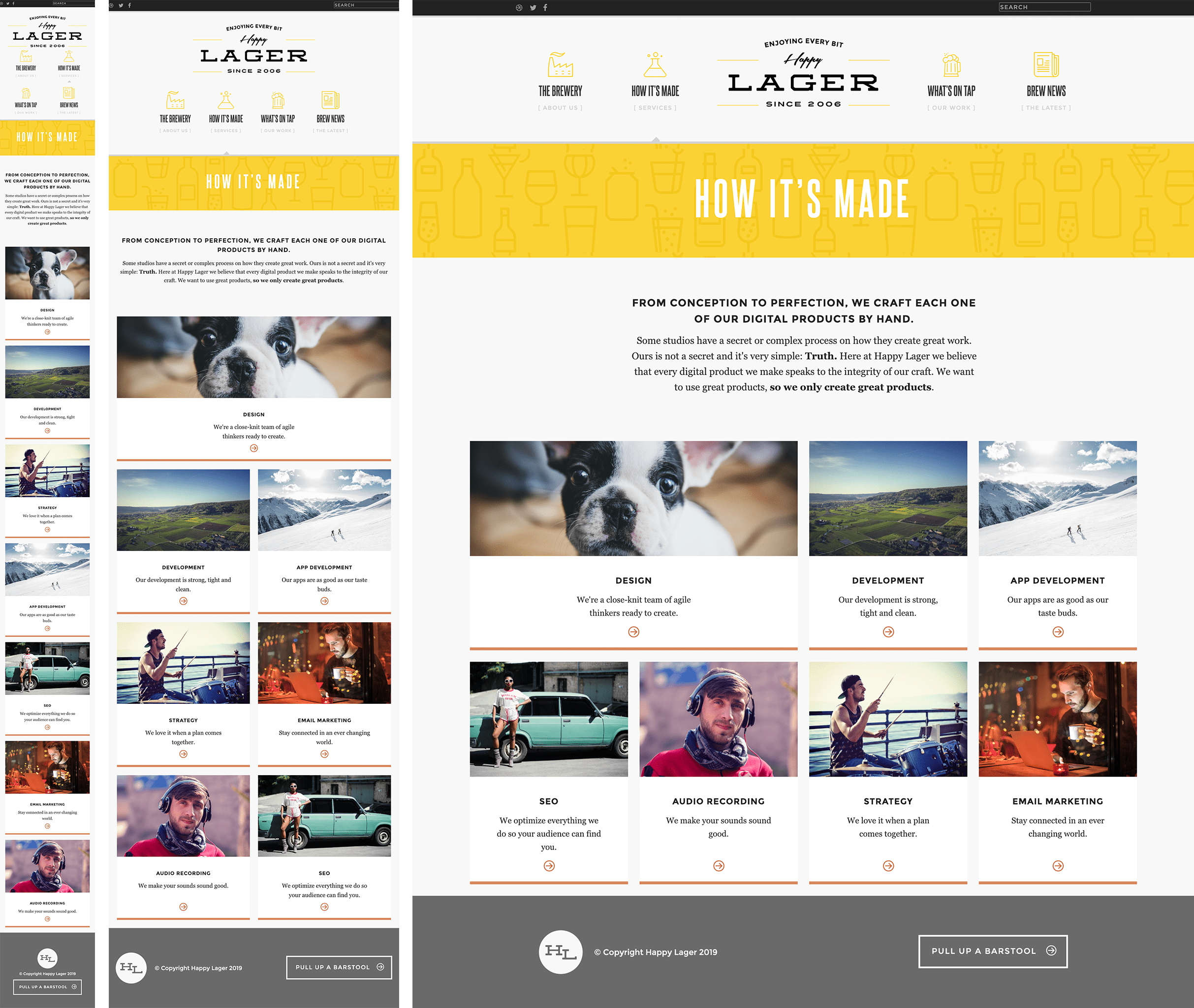
Content editors can optimize content layout for different screen sizes.
Flexible Twig tags create the grid container and wraps all of the grid items while generating the CSS for each layout.
New to CSS Grid Layout?
If you haven't used CSS Grid Layout in your projects before, here are a few resources that can help you understand its concepts:
Browser Support
CSS Grid actually started out as a feature in Internet Explorer 10, however, since then an updated spec has emerged and gained support in modern browsers. While it is possible—and often easy—to support the IE spec, the Grid plugin only supports the modern, non-prefixed spec.
To ensure that the right CSS support is available, all of the CSS generated by Grid is wrapped in a feature query (@supports). CSS Feature Queries and CSS Custom Properties—which is what the query is validating—are not available on any version of IE.
If you need to provide a CSS fallback for your grid items, take a look at these great articles:
Configuring Grid
Target Field
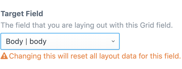
Grid fields can be paired up with an element-based field. In Grid, this is called the "target field".
When setting up a Grid field a drop down field selects the target field from a list of supported field types, so it is best to create the target field before creating a Grid field.
Once a Grid field is used and there is data stored in the CMS, it‘s important that the target field is not changed. Changing the target field will result in lost or corrupt Grid data.
Supported Field Types
Core
- Assets
- Categories
- Entries
- Matrix
- Users
Craft Commerce
- Products
- Variants
Using Grid Without a Target Field
Grid can also be used as a general layout field when the content you want to lay out is not managed through the CMS. For example, this could be used for content collected by an element query, items in a table field, and data pulled from a decoded JSON string.
To use a grid field without a target field, leave the Target Field option set to None on the field setting page.
When rendering a grid field that doesn‘t have a target field, the data must be in the form of an array and it must be passed into the {% grid %} block, as detailed in Advanced Twig Options.
Field Settings
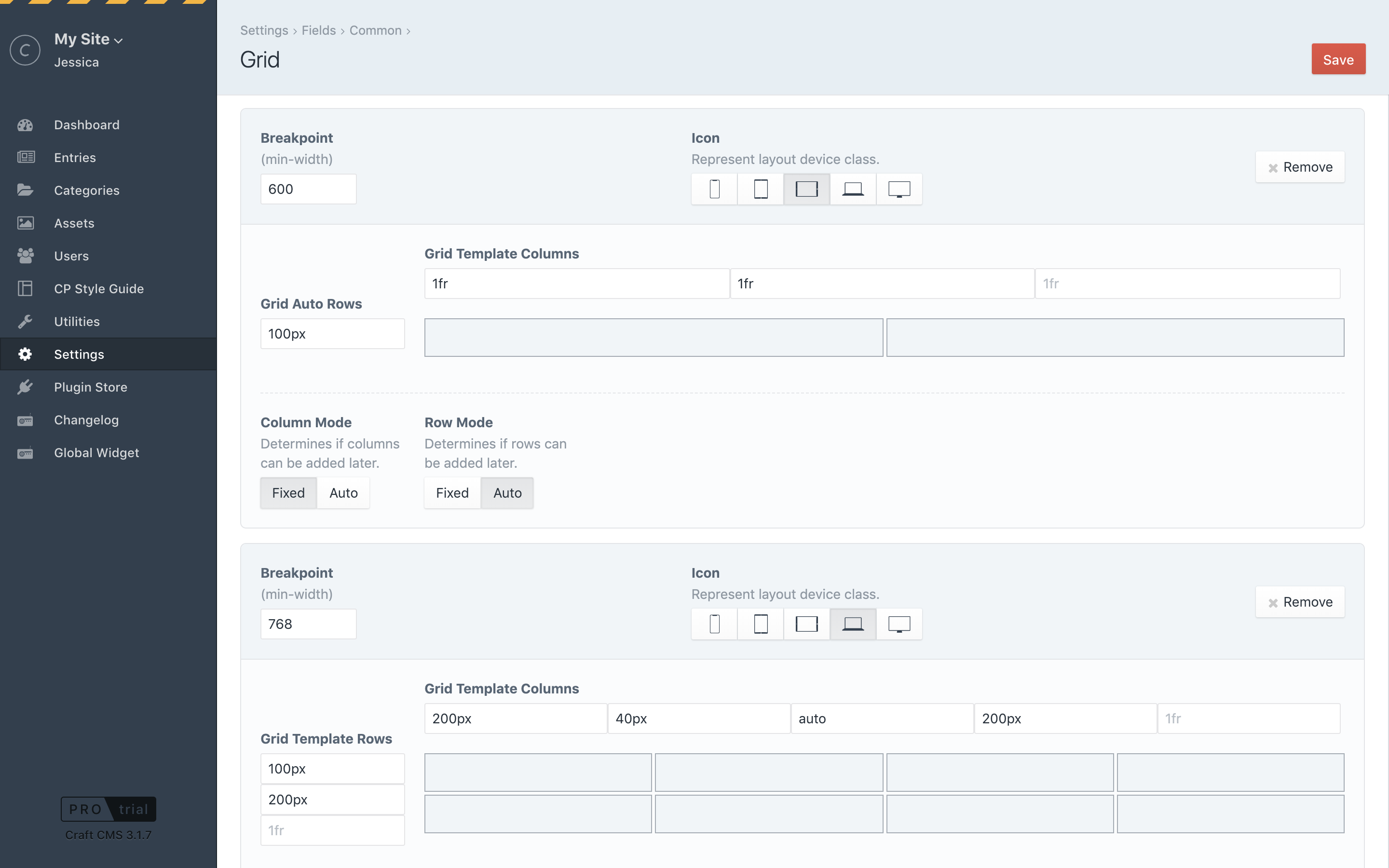
Layouts
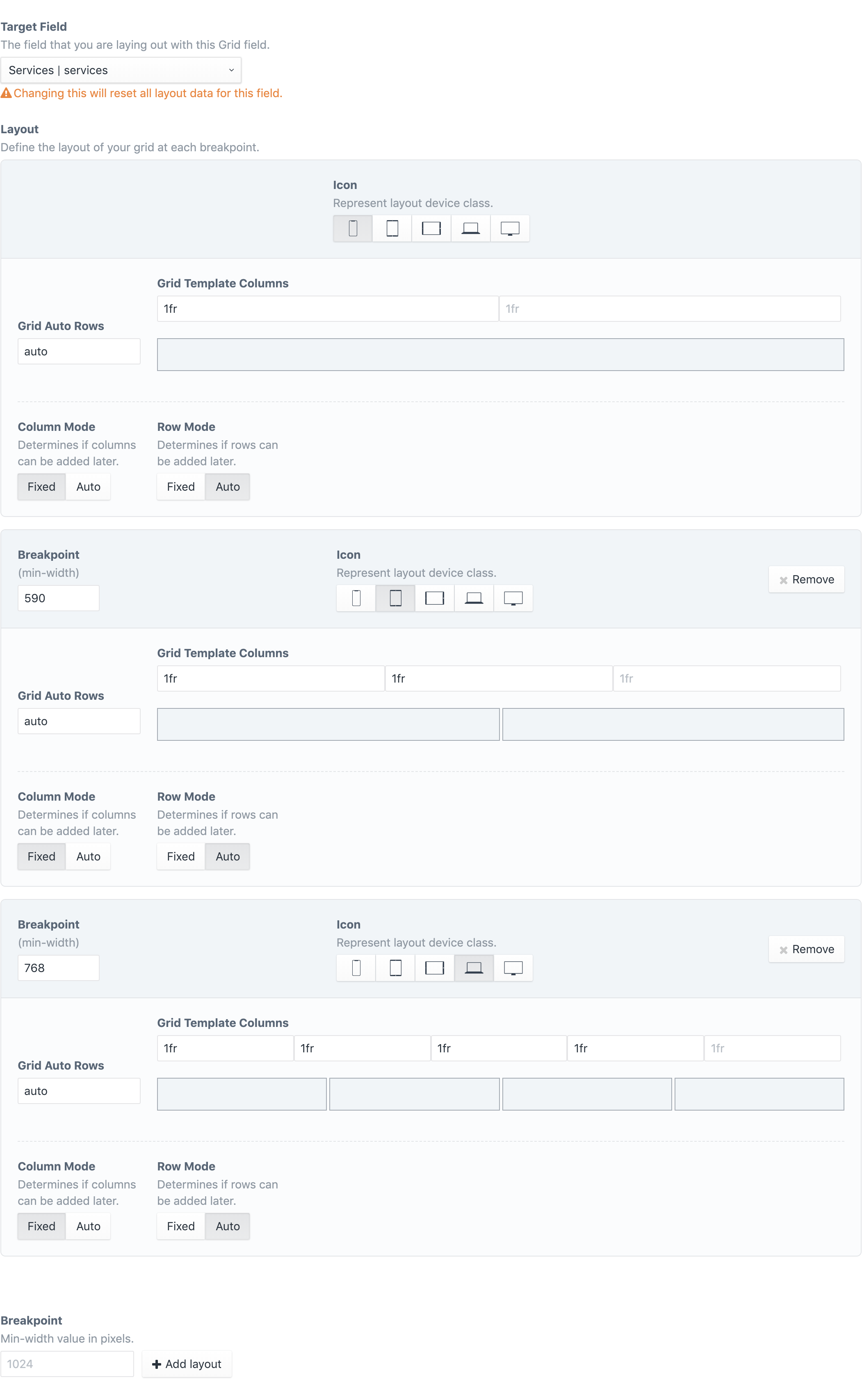
Grid‘s CSS code is generated mobile first, so the first grid layout is meant for mobile devices or it can used without any other breakpoints. To create additional grid layouts, create a breakpoint at the bottom of the page.
When adding a layout, the breakpoint‘s min-width value is required. This is set as a number in pixel units. Grid layouts are sorted from smallest to largest breakpoint min-width value.
Columns and Rows
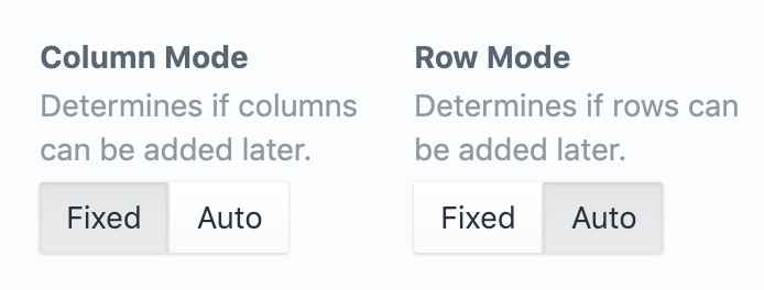
Columns and rows can be configured to a fixed layout or they can give editors the ability to add or remove columns and rows as needed. When you change the mode of a column or row, you‘ll see the fields that define the grid will change.
Auto Mode
Setting a Row Mode to auto is like defining a CSS grid-auto-rows property. Content editors will be able to create as many rows as needed and the layout will follow the value you place in the Grid Auto Rows field.
Any valid grid-auto-rows value can be used in the Grid Auto Rows field. Mozilla offers some great examples on their web docs page: MDN grid-auto-rows
NOTE: Column Mode works the same way, and example values can be found here: MDN grid-auto-columns
Fixed Mode
When you want to define the exact column layout, setting Column Mode to fixed will let you define each column, just like grid-template-columns would. For each column, enter in a valid size and you will see the grid preview reflect the amount of columns you have defined.
You can use valid sizing units—such as fr, px, %, em, or rem—and you can even use functions—like minmax()—or keyword value—like max-content. However, values that create multiple columns—like the repeat() function—should not be used in fixed mode because they will not be interpreted by the Grid field.
Row Mode works the same way for fixed row layouts.
Item Visibility
By default, items that are not laid out onto a grid field layout will be hidden using CSS (display: none, visibility: hidden, opacity: 0, etc ...). Using the Item Visibility option, you may allow all items be visible and they will be added to your grid based on your grid‘s CSS.
This could be useful on single-column layouts where you want to display all grid items in order, without taking the time to add each item to the layout.
NOTE: When there is no room left on a grid layout items can sometimes appear outside of the grid.
Hide Layout
If Item Visibility is set to Visible, you may hide the layout from the input field by setting Hide Layout to Yes.
This could be useful for single-column layouts that should be ordered by the Target Field.
NOTE: Setting Hide Layout to Yes only hides the layout from the input field. Grid settings are still applied and any existing field data will still be rendered.
Using the Grid Field
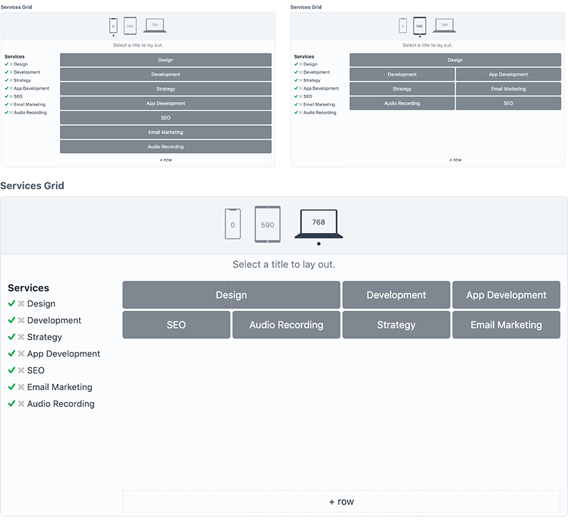
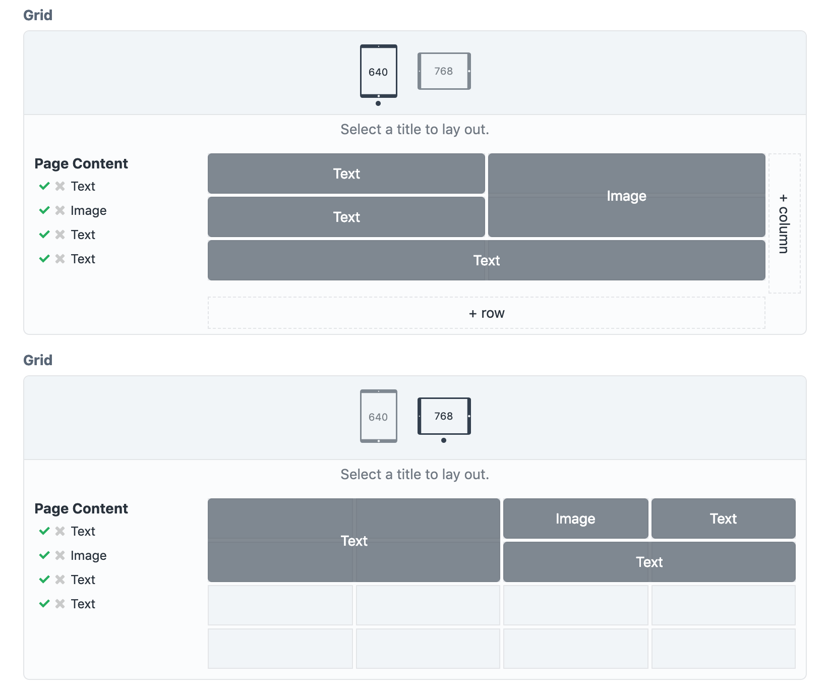
When a Grid field is added to an element—such as an entry—it will look for its target field and display all of the items that populate the target field. At first, the field shows information for the smallest layout and at the top of the field you will see an icon that lets you select other layouts.
To lay out a piece of content onto the grid, click on the title of the content to begin. Click on a cell in the grid to set the starting point in that cell, then click on the same cell or on another cell to set the ending point.
When a piece of content has been laid onto the grid, a check mark will appear next to the title.
TIP: Because CSS Grid allows it, you can overlap items in your layout. The order of the items in the target field determines which items are in the front and which are in the back.
Adding Grid to a Twig Template
To render a grid field, drop this into your Twig template.
{% grid entry.gridHandle as gridItems %}
    {% for item in gridItems %}
        {% griditem %}
            {# use item.content.fieldHandle to render grid item content #}
        {% endgriditem %}
    {% endfor %}
{% endgrid %}
- The
gridblock requires that you pass in your grid field (entry.gridHandle). Grid will determine the element and target field associated with the Grid field, however this can also be set (see Advanced Twig Options). Thegridblock creates an HTML element along with the appropriate classes. - On the
gridblock,gridItemsis a variable that‘s name can be set to anything you‘d like. gridItemsrepresents all of the content in the target field—along with data from thegridblock. Aforloop is used to access each grid item.- The
griditemblock creates an HTML element with the right classes to make your layout work. - The content for each
itemcan be accessed through{{ item.content.fieldHandle }}. For example, if eachitem.contentwas an entry,{{ item.content.title }}would display the title field. - Here's an example of a matrix field that is processed inside of the
griditemblock:
{% grid entry.grid as gridItems %}
    {% for item in gridItems %}
        {% griditem %}
            {% switch item.content.type.handle %}
                {% case 'text' %}
                    <p>{{ item.content.myText }}</p>
                {% case 'image' %}
                    <img src="{{ item.content.myImage.one().url }}" alt="{{ item.content.myImage.one().title }}">
            {% endswitch %}
        {% endgriditem %}
    {% endfor %}
{% endgrid %}
Advanced Twig Options
The grid block and griditem block accept more arguments and configuration when needed.
Target Array
To specify your target field or to use eager loading for your target field, add your target field and the keyword using before your Grid field on the grid block:
{% grid entry.relatedEntries.with['featuredImage'].all() using entry.grid as gridItems %}
    {# ... #}
{% endgrid %}
In this example, entry.relatedEntries is specified and eager loading is used to get a featuredImage asset.
NOTE: This must be in the form of an array, so it‘s important that you use .all() when passing in element criteria.
Modify the Grid Container
By default, the grid block is turned into a <div> tag with predefined classes on it. A configuration object can be passed in to modify the tag, add classes, and set custom attributes.
{% grid entry.grid as gridItems with { attributes:"id='my_grid'" classes:"my classes", element:"nav", } %}
    {# ... #}
{% endgrid %}
| Argument | Default | Description |
|---|---|---|
attributes |
'' |
Add in any valid HTML attribute, data- attributes, Vue directives, etc... |
classes |
'' |
Adds classes into the element‘s class attribute. This can by helpful for styling the grid container and its child items. |
element |
'div' |
Change the element for more semantic HTML or for better accessibility. |
preview |
false |
Setting this to true adds simple styling to let you preview your content in your grid layout. This is meant to be used for early development and may not work with content that is already styled. |
unit |
px |
Converts media queries generated by the grid block to em or rem units (based on a 16px default font size). Accepts em, rem, or px. |
Modify Grid Items
The griditem block creates a <div> tag for each grid item. A configuration object can be passed in to modify the tag, add classes, and set custom attributes.
{% grid entry.grid as gridItems %}
    {% for item in gridItems %}
        {% griditem with { attributes:"@click='clickHandler'" classes:"my_grid__item", element:"a", } %}
            {# ... #}
        {% endgriditem %}
    {% endfor %}
{% endgrid %}
| Argument | Default | Description |
|---|---|---|
attributes |
'' |
Add in any valid HTML attribute, data- attributes, Vue directives, etc... |
classes |
'' |
Adds classes into the element‘s class attribute. |
element |
'div' |
Change the element for more semantic HTML or for better accessibility. |
helperClasses |
[] |
Adds additional classes that can be used for styling components based on where they are laid out in the grid. See below for accepted arguments. |
Using Grid Item Helper Classes
Helper classes can be added to grid items to assist in styling them based on their locations in each layout.
Setting helperClasses to true adds classes to each grid item that matches the following situations:
| Keyword | Description | Class Format |
|---|---|---|
top |
When the grid item is laid out at the top of a grid. | [GRID_SELECTOR]--top--[LAYOUT_BREAKPOINT] |
bottom |
In Fixed Row Mode, when the grid item is laid out at the bottom of a grid. In Auto Row Mode, when the grid item’s end row aligns with the bottom-most element. |
[GRID_SELECTOR]--bottom--[LAYOUT_MINWIDTH] |
left |
When the grid item is laid out at the left of a grid. | [GRID_SELECTOR]--left--[LAYOUT_BREAKPOINT] |
right |
In Fixed Column Mode, when the grid item is laid out at the right of a grid. In Auto Column Mode, when the grid item’s end column aligns with the right-most element. |
[GRID_SELECTOR]--right--[LAYOUT_MINWIDTH] |
Since all of these classes can lead to unnecessary markup, instead of a boolean you may pass in an array of only the classes you need.
Helper Classes Example
For example, in the grid field in this screenshot, Helper Classes could be handy if you wanted to know when the "Image" block was laid out on the right side so you could put a border on the image.
By setting helperClasses to ['right'] a class of grid__grid__page_content--right--640 will get added to the "Image" grid item (and any other grid items that are laid out on the right in any layout).
Adding styles into CSS that are specific to each grid layout matches up the helper class for each media query.
@media (min-width: 640px) and (max-width: 767px) {
    .grid__grid__page_content--right--640 {
        border-left: 2px solid rebeccapurple;
    }
}
@media (min-width: 768px) {
    .grid__grid__page_content--right--768 {
        border-left: 2px solid rebeccapurple;
    }
}
In this example layout, only the 640 layout would display the border, but this CSS is ready to apply the border to the 768 layout if the 768 layout changes.
There are a few caveats to using helper classes:
- Helper Classes are only applied to grid items that have been laid out onto a grid field.
- All calculations about the location of grid items are based only on grid items that have been laid out onto a grid field.
- If the breakpoint of a layout changes, helper classes will change to reflect the new breakpoint value.
- Because of this, custom CSS or Javascript selectors will need to be updated.
- Media queries in your CSS will also need to be updated to match the new breakpoint value.
Getting a Grid Value
Accessing a grid field value using $element->gridHandle (in PHP) or {{ element.gridHandle }} (in Twig) will give you data as it is stored into Craft, but this is condensed and not meant for output.
If you would like access to the value of a grid/target pair, a PHP function and Twig variable are available. Both return the same array of information and they both require that you pass in the target value and the grid value.
The output will include:
| Value | Description |
|---|---|
css |
The CSS that is generated for the grid/target pair. |
grid |
Information on the grid, such as the selector used when generating the Grid CSS. |
items |
An array of information for each grid item, such as the selector and which layouts have been set for each item. |
NOTE: Both the PHP method and twig variable require that you pass in the target as an array, so use .all() or eager loading before passing it in.
Getting a Grid Value from a Module or Plugin
$entry = Entry::find()
    ->with(['pageContent'])
    ->one();

$gridValue = Grid::$plugin->grid->getGridValue($entry->pageContent, $entry->grid);
Getting a Grid Value from Twig
{% set gridValue = craft.grid.value(entry.pageContent.all(), entry.grid) %}
Brought to you by Will Browar.
Thank you to Marc Hartwig and Andrew Welch for your advice and suggestions.

