unb-libraries / unb_lib_theme
Drupal Bootstrap 4.x Base Theme For UNB Libraries Branding.
Maintainers
Package info
github.com/unb-libraries/unb_lib_theme
Language:Twig
Type:drupal-theme
pkg:composer/unb-libraries/unb_lib_theme
Requires (Dev)
- twbs/bootstrap: ~4.5.3
This package is auto-updated.
Last update: 2026-07-14 14:18:18 UTC
README

UNB Libraries Theme.
Drupal 8 and 9 theme based on Bootstrap Barrio 5.1.x theme (https://www.drupal.org/project/bootstrap_barrio).
Note the theme branch 9.x segment refers to Drupal 9.x while the 4.x segment refers
to Bootstrap 4. The dev-8.x-4.x branch is intended to use for projects using Drupal 8.x.
License
-
unb_lib_theme is licensed under the MIT License:
-
Attribution is not required, but much appreciated:
unb_lib_theme by UNB Libraries
How to Use
This theme is not intended to be used directly but instead as a parent theme that provides UNB Libraries-branded header/footer/assets etc. for a project's subtheme. Requirements/dependencies are as follows:
-
add
Bootstrap Barrio,UNB Libraries Calendar Hours ClientandUNB Libraries Banner Alerts, along withUNB Libraries themeto your project repo build/composer.json file's require section:"require": { … "drupal/bootstrap_barrio": "5.1.10", "unb-libraries/alert_scheduler": "dev-8.x-1.x", "unb-libraries/calendar_hours": "dev-9.x-1.x", "unb-libraries/unb_lib_theme": "dev-9.x-4.x", … }The emergency banner and banner image library hours sections of the default page template header section depend on UNB Libraries' Alert Scheduler and Calendar Hours Client projects respectively to function as intended.
For more information visit https://github.com/unb-libraries/alert-scheduler and https://github.com/unb-libraries/calendar_hours -
add
Twitter Bootstrap4.5.x to your project repo's rootcomposer.jsonfile'srequire-devsection. This will provide the SASS code necessary (within thevendorfolder) for your subtheme dev environment for extending/overriding Bootstrap variables/functions/etc. Example:"require": { … "twbs/bootstrap": "~4.5.3", … }
Note that the 4.5.3 branch was selected to match the version used by Bootstrap Barrio 5.1.x.
UNB Libraries Administration Theme Enhancements
This theme contains various stylistic improvements to Drupal core's Seven administration
theme defined in the src/scss/admin-overrides-seven.scss Sass file. These style
rules are primary intended for UNB Libraries projects. Should you use Seven as your
project's administration theme and want to incorporate these overrides please proceed as follows:
- create an
admin-style.scssfiles inside your subtheme'ssrc/scssfolder - add the following import at the top of this file:
@import '../../../../../vendor/unb-libraries/unb_lib_theme/src/scss/admin-overrides-seven.scss'; - define a library for the administration styles in your subtheme's
SUBTHEMENAME.libraries.ymlfile:admin-styling: version: VERSION css: theme: dist/css/admin-style.css: { minified: true } - finally, you may attach the admin library assets to an administration form in code using:
$form['#attached']['library'][] = 'lib_unb_ca/admin-styling';
This will compile (minimized) to dist/css/admin-style.css. If you wish to add additional project-specific
administration rules simply add them after your @import line.
Utility Classes
Several utility classes are available for use for your convenience (see src/scss/custom/_utility.scss):
-
Hover Grow
-
To transitionally scale an element by 3% on hover/focus, apply
hover-growclass to the element
Example:<div class="card bg-light border border-unb-red hover-grow text-center">
See: https://lib.unb.ca/copyright -
To transitionally scale an element horizontally (i.e. width) by 3% on hover/focus, apply
hover-grow-hclass to the element
Example:<div class="card bg-light border border-unb-red hover-grow-h text-center"> -
To transitionally scale an element vertically (i.e. height) by 3% on hover/focus, apply
hover-grow-vclass to the element
Example:<div class="card bg-light border border-unb-red hover-grow-v text-center">
-
-
Expanded/Collapsed Icons
-
To add a Font Awesome square caret (i.e. upward/downward-facing arrow) icon to the left of toggle buttons to indicate expandable/collapsible sections simply apply a header-icon-h class to the parent element of the buttons.
Example:
<div class="accordion header-icon-h" id="accordion-example">Note this feature relies on the aria-expanded attribute - for info on Bootstrap buttons + aria see: https://getbootstrap.com/docs/4.6/components/collapse/#accordion-example)
-
-
Linked images
-
To add a standardized image link visual hover/focus effect, add the
img-linkclass either to the parent<a>tag of the image or to the parent container of the<a>tag itself
Example (class added to parent tag of <a>):<div class="img-link"> <a href="#url">><img src="/path/img-filename" alt="Logo of external website"></a> </div>This will reduce the opacity of the linked image using a 3ms transition effect upon hover and focus.
-
-
Custom opacities
- To add a transparent quality to a container apply one of UNB Library Theme's custom opacity classes
Example: (slightly see the content behind an affixed navbar)
<nav id="navbar-main" class="navbar navbar-expand-lg px-0 affix opacity-80">
Valid class values, from least to most opaque (i.e. most to least translucent), are:- opacity-25
- opacity-50
- opacity-75
- opacity-80
- opacity-85
- opacity-90
- opacity-95
- To add a transparent quality to a container apply one of UNB Library Theme's custom opacity classes
-
Inline lists
- To change the default display behaviour of an unordered list from block to inline block, wrap the ul list element with a container that has the wrapper-list-inline class applied.
<div id="quicklinks-wrapper" class="collapse wrapper-list-inline">
  <h3 class="d-inline-block">Quick Links:</h3>
  <ul class="pl-2">
    <li><a href="https://unb.on.worldcat.org/myaccount">Renew Books / My Account</a></li>
    <li><a href="/services/docdel">Document Delivery</a></li>
    <li><a href="/services/recalls">Recalls</a></li>
    <li><a href="/about/find-us">Floor Plans</a></li>
    <li><a href="/services/tech-tools">Borrow Tech & Tools</a></li>
  </ul>
</div>


Style Guide Suggestions
Webforms
-
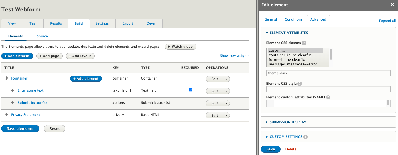
UNB Libraries forms adopt a standardized look and feel for attributes such as background, border, button colors, etc - this is done by wrapping the form field (including form action buttons)) inside a container with a
theme-darkclass applied to it: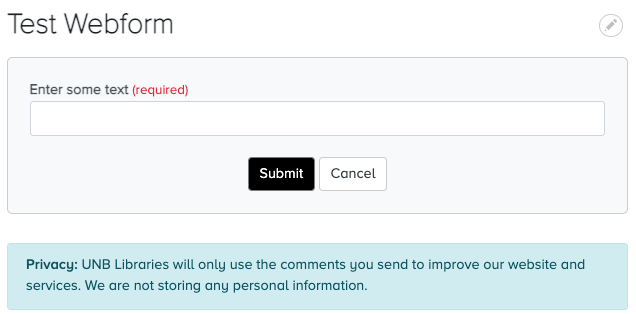
-
Note: to implement this using Webform UI, add a parent Container element, edit it, switch to the Advanced tab and expand the Element Attributes section. Next, choose the custom element CSS class and enter theme-dark in the conditional field. Finally, save the change.
-
The Privacy footer is used across most webforms and is implemented using a Bootstrap alert:
<div class="alert alert-info" role="alert"> <strong>Privacy: UNB Libraries will only use the comments you send to improve our website and services. We are not storing any personal information. </div> -
Related fields are typically grouped together as children of a Fieldset element container within the Webform "Build" UI.
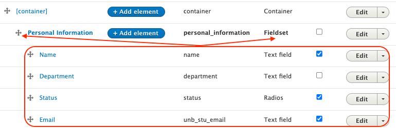
This triggers custom style attributes for the form display with regards to font-size, font-weight, whitespace, etc


Notes
-
This subtheme uses Bootstrap Barrio as a base theme, specifically the 5.1.x branch which, in turn, employs Bootstrap 4 (Barrio 5.5.x uses Bootstrap v5):
-
As of Bootstrap Barrio v5.1.10, Bootstrap v4.5.x is specifically bundled (i.e. do not use v4.6.x - see global-styling theme library)
-
Subthemes compiling sass should add the following
require-devpackage tocomposer.jason:
"twbs/bootstrap": "~4.5.3", -
The banner hours depends on the UNB Libraries > Calendar Hours > Calendar Hours Client module:
-
Add Font Awesome Icons module, 2.x branch for icons used in Header/Footer:
- https://www.drupal.org/project/fontawesome
- load only the free icon subset, i.e. the Solid and Brand icons (else the non-free icon font
may take precedence and not display)
- this in done via the Font Awesome Settings > Partial File Configuration admin config form: /admin/config/content/fontawesome
-