sylvainjule / pagetable
Display subpages in a flexible table
Maintainers
Package info
github.com/sylvainjule/kirby-pagetable
Type:kirby-plugin
pkg:composer/sylvainjule/pagetable
Requires
README
This plugin is compatible with Kirby 3 for legacy projects, it won't be updated to Kirby 4 whose Pages sections offer a
layout: tableoption.
Kirby 3 - Pagetable
Display subpages in a flexible, sortable and searchable table.
Overview
Kirby 3.6+ is supported with Pagetable 1.1+. You should use 1.0.9 with previous Kirby 3 versions.
This plugin is completely free and published under the MIT license. However, if you are using it in a commercial project and want to help me keep up with maintenance, please consider making a donation of your choice or purchasing your license(s) through my affiliate link.
- 1. Installation
- 2. Setup
- 3. Global options
- 4. Column options
- 5. Complete example
- 6. License
- 7. Credits
1. Installation
If you are looking for a Kirby 2 version of this field, please check out the index field.
Download and copy this repository to /site/plugins/pagetable
Alternatively, you can install it with composer: composer require sylvainjule/pagetable
2. Blueprint usage
The pagetable section can replace any pages section you have already set:
sections:
  mypagetable:
    headline: My PageTable
    type: pagetable
3. Global options
3.1. Inherited options
These options work exactly the same way they do for the pages section, please refer to its documentation:
- create
- headline
- image
- max
- min
- parent
- sortBy
- status
3.2. Limit options
You can limit the initial number of displayed pages the same way you could with the usal pages section, only pagination will happen on the front-end.
Default is 25.
sections:
  mypagetable:
    type: pagetable
    limit: 25
You can also set the limit options displayed in the select input at the bottom of the section. Default is [10, 25, 50].
sections:
  mypagetable:
    type: pagetable
    limitOptions:
      - 10
      - 25
      - 50
3.3. Visibility options
You can toggle the visibility of the image column, status button and action button
sections:
  mypagetable:
    type: pagetable
    showImage: false
    showStatus: false
    showActions: false
3.4. Query
You can query any set of pages you'd like with the query option. Queries can start with either kirby, site, pages or (current) page.
This, for example, will query pages that have "Foo" in their title.
sections:
  mypagetable:
    type: pagetable
    query: site.index.filterBy('title', '*=', 'Foo')
Learn more about Kirby's blueprints query language here.
3.5. Custom strings
Pagetable ships with translated strings for its placeholders / buttons / etc. You can change any of them to whatever you'd like in your blueprint:
sections:
  mypagetable:
    type: pagetable
    translations:
      # single language
      empty: You have not added any products yet
      # or translated
      empty:
        en: You have not added any projects yet
        fr: Vous n'avez actuellement aucun projet à afficher
      # All available keys and their default english strings
      empty: No pages yet
      rowsPerPage: Pages displayed
      all: All
      loading: Loading pages…
      filterPages: Filter pages…
      reset: Reset
3.6. Panel / preview link
By default, each row will redirect to its panel page. You can however chose to redirect your editors to its preview page instead, by setting the url option.
sections:
  mypagetable:
    type: pagetable
    url: preview
4. Column options
The plugin allows you to choose the columns you want to display, and fine-tune their behaviour. A column with all options explicitely set will look like:
columns:
  title:
    label: Page title
    text: '{{ page.title }}'
    type: text
    width: 1/2
    class: my-title-class
    sortable: true
    searchable: true
  modified:
    ...
4.1. label
type:
string, default: the option's key
The column's title, displayed in the head / first row of the table.
# Single-language
columns:
  title:
    label: Page title

# Multi-language
columns:
  title:
    label:
      en: Page title
      fr: Titre de la page
4.2. text (required)
type:
string
Defines the information displayed in each row of the column. You will need to inject information from the current page there, with the help of template placeholders:
columns:
  title:
    text: '{{ page.title }}'
Note that the only limitation here is to always return a string. This string can either contain plain text or html markup, it will be rendered accordingly. Which means, for example, that your can format the returned string with a field method:
// site/plugins/my-methods/index.php
Kirby::plugin('your/plugin', [
    'fieldMethods' => [
        'toBlue' => function($field) {
            return '<span style="color: #384d9d">' . $field->value . '</span>';
        }
    ]
]);
In your blueprint:
columns:
  title:
    text: '{{ page.title.toBlue }}'
Will display blue titles in the table:

4.3. type
type:
string, default:text
The content type of the column. Most of the time you will want to keep the default type, but in a few cases is crucial to set it explicitely in order to get the sorting and alignement right. Options are:
text: default, left alignednumber: right aligneddecimal: right aligned, 2 decimal placespercentage: right aligned, expects a decimal between 0 and 1 (like 0.03) and formats it as 3.00%boolean: right aligneddate: right aligned, expects a string representation of date, as well as a two other required options.
The table needs to know the format in which your are passing the date (dateInputFormat) and how you want it to display them (dateOutputFormat). There is a little subtlety here, because syntax differs between php dates and the JS dates library, date-fns. For example :
columns:
  title:
    type: date
    # return the date as 2018-12-24
    text: '{{ page.modified("Y-m-d") }}'
    # tell the table to expect a date formated as 2018-12-24
    dateInputFormat: 'YYYY-MM-DD'
    # output it as Dec 24th 2018
    dateOutputFormat: 'MMM Do YYYY'
4.4. width
type:
string, default:auto
The width of the column in the table, written as a fraction and automatically calculated (1/2, 1/3, 1/6, 32/94, etc.)
columns:
  title:
    width: 3/4
4.5. class
type:
string, default:null
Allows you to add a custom class to the column.
A class myClass will be added as .head-myClass to its th, and .row-myClass to its td.
columns:
  title:
    class: myClass
4.6. sortable
type:
Boolean, default:true
Enable / disable sorting of the column.
columns:
  title:
    sortable: true
4.7. searchable
type:
Boolean, default:true
If false, this column will be ignored by the global search.
columns:
  title:
    searchable: true
4.8. mobile
type:
Boolean, default:false
By default, only the first column is shown on mobile viewports. You can change it for whichever column you'd like by setting this to true.
columns:
  title:
    mobile: true
Note that only one column can have this option.
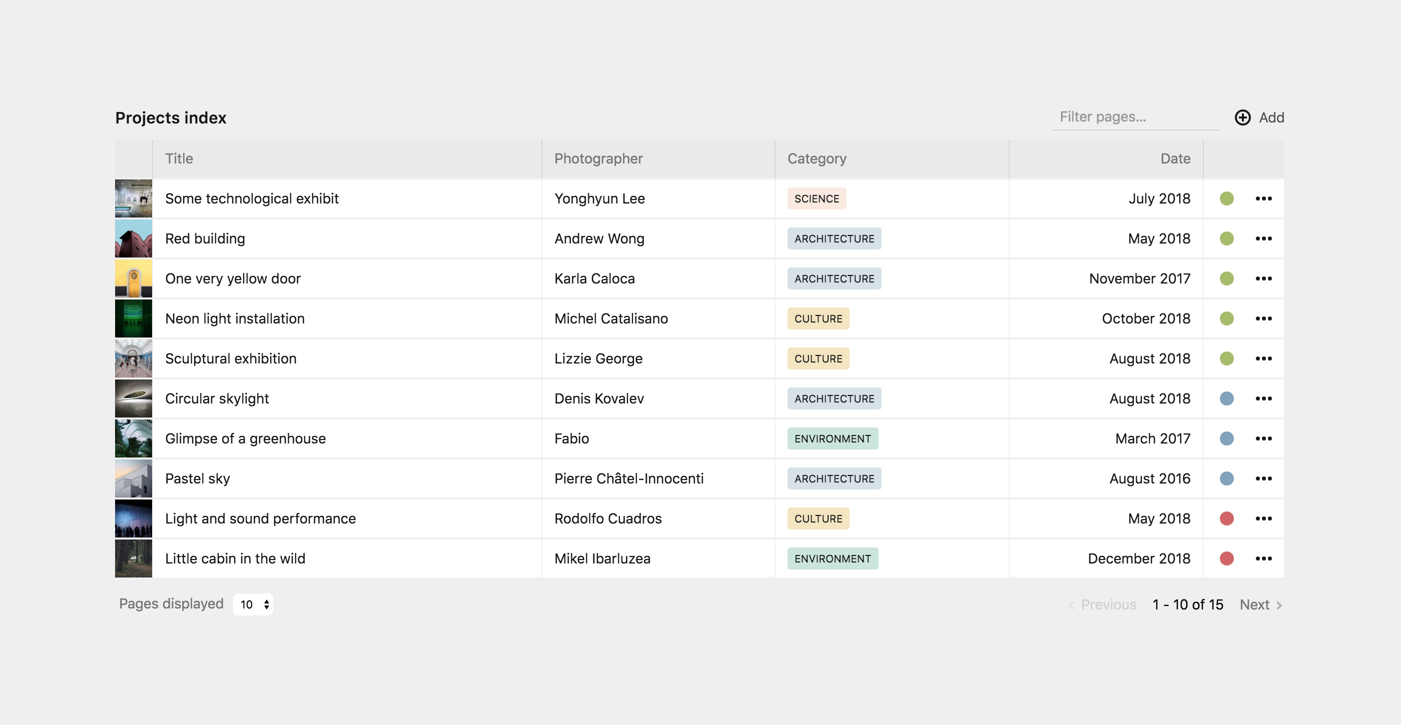
5. Complete example
Here's how to reproduce the screenshot on top of this README:
First, we need to have a few fields available in our children's blueprint (photographer's name, category, project's date):
...
fields:
  photographer:
    type: text
  category:
    type: select
    options:
      architecture: Architecture
      culture: Culture
      environment: Environment
      gastronomy: Gastronomy
      science: Science
  date:
    type: date
We then create our pagetable section, and set the associated columns:
sections:
  mypagetable:
    headline: Projects index
    type: pagetable
    status: all
    image:
      cover: true
    columns:
      title:
        label: Title
        text: '{{ page.title }}'
        width: 1/3
      photographer:
        label: Photographer
        text: '{{ page.photographer }}'
      category:
        label: Category
        text: '{{ page.category }}'
      date:
        label: Date
        type: date
        text: '{{ page.date.toDate("Y-m-d") }}'
        dateInputFormat: 'YYYY-MM-DD'
        dateOutputFormat: 'MMMM YYYY'
        width: 1/6
At this point, every information should be displayed but categories still lack any kind of styling. We need to call a field method here, that we need to register in a custom plugin. We'll create a site/plugins/my-methods/index.php and write:
Kirby::plugin('your/plugin', [
    'fieldMethods' => [
        'toLabel' => function($field) {
          $value = $field->value;
          return '<span class="category-label" data-category="'. $value .'">' . $value . '</span>';
        },
    ]
]);
Now every label will be rendered as:
<span class="category-label" data-category="architecture">architecture</span>
We're on our way but there is still no styling. Let's create an assets/css/panel.css stylesheet (if you have none yet), and add some rules there:
.k-pagetable-section .category-label {
  font-size: 0.65rem;
  text-transform: uppercase;
  padding: 5px 7px;
  border-radius: 3px;
}
.k-pagetable-section .category-label[data-category="architecture"] {
  background: #d7e1e9;
}
.k-pagetable-section .category-label[data-category="culture"] {
  background: #f5e6bf;
}
.k-pagetable-section .category-label[data-category="environment"] {
  background: #cae5dd;
}
.k-pagetable-section .category-label[data-category="gastronomy"] {
  background: #e0d7dd;
}
.k-pagetable-section .category-label[data-category="science"] {
  background: #f9e9e0;
}
Don't forget to tell the panel that you want to load the stylesheet by adding it in your site/config/config.php:
<?php

return array(
  'panel' => array('css' => 'assets/css/panel.css'),
);
Last step is changing the column's text in our blueprint, and append our new toLabel method:
category:
  label: Category
  text: '{{ page.category.toLabel }}'
You should now end up with the exact same setup than illustrated in the above screenshot.
6. License
MIT
7. Credits
- Many thanks to stevenworldplay for the
queryoption, from k3-pagesdisplay-section - This section is built on top of vue-good-table.
- Please have a look at https://github.com/jongacnik/kirby-index-field for a K2 version.