smitmartijn / laravel-lookbook
Laravel Lookbook is a component development environment for Laravel that helps you build, document, and organize your Blade components in isolation.
Requires
- php: >=8.1
- laravel/framework: >=10.0
Requires (Dev)
- orchestra/testbench: ^8.0
- phpunit/phpunit: ^10.0
README
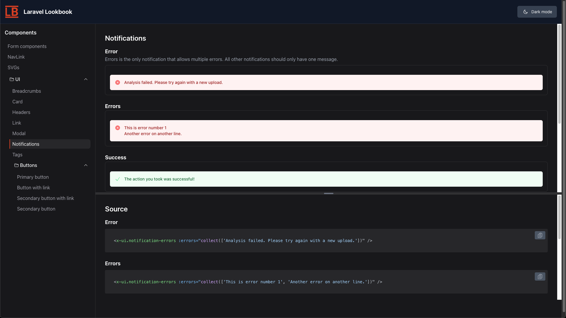
Laravel Lookbook is a component development environment for Laravel that helps you build, document, and organize your Blade components in isolation. Preview different component states, document usage examples, switch between light and dark modes to verify your components - all while working in your Laravel application. Inspired by the Ruby on Rails Lookbook gem, this package brings the same powerful component development workflow to the Laravel ecosystem.

Lookbook with notification components in dark mode
Features
- Component Previews: Render and display Blade components with their output.
- Multiple Component Versions: Show different versions/states of the same component. (i.e., primary button, secondary button, etc.)
- Source Code Display: View the Blade source code used to render the components.
- Collapsible Folders: Organize components in collapsible category folders
- Light/Dark Mode: Switch between light and dark themes for better visibility.
- Component Generator: Artisan command to scaffold new component previews
- Markdown Documentation: Add markdown-formatted notes to your components
Installation
- Install the package via Composer:
composer require --dev smitmartijn/laravel-lookbook
- Publish the configuration file and views:
php artisan vendor:publish --provider="LaravelLookbook\LookbookServiceProvider"
-
Update the configuration file located at
config/lookbook.phpto optionally customize the route and other settings. -
Visit
/lookbookto check out the interface! -
Optionally, add
"./app/Lookbook/**/*.php",to thecontentarray intailwind.css.js, if you are going to be using classes in the component preview files.
Usage
- Access the Lookbook interface at the configured route (default:
/lookbook). - Organize your Blade component previews in the
app/Lookbookdirectory. - Create component preview files to define how each component is displayed in the previews.
Creating component previews
- Create a component preview
# php artisan make:lookbook-component Button
Lookbook component created successfully in app/Lookbook/Button.php
- Edit the created component preview model (
app/Lookbook/Button.phpin example) to include the code for your Blade component. For example:
<?php

namespace App\Lookbook;

use LaravelLookbook\Support\ComponentPreview;
use Illuminate\Support\Facades\Blade;

class Button extends ComponentPreview
{
   /**
    * @name Primary button
    * @notes This is the button style you should use for most things.
    */
   public function primary()
   {
      return (string) Blade::render(<<<'HTML'
<x-button type="submit">
   Button Text
</x-button>
HTML);
   }

  /**
   * @name Success button
   * @notes
   * Use this button style when a form is filled out successfully, or we want to encourage users to click this.
   *
   * This style uses a `#008000` green color
   */
   public function success()
   {
      return (string) Blade::render(<<<'HTML'
<x-button type="submit" color="success">
   Link Text
</x-button>
HTML);
   }
}
Notes:
- You can have as many functions inside the component preview files as you want.
- The phpdoc block is optional. Without a
@namethe function name will be used as the component preview name. - The component name will be derived from the class name, but you can override it by adding a function to the class:
class Button extends ComponentPreview
{
   static public function getName()
   {
      return 'Button Component';
   }
   ...
}
Contributing
This package is in early stages, and contributions are welcome! Please open an issue or submit a pull request for any enhancements or bug fixes.
Testing
Run the tests with:
composer test
License
This package is licensed under the LGPL-3.0 License. See the LICENSE file for more information.
