octopyid / filament-palette
Easily switch and customize the UI color palette for your FilamentPHP
Requires
- php: ^8.2
- filament/filament: ^3.3|^4|^5
README
Filament Palette Switcher
A FilamentPHP plugin that allows users to easily switch and customize the UI color palette in their Filament admin panels. This plugin provides a seamless way to change themes, either per user or globally across the application.
✨ Features
- ✅ User-specific themes – Each user can choose their preferred color palette.
- 🌐 Global theme support – Apply a single theme for all users.
- 🧠 Conditional visibility – Show or hide the palette switcher based on custom logic.
- 🎨 Custom color palettes – Define your own color schemes or modify existing ones.
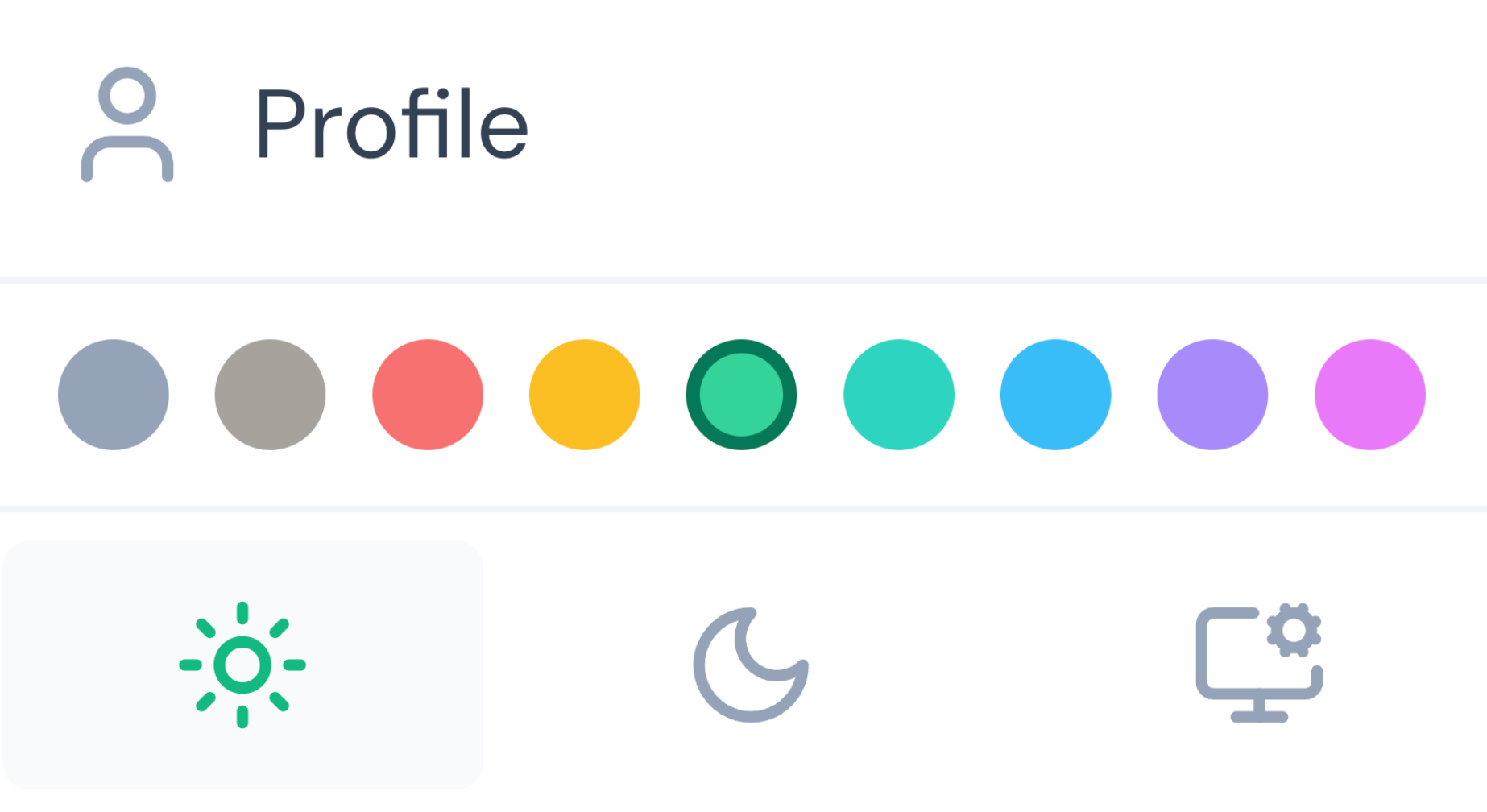
- 🌈 Pre-built palettes – Includes 9 beautiful ready-to-use palettes.
- ⚡ Easy integration – Simple installation with minimal configuration.
- 🔧 Flexible customization – Full control over theme application and visibility.
🚀 Installation
Install the package via Composer:
composer require octopyid/filament-palette
Filament v3 (Tailwind v3) — add plugin views to tailwind.config.js:
content: [
    './vendor/octopyid/filament-palette/resources/**/*.blade.php',
]
Filament v4 (Tailwind v4) — declare sources in your panel theme CSS (paths are relative to this CSS file):
@source '../../../../vendor/octopyid/filament-palette/resources';
Optionally, publish the configuration file:
php artisan vendor:publish --tag=filament-palette
⚙️ Usage
Basic Setup
Add the plugin to your Filament panel configuration:
public function panel(Panel $panel): Panel
{
    return $panel->plugin(
        \Octopy\Filament\Palette\PaletteSwitcherPlugin::make()
    );
}
By default, the color palette is applied individually to each user, allowing them to freely choose their preferred colors.
Global Theme Application;
To apply themes globally across all users:
public function panel(Panel $panel): Panel
{
    return $panel->plugin(
        \Octopy\Filament\Palette\PaletteSwitcherPlugin::make()->applyThemeGlobally(true)
    );
}
Conditional Visibility
Hide the palette switcher programmatically based on custom conditions:
public function panel(Panel $panel): Panel
{
    return $panel->plugin(
        \Octopy\Filament\Palette\PaletteSwitcherPlugin::make()->hidden(function () {
            return auth()->user()->email === 'foo@bar.baz';
        }),
    );
}
🎨 Customization
Available Color Palettes
The plugin includes 9 pre-configured palettes:
- Slate – Professional gray-blue theme
- Stone – Warm neutral theme
- Red – Bold red theme
- Amber – Warm orange theme
- Emerald – Fresh green theme
- Teal – Cool blue-green theme
- Sky – Bright blue theme
- Violet – Rich purple theme
- Fuchsia – Vibrant pink theme
Custom Color Palettes
You can tailor your palettes by editing the configuration file located at config/filament-palette.php. This file gives you full control to define new color schemes or modify
existing ones using various methods.
<?php

use Filament\Support\Colors\Color;

return [
    'default' => env('FILAMENT_PALETTE_DEFAULT', 'slate'),

    'palette' => [
        // Custom palette example using Filament's pre-defined colors
        'custom' => [
            'primary' => Color::Orange,
            'warning' => Color::Amber,
            'danger'  => Color::Red,
            'success' => Color::Green,
            'info'    => Color::Blue,
        ],

        // Custom palette example using HEX codes
        'brand' => [
            'primary' => [
                50 => '#eff6ff',
                100 => '#dbeafe',
                // ... add all shades from 50 to 950 for comprehensive styling
                900 => '#1e3a8a',
                950 => '#1e40af',
            ],
            'warning' => Color::Yellow,
            'danger'  => Color::Red,
            'success' => Color::Emerald,
            'info'    => Color::Sky,
        ],

        // Define a custom primary color directly from a HEX value
        'my-hex-theme' => [
            'primary' => Color::hex('#ff0000'), // This will generate shades based on the given hex code
            'warning' => Color::Yellow,
            'danger'  => Color::Red,
            'success' => Color::Green,
            'info'    => Color::Blue,
        ],

        // Define a custom primary color directly from an RGB value
        'my-rgb-theme' => [
            'primary' => Color::rgb('rgb(0, 128, 0)'), // Example using an RGB string
            'warning' => Color::Amber,
            'danger'  => Color::Red,
            'success' => Color::Green,
            'info'    => Color::Blue,
        ],
        // ... other pre-built palettes
    ],
];
Removing Unwanted Palettes
Limit the available palettes by removing entries from the palette array:
'palette' => [
    'slate' => [
        'primary' => Color::Slate,
        'warning' => Color::Amber,
        'danger'  => Color::Red,
        'success' => Color::Emerald,
        'info'    => Color::Sky,
    ],
    'emerald' => [
        'primary' => Color::Emerald,
        'warning' => Color::Yellow,
        'danger'  => Color::Red,
        'success' => Color::Emerald,
        'info'    => Color::Sky,
    ],
    // Only these two palettes will be available
],
🔐 Security
If you discover any security-related issues, please email bug@octopy.dev instead of using the issue tracker.
🙏 Credits
📄 License
The MIT License (MIT). Please see License File for more information.

