microman / kirby-components-example
Components Example
Maintainers
Package info
github.com/plain-solutions-gmbh/kirby-components-example
Type:project
pkg:composer/microman/kirby-components-example
Requires
- php: >=8.0.0 <8.3.0
- getkirby/plainkit: ^3.9
- microman/kirby-components: ^1.0
- microman/kirby-form-block-suite: ^3.5
README
Overview
Kirby Component Plugin for Kirby V3 brings snippets and blueprints together in one place. It includes useful tools, that completely changing the way you work with Kirby: Fast and well organized.
In most of the time. You're working with elements that repeats allover your webpage. Once you create these elements, you probably will use this on other project too.
Kirby CMS gives you the possibility to reuse such elements by extending your blueprints or using snippets. But these are in different folders and by growing your project, you can easaly loose your orientation. And if you like to use this elements for other project, it's hard to tear all the desiered files out of an existing project.
This repository contains the example that is build in the following tutorial.
Video Tutorial
Watch the tutorial to see how we made this example project:
Installation
The easiest way to install this example project is with composer:
composer create-project microman/kirby-components-example
If you download it from GitHub, you'il need to install:
Step-by-step tutorial
Continue reading, if you like to rebuild the example of this repository from scratch.
Setup Kirby
The first thing is to setup a Kirby instance. You can clone or download the Kirby plainkit it from github.
git clone https://github.com/getkirby/plainkit.git .
Start your server, go to the panel and init your Kirby installation.
Let's create an empty components page template and create a page with it.
site/templates/components.php
<!DOCTYPE html>
<html lang="en">
<head>
    <meta charset="UTF-8">
    <meta http-equiv="X-UA-Compatible" content="IE=edge">
    <meta name="viewport" content="width=device-width, initial-scale=1.0">
    <title>Components Exampl</title>
</head>
<body>

</body>
</html>
The first component
We using Tailwind for the styling.
Tailwind is a css framework. Similar to Bootstrap. Just contemporary and much more powerfull. With Tailwind, you can style your entire website only! with classes.
In the following weeks i will finalize a Tailwind integration plugin for Kirby. Visit my GitHub profile to check if it's already released
For testing you can use Tailwind CDN. Don't use the CDN in production! Tailwind should be always parsed server side.
Put this snippet in your head section of the website:
site/templates/components.php
...
<script src="https://cdn.tailwindcss.com"></script>
...
Then we can add the call of our first component. This goes to the body section:
site/templates/components.php
...
<h1 class="h-full pt-8 pl-8 text-2xl">My irst component</h1>
<div class="flex flex-wrap p-5">
    <?= $page->card_field()->toComponent() ?>
</div>
...
Now the blueprint:
site/blueprints/pages/components.yml
tabs:
  single_card:
    label: Single Card
    fields:
      card_field:
        type: component
        fieldsets: cards
        pretty: true
Set pretty to true. That saves the values in a nice and clearly format into our content file.
Let's create a componets folder and a folder for our cards component.
´site/components/cards´
This folder contains our blueprints and the snippets of our main and sub components. Keep in mind, that the file of the main component must have the same name as the folder.
site/components/cards/cards.php
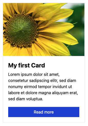
<div class="flex flex-col max-w-xs m-2 border">
    <img src="<?= $content->img()->toFile()->url() ?>" class="object-cover w-full h-52">
    <div class="flex flex-col p-5 grow">
        <h3 class="mb-2 text-2xl font-bold"><?= $content->title() ?></h3>
        <div class="grow"><?= $content->lead() ?></div>
        <a href="<?= $content->link()->toPage()->url() ?>" class="block px-3 py-2 mt-5 text-center text-white bg-blue-700">Read more</a>
    </div>
</div>
And the blueprint:
site/components/cards/cards.yml
title: Card
icon: draft
fields:
  img:
    type: files
    multiple: false
  title:
    type: text
  lead:
    type: writer
  link:
    type: pages
    multiple: false
Setup your Card in the panel et voila! We've got our first component!
The components folder
You can change the location of your components folder in your config.
site/config/config.php
<?php
return [
    'microman.components.root' => "site/my_location"
];
Pass an absolute path here and it could be anywhere on your server.
Using component as snippet
You can call a component with data from a array, page, block or any other object that contains a content object. Go and try it. The magic happen with this method:<?= component('name_of_the_component', $data, $extends) ?>
If $data is a content object, it makes sense to extend it with an array, or an another content object with $extends
We make an example. We show cards for pages. For this we create a page template named team with our fields from the cards component:
site/blueprints/pages/team.yml
fields:
  img:
    type: files
    multiple: false
  lead:
      type: writer
We don't use title and link. Cause title is set itself for pages and we link the card to the page later.
Create now a few team member with this template.
Now in our components template we let them show like this:
site/templates/components.php
<h1 class="h-full pt-8 pl-8 text-2xl">Our Team</h1>
<div class="flex flex-wrap p-5 cards column">
    <?php foreach ($site->pages()->template('team') as $team): ?>
        <?= component('cards', $team->content(), ['link' => [$team]]) ?>
    <?php endforeach ?>
</div>
As you see, we pass the page value as link over the third parameter to the component. The other values comes from the page itself.

Subcomponents
Subcompnents are in many ways useful. Either to outsource some element of your component. Or you have a different kind/style of this component. We make an example with the last one.
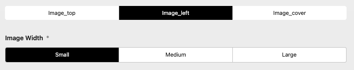
Let's say we like to have 3 different styles of our card, so we make 3 new sub components: image_top, image_left and image_cover.

Let's create these files:
site/components/cards/image_top.yml
site/components/cards/image_cover.yml
fields:
  max_width:
    label: Width
    type: toggles
    default: xs
    required: true
    options:
      - text: Small
        value: xs
      - text: Medium
        value: lg
      - text: Large
        value: 3xl
site/components/cards/image_left.yml
fields:
  image_width:
    label: Image Width
    type: toggles
    default: xs
    required: true
    options:
      - text: Small
        value: xs
      - text: Medium
        value: md
      - text: Large
        value: xl
And now the templates:
site/components/cards/image_top.php
<div class="flex flex-col max-w-<?= $content->max_width() ?> m-2 border">
    <img src="<?= $content->img()->toFile()->url() ?>" class="object-cover w-full h-52">
    <div class="flex flex-col p-5 grow">
        <h3 class="mb-2 text-2xl font-bold"><?= $content->title() ?></h3>
        <div class="grow"><?= $content->lead() ?></div>
        <a href="<?= $content->link()->toPage()->url() ?>" class="block px-3 py-2 mt-5 text-center text-white bg-blue-700">Read more</a>
    </div>
</div>
site/components/cards/image_left.php
<div class="flex flex-col max-w-xs m-2 border min-w-1/5 <div class="flex flex-col max-w-xs m-2 border min-w-1/5 md:max-w-full md:flex-row">
    <img src="<?= $content->img()->toFile()->url() ?>" class="object-cover w-full h-full md:max-w-xs lg:max-w-<?= $content->image_width() ?>">
    <div class="flex flex-col p-5 grow">
        <h3 class="mb-2 text-2xl font-bold"><?= $content->title() ?></h3>
        <div class="grow"><?= $content->lead() ?></div>
        <a href="<?= $content->link()->toPage()->url() ?>" class="block px-3 py-2 mt-5 text-center text-white bg-blue-700 w-52">Read more</a>
    </div>
</div>
site/components/cards/image_cover.php
<div class="relative max-w-<?= $content->max_width() ?> m-2 border min-h-[30em]">
    <img src="<?= $content->img()->toFile()->url() ?>" class="object-cover h-full">
    <div class="absolute bg-white-300 bg-white/[.6] bottom-0 inset-y p-5">
        <h3 class="mb-2 text-2xl font-bold"><?= $content->title() ?></h3>
        <div class="grow"><?= $content->lead() ?></div>
        <a href="<?= $content->link()->toPage()->url() ?>" class="block px-3 py-2 mt-5 text-center text-white bg-blue-700 w-52">Read more</a>
    </div>
</div>
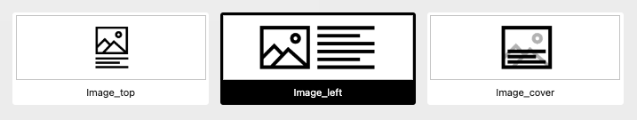
Component selector
The component selector in the component field appers, as we set more than one fieldsets. This we try now and create component field with our new sub components:
site/blueprints/pages/component.yml
title: Card
icon: draft
tabs:
  single_card:
    ...
  styled_card:
    label: Styled Card
    fields:
      card_style:
        type: component
        fieldsets:
          - cards/image_top
          - cards/image_left
          - cards/image_cover
        pretty: true
We can see in the panel already the selector. Why we style it a little bit by adding images to it. All you need to do is to copy images into the components folder with the same name as the components. This could be an png, jpg, jpeg, webp or an svg.
image_top.png
image_left.png
image_cover.png
We can pimp it a little bit by passing a few option to the selector in our card_style field.
site/blueprints/pages/component.yml
...
selector:
  default: cards/image_left
  gap: 1em
  ratio: 3/1
...
This selector can also be used as standalone field. It called imagetoggles and it follows the same rules as the toggles field. All you need to know is the
rootprops for the location of the images. And theimageprop in the options.
Extending components
That's cool so far. But we don't have any sources for our sub components. Why we don't insert our existing cards component for this?
site/blueprints/pages/component.yml
...
title: Card
icon: draft
tabs:
  single_card:
    ...
  styled_card:
    label: Styled Card
    fields:
      card_style:
        type: component
        fieldsets:
          - cards/image_top
          - cards/image_left
          - cards/image_cover
        pretty: true
            card_content:
                type: component
                fieldsets: cards/card
...
Here we go. Now we can focus on the output.
site/templates/components.php
<h1 class="h-full pt-8 pl-8 text-2xl">Styled Card</h1>
<div class="flex flex-wrap p-5">
    <?php $carddata = $page->card_content()->toComponent() ?>
    <?= $page->card_style()->toComponent($carddata) ?>
</div>
As you see, we just pass our card_content to the toComponent method, and give it to the card_style component.
With the
toComponentmethod you'il get the current selected component. But if you like to get all components that's available in the fieldsets, just use thetoComponentsmethod. More later...
Phew! It's a lot of stuff. And maybe hard to understanding depending on your kirby skills. But it covers every features of the component field. And give you a little insight for the possibilities thats open up here.
Using Kirby block elements
You can use component fields to insert a single kirby block. For that, there's nothing more to do than write block/ before the name of the desired block. Let us do it with the kirby form block suite plugin.
If you don't know it. This is a powerful plugin that allows you to easely create a contact form.
First we install this plugin:
composer require microman/kirby-form-block-suite
Next we assign this block to our component field:
site/blueprints/pages/component.yml
title: Card
icon: draft
tabs:
  ...
  block:
    label: Single Block
    fields:
      component_block:
        type: component
        fieldsets: blocks/form
        pretty: true
For a nice output we add the css call to the head of our website:
site/templates/components.php
<?= snippet('blocks/formcore/styles') ?>
And the output:
<h1 class="h-full pt-8 pl-8 text-2xl">Single Block</h1>
<?= $page->component_block()->toComponent() ?>
Create a form and see whats happen. ;)
Components
There's only one card at the moment. But we need more. For this we get help from the components field (components with zzzz - plural!).
Let's make a litle conversion and make our cards main component to a card sub component.
We rename cards -> cards/card and change the type from cards to cards/card in
site/templates/component.php
site/templates/component.yml
content/component/component.txt
Now we can now recreate a new main component:
site/components/cards/cards.yml
title: Cards
icon: draft
fields:
  card_content:
    type: components
    fieldsets: cards/card
  type:
    type: component
    selector:
      default: cards/image_left
      gap: 1em
      ratio: 3/1
    fieldsets:
      - cards/image_top
      - cards/image_left
      - cards/image_cover
site/components/cards/cards.php
<div class="flex flex-wrap p-5">
    <?php foreach ($content->card_content()->toComponents() as $source): ?>
        <?= $content->type()->toComponent($source)?>
    <?php endforeach ?>
</div>
And then we integrate it to our page:
site/blueprints/pages/component.yml
title: Card
icon: draft
tabs:
  single_card:
    ...
  multiple:
    label: Multiple Cards
    fields:
      blocks:
        type: components
        fieldsets: cards
        pretty: true
site/templates/components.php
  <h1 class="h-full pt-8 pl-8 text-2xl">Multiple components</h1>
  <?= $page->blocks()->toComponents() ?>
...and see how it works.
Let's say, we want to get the content for our component eighter from selected pages or from manual entered values. Therefore we add an toggles selecter to choos between these opportunities:
Replace our card_content with this:
site/components/cards/cards.yml
...
  source:
    type: toggles
    default: manual
    required: true
    options:
      - text: Selected Pages
        value: pages
      - text: Manual
        value: manual
  pages:
    query: site.index.template('team')
    when:
      source: pages
  card_content:
    type: components
    fieldsets: cards/card
    when:
      source: manual
...
Now our snipppet:
site/components/cards/cards.php
<?php
    if ($content->source()->value() === "manual") {
        $sources = $content->card_content()->toComponents();
    }
    if ($content->source()->value() === "pages") {
        $sources = $content->pages()->toPages();
    }
    $sources ??= [];
?>
<div class="flex flex-wrap p-5">
    <?php foreach ($sources as $source): ?>
        <?= $content->type()->toComponent($source)?>
    <?php endforeach ?>
</div>
It would be going too far if I were to go into more detail here. But all you have to know, is that you can extend your component with data given to the toComponents method.
Add more blocks to the components field
As we knew from our last part. We can use blocks in our componen fields. Also in components.
site/blueprints/pages/component.yml
fieldsets:
  - blocks/heading
  - blocks/text
  - blocks/list
  - blocks/quote
  - cards
Bring your blocks to the components folder
You can create a folder blocks in your components folder. And copy all your blocks there. And, you can add images for the selector.
The location of all basic Kirby blocks is in kirby/config/blocks.
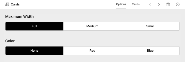
Tab injection
You would like set here the maximum height for each component, just create a component and make a tab.
site/components/sections/options.yml
fields:
  max_width:
    label: Maximum Width
    type: toggles
    options:
      - text: Full
        value: full
      - text: Medium
        value: 3xl
      - text: Small
        value: xl
site/components/cards/cards.php
...
<div class="flex flex-wrap p-5 max-w-<?= $content->max_width() ?> mx-auto">
...
And the injection in our blocks field:
site/blueprints/pages/component.yml
...
tabs:
  section/options:
    label: options
    position: after
...
You can also overwrite or extends the whole component in there:
site/blueprints/pages/component.yml
...
tabs:
  section/options:
    label: options
    position: before
    fields:
      color:
        type: toggles
        options:
          - text: None
            value: none
          - text: Red
            value: red
          - text: Blue
            value: blue
...
This also works in component field. There you can set the 'active: true' props.
Credits
Thank you for your interest in kirby components plugin. Here all the important links: