keiwen / enhanced-check
Enhance checkboxes and radio buttons design
Maintainers
Package info
github.com/Keiwen/enhancedCheck
Language:JavaScript
Type:component
pkg:composer/keiwen/enhanced-check
This package is auto-updated.
Last update: 2026-06-26 09:33:17 UTC
README
Require Bootstrap >= 3.0.0
Known issue about angular disabled style
Components
Basic
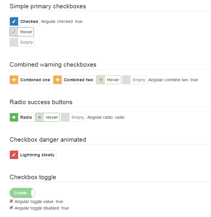
Enhance checkboxes and radio buttons design. Just put input and label (label after input) in a div with desired class
- enhancedCheck: base class:
- enhancedCheck-inline: display inputs inline if they are nested into not-inline div
- enhancedCheck-[primary|success|danger|warning]: change base color to [blue|green|red|orange]
- enhancedCheck-combine: alternate design for checkboxes, aiming at grouping values
- enhancedCheck-animate: color change slowly on select/unselect
Toggle
Also provide toggles/checkboxes. Just provide "enhancedCheck-toggle" class on input, and you can configure data attributes. Toggle require jQuery!
- data-on: label for toggle checked
- data-off: label for toggle unchecked
- data-onstyle: bootstrap class for checked label (success/warning/danger/...)
- data-offstyle: bootstrap class for unchecked label (success/warning/danger/...)
- data-style: toggle border style ("squarred", "rounded", empty is default (medium))
If you need angular 1 support, include directive file and use 'ui.enhancedCheck' module in your app. Obviously require angular in that case. You can add ngModel (required), ngDisabled and ngChange on your input tag.
Preview
See index.html or following sample
Samples
Typical HTML sample:
<div class="enhancedCheck enhancedCheck-primary">
  <input type="checkbox" id="sampleCheckbox">
  <label for="sampleCheckbox">Checkbox</label>
</div>
Or:
<div class="enhancedCheck enhancedCheck-success">
  <input type="radio" name="rb" id="sampleRadio1">
  <label for="sampleRadio1">Radio one</label>
  <input type="radio" name="rb" id="sampleRadio2">
  <label for="sampleRadio2">Radio two</label>
</div>
Toggle with angular:
<input type="checkbox" id="sampleCheckboxToggle" class="enhancedCheck-toggle"
       data-on="Enable" data-off="Disable" data-onstyle="success" data-offstyle="danger"
       data-style="rounded"
       ng-model="toggle" ng-change="toggleChange()" ng-disabled="toggleDisabled"/>