drewdan / page-builder
A simple page builder tool for Laravel
Package info
github.com/Drewdan/tailwind-page-builder-for-laravel
Language:JavaScript
pkg:composer/drewdan/page-builder
Requires
- php: ^8.0
- ext-json: *
- laravel/vapor-core: ^2.31
Requires (Dev)
- orchestra/testbench: ^8.5
- phpunit/phpunit: ^10.1
- spatie/laravel-ray: ^1.32
This package is auto-updated.
Last update: 2026-04-29 01:33:34 UTC
README
A Vue-powered page builder for Laravel, designed with Tailwind CSS for styling. Easily construct pages using components such as headings, paragraphs, and images. The layout is managed using a grid system, ensuring a responsive design across both mobile and larger devices.
Installation
- Install the package via Composer:
composer require drewdan/page-builder
- Ensure the public assets are always up-to-date by adding the following to the
post-update-cmdin yourcomposer.jsonfile:
"post-update-cmd": [
    "@php artisan vendor:publish --tag=page-builder-assets --ansi --force"
]
- You can publish the package's config file using the following command:
php artisan vendor:publish --tag=page-builder-config
Configuration
The package comes with a primary configuration file which allows you to set various options for the page builder. Here's a brief overview:
prefix: The URL prefix for the page builder.middleware: Middleware to apply. It's recommended to include 'web' here.external: Configuration for external routes.layout: The default layout for the page builder pages.elements: Define the elements available in the page builder, such as headings, paragraphs, and images.
Here's a snippet from the default configuration:
'elements' => [
    [
        'id' => 1,
        'type' => 'h1',
        'renderer' => 'Text',
        'name' => 'Heading',
        ...
    ],
    ...
]
Usage
By default, the index of pages can be located by visiting /page-builder/pages. You can change this by updating the prefix option in the configuration file.
Clicking create new page will trigger a modal where you can name your new page. Clicking edit will allow you to edit a page
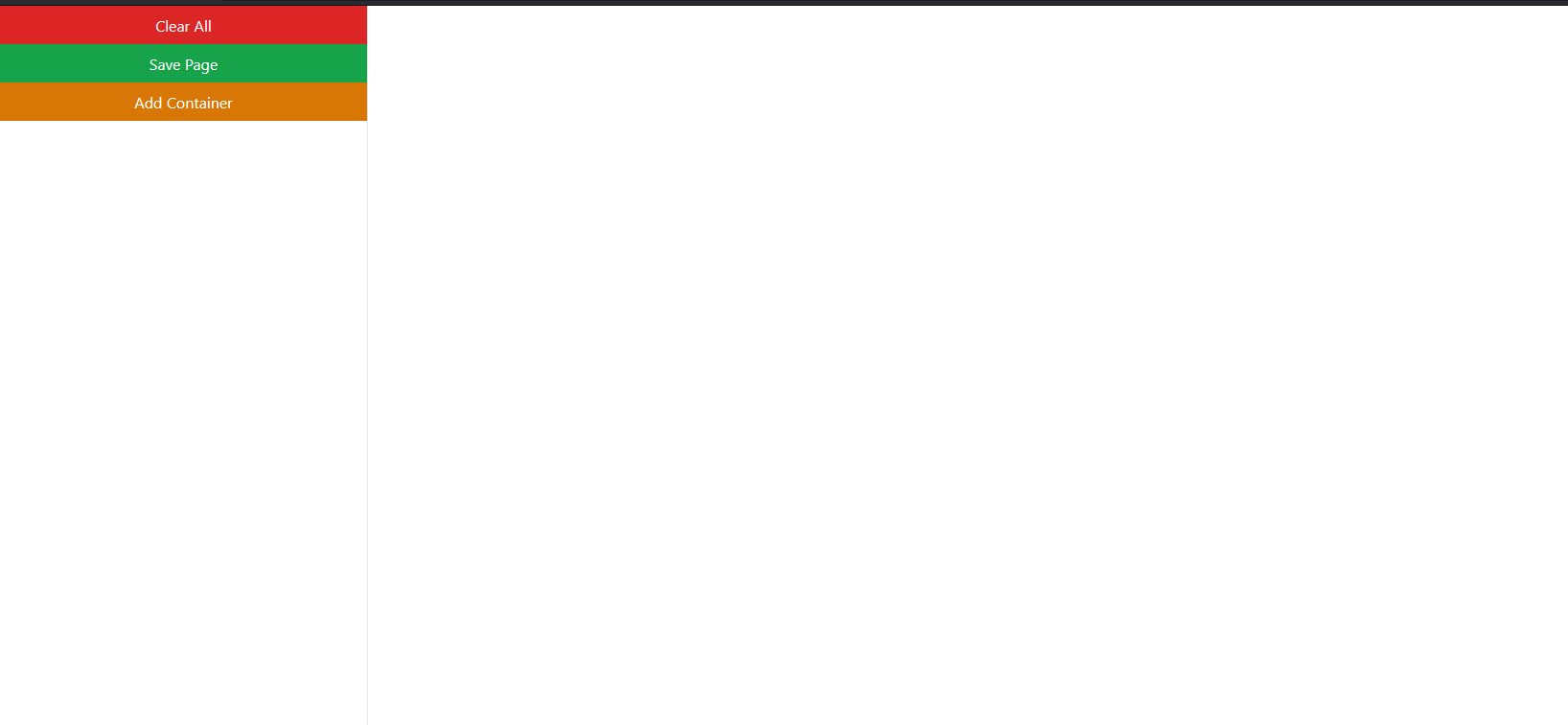
At the time of writing, the default new page is completely blank.
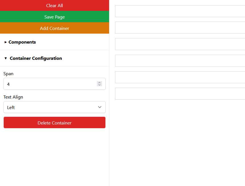
To create a page you must first add "containers to the page" using the "Add Container" button. The containers utilise the tailwind grid system, with a default of 4 columns. By selecting the container, you will have the option to change the span of the container, this will allow you to stack containers side by side. On the smaller breakpoints, these will always default to 1 column. You may also set the text alignment of the contents of the container.
Once you have added a container, you can then add elements to the container.
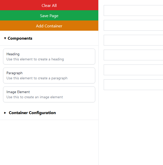
At the time of writing, there are three "components", header, paragraph and image. We have plans to add more and to allow you to define your own custom components.
Click and drag these components to the container, they will contain some default content which you can then configure.
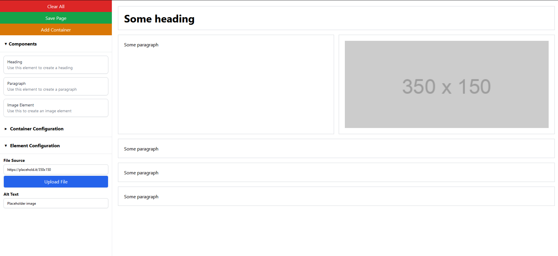
Clicking on an element will allow you to edit its settings.
Each type of element has its own configuration options, for example, the header element allows you to set the header size, the paragraph element allows you to set the text alignment and the image element allows you to set the image source.
Once you have finished editing your page, click save.
This package is still in early development, so lots of features are still to come! If you have any feedback, please feel free to open an issue or a PR.
To view your page, you can visit /page/{slug}.
Contributing
Contributions are very welcome! Please follow the conventions set out by GitFlow when submitting pull requests.
License
This package is open-sourced software licensed under the MIT license.


